LinkButton
Basics
Usage example:
<layout>
<linkButton id="saveButton"
caption="Save"
description="Click Me!"
icon="SAVE"/>
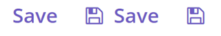
</layout>The LinkButton differs from the regular Button only in its appearance. All properties and behavior are identical to those described for Button.
|
By default, the caption for You can change the default behavior to display
|
All XML Attributes
action - align - caption - captionAsHtml - colspan - css - description - descriptionAsHtml - disableOnClick - enable - box.expandRatio - height - htmlSanitizerEnabled - icon - id - responsive - rowspan - shortcut - stylename - tabIndex - visible - width
