FileStorageUploadField
FileStorageUploadField component allows you to upload a file to the file storage and link it to an entity attribute as a FileRef object.
The component can contain a caption, a link to the uploaded file, and an upload button. When the upload button is clicked, a standard OS file picker window is shown, where the user can select a file.
Component’s XML-name: fileStorageUpload.
Basics
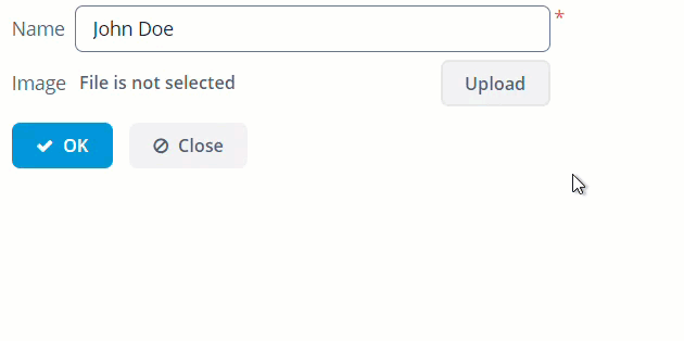
In the example below, image attribute of the Person entity has the FileRef type.
@JmixEntity
@Table(name = "UIEX1_PERSON")
@Entity(name = "uiex1_Person")
public class Person {

    /* other attributes */

    @Column(name = "IMAGE", length = 1024)
    private FileRef image;
<data>
<instance id="personDc"
class="ui.ex1.entity.Person">
<fetchPlan extends="_base"/>
<loader/>
</instance>
</data>
<layout spacing="true">
<form id="form" dataContainer="personDc">
<column width="350px">
<textField id="nameField"
property="name"/>
<fileStorageUpload id="imageField"
showFileName="true"
property="image"/>
</column>
</form>
</layout>To store a file in an entity attribute as a byte array instead of FileRef, use the FileUploadField component.
The uploaded file will be immediately stored in the default FileStorage. To control the saving of the file programmatically, use the fileStoragePutMode attribute.
Listeners
You can track the upload process with the following listeners:
-
AfterValueClearListener- invoked after the value has been cleared using the clear button.
-
BeforeValueClearListener- invoked when you click on the clear button.
-
FileUploadErrorListener- invoked when the upload is finished, but unsuccessful.
-
FileUploadFinishListener- invoked when the file is uploaded.
-
FileUploadStartListener- invoked when start uploading the file.
-
FileUploadSucceedListener- invoked when the upload is successfully finished.
-
ValueChangeListener- invoked when the value of the field is changed.
Attributes
fileStoragePutMode
By default, the fileStoragePutMode attribute is set to IMMEDIATE value. You can control the saving of the file programmatically if you set the fileStoragePutMode attribute to the MANUAL value:
<fileStorageUpload id="manuallyControlledField"
                   property="image"
                   fileStoragePutMode="MANUAL"/>
In the screen controller, define the component itself, and the TemporaryStorage interface. Then subscribe to the events of successful uploads or error:
@Autowired
private FileStorageUploadField manuallyControlledField;
@Autowired
private TemporaryStorage temporaryStorage;
@Autowired
private Notifications notifications;

@Subscribe("manuallyControlledField")
public void onManuallyControlledFieldFileUploadSucceed(SingleFileUploadField.FileUploadSucceedEvent event) {
    File file = temporaryStorage.getFile(manuallyControlledField.getFileId()); (1)
    if (file != null) {
        notifications.create()
                .withCaption("File is uploaded to temporary storage at " + file.getAbsolutePath())
                .show();
    }
    (2)
    FileRef fileRef = temporaryStorage.putFileIntoStorage(manuallyControlledField.getFileId(), event.getFileName()); (3)
    manuallyControlledField.setValue(fileRef);
    notifications.create()
            .withCaption("Uploaded file: " + manuallyControlledField.getFileName())
            .show();
}

@Subscribe("manuallyControlledField")
public void onManuallyControlledFieldFileUploadError(SingleFileUploadField.FileUploadErrorEvent event) {
    notifications.create()
            .withCaption("File upload error")
            .show();
}| 1 | Here you can get the file uploaded to the temporary storage if you need it. |
| 2 | Do what you want with the file here. |
| 3 | Save file to FileStorage. |
The component will upload the file to the temporary storage and invoke the FileUploadSucceedEvent listener.
TemporaryStorage.putFileIntoStorage() method moves the uploaded file from the temporary client storage to the default File Storage. Parameters of this method are file identifier and file name. Both of these parameters are provided by FileStorageUploadField.
The ValueChangedEvent is not fired automatically after uploading or clearing the FileStorageUploadField field with MANUAL put mode, because the FileRef value can be obtained only after uploading a file to the permanent file storage.
|
fileStorage
The fileStorage attribute allows you to specify the name of a FileStorage where the uploaded file will be placed.
dropZone
The dropZone attribute allows you to specify a BoxLayout to be used as a target for drag-and-dropping files from outside of the browser. The dropZone can cover the whole layout of a dialog window. The selected container is highlighted when a user drags a file over the container, otherwise, it is not visible.
<layout spacing="true">
        <vbox>
            <textField id="titleField"
                       caption="Title"
                       width="100%"/>
            <vbox id="dynamicDropZone"
                  height="AUTO"
                  spacing="true">
                <textArea id="descriptionArea"
                          caption="Description"
                          width="100%"
                          rows="5"/>
                <checkBox caption="Is reference document"
                          width="100%"/>
                <fileStorageUpload id="fileStorageUpload"
                                   dropZone="dynamicDropZone"
                                   showClearButton="true"
                                   showFileName="true"/>
            </vbox>
        </vbox>
</layout>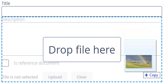
To make a dropZone static and display it permanently, assign the predefined dropzone-container style to its container. In this case, the container should be empty with only the label component inside:
<layout spacing="true">
        <textField id="textField"
                   caption="Title"
                   width="100%"/>
        <checkBox caption="Is reference document"
                  width="100%"/>
        <fileStorageUpload id="upload"
                           dropZone="dropZone"
                           showClearButton="true"
                           showFileName="true"
                           dropZonePrompt="Drop your file here"/>
        <vbox id="dropZone"
              height="150px"
              spacing="true"
              stylename="dropzone-container">
            <label stylename="dropzone-description"
                   value="Drop file here"
                   align="MIDDLE_CENTER"/>
        </vbox>
</layout>
dropZonePrompt
The dropZonePrompt attribute allows you to set the text that will be shown on drag over the window with a file.
<fileStorageUpload id="upload"
                   dropZone="dropZone"
                   showClearButton="true"
                   showFileName="true"
                   dropZonePrompt="Drop your file here"/>
pasteZone
The pasteZone attribute allows you to specify a container to be used for handling paste shortcuts when a text input field nested in this container is focused. To do this, set the pasteZone attribute to the container id value. This feature is supported by Chromium-based browsers.
<fileStorageUpload id="pasteUploadField"
                   pasteZone="vboxId"
                   showClearButton="true"
                   showFileName="true"/>
fileSizeLimit
Maximum upload size is determined by the jmix.ui.component.uploadFieldMaxUploadSizeMb application property and equals 20MB by default. If you select a file of a larger size, a corresponding message will be displayed, and the upload will be interrupted. To change the maximum upload size for concrete fileStorageUploadField use the fileSizeLimit attribute, which allows you to set the maximum allowed file size specified in bytes.
<fileStorageUpload id="sizedUploadField"
                   fileSizeLimit="31457280"/>
permittedExtensions
The permittedExtensions attribute allows you to set the white list of permitted file extensions. The value of the attribute should be a comma-separated list of extensions with leading dots.
<fileStorageUpload id="permittedUploadField"
                   permittedExtensions = ".jpg,.png"/>
accept
The accept attribute allows you to set the file type mask in the file selection dialog. You still will be able to change the mask to "All files" and upload arbitrary files.
<fileStorageUpload id="acceptUploadField"
                   accept="*.jpg,*.png"/>
showFileName
The showFileName attribute controls whether the name of the uploaded file is displayed next to the upload button. It is false by default.
<fileStorageUpload id="namedUploadField"
showFileName="true"/>Methods
-
getFileId()- returnsidfor uploaded file inTemporaryStorage. -
getFileName()- returns caption to be shown in the file download link next to upload button.
All XML Attributes
accept - align - box.expandRatio - buffered - caption - captionAsHtml - clearButtonCaption - clearButtonDescription - clearButtonIcon - colspan - contextHelpText - contextHelpTextHtmlEnabled - css - dataContainer - description - descriptionAsHtml - dropZone - dropZonePrompt editable - enable - fileSizeLimit - fileStoragePutMode - filestorage - height - htmlSanitizerEnabled - icon - id - pasteZone - permittedExtensions - property - required - requiredMessage - responsive - rowspan - showClearButton - showFileName - stylename - tabindex - uploadButtonCaption - uploadButtonDescription - uploadButtonIcon visible - width
