TextField
TextField is a component for text editing. It can be used both for working with entity attributes and entering/displaying arbitrary textual information.
Component’s XML-name: textField.
Basics
Usage example:
<textField id="nameField"
           caption="Name"/>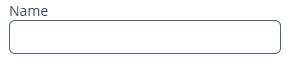
To create a TextField connected to data, use dataContainer and property attributes.
<data>
    <instance id="customerDc" class="ui.ex1.entity.Customer">
        <loader/>
    </instance>
</data>

<layout>
    <vbox margin="true" spacing="true">
    <textField dataContainer="customerDc"
               property="firstName"
               caption="Name"/>
</layout>
In the example above, the screen describes the customerDc data container for Customer entity, which has firstName attribute. The TextField component has a link to the container specified in the dataContainer attribute; property attribute contains the name of the entity attribute that is displayed in the TextField.
Attributes
datatype
If the field is not connected to an entity attribute (the data container and attribute name are not set), you can set the data type using the datatype attribute. It is used to format field values. The attribute value accepts any registered data type in the application metadata.
Typically, TextField uses the following data types:
-
decimal -
double -
int -
long
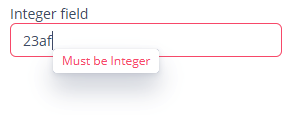
<textField id="integerField"
           datatype="int"
           caption="Integer field"/>
maxLength
If a TextField is linked to an entity attribute (via dataContainer and property), and if the entity attribute has a length parameter defined in the @Column JPA-annotation, then the TextField will limit the maximum length of entered text accordingly.
If a TextField is not linked to an attribute, or if the attribute does not have length value defined, or this value needs to be overridden, then the maximum length of the entered text can be limited using maxLength attribute. The value of "-1" means there are no limitations. For example:
<textField id="shortTextField"
           maxLength="10"/>
trim
By default, TextField trims spaces at the beginning and at the end of the entered string. For example, if user enters " aaa bbb ", the value of the field returned by the getValue() method and saved to the linked entity attribute will be "aaa bbb". You can disable trimming of spaces by setting the trim attribute to false.
Note that trimming only works when users enter a new value. If the value of the linked attribute already has spaces in it, the spaces will be displayed until user edits the value.
<textField id="trimField"
           caption="Trimmed field"
           trim="false"/>
TextField always returns null instead of an entered empty string. Therefore, with the trim attribute enabled, any string containing spaces only will be converted to null.
Conversions
Case Conversion
TextField supports automatic case conversion. The caseConversion attribute can have one of the following values:
-
UPPER- the upper case. -
LOWER- the lower case. -
NONE- without conversion (the default value). Use this option to support key-sequence input using IME (for example, for Japanese, Korean or Chinese language).
Data Type Conversion
If the user enters a value that cannot be parsed to a required data type, the default conversion error message appears.
Consider TextField with an Integer data type:
<textField id="integerField"
           datatype="int"
           caption="Integer field"/>
If you enter a value that cannot be interpreted as an integer number the application will show a default error message.
Default error messages can be customized globally for the project as described in Conversion Error Messages section.
Also, you can use the conversionErrorMessage attribute to specify a custom conversion error message declaratively in the screen XML descriptor, for example:
<textField id="textField"
           conversionErrorMessage="This field can work only with Integers"
           datatype="int"
           caption="Integer field"/>
or programmatically in the screen controller:
@Autowired
private TextField<Integer> textField;

@Subscribe
protected void onInit(InitEvent initEvent) {
    textField.setConversionErrorMessage("This field can work only with Integers");
}
Validation
To check values entered into the TextField component, you can use a validator in a nested validators element.
The following predefined validators are available for TextField:
In the example below, we will show a NegativeValidator usage for textValidField:
<textField id="textValidField"
           datatype="int">
    <validators>
        <negative/>
    </validators>
</textField>
Styles
You can set predefined styles to the TextField component using the stylename attribute either in the XML descriptor or in the screen controller:
<textField stylename="borderless"
           caption="Borderless field"/>
@Autowired
private TextField<String> styledField;
@Subscribe
protected void onInit(InitEvent initEvent) {
styledField.setStyleName("align-center");
}-
align-center- align the text inside the field to center. -
align-right- align the text inside the field to the right. -
borderless- remove the border and background from the text field. -
inline-icon- move the default caption icon inside the text field.
Methods
-
You can use the
setCursorPosition()method to focus the field and set the cursor position to the specified 0-based index.
Events and Handlers
|
To generate a handler stub in Jmix Studio, select the component in the screen descriptor XML or in the Jmix UI hierarchy panel and use the Handlers tab of the Jmix UI inspector panel. Alternatively, you can use the Generate Handler button in the top panel of the screen controller. |
EnterPressEvent
See EnterPressEvent.
Formatter
Adds a formatter instance to the component.
In the example below, we will show a formatter usage for the customerField text field:
@Install(to = "customerField", subject = "formatter")
protected String customerFieldFormatter(String value) {
    return value.toUpperCase();
}
To add a formatter programmatically, use the setFormatter() component method.
TextChangeEvent
TextChangeEvent is sent when the user type something in the component. This event is processed asynchronously after typing in order not to block the typing.
@Autowired
private Label<String> shortTextLabel;
@Autowired
private TextField<String> shortTextField;

@Subscribe("shortTextField")
public void onShortTextFieldTextChange(TextInputField.TextChangeEvent event) {
    int length = event.getText().length();
    shortTextLabel.setValue(length + " of " + shortTextField.getMaxLength());
}
Programmatic registration of the event handler: use the addTextChangeListener() component method.
The TextChangeEventMode defines the way the changes are transmitted to the server to cause a server-side event. There are 3 predefined event modes:
-
LAZY(default) - an event is triggered when there is a pause in editing the text. The length of the pause can be modified withsetInputEventTimeout(). -
TIMEOUT- an event is triggered after a timeout period. The length of the timeout can be set withsetInputEventTimeout(). -
EAGER- an event is triggered immediately for every change in the text content, typically caused by a key press. -
BLUR- an event is triggered when the text field loses focus.
The textChangeTimeout attribute modifies how often events are communicated to the application when TextChangeEventMode is LAZY or TIMEOUT.
Programmatic usage: call the setTextChangeEventMode() component method.
@Autowired
private TextField<String> shortTextField;

@Subscribe
protected void onInit(InitEvent initEvent) {
    shortTextField.setTextChangeEventMode(TextInputField.TextChangeEventMode.LAZY);
}
Validator
Adds a validator instance to the component. The validator must throw ValidationException if the value is not valid.
If you are not satisfied with the predefined validators, add your own validator instance:
@Install(to = "zipField", subject = "validator")
protected void zipFieldValidator(Integer value) {
    if (value != null && String.valueOf(value).length() != 6)
        throw new ValidationException("Zip must be of 6 digits length");
}
ValueChangeEvent
See ValueChangeEvent.
TextField XML Attributes
|
You can view and edit attributes applicable to the component using the Jmix UI inspector panel of the Studio’s Screen Designer. |
align - buffered - caseConversion - caption - captionAsHtml - colspan - contextHelpText - contextHelpTextHtmlEnabled - conversionErrorMessage - css - dataContainer - dataType - description - descriptionAsHtml - editable - enable - box.expandRatio - height - htmlSanitizerEnabled - htmlName - icon - id - inputPrompt - maxLength - property - required - requiredMessage - responsive - rowspan - stylename - tabIndex - textChangeEventMode - textChangeTimeout - trim - visible - width
