DataGrid
DataGrid, similarly to the Table component, is designed to display and sort tabular data and provides means to manipulate rows and columns with greater performance due to the lazy loading of data while scrolling.
In addition to this, DataGrid has the following features:
-
Advanced configuration of Header and Footer;
However, DataGrid has no corresponding implementation with grouping capabilities (but Table has).
Component’s XML-name: dataGrid.
Basics
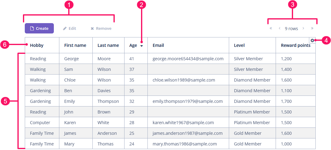
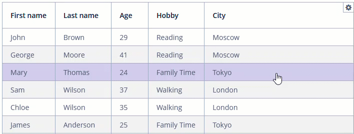
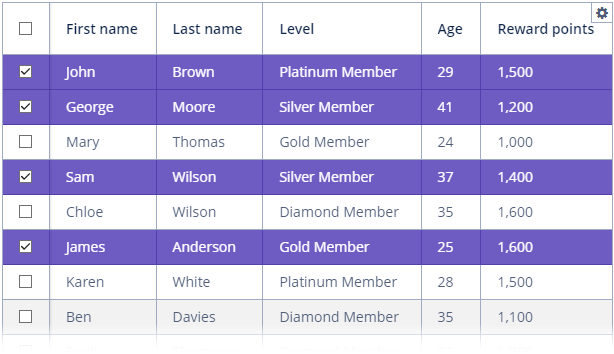
A typical dataGrid is shown below:
-
Buttons panel
-
Sort button
-
Pagination
-
Column control button
-
Rows
-
Header row
An example of dataGrid declaration in the XML screen descriptor is shown below:
<data>
    <collection id="customersDc" class="ui.ex1.entity.Customer">
        <fetchPlan extends="_base"/>
        <loader id="customersDl">
            <query>
                <![CDATA[select e from uiex1_Customer e]]>
            </query>
        </loader>
    </collection>
</data>
<layout>
    <dataGrid id="customersGrid" width="100%" dataContainer="customersDc">
        <actions>
            <action id="create" type="create"/>
            <action id="edit" type="edit"/>
            <action id="remove" type="remove"/>
        </actions>
        <buttonsPanel alwaysVisible="true">
            <button id="customersGridCreateBtn" action="customersGrid.create"/>
            <button id="customersGridEditBtn" action="customersGrid.edit"/>
            <button id="customersGridRemoveBtn" action="customersGrid.remove"/>
        </buttonsPanel>
        <simplePagination/>
        <columns>
            <column id="hobby" property="hobby"/>
            <column id="firstName" property="firstName"/>
            <column id="lastName" property="lastName"/>
            <column id="age" property="age"/>
            <column id="email" property="email"/>
            <column id="level" property="level"/>
            <column id="rewardPoints" property="rewardPoints"/>
        </columns>
    </dataGrid>
</layout>
In the example, there is a collection container for the Customer entity. The DataGrid component is bound to the container using the dataContainer attribute, while its columns element defines which entity attributes are shown in the data grid columns.
Data Binding
Declarative Binding
Usually, you bind dataGrid to data declaratively in the screen XML descriptor using the dataContainer attribute. It should refer to a collection container.
Using Key-Value Containers
You can bind the data grid to a key-value container to display the results of a query that returns scalar values and/or aggregates. For example:
<data>
    <keyValueCollection id="salesDc">
        <loader id="salesLoader">
            <query>
                <![CDATA[select o.customer, o.customer.firstName,
                sum(o.amount) from uiex1_Order o group by o.customer]]>
            </query>
        </loader>
        <properties>
            <property class="ui.ex1.entity.Customer" name="customerEntity"/>
            <property datatype="string" name="customerName"/>
            <property datatype="decimal" name="sum"/>
        </properties>
    </keyValueCollection>
</data>
<layout>
    <dataGrid id="keyValueGrid" width="100%" dataContainer="salesDc">
        <columns>
            <column id="customerName" caption="Customer"/>
            <column id="sum" caption="Summary amount"/>
        </columns>
    </dataGrid>
</layout>
Programmatic Binding
If you need to define a data container programmatically in the screen controller, set the metaClass attribute instead of dataContainer in XML descriptor:
<dataGrid id="customersDataGrid"
          width="100%"
          metaClass="uiex1_Customer">
    <columns>
        <column id="firstName" property="firstName"/>
        <column id="lastName" property="lastName"/>
    </columns>
</dataGrid>
In the screen controller, use ContainerDataGridItems class to bind the data grid to a data container:
@Autowired
private DataGrid<Customer> customersDataGrid;

@Autowired
private CollectionContainer<Customer> customersDc;


@Subscribe
public void onInit(InitEvent event) {
    customersDataGrid.setItems(new ContainerDataGridItems<>(customersDc));
}
Columns
The set of columns for a data grid is defined in the columns element. If it is not specified, columns will be automatically determined by the fetch plan defined in dataContainer.
The columns element can have the following attributes:
-
includeAllincludes all the attributes fromfetchPlanthat is defined indataContainer.In the example below, we will show all the attributes from the fetch plan used in
customersDc:<dataGrid id="gridIncludeAll" width="100%" dataContainer="customersDc"> <columns includeAll="true"/> </dataGrid>If the entity fetch plan contains a reference attribute, this attribute will be displayed according to its instance name. If you want to show a specific nested attribute, define it in the fetch plan as well as in the
columnelement:<data> <collection id="customersDc1" class="ui.ex1.entity.Customer"> <fetchPlan extends="_base"> <property name="city" fetchPlan="_base"> <property name="country" fetchPlan="_base"/> </property> </fetchPlan> <loader id="customersDl1"> <query> <![CDATA[select e from uiex1_Customer e]]> </query> </loader> </collection> </data> <layout> <dataGrid id="gridIncludeAllReference" width="100%" dataContainer="customersDc1"> <columns includeAll="true"> <column id="city.country.name"/> </columns> </dataGrid> </layout>
-
excludecontains a comma-separated list of attributes that should not be displayed in the data grid.In the example below, we will show all the attributes excluding
id,maritalStatus, andemail:<dataGrid id="gridExclude" width="100%" dataContainer="customersDc"> <columns includeAll="true" exclude="id,maritalStatus,email"/> </dataGrid>
Column
Each column is described in a nested column element.
id - an optional attribute specifying the column identifier. If not set, the value of the property attribute is used as the column identifier. If neither id nor property attribute is specified, the GuiDevelopmentException exception is thrown at runtime. The id attribute is mandatory for generated columns.
property specifies the name of an entity attribute displayed in the column. It can be either an attribute of the entity from the data container or a linked entity (use dot notation to traverse the object graph). For example:
<columns>
    <column property="firstName"/>
    <column property="lastName"/>
    <column property="city.name"/>
    <column property="city.country.name"/>
</columns>|
To add |
Column Caption
caption - an optional attribute containing the column caption. If not specified, a localized name of the entity attribute is used.
This caption is also used as the hiding toggle caption unless explicitly set via the collapsingToggleCaption attribute.
Column Collapsing
collapsed - an optional attribute; hides the column by default when set to true. Users can control the column’s visibility using the menu available via the  button in the top right corner of the data grid when the columnsCollapsingAllowed attribute is
 true. By default, collapsed is false.
The collapsible attribute defines whether a user can hide or show columns using the column control button. The default value is true.
The collapsingToggleCaption attribute sets the column’s caption in the column control menu. By default, its value is null; in this case, the caption remains the same as the column’s caption.
<dataGrid id="collapsedGrid"
          width="100%"
          dataContainer="customersDc">
    <columns>
        <column property="firstName"
                collapsible="false"/>
        <column property="lastName"
                collapsible="false"/>
        <column property="age"
                collapsed="true"/>
        <column property="hobby"
                collapsingToggleCaption="The favourite customer's hobby"/>
        <column property="level"/>
        <column property="city"/>
    </columns>
</dataGrid>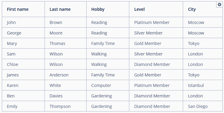
As you can see, the age column is collapsed by default, but users can expand it from the button’s drop-down menu.
At the same time, the firstName and lastName columns cannot be collapsed by the user.
The custom caption for the hobby column is shown in the drop-down menu of the column control button.
The column collapsing can be tracked with ColumnCollapsingChangeEvent.
Column Width
width - an optional attribute controlling the default column width. It may contain only numeric values in pixels.
<columns>
    <column property="firstName" width="120"/>
    <column property="lastName" width="150"/>
    <column property="city" width="100"/>
</columns>
expandRatio - an optional attribute that specifies the expand ratio for each column. The ratio must be greater than or equal to 0. If some value is set for at least one column, all implicit values are ignored, and only explicitly assigned values are considered.
By default, all columns expand equally (treated as if all of them had the expand ratio of 1).
If you set width and expandRatio attributes simultaneously, the expandRatio attribute will be ignored.
<columns>
    <column property="firstName" expandRatio="0"/>
    <column property="lastName" expandRatio="1"/>
    <column property="city" expandRatio="2"/>
</columns>
In the example above, the DataGrid component has three columns, with expand ratios 0, 1, and 2, respectively. The column with a ratio of 0 is exactly as wide as its contents require. The column with a ratio of 1 is as wide as it needs, plus a third of any excess space, because we have three parts total, and this column reserves only one of those. The column with a ratio of 2 is as wide as it needs to be, plus two thirds of the excess width.
To clear the expand value, set a negative number to an expandRatio attribute.
The minimumWidth attribute defines the minimum guaranteed pixel width of the column when it is set to expand.
The maximumWidth attribute defines the maximum allowed pixel width of the column when it is set to expand.
Column Resizing
Users can resize data grid columns:
The resizable attribute defines whether users can resize this column. By default, all columns are resizable.
Use the columnResizeMode attribute to specify the resize mode. Two modes are supported:
-
In the
ANIMATEDmode, the grid redraws its columns continuously when users resize columns. -
In the
SIMPLEmode, the grid redraws columns only when the user releases the mouse button.
The column size changes can be tracked with ColumnResizeEvent.
Column Reordering
DataGrid provides the drag-and-drop functionality allowing users to change the order in which columns are displayed within the data grid.
The column reordering functionality is enabled by default. To disable it, set the reorderingAllowed attribute to false.
The column order changes can be tracked with ColumnReorderEvent.
Column Freezing
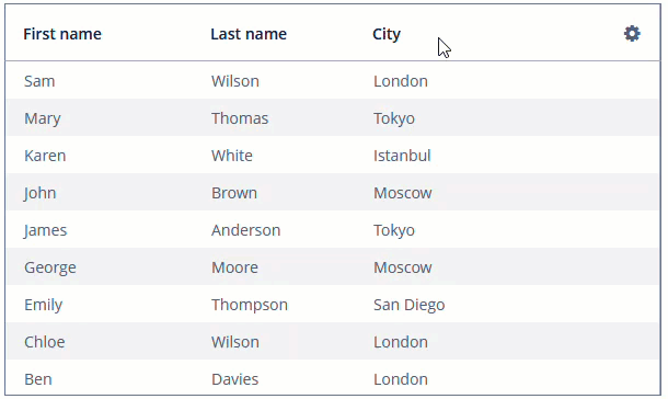
DataGrid allows you to anchor columns to its left side. It can help keep the essential columns always visible in a grid with a large number of columns. Frozen columns are not scrolled when you scroll the grid horizontally.
The frozenColumnCount attribute sets the number of fixed columns. The 0 value means that no columns will be fixed except the predefined column with checkboxes for multiple-choice if the checkbox selection mode is used. The -1 value makes even a multi-select column not fixed. The default value is 0.
Let’s consider an example with a data grid where the first two columns are frozen.
<dataGrid id="frozenGrid"
          width="100%" footerVisible="false"
          dataContainer="customersDc"
          frozenColumnCount="2">
    <columns>
        <column property="firstName"/>
        <column property="lastName"/>
        <column property="age"/>
        <column property="email"/>
        <column property="level"/>
        <column property="rewardPoints"/>
        <column property="hobby"/>
        <column property="city"/>
    </columns>
</dataGrid>
Sizes
Grid Sizing
In addition to the height and width attributes, DataGrid has the minHeight and minWidth optional attributes:
-
minHeightis used to set the minimum height of theDataGridcomponent.
-
minWidthis used to set the minimum width of theDataGridcomponent.
Column Sizing
See the width, expandRatio, minimumWidth and maximumWidth attributes in the Column Width section.
Row Sizing
To set the header row height, use the headerRowHeight attribute.
Use the bodyRowHeight attribute to set the height of a body rows in pixels. If the value is -1, the row height is calculated based on the theme for an empty row before the DataGrid is displayed.
To set the footer row height, use the footerRowHeight attribute.
In the example below, we will show the DataGrid component with a custom height of a header and body rows:
<dataGrid id="sizedGrid"
          width="100%"
          dataContainer="customersDc"
          headerRowHeight="36"
          bodyRowHeight="28">
    <columns>
        <column id="firstName" property="firstName"/>
        <column id="lastName" property="lastName"/>
        <column id="level" property="level"/>
        <column id="age" property="age"/>
        <column id="rewardPoints" property="rewardPoints"/>
    </columns>
</dataGrid>
Selection
The DataGrid component allows users to select single or multiple rows.
The selectionMode attribute sets the rows selection mode. There are 4 predefined selection modes:
-
SINGLE; -
MULTI; -
MULTI_CHECK; -
NONE.
Rows selection events can be tracked by SelectionEvent.
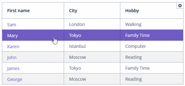
Single Selection Mode
Set the selectionMode attribute to the SINGLE value to allow users to select a single row at a time. Single selection mode is enabled by default.
Multi Selection Mode
If the selectionMode attribute is set to MULTI, users can select multiple rows in the grid using a keyboard or mouse and holding Ctrl or Shift keys.
Placeholder
DataGrid allows you to set a placeholder message and/or link, shown when the data container is empty or not set at all.
The placeholder message is defined using the emptyStateMessage attribute. It should contain information about why the grid is empty.
The placeholder link is defined using the emptyStateLinkMessage attribute. It should describe the action that needs to be performed to fill the grid.
For example:
<dataGrid id="placeholderGrid"
          width="100%"
          height="200"
          metaClass="uiex1_Customer"
          emptyStateMessage="No customers added."
          emptyStateLinkMessage="Add customer">
    <columns>
        <column id="firstName" property="firstName"/>
        <column id="lastName" property="lastName"/>
        <column id="level" property="level"/>
        <column id="age" property="age"/>
        <column id="rewardPoints" property="rewardPoints"/>
    </columns>
</dataGrid>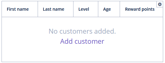
Both emptyStateMessage and emptyStateLinkMessage can load messages from the message bundle.
To handle clicks on the link, use EmptyStateLinkClickHandler.
Column Control Visibility
Users can select which columns are collapsed using the column control button in the right part of the data grid header.
Currently displayed columns are marked in the drop-down menu. There are additional menu items:
-
Select all- shows all data grid columns; -
Deselect all- hides all columns that are possible.
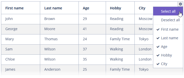
If the columnsCollapsingAllowed attribute is set to false, users cannot collapse columns. The default value is true.
Headers and Footers
The headerVisible attribute defines whether the DataGrid header is visible. The default value is true.
Use the headerRowHeight attribute to set the height of a header row in pixels. If the value is -1, the row height is calculated based on the theme for an empty row before the DataGrid is displayed. The default value is -1.
HeaderRow and FooterRow interfaces are used to represent header and footer cells respectively. These cells may be merged for multiple columns.
The following methods of DataGrid allow you to create and manage the DataGrid header and footer:
-
appendHeaderRow(),appendFooterRow()- adds a new row at the bottom of the header/footer section. -
prependHeaderRow(),prependFooterRow()- adds a new row at the top of the header/footer section. -
addHeaderRowAt(),addFooterRowAt()- inserts a new row at the given position to the header/footer section. Shifts the row currently at that position and any subsequent rows down incrementing their indices. -
removeHeaderRow(),removeFooterRow()- removes the given row from the header/footer section. -
getHeaderRowCount(),getFooterRowCount()- gets the row count for the header/footer section. -
setDefaultHeaderRow()- sets the default row of the header. The default row is a special header row providing a user interface for sorting columns.
HeaderCell and FooterCell interfaces provide means of customization of static DataGrid cells:
-
setStyleName()- sets a custom style name for this cell. -
getCellType()- returns the type of content stored in this cell. There are 3 types ofDataGridStaticCellTypeenumeration available:-
TEXT -
HTML -
COMPONENT
-
-
getComponent(),getHtml(),getText()- returns the content displayed in this cell depending on its type.
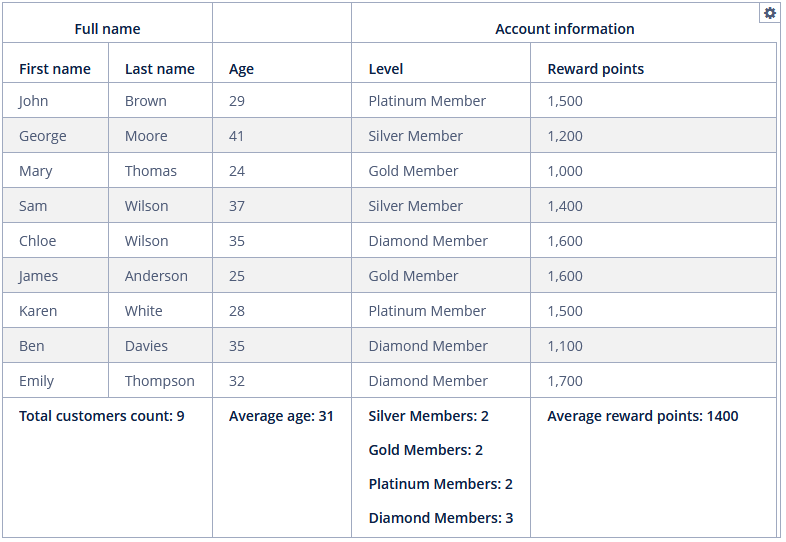
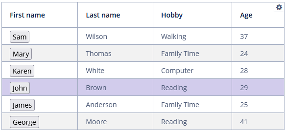
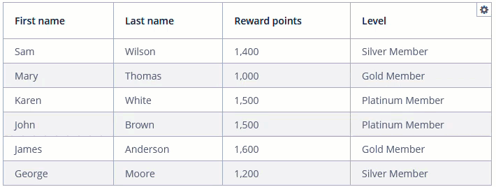
Below is an example of DataGrid with the header that contains merged cells and the footer displaying calculated values.
<dataGrid id="dataGrid"
          width="100%"
          footerRowHeight="140"
          headerRowHeight="40"
          dataContainer="customersDc">
    <columns>
        <column property="firstName"/>
        <column property="lastName"/>
        <column property="age"/>
        <column property="level"/>
        <column property="rewardPoints"/>
    </columns>
</dataGrid>
@Autowired
private DataGrid<Customer> dataGrid;
@Autowired
private CollectionLoader<Customer> customersDl;
private int silverCount = 0;
private int goldCount = 0;
private int platinumCount = 0;
private int diamondCount = 0;
@Subscribe
public void onInit(InitEvent event) {
customersDl.load();
initFooter();
initHeader();
}
private void initFooter() {
DataGrid.FooterRow footerRow = dataGrid.prependFooterRow();
DataGrid.FooterCell footerCell = footerRow.join("firstName","lastName");
footerCell.setHtml("<strong>Total customers count: " +
customersDc.getItems().size() + "</strong>");
calculateMemberCount();
footerRow.getCell("age").setHtml("<strong>Average age: " + getAverage("age") +
"</strong>");
footerRow.getCell("level").setHtml("<strong>Silver Members: " + silverCount +
"<br>" + "Gold Members: " + goldCount + "<br>" +
"Platinum Members: " + platinumCount + "<br>" +
"Diamond Members: " + diamondCount + "<br>" +
"</strong>");
footerRow.getCell("rewardPoints").setHtml("<strong>Average reward points: " +
getAverage("rewardPoints") + "</strong>");
}
private void initHeader() {
DataGrid.HeaderRow headerRow = dataGrid.prependHeaderRow();
DataGrid.HeaderCell headerCell = headerRow.join("firstName", "lastName");
headerCell.setText("Full name");
headerCell.setStyleName("center-bold");
headerCell = headerRow.join("level", "rewardPoints");
headerCell.setText("Account information");
headerCell.setStyleName("center-bold");
}
private int getAverage(String propertyId) {
double average = 0.0;
Collection<Customer> items = customersDc.getItems();
for (Customer customer : items) {
Double value = propertyId.equals("rewardPoints") ?
customer.getRewardPoints().doubleValue() :
customer.getAge().doubleValue();
average += value != null ? value : 0.0;
}
return (int) (average / items.size());
}
private void calculateMemberCount() {
Collection<Customer> items = customersDc.getItems();
for (Customer customer : items) {
switch (customer.getLevel()) {
case SILVER:
silverCount++;
break;
case GOLD:
goldCount++;
break;
case PLATINUM:
platinumCount++;
break;
case DIAMOND:
diamondCount++;
break;
}
}
}
Aggregating
DataGrid supports the aggregation of values in rows.
The following operations are supported:
-
SUM- calculate the sum; -
AVG- calculate the average value; -
COUNT- calculate the total number; -
MIN- find the minimum value; -
MAX- find the maximum value.
To enable aggregation for a data grid, you should:
-
Set the
aggregatableattribute totrue. -
Set the
aggregationelement for aggregated grid columns. -
Set the
typeattribute for theaggregationelement, which defines the aggregation function.
|
To define |
The aggregated values are shown in an additional row.
The aggregationPosition attribute allows you to specify the location of the aggregation row: TOP or BOTTOM. TOP is used by default.
|
By default, only numeric data types are supported in aggregated columns, such as |
An example of an aggregated data grid description:
<dataGrid id="aggregationGrid"
          width="100%"
          dataContainer="customersDc1"
          aggregatable="true">
    <columns>
        <column id="firstName" property="firstName"/>
        <column id="lastName" property="lastName"/>
        <column id="level" property="level"/>
        <column id="age" property="age">
            <aggregation type="AVG"/>
        </column>
        <column id="rewardPoints" property="rewardPoints"/>
    </columns>
</dataGrid>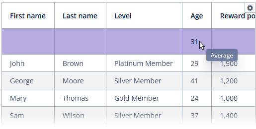
The valueDescription attribute defines a hint displayed in a popup when a user hovers the mouse cursor on the aggregated value. For the operations listed above (SUM, AVG, COUNT, MIN, MAX), popup hints are already available by default.
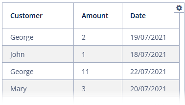
You can specify formatter to display the aggregated value in the format other than the standard for this Datatype:
<column id="amount" property="amount">
    <aggregation type="SUM">
        <formatter>
            <number format="#,##0.00"/>
        </formatter>
    </aggregation>
</column>
The aggregation element can also contain the strategyClass attribute specifying a class implementing the AggregationStrategy interface.
public class CustomerHobbyAggregation implements AggregationStrategy<Hobby, String> {
    @Override
    public String aggregate(Collection<Hobby> propertyValues) {
        Hobby mostFrequent = null;
        long max = 0;
        if (CollectionUtils.isNotEmpty(propertyValues)) {
            for (Hobby hobby : Hobby.values()) {
                long current = propertyValues.stream()
                        .filter(customerHobby -> customerHobby.equals(hobby))
                        .count();

                if (current > max) {
                    mostFrequent = hobby;
                    max = current;
                }
            }
        }

        if (mostFrequent != null) {
            return String.format("%s: %d/%d",
                    mostFrequent.name(), max, propertyValues.size());
        }

        return null;
    }

    @Override
    public Class<String> getResultClass() {
        return String.class;
    }
}
<dataGrid id="gridAggregationStrategy"
width="100%"
aggregatable="true"
dataContainer="customersDc">
<columns>
<column id="firstName" property="firstName"/>
<column id="lastName" property="lastName"/>
<column id="hobby" property="hobby">
<aggregation
strategyClass="ui.ex1.screen.component.datagrid.CustomerHobbyAggregation"/>
</column>
</columns>
</dataGrid>Sorting
DataGrid allows users to sort column data. Sorting functionality is enabled by default.
The sortable attribute enables sorting data in the grid. By default, it is set to true. If sorting is allowed, clicking a column header will show a  /
/ icon to the right of the column name.
Sorting by multiple columns is possible when you click a column while holding down the Shift key.
You can disable sorting for a particular column by using its sortable attribute.
In the example below, we disable sorting by the lastName column:
<columns>
    <column id="firstName" property="firstName"/>
    <column id="lastName" property="lastName" sortable="false"/>
    <column id="city" property="city"/>
    <column id="hobby" property="hobby"/>
</columns>
The sort attribute of the column element allows you to set the initial sorting direction of the data grid by this column. Possible values:
-
ASCENDING- ascending order (0 → 9 → A → Z). -
DESCENDING- descending order (Z → A → 9 → 0).
For example:
<columns>
    <column id="firstName" property="firstName" sort="DESCENDING"/>
    <column id="lastName" property="lastName"/>
    <column id="city" property="city"/>
    <column id="hobby" property="hobby"/>
</columns>|
|
The DataGrid sorting events can be tracked by SortEvent.
Paging
The SimplePagination component can be used inside dataGrid to provide pagination:
<dataGrid id="gridPagination"
          width="100%"
          dataContainer="customersDc">
    <columns>
        <column id="firstName" property="firstName"/>
        <column id="lastName" property="lastName"/>
        <column id="hobby" property="hobby"/>
        <column id="age" property="age"/>
    </columns>
    <simplePagination
            itemsPerPageVisible="true"
            itemsPerPageOptions="2, 4, 6"/>
</dataGrid>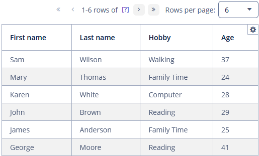
Alternatively, you can use the standalone Pagination component.
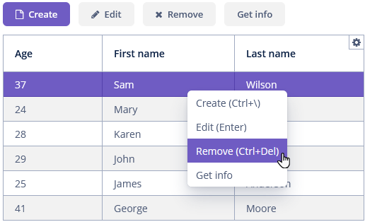
DataGrid Actions
The DataGrid component implements the ActionsHolder interface and can contain custom actions, as well as standard list actions.
Data grid actions are defined in the nested actions element.
|
To add |
If an action has a caption, it is displayed as an item of the data grid context menu. Additionally, a data grid action can be assigned to a button located anywhere on the screen.
<dataGrid id="gridWithActions"
       width="100%"
       dataContainer="customersDc">
    <actions>
        <action id="create" type="create"/> (1)
        <action id="edit" type="edit"/>
        <action id="remove" type="remove"/>
        <action id="about" caption="Get info"/> (2)
    </actions>
    <columns>
        <column id="age" property="age"/>
        <column id="firstName" property="firstName"/>
        <column id="lastName" property="lastName"/>
    </columns>
    <buttonsPanel id="buttonsActionsPanel" alwaysVisible="true"> (3)
        <button id="create" action="gridWithActions.create"/>
        <button id="edit" action="gridWithActions.edit"/>
        <button id="remove" action="gridWithActions.remove"/>
        <button id="about" action="gridWithActions.about"/>
    </buttonsPanel>
</dataGrid>| 1 | Define the create standard action. |
| 2 | Define the about custom action. |
| 3 | Define a ButtonsPanel container inside a data grid. |
Column Generation
The ColumnGeneratorEvent handler allows you to add generated, or calculated, columns and define a custom representation of data in a column.
The handler is invoked by the framework for each cell when rendering the data grid. ColumnGeneratorEvent contains information on the entity, displayed in the current DataGrid row, and the column identifier.
You can create the ColumnGeneratorEvent handler for a data grid column using Studio. To do this, you should choose a generated type from the list suggested by Studio and the corresponding type of renderer.
As an example, let’s create a generated column containing the full name of the customer.
First, create a column with the fullName id:
<column id="fullName" caption="Full name">
    <textRenderer nullRepresentation="null"/>
</column>
Then create the ColumnGeneratorEvent handler for the fullName column using Studio and implement it as follows:
@Install(to = "grid.fullName", subject = "columnGenerator")
private String gridFullNameColumnGenerator(DataGrid.ColumnGeneratorEvent<Customer> columnGeneratorEvent) {
    return columnGeneratorEvent.getItem().getFirstName() + " " + columnGeneratorEvent.getItem().getLastName();
}
The result:
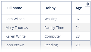
The fullName column is a generated column with TextRenderer.
To register the column generator handler programmatically, use the addGeneratedColumn() method of the DataGrid component.
Exporting Column Values
To export contents of the DataGrid component as a file in one of the supported formats, use the Grid Export Actions add-on.
After installing the add-on, you can define the excelExport or jsonExport action for the data grid, or use Table exporters.
Below is an example of setting a custom presentation of the data within a column when exporting to an XLSX file via the excelExport action.
Screen descriptor:
<dataGrid id="gridExport"
          width="100%"
          dataContainer="customersDc">
    <actions>
        <action id="excelExport" type="excelExport"/>
    </actions>
    <columns>
        <column id="firstName" property="firstName"/>
        <column id="hobby" property="hobby"/>
        <column id="age" property="age"/>
    </columns>
</dataGrid>
Screen controller:
@Named("gridExport.excelExport")
protected ExcelExportAction gridExcelExport;

@Subscribe
public void onInit(InitEvent event) {
    gridExcelExport.addColumnValueProvider("firstName", context -> { (1)
        Customer customer = context.getEntity();
        return "Name: " + customer.getFirstName();
    });
}| 1 | The method accepts the column identifier and a function to get value from the column. |
Renderers
The way the data is displayed in columns can be customized using parameterized declarative renderers. Some DataGrid renderers are set by special XML elements with parameters defined in the corresponding attributes. Renderers can be declared both for regular and generated columns.
The framework provides the following renderers:
ButtonRenderer
ButtonRenderer displays string values as a button caption.
ButtonRenderer cannot be declared in the XML descriptor because it is not possible to define a renderer click listener in the XML descriptor. Studio will generate the ButtonRenderer declaration code in the onInit() screen controller method, for example:
@Autowired
private Notifications notifications;

@Autowired
private DataGrid<Customer> gridButtonRenderer;


@Subscribe
public void onInit(InitEvent event) {
    DataGrid.ButtonRenderer<Customer> gridButtonRendererFirstNameRenderer =
            getApplicationContext().getBean(DataGrid.ButtonRenderer.class);
    gridButtonRendererFirstNameRenderer.setRendererClickListener(
            clickableRendererClickEvent ->
            notifications.create()
                    .withCaption("ButtonRenderer")
                    .withDescription("Column id: " +
                            clickableRendererClickEvent.getColumnId())
                    .show());
    gridButtonRenderer.getColumn("firstName")
            .setRenderer(gridButtonRendererFirstNameRenderer);
}
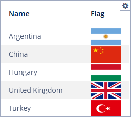
ImageRenderer
ImageRenderer is a renderer for presenting images. The value of the corresponding property is used as the image location. Location can be a theme resource or URL.
ImageRenderer cannot be declared in the XML descriptor because it is not possible to define a renderer click listener in the XML descriptor. Studio will generate the ImageRenderer declaration code in the onInit() screen controller method, for example:
@Autowired
private Notifications notifications;

@Autowired
private DataGrid<Country> imageGrid;


@Subscribe
public void onInit(InitEvent event) {
    DataGrid.ImageRenderer<Country> imageGridFlagRenderer =
            getApplicationContext().getBean(DataGrid.ImageRenderer.class);
    imageGridFlagRenderer.setRendererClickListener(clickableTextRendererClickEvent -> {
    });
    imageGrid.getColumn("flag").setRenderer(imageGridFlagRenderer);
}
The result:
CheckBoxRenderer
CheckBoxRenderer displays boolean values as a checkbox icon.
The column element of DataGrid has a child checkBoxRenderer element:
<column id="isEmail" caption="Is email">
    <checkBoxRenderer/>
</column>
NumberRenderer
NumberRenderer displays numbers in the defined format.
The column element of DataGrid has a child numberRenderer element with the optional nullRepresentation attribute and required format string attribute.
<column id="percent" property="percent">
    <numberRenderer nullRepresentation="null" format="%d%%"/>
</column>
formatString is the format string describing the number format which will be used to create the NumberFormat instance.
LocalDateTimeRenderer
LocalDateTimeRenderer displays dates as LocalDateTime values.
The column element of DataGrid has a child localDateTimeRenderer element with the optional nullRepresentation attribute and required format string attribute:
<column id="dateTime" property="dateTime">
    <localDateTimeRenderer nullRepresentation="null"
                           format="dd/MM/YYYY HH:mm:ss"/>
</column>
LocalDateRenderer
LocalDateRenderer displays dates as LocalDate values.
The column element of DataGrid has a child localDateRenderer element with the optional nullRepresentation attribute and required format string attribute:
<column id="date" property="date">
    <localDateRenderer nullRepresentation="null" format="dd/MM/YYYY"/>
</column>
The result:
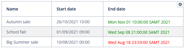
DateRenderer
DateRenderer displays dates in the defined format.
The column element of DataGrid has a child dateRenderer element with the optional nullRepresentation attribute and required format string attribute:
<dataGrid id="eventGrid"
          width="100%"
          dataContainer="eventsDc">
    <columns>
        <column id="name" property="name"/>
        <column id="startDate" property="startDate">
            <dateRenderer nullRepresentation="null"
                          format="yyyy-MM-dd HH:mm:ss"/>
        </column>
        <column id="endDate" property="endDate"/>
    </columns>
</dataGrid>
formatString is the format string describing the date and time format used to create the DateFormat instance.
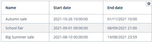
Please notice that the startDate field has a DateRenderer, and the endDate field has not.
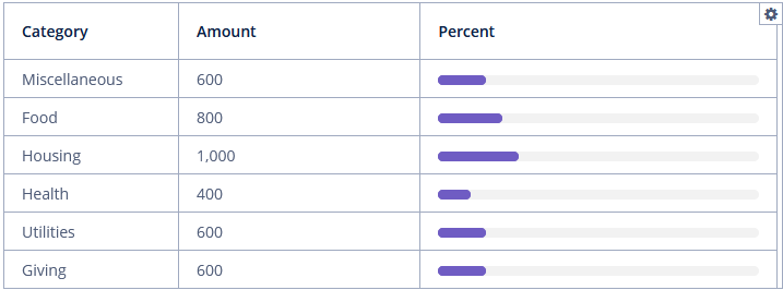
ProgressBarRenderer
ProgressBarRenderer displays double values between 0 and 1 as a ProgressBar component.
The column element of DataGrid has a child progressBarRenderer element:
<column id="percent" property="percent">
    <progressBarRenderer/>
</column>
The result:
HtmlRenderer
HtmlRenderer displays HTML layout.
The column element of DataGrid has a child htmlRenderer element with the optional nullRepresentation attribute.
Below is an example of rendering the endDate attribute:
<column id="endDate" property="endDate">
    <htmlRenderer nullRepresentation="null"/>
</column>
@Install(to = "htmlGrid.endDate", subject = "columnGenerator")
private String htmlGridEndDateColumnGenerator(DataGrid.ColumnGeneratorEvent<Event> columnGeneratorEvent) {
return columnGeneratorEvent.getItem().getEndDate().before(new Date())
? "<font color='red'>" +
columnGeneratorEvent.getItem().getEndDate() + "</font>"
: "<font color='green'>" +
columnGeneratorEvent.getItem().getEndDate() + "</font>";
}The result:
ClickableTextRenderer
ClickableTextRenderer displays simple plain-text string values as a link with a click listener.
ClickableTextRenderer cannot be declared in the XML descriptor because it is not possible to define a renderer click listener in the XML descriptor. Studio will generate the ClickableTextRenderer declaration code in the onInit() screen controller method, for example:
@Autowired
private Notifications notifications;

@Autowired
private DataGrid<Customer> gridClick;


@Subscribe
public void onInit(InitEvent event) {
    DataGrid.ClickableTextRenderer<Customer> gridClickFirstNameRenderer =
            getApplicationContext().getBean(DataGrid.ClickableTextRenderer.class);
    gridClickFirstNameRenderer.setRendererClickListener(clickEvent ->
            notifications.create()
                    .withDescription("The full name: " +
                            clickEvent.getItem().getFirstName() +
                            " " + clickEvent.getItem().getLastName())
                    .show());
    gridClick.getColumn("firstName").setRenderer(gridClickFirstNameRenderer);
}
The result:
TextRenderer
TextRenderer is a renderer for presenting simple plain-text string values.
The column element of DataGrid has a child textRenderer element with non-required nullRepresentation attribute:
<column id="fullName" caption="Full name">
<textRenderer nullRepresentation="null"/>
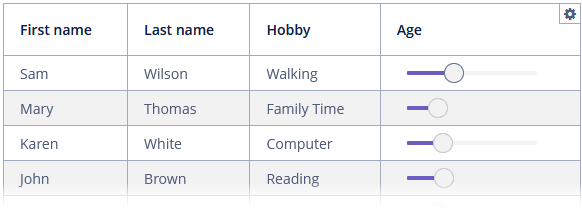
</column>ComponentRenderer
ComponentRenderer is a renderer for UI components.
The column element of DataGrid has a child componentRenderer element:
<column id="age" property="age">
    <componentRenderer/>
</column>
In the example below, we will display the age value in the Slider component.
@Install(to = "gridComponent.age", subject = "columnGenerator")
private Component gridComponentAgeColumnGenerator(DataGrid.ColumnGeneratorEvent<Customer> columnGeneratorEvent) {
    Slider<Integer> slider = uiComponents.create(Slider.NAME);
    slider.setValue(columnGeneratorEvent.getItem().getAge());
    slider.setEditable(false);
    slider.setWidth("150px");
    return slider;
}
The result:
IconRenderer
IconRenderer is a renderer that represents JmixIcon.
The column element of DataGrid has a child iconRenderer element.
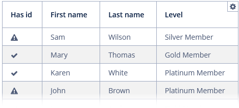
Below is an example of rendering a generated hasEmail attribute:
<column id="hasEmail" caption="Has id">
    <iconRenderer/>
</column>
@Install(to = "iconGrid.hasEmail", subject = "columnGenerator")
private Icons.Icon iconGridHasEmailColumnGenerator(DataGrid.ColumnGeneratorEvent<Customer> columnGeneratorEvent) {
return columnGeneratorEvent.getItem().getEmail() != null ?
JmixIcon.OK : JmixIcon.EXCLAMATION_TRIANGLE;
}The result:
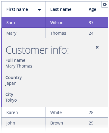
Item Details Generator
Item details are expandable content areas used to display more information for a specific row.
The DetailsGenerator interface allows you to create a custom component to display item details.
You can create the DetailsGenerator handler for DataGrid using Studio (see below) and implement it as follows:
@Autowired
private DataGrid<Customer> detailsGrid;

@Install(to = "detailsGrid", subject = "detailsGenerator")
private Component detailsGridDetailsGenerator(Customer customer) {
    VBoxLayout mainLayout = uiComponents.create(VBoxLayout.class);
    mainLayout.setWidth("100%");
    mainLayout.setMargin(true);

    HBoxLayout headerBox = uiComponents.create(HBoxLayout.class);
    headerBox.setWidth("100%");

    Label<String> infoLabel = uiComponents.create(Label.TYPE_STRING);
    infoLabel.setHtmlEnabled(true);
    infoLabel.setStyleName("h1");
    infoLabel.setValue("Customer info:");

    Component closeButton = createCloseButton(customer);
    headerBox.add(infoLabel);
    headerBox.add(closeButton);
    headerBox.expand(infoLabel);

    Component content = getContent(customer);

    mainLayout.add(headerBox);
    mainLayout.add(content);
    mainLayout.expand(content);

    return mainLayout;
}

protected Component createCloseButton(Customer entity) {
    Button closeButton = uiComponents.create(Button.class);
    closeButton.setIcon("font-icon:TIMES");
    BaseAction closeAction = new BaseAction("closeAction")
            .withHandler(actionPerformedEvent ->
                    detailsGrid.setDetailsVisible(entity, false))
            .withCaption("");
    closeButton.setAction(closeAction);
    return closeButton;
}

protected Component getContent(Customer entity) {
    Label<String> content = uiComponents.create(Label.TYPE_STRING);
    content.setHtmlEnabled(true);
    content.setId("contentLabel");

    StringBuilder sb = new StringBuilder();
    sb.append("<b>Full name</b><br>")
            .append(entity.getFirstName() + " " + entity.getLastName() + "<br><br>")
            .append("<b>Country</b><br>")
            .append(entity.getCity().getCountry().getName()+ "<br><br>")
            .append("<b>City</b><br>")
            .append(entity.getCity().getName());

    content.setValue(sb.toString());

    return content;
}
To handle showing and hiding the details you should implement your own listener. For instance, in this sample, we handle opening the details in the ItemClickAction of the DataGrid component:
@Subscribe("detailsGrid")
public void onDetailsGridItemClick(DataGrid.ItemClickEvent<Customer> event) {
    detailsGrid.setItemClickAction(new BaseAction("itemClickAction")
            .withHandler(actionPerformedEvent ->
                    detailsGrid.setDetailsVisible(detailsGrid.getSingleSelected(), true)));
}
The result:
Editing Values
DataGrid provides inline editing that allows users to manipulate grid data. To enable inline editing, set the editorEnabled attribute to true.
Usage
-
Inline editing can be instantiated by double-clicking on the field to be edited or pressing Enter when an editable cell is focused.
-
The columns with
editable = trueattribute show components to edit the attributes of the corresponding entity. Non-editable fields will be disabled. -
The component type for each editable column is selected automatically based on the type of the corresponding entity attribute. For example, for string and numeric attributes, the application will use TextField, for
Date- DateField, for enumerations - ComboBox, for links to other entities - EntityPicker. -
Once a row becomes editable, default OK and Cancel buttons will appear near the row allowing users to commit or cancel the edit.
-
To save the changes and exit edit mode, click the OK button or press Enter.
-
To discard the changes and exit edit mode, click the Cancel button or press Esc.
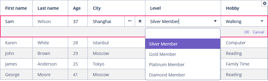
Modes
Editing can be either buffered and non-buffered.
-
In the buffered mode, changes must be explicitly committed.
-
Non-buffered editing automatically commits changes when a field loses focus.
The editorBuffered attribute sets the buffered editor mode. The default value is true.
The changes are committed to the data container only. Saving of changes to the database is usually performed by DataContext on the screen commit.
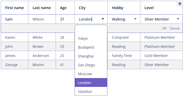
Inline Editor Customizing
The editorCancelCaption attribute sets the caption on the cancel button in the DataGrid editor.
The editorSaveCaption attribute sets the caption on the save button in the DataGrid inline editor.
The editor field can be customized with the help of EditorFieldGenerationContext class.
You should create an edit field generator that generates a component for this column in DataGrid editor, for example:
@Autowired
private CollectionContainer<City> citiesDc;

@Install(to = "editingGrid.city", subject = "editFieldGenerator")
private Field<City> editingGridCityEditFieldGenerator(
        DataGrid.EditorFieldGenerationContext<Customer> editorFieldGenerationContext) {
    ComboBox<City> comboBox = uiComponents.create(ComboBox.NAME);
    comboBox.setValueSource((ValueSource<City>) editorFieldGenerationContext
            .getValueSourceProvider().getValueSource("city"));
    comboBox.setOptionsList(citiesDc.getItems());
    return comboBox;
}
The result:
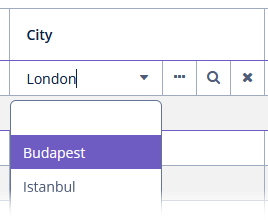
There is also a declarative way of defining what component to use for selecting an entity in generic mechanisms. It is based on the jmix.ui.component.entity-field-type and jmix.ui.component.entity-field-actions properties.
For example, if you add the following lines to the application.properties file:
jmix.ui.component.entity-field-type.uiex1_City = entityComboBox
jmix.ui.component.entity-field-actions.uiex1_City = entity_lookup, entity_open, entity_clear
Then the EntityComboBox component will be generated for the City entity:
Cross Field Validation
DataGrid inline editor can take into account entity constraints (cross-field validation). If there are validation errors, DataGrid will show an error message. To enable or disable validation, use the editorCrossFieldValidate attribute. The default value is true.
Editor Events
Editor events provide access to the components used in the editor, allowing you to change or use their values.
-
EditorOpenEventis an event that is fired before theDataGrideditor is opened.For example:
@Subscribe("editEventsGrid")
public void onEditEventsGridEditorOpen(DataGrid.EditorOpenEvent<Event> event) {
    Map<String, Field> fields = event.getFields();
    Field field1 = fields.get("startDate");
    Field field2 = fields.get("endDate");
    field1.addValueChangeListener(valueChangeEvent ->
            field2.setValue(DateUtils.addDays((Date) field1.getValue(), 1)));
    field2.addValueChangeListener(valueChangeEvent ->
            field1.setValue(DateUtils.addDays((Date) field2.getValue(), -1)));
}
-
EditorCloseEventis an event that is fired when theDataGrideditor is closed.
-
EditorPreCommitEventis an event that is fired before the item is updated.
-
EditorPostCommitEventis an event that is fired after the item is updated.
Methods of Inline Editor
-
getEditedItem()returns the item that is currently being edited ornullif no item is being edited at the moment.
-
isEditorActive()returns whether an item is currently being edited in the editor.
-
The
edit()method opens the editor interface for the provided entity. ScrollsDataGridto bring the entity to view if it is not already visible.
Context Menu
The context menu is activated by right-clicking within the data grid.
The contextMenuEnabled attribute enables the context menu. By default, this attribute is set to true. The context menu shows data grid actions (if any).
The right mouse clicks on the data grid can be tracked with ContextClickEvent.
Styling
You can set predefined styles to the DataGrid component using the stylename attribute either in the XML descriptor or in the screen controller:
<dataGrid id="progressGrid"
          width="100%"
          stylename="no-stripes"
dataContainer="budgetItemsDc">progressGrid.setStyleName(ThemeClassNames.DATAGRID_NO_STRIPES);Predefined styles:
-
borderless- removes the outer border of the data grid; -
no-horizontal-lines- removes the horizontal divider lines between the data grid rows; -
no-vertical-lines- remove the vertical divider lines between the data grid columns. -
no-stripes- removes the alternating row colors.
The appearance of the DataGrid component can be customized using SCSS variables with the $jmix-datagrid-* prefix. You can change these variables in the visual editor after creating a custom theme.
See also RowStyleProvider.
Methods of DataGrid Interface
-
getColumns()returns a copy of currently configured columns in their current visual order in thisDataGrid.
-
getVisibleColumns()returns a copy of columns not hidden by security permissions.
-
The
sort()method sorts theDataGriddata for the specified column in the chosen sort direction.
-
scrollTo()allows you to scroll theDataGridto the specified row. It takes an entity instance identifying the row as a parameter. Besides the entity instance, an overloaded method can take aScrollDestinationparameter with the following possible values:-
ANY- scroll as little as possible to show the target element. If the element fits into view, this works asSTARTorEND, depending on the current scroll position. If the element does not fit into view, this works asSTART. -
START- scrolls so that the element is shown at the start of the viewport. The viewport will, however, not scroll beyond its contents. -
MIDDLE- scrolls so that the element is shown in the middle of the viewport. However, the viewport will not scroll beyond its contents, given more elements than what the viewport can show at once. Under no circumstances will the viewport scroll before its first element. -
END- scrolls so that the element is shown at the end of the viewport. The viewport will, however, not scroll before its first element.
-
-
scrollToStart()andscrollToEnd()- scrollDataGridto the first data item and to last data item respectively.
-
The
getAggregationResults()method returns a map with aggregation results, where map keys are data grid column identifiers and values are aggregation values.
Events and Handlers
|
To generate a handler stub in Jmix Studio, select the component in the screen descriptor XML or in the Jmix UI hierarchy panel and use the Handlers tab of the Jmix UI inspector panel. Alternatively, you can use the Generate Handler button in the top panel of the screen controller. |
ColumnCollapsingChangeEvent
ColumnCollapsingChangeEvent is sent when a column’s collapsing changes.
Example of subscribing to the event for the data grid defined in the screen XML with the collapseGrid id:
@Subscribe("collapseGrid")
public void onCollapseGridColumnCollapsingChange(DataGrid.ColumnCollapsingChangeEvent event) {
    notifications.create()
            .withCaption((event.isCollapsed() ? "Collapsed: " : "Expanded: ") +
                    event.getColumn().getCaption())
            .show();
}
To register the event handler programmatically, use the addColumnCollapsingChangeListener() component method.
ColumnReorderEvent
See ColumnReorderEvent.
ColumnResizeEvent
ColumnResizeEvent is sent when a column is resized.
Example of subscribing to the event for the data grid defined in the screen XML with the resizedEventGrid id:
@Subscribe("resizedEventGrid")
public void onResizedEventGridColumnResize(DataGrid.ColumnResizeEvent event) {
    notifications.create()
            .withCaption("The " + event.getColumn().getCaption() + " column was resized")
            .show();
}
To register the event handler programmatically, use the addColumnResizeListener() component method.
ContextClickEvent
ContextClickEvent happens when a context-click occurs on the client-side inside DataGrid.
ContextClickEvent contains information about mouse event details.
Example of subscribing to the event for the data grid defined in the screen XML with the contextGrid id:
@Subscribe("contextGrid")
public void onContextGridContextClick(DataGrid.ContextClickEvent event) {
    notifications.create()
            .withCaption("Clicked " + event.getButton().name())
            .show();
}
To register the event handler programmatically, use the addContextClickListener() component method.
EditorCloseEvent
See EditorCloseEvent.
EditorOpenEvent
See EditorOpenEvent.
EditorPreCommitEvent
See EditorPreCommitEvent.
ItemClickEvent
ItemClickEvent is sent when the user clicks on a data grid. ItemClickEvent contains information about:
-
Mouse event details;
-
An entity instance represented by the clicked row;
-
An item
id; -
idof the clickedDataGridcolumn.
As an example, we will give the user to begin editing by single-clicking on an editable cell:
@Subscribe("clickGrid")
public void onClickGridItemClick(DataGrid.ItemClickEvent<Event> event) {
    clickGrid.edit(event.getItem());
}
To register the event handler programmatically, use the addItemClickListener() component method.
SelectionEvent
See SelectionEvent.
SortEvent
SortEvent is sent when a sort order is changed.
Example of subscribing to the event for the data grid defined in the screen XML with the sortGrid id:
@Subscribe("sortGrid")
public void onSortGridSort(DataGrid.SortEvent event) {
    notifications.create()
            .withCaption("The sort order was changed")
            .show();
}
To register the event handler programmatically, use the addSortListener() component method.
DetailsGenerator
See DetailsGenerator.
LookupSelectHandler
See LookupSelectHandler.
RowDescriptionProvider
RowDescriptionProvider generates optional descriptions (tooltips) when the user hovers over a DataGrid row. If DescriptionProvider for a column is also set, the row description generated by RowDescriptionProvider is used for cells for which the cell description provider returns null.
In the example below, we will show a RowDescriptionProvider usage for the rowDescGrid:
@Install(to = "rowDescGrid", subject = "rowDescriptionProvider")
private String rowDescGridRowDescriptionProvider(Customer customer) {
    switch (customer.getLevel()) {
        case SILVER:
            return "The customer gets special offers from sellers and birthday congratulations";
        case GOLD:
            return "The customer gets 2 coupons with a rating of $ 1";
        case PLATINUM:
            return "The customer gets a coupons with a par value of $ 3";
        case DIAMOND:
            return "The customer gets a coupon with a par value of $ 5";
    }
    return null;
}
The result:
To register the provider programmatically, use the setRowDescriptionProvider() component method.
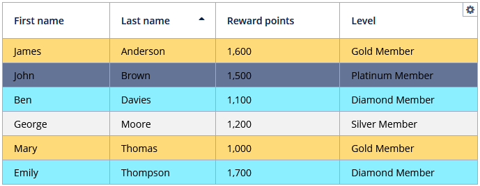
RowStyleProvider
RowStyleProvider allows style providers for the DataGrid rows.
DataGrid can use several providers to obtain many style names for rows.
Example of setting a style:
@Install(to = "styledGrid", subject = "rowStyleProvider")
private String styledGridRowStyleProvider(Customer customer) {
    switch (customer.getLevel()) {
        case SILVER:
            return "level-silver";
        case GOLD:
            return "level-gold";
        case PLATINUM:
            return "level-platinum";
        case DIAMOND:
            return "level-diamond";
    }
    return null;
}
Then you should define row styles in the application theme. Detailed information on creating a theme is available in Themes. Style names returned by the provider in the screen controller should be used as CSS selectors. For example:
.v-grid-row.level-silver > td {
  background-color: #f2f2f2;
  color: black;
}

.v-grid-row.level-gold > td {
    background-color: #ffda79;
    color: black;
}

.v-grid-row.level-platinum > td {
      background-color: #637497;
      color: black;
}

.v-grid-row.level-diamond > td {
        background-color: #8befff;
        color: black;
}
The result:
All XML Attributes
|
You can view and edit attributes applicable to the component using the Jmix UI inspector panel of the Studio’s Screen Designer. |
DataGrid XML Attributes
aggregatable - aggregationPosition - align - bodyRowHeight - box.expandRatio - caption - captionAsHtml - colspan - columnResizeMode - columnCollapsingAllowed - contextHelpText - contextHelpTextHtmlEnabled - contextMenuEnabled - css - dataContainer - description - descriptionAsHtml - editorBuffered - editorCancelCaption - editorCrossFieldValidate - editorEnabled - editorSaveCaption - emptyStateLinkMessage - emptyStateMessage - enable - footerRowHeight - footerVisible - frozenColumnCount - headerRowHeight - headerVisible - height - htmlSanitizerEnabled - icon - id - metaClass - minHeight - minWidth - reorderingAllowed - responsive - rowspan - selectionMode - sortable - stylename - tabIndex - textSelectionEnabled - visible - width
Column XML Attributes
box.expandRatio - caption - collapsed - collapsible - collapsingToggleCaption - colspan - editable - expandRatio - id - maximumWidth - minimumWidth - property - resizable - rowspan - sort - sortable - width
