Button
Basics
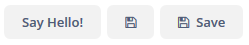
Buttons can have a caption, an icon, or both:
An example of defining a button with a caption and a tooltip retrieved from localized messages:
<button id="helloButton"
        caption="msg://button.caption"
        description="msg://button.description"/>
The button’s caption is set using the caption attribute, the tooltip – using the description attribute.
To handle button clicks, subscribe to the ClickEvent in the screen controller:
@Subscribe("helloButton")
private void onHelloButtonClick(Button.ClickEvent event) {
    // ...
}
If the disableOnClick attribute is set to true, the button will be automatically disabled when clicked, typically to prevent (accidental) extra clicks on a button. You can later re-enable the button by invoking the setEnabled(true) method.
The icon attribute defines icon location in the theme catalog or the icon name in the icon set. See Icons for more information on working with icons.
Example of creating a button with an icon:
<button id="saveButton"
        caption="Save"
        icon="SAVE"/>
Action
Another way of handling button clicks is associating the button with an Action:
<actions>
    <action id="someAction"
            caption="Click Me!"/>
</actions>
<layout>
    <vbox spacing="true">
        <button action="someAction"/>
</layout>
You can associate a button with any action defined in the window or in a table-like component (they implement Component.ActionsHolder interface). In the case of window action, specify the action id in the action attribute of the button, as in the example above. In the case of a component, specify the component id and the id of the action separated by a dot. In the following example, a button is associated with the create action of the usersTable component:
<table id="usersTable"
       width="100%"
       dataContainer="usersDc">
    <actions>
        <action id="create"
                type="create"/>
    </actions>
    <buttonsPanel>
        <button id="usersTableCreateBtn"
                action="usersTable.create"/>
    </buttonsPanel>
</table>
Button actions can also be created programmatically in the screen controller by deriving them from BaseAction class.
Shortcut
The shortcut attribute is used to specify a key combination for a button. Possible modifiers: ALT, CTRL, SHIFT - are separated by the "-" character. For example:
<button id="saveButton2"
        description="Save"
        icon="SAVE"
        shortcut="ALT-S"/>
Predefined Styles
The primary attribute is used to set the highlighting for the button. The highlighting is applied by default if the action invoked by this button is primary.
<button id="primaryBtn"
        caption="Primary button"
        primary="true"/>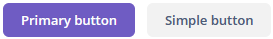
The highlighting is available by default in the hover and helium themes; to enable this feature in the halo theme, set true for the $jmix-highlight-primary-action style variable.
You can set predefined styles to the Button component using the stylename attribute either in the XML descriptor or in the screen controller:
<button id="styledBtn1"
        caption="Borderless"
        stylename="borderless"/>
When setting a style programmatically, select one of the ThemeClassNames class constants with the BUTTON_ prefix:
styledBtn1.setStyleName(ThemeClassNames.BUTTON_BORDERLESS);Predefined styles:
-
borderless- a borderless button. You can combine it with any differentButtonstyle.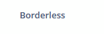
-
borderless-colored- a borderless button with a colored caption text. You can combine it with any differentButtonstyle.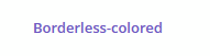
-
danger- a prominent button that can be used when the action is considered unsafe for the user (for example, it causes data loss or some other irreversible action). You can combine it with any differentButtonstyle.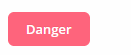
-
friendly- a prominent button that can be used for primary actions when the action is considered safe for the user (for example, does not cause any data loss or any other irreversible action). You can combine it with any differentButtonstyle.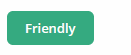
-
icon-align-right- align the icon to the right side of the button caption. You can combine it with any differentButtonstyle.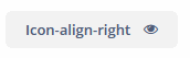
-
icon-align-top- stack the icon on top of the button caption. You can combine it with any differentButtonstyle.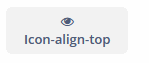
-
icon-only- only show the icon in the button, and size the button to a square shape.
-
quiet- a "quiet" button that looksborderlessuntil you hover over it with the mouse. You can combine it with any differentButtonstyle.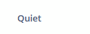
The appearance of the Button component can be customized using SCSS variables with the $jmix-button-* prefix. You can change these variables in the visual editor after creating a custom theme.
The Click Method
The click() method of the Button interface simulates a button click, notifying all server-side listeners.
No action is taken if the button is disabled.
Events and Handlers
|
To generate a handler stub in Jmix Studio, select the component in the screen descriptor XML or in the Jmix UI hierarchy panel and use the Handlers tab of the Jmix UI inspector panel. Alternatively, you can use the Generate Handler button in the top panel of the screen controller. |
ClickEvent
ClickEvent is sent when the user clicks on a button.
@Subscribe("helloButton") (1)
private void onHelloButton1Click(Button.ClickEvent event) {
    Button button = event.getSource(); (2)
    // ...
}| 1 | The @Subscribe annotation contains the button id. |
| 2 | If needed, you can get the clicked button from the event object. |
To register the event handler programmatically, use the addClickListener() component method.
All XML Attributes
|
You can view and edit attributes applicable to the component using the Jmix UI inspector panel of the Studio’s Screen Designer. |
action - align - caption - captionAsHtml - colspan - css - description - descriptionAsHtml - disableOnClick - enable - box.expandRatio - height - htmlSanitizerEnabled - icon - id - primary - responsive - rowspan - shortcut - stylename - tabIndex - visible - width
