SingleSelectList
SingleSelectList displays a pre-defined list of options in a vertically scrollable list. SingleSelectList allows users to select only a single item from the list.
Component’s XML-name: singleSelectList.
Basics
Use SingleSelectList if:
-
Users need to select a single option.
-
The number of options is too large to use
RadioButtonGroup. -
The number of options is finite, and there’s no need to enter custom values.
The simplest case of using SingleSelectList is to select an enumeration value for an entity attribute. For example, a Customer entity has a level attribute of the Level type, which is an enumeration.
In the following example, the screen defines the customerDc data container for the Customer entity having the level attribute. In the singleSelectList element, the dataContainer attribute contains a link to the customerDc data container, and the property attribute refers to the level entity attribute. In this case, the entity attribute is an enumeration, and the single select list displays localized names of all enumeration values.
<data>
<instance id="customerDc"
class="ui.ex1.entity.Customer"
fetchPlan="_base"/>
</data>
<layout>
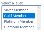
<singleSelectList id="singleSelectList"
caption="Select a level:"
dataContainer="customerDc"
property="level"
nullOptionVisible="false"
height="100"/>
</layout>By default, SingleSelectList displays the first null option in the options list. Set the nullOptionVisible attribute to false to disable this behavior.
Defining Options
You can specify a list of options either in the XML descriptor using the optionsContainer, optionsEnum attributes or programmatically in the controller using the setOptionsList(), setOptionsMap() and setOptionsEnum() methods.
optionsContainer
The component can take a list of options from a data container. For this purpose, use the optionsContainer attribute. For example:
<data>
    <collection id="customersDc"
                class="ui.ex1.entity.Customer"
                fetchPlan="_base">
        <loader id="customersDl">
            <query>
                <![CDATA[select e from uiex1_Customer e]]>
            </query>
        </loader>
    </collection>
</data>
<layout>
    <singleSelectList id="customerList"
                      optionsContainer="customersDc"
                      captionProperty="lastName"/>
</layout>
We used the captionProperty attribute, so the customerList component will display the lastName attribute of the Customer entity, located in the customersDc data container.
setOptionsList()
The setOptionsList() method allows you to specify a list of component options programmatically.
First, declare a component in the XML descriptor:
<singleSelectList id="rewardPointsList"
                  caption="Select reward points:"
                  height="200"/>
Then inject the component into the controller and specify a list of options in the onInit() method:
@Autowired
private SingleSelectList<Integer> rewardPointsList;
@Subscribe
public void onInit(InitEvent event) {
    List<Integer> list = new ArrayList<>();
    list.add(1000);
    list.add(2000);
    list.add(3000);
    list.add(4000);
    list.add(5000);
    list.add(6000);
    list.add(7000);
    rewardPointsList.setOptionsList(list);
}
The component will be displayed as follows:
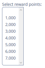
Depending on the selected option, the getValue() method of the component will return Integer values: 1000, 2000, 3000, 4000, 5000, 6000, 7000.
setOptionsMap()
The setOptionsMap() method allows you to specify a string caption for each option value explicitly.
First, declare a component in the XML descriptor:
<singleSelectList id="ratingList"
                  caption="Select a rating:"
                  height="150"/>
Then inject the component into the controller and specify an options map in onInit():
@Autowired
private SingleSelectList<Integer> ratingList;
@Subscribe
public void onInit(InitEvent event) {
    Map<String,Integer> map = new LinkedHashMap<>();
    map.put("Poor",2);
    map.put("Average",3);
    map.put("Good",4);
    map.put("Excellent",5);
    ratingList.setOptionsMap(map);
}
The component will be displayed as follows:
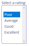
Depending on the selected option, the getValue() method of the component will return Integer values: 2, 3, 4, 5, and not the strings that are displayed on the screen.
setOptionsEnum()
The setOptionsEnum() method takes the class of an enumeration as a parameter. The options list will show localized names of enum values; the component’s value will be an enum value.
The simplest way to set options from the enum class is to use the optionsEnum attribute in the XML descriptor:
<singleSelectList id="hobbyList"
                  caption="Select a hobby:"
                  optionsEnum="ui.ex1.entity.Hobby"/>
Events and Handlers
|
To generate a handler stub in Jmix Studio, select the component in the screen descriptor XML or in the Jmix UI hierarchy panel and use the Handlers tab of the Jmix UI inspector panel. Alternatively, you can use the Generate Handler button in the top panel of the screen controller. |
DoubleClickEvent
DoubleClickEvent is sent when the user double-clicks the mouse on a list option.
You can subscribe to the event in the screen controller, for example:
@Subscribe("hobbyList") (1)
public void onHobbyListDoubleClick(SelectList.DoubleClickEvent<Hobby> event) {
    notifications.create()
            .withCaption("Double clicked on the " + event.getItem() + " hobby") (2)
            .show();
}| 1 | The @Subscribe annotation contains the id of SingleSelectList. |
| 2 | If needed, you can get the clicked item from the event object. |
Validator
See Validator.
ValueChangeEvent
See ValueChangeEvent.
SingleSelectList XML Attributes
|
You can view and edit attributes applicable to the component using the Jmix UI inspector panel of the Studio’s Screen Designer. |
align - caption - captionAsHtml - captionProperty - colspan - contextHelpText - contextHelpTextHtmlEnabled - css - dataContainer - description - descriptionAsHtml - editable - enable - box.expandRatio - height - htmlSanitizerEnabled - icon - id - nullOptionVisible - optionsContainer - optionsEnum - property - required - requiredMessage - responsive - rowspan - stylename - tabIndex - visible - width
