TwinColumn
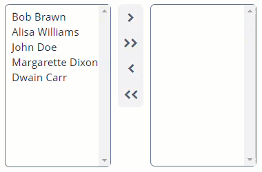
TwinColumn is a multiple selection component that shows two lists side by side, with the left column containing unselected items and the right column the selected items. Users can select the values by transferring them from the left to the right and backward using a double click or dedicated buttons.
Component’s XML-name: twinColumn.
Basics
Below is an example of TwinColumn component usage to select entity instances. To specify possible values, use the optionsContainer attribute with the id of the desired collection of entities as a value.
@JmixEntity
@Table(name = "UIEX1_EMPLOYEE")
@Entity(name = "uiex1_Employee")
public class Employee {
    @InstanceName
    @Column(name = "NAME")
    private String name;

    @JmixGeneratedValue
    @Column(name = "ID", nullable = false)
    @Id
    private UUID id;
}
<data>
<collection id="employeesDc"
class="ui.ex1.entity.Employee">
<fetchPlan extends="_local"/>
<loader id="employeesDl">
<query>
<![CDATA[select e from uiex1_Employee e]]>
</query>
</loader>
</collection>
</data>
<layout>
<twinColumn id="twinColumn"
addAllBtnEnabled="true"
optionsContainer="employeesDc"/>
</layout>In the example above, the component displays the Employee entities' field, which is marked with the @InstanceName annotation. The component value is a list of the selected entities.
For example, let’s define a button displaying a list of the selected entities' names:
<button id="button" caption="Show value"/>@Autowired
private TwinColumn<Employee> twinColumn;
@Autowired
private Notifications notifications;
@Autowired
private MetadataTools metadataTools;
@Subscribe("button")
protected void onButtonClick(Button.ClickEvent event) {
StringBuilder sb = new StringBuilder();
Collection<Employee> employees = twinColumn.getValue();
if (employees != null) {
notifications.create()
.withCaption(
employees.stream()
.map(employee -> metadataTools.getInstanceName(employee))
.collect(Collectors.joining("\n"))
)
.show();
}
}Options
As a list of the possible values, you can use one of the implementations of the Options interface. Learn more about setting options programmatically on the CheckBoxGroup page.
Attributes
-
addAllBtnEnabledattribute shows buttons that move all elements from one column to another. There are the following possible values:-
true -
false- the default value.
-
-
leftColumnCaptionandrightColumnCaptionattributes allow you to set captions for the columns. -
rowsattribute allows you to set the number of rows in each list. The value ofheighthas priority over the value ofrows.
Events and Handlers
|
To generate a handler stub in Jmix Studio, select the component in the screen descriptor XML or in the Jmix UI hierarchy panel and use the Handlers tab of the Jmix UI inspector panel. Alternatively, you can use the Generate Handler button in the top panel of the screen controller. |
ValueChangeEvent
See ValueChangeEvent.
OptionStyleProvider
See OptionStyleProvider.
Validator
See Validator.
TwinColumn XML Attributes
|
You can view and edit attributes applicable to the component using the Jmix UI inspector panel of the Studio’s Screen Designer. |
addAllBtnEnabled - align - box.expandRatio - caption - captionAsHtml - captionProperty - colspan - contextHelpText - contextHelpTextHtmlEnabled - css - dataContainer - description - descriptionAsHtml - editable - enable - height - htmlSanitizerEnabled - icon - id - leftColumnCaption - optionsContainer - property - required - requiredMessage - responsive - rightColumnCaption - rows - rowspan - stylename - tabIndex - visible - width
