multiValuePicker
multiValuePicker works with a list of values of any type. It consists of the text field and the set of buttons defined by actions.
XML Element |
|
|---|---|
Java Class |
|
Attributes |
id - alignSelf - allowCustomValue - ariaLabel - ariaLabelledBy - autofocus - classNames - colspan - css - dataContainer - enabled - focusShortcut - height - helperText - label - maxHeight - maxWidth - minHeight - minWidth - placeholder - property - readOnly - required - requiredMessage - tabIndex - themeNames - title - visible - width |
Handlers |
AttachEvent - BlurEvent - ComponentValueChangeEvent - CustomValueSetEvent - DetachEvent - FocusEvent - formatter - statusChangeHandler - validator |
Elements |
Basics
multiValuePicker is ideal for editing lists of values through actions, rather than typing directly in a text field.
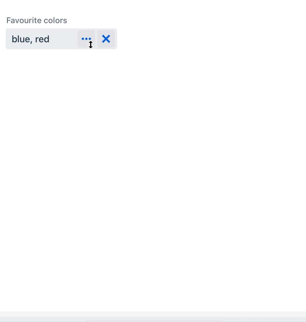
Basic multiValuePicker example:
<multiValuePicker id="stringsValuesPicker" label="Favourite colors">
    <actions>
        <action id="multiValueSelect" type="multi_value_select">
            <properties>
                <property name="javaClass" value="java.lang.String"/>
            </properties>
        </action>
        <action id="valueClear" type="value_clear"/>
    </actions>
</multiValuePicker>
When users click the value selection button, the Select Value view appears. Here, they can add new values to a result list or remove existing ones. To add a value, they can either click the Add button or press Enter.
You can create a custom Select Value view. This view needs to implement the MultiValueSelectView interface and then be set to the action as either viewClass or viewId.
|
Actions
You can add custom or predefined actions to your multiValuePicker, displayed as buttons on the right side. You can do this in two ways:
-
XML Descriptor: Define your actions within the nested
<actions>element in your XML descriptor. -
Controller: Programmatically add actions to
multiValuePickerusing theaddAction()method in your controller.
|
To add |
Predefined Action
The framework provides two predefined actions for multiValuePicker: value_clear and multi_value_select.
The multi_value_select action populates multiValuePicker using a value selection view. This view dynamically generates a component for selecting or creating a value based on the data type provided. The multi_value_select action can handle various data types, including:
-
Java types, like
String,Integer,Long,Double,BigDecimal,Date,LocalDate,LocalTime,LocalDateTime,OffsetTime,OffsetDateTime,Date,Time,UUIDandjava.sql.Date,java.sql.Time.You can specify the Java class representing the data type of the selected value using the
javaClassproperty.For instance, in the previous example, the
multi_value_selectaction utilizes thejava.lang.StringJava class. -
Enum values
Use the
enumClassproperty to specify the enumeration class that represents the data type of the selected value.<multiValuePicker id="enumValuesPicker" label="Onboarding statuses"> <actions> <action id="multiValueSelect" type="multi_value_select"> <properties> <property name="enumClass" value="com.company.onboarding.entity.OnboardingStatus"/> </properties> </action> <action id="valueClear" type="value_clear"/> </actions> </multiValuePicker>When dealing with enums, a
comboBoxis generated on the Select Value view, providing a dropdown list of available enum values. -
Entity instances
Use the
entityNameproperty to set the name of the entity class that represents the data type of the selected value.<multiValuePicker id="entityValuesPicker" label="Departments"> <actions> <action id="multiValueSelect" type="multi_value_select"> <properties> <property name="entityName" value="Department"/> <property name="useComboBox" value="true"/> </properties> </action> <action id="valueClear" type="value_clear"/> </actions> </multiValuePicker>The
useComboBoxproperty controls whether anentityComboBoxshould be used in the Select Value view. The default value isfalse.
Custom Actions
Custom actions for multiValuePicker are similar to custom actions used with valuePicker.
Validation
To check values entered into the multiValuePicker component, you can use a validator in a nested validators element.
The following predefined validators are available for multiValuePicker:
XML Element |
|
|---|---|
Predefined validators |
custom - decimalMax - decimalMin - digits - doubleMax - doubleMin - email - max - min - negative - negativeOrZero - notBlank - notEmpty - notNull - positive - positiveOrZero - regexp - size |
