comboBox
comboBox allows users to select a single value from a predefined list of items.
XML Element |
|
|---|---|
Java Class |
|
Attributes |
id - alignSelf - allowCustomValue - ariaLabel - ariaLabelledBy - autoOpen - autofocus - classNames - clearButtonVisible - colspan - css - dataContainer - datatype - enabled - errorMessage - focusShortcut - height - helperText - itemsEnum - label - maxHeight - maxWidth - minHeight - minWidth - overlayClass - pageSize - pattern - placeholder - property - readOnly - required - requiredMessage - tabIndex - themeNames - title - visible - width |
Handlers |
AttachEvent - BlurEvent - ClientValidatedEvent - ComponentValueChangeEvent - CustomValueSetEvent - DetachEvent - FocusEvent - itemLabelGenerator - itemsFetchCallback - renderer - statusChangeHandler - validator |
Elements |
itemsQuery - prefix - tooltip - validator |
Basics
comboBox provides filtering of values as the user enters some text, and pagination of available values.
Use comboBox when:
-
Dynamic Filtering. You need the ability for users to filter the items in the dropdown as they type.
comboBoxprovides built-in filtering capabilities. -
Large Datasets. You are working with a large number of items in your dropdown.
comboBoxhandles pagination, allowing you to display only a limited number of options at a time, enhancing performance. -
Custom Rendering. You want to customize the appearance of the dropdown items, perhaps with additional information or styling.
comboBoxoffers more flexibility for customizing how items are rendered.
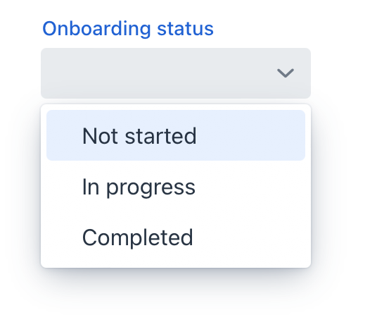
The simplest case of using comboBox is to select an enumeration value for an entity attribute. For example, the User entity has the onboardingStatus attribute of the OnboardingStatus type, which is an enumeration.
<data>
    <instance class="com.company.onboarding.entity.User" id="userDc"> (1)
        <fetchPlan extends="_base"/> (2)
        <loader id="userDl"/>
    </instance>
</data>
<layout>
    <comboBox id="comboBox"
              label="Onboarding status"
              dataContainer="userDc"
              property="onboardingStatus"/> (3)
</layout>| 1 | InstanceContainer for the User entity. |
| 2 | Inline fetch plan of the entity instance located in the container. |
| 3 | Binding the component to a data container and property. The dataContainer attribute contains a link to the userDc data container, and the property attribute refers to the onboardingStatus entity attribute. |
Custom Items
Items List
You can specify the list of comboBox items using the setItems() method.
First, declare a component in the XML descriptor:
<data>
    <instance class="com.company.onboarding.entity.Step" id="stepDc">
        <fetchPlan extends="_base"/>
        <loader id="stepDl"/>
    </instance>
</data>
<layout>
    <comboBox id="durationComboBox"
              dataContainer="stepDc"
              property="duration"/>
</layout>
Then inject the component into the controller and specify a list of items in the onInit() method:
@ViewComponent
private JmixComboBox<Integer> durationComboBox;

@Subscribe
public void onInit(InitEvent event) {
    durationComboBox.setItems(1,2,3,4,5);
}
In the component’s drop-down list, the values 1, 2, 3, 4 and 5 will be displayed. The selected value will be put into the duration attribute of an entity located in the stepDc data container.
Items Map
ComponentUtils.setItemsMap() allows you to specify a string label for each item value explicitly.
@ViewComponent
private JmixComboBox<Integer> ratingComboBox;

@Subscribe
public void onInit(InitEvent event) {
    Map<Integer, String> map = new LinkedHashMap<>();
    map.put(2, "Poor");
    map.put(3, "Average");
    map.put(4, "Good");
    map.put(5, "Excellent");
    ComponentUtils.setItemsMap(ratingComboBox, map);
}
Items Enum
You can use either a declarative or programmatic approach to set the values of an enum as comboBox items.
The itemsEnum attribute defines the enumeration class for creating a list of items. The drop-down list will show localized names of enum values; the component’s value will be an enum value.
<comboBox label="Onboarding status"
          itemsEnum="com.company.onboarding.entity.OnboardingStatus"/>
The example below uses the programmatic approach.
@ViewComponent
private JmixComboBox<OnboardingStatus> enumComboBox;

@Subscribe
public void onInit(InitEvent event) {
    enumComboBox.setItems(OnboardingStatus.class);
}
Custom Filtering
By default, comboBox performs case-insensitive substring matching for its filtering. This means that it will show any items where the entered text appears anywhere within the item’s label, regardless of capitalization.
You can also customize filtering. To set a custom filter for comboBox, use the setItems() method.
@ViewComponent
private JmixComboBox<String> colorDropDown;

@Subscribe
public void onInit(InitEvent event) {
    List<String> itemsList = List.of("White", "Red", "Blue", "Grey");
    colorDropDown.setItems(getStartsWithFilter(), itemsList);

}
protected ComboBox.ItemFilter<String> getStartsWithFilter() {
    return (color, filterString) ->
            color.toLowerCase().startsWith(filterString.toLowerCase());
}
Custom Value Entry
comboBox allows you to configure it to accept custom values not in the list of items.
When the allowCustomValue attribute is set to true, users can enter custom string values that don’t match any existing items. This triggers CustomValueSetEvent.
comboBox doesn’t do anything with the custom value string automatically. Use CustomValueSetEvent to determine how the custom value should be handled.
|
This example demonstrates the ability to add new values to the list of items, making them available for future selections:
<comboBox id="colorComboBox"
          label="Select the color"
          allowCustomValue="true"/>
@ViewComponent
private JmixComboBox<String> colorComboBox;
@Subscribe
public void onInit(InitEvent event) {
colorComboBox.setItems("White", "Red", "Blue", "Grey");
}
@Subscribe("colorComboBox")
public void onColorComboBoxCustomValueSet(CustomValueSetEvent<ComboBox<String>> event) {
colorComboBox.setValue(event.getDetail());
}Items Fetch Callback
comboBox can load items in batches in response to user input.
For example, when the user enters foo, the component loads from the database at most 50 items having foo in the name and shows them the dropdown. When the user scrolls down the list, the component fetches the next batch of 50 items with the same query and adds them to the list.
Declarative Configuration
To implement this behavior, define the itemsQuery nested element.
The itemsQuery element should contain the JPQL query text in the nested query element and a few additional attributes specifying what and how to load data:
-
escapeValueForLike- enables searching for the values that contain special symbols:%,\, etc. The default value isfalse. -
searchStringFormat- a string that contains a variable placeholder, which is subsequently replaced with an actual value.
Example of itemsQuery in comboBox:
<comboBox id="userComboBox"
          label="User name"
          pageSize="30"> (1)
    <itemsQuery escapeValueForLike="true"
                searchStringFormat="(?i)%${inputString}%"> (2)
        <query>
            <![CDATA[select e.username from User e where e.username
            like :searchString escape '\' order by e.username asc]]>
        </query>
    </itemsQuery>
</comboBox>| 1 | The pageSize attribute of the component defines the batch size when loading data from the database. It is 50 by default. |
| 2 | As you can see, itemsQuery in comboBox does not need class and fetchPlan attributes because the query is supposed to return the list of scalar values (notice e.name in the result set). To work with entities, use the entityComboBox component. |
Programmatic Configuration
Items fetching can also be defined programmatically using the itemsFetchCallback handler. For example:
@Autowired
protected DataManager dataManager;

protected Collection<User> users;

@Subscribe
public void onInit(InitEvent event) {
    users = dataManager.load(User.class).all().list();
}

@Install(to = "programmaticComboBox", subject = "itemsFetchCallback")
private Stream<User> programmaticComboBoxItemsFetchCallback(Query<User, String> query) {
    String enteredValue = query.getFilter()
            .orElse("");

    return users.stream()
            .filter(user -> user.getDisplayName() != null &&
                    user.getDisplayName().toLowerCase().contains(enteredValue.toLowerCase()))
            .skip(query.getOffset())
            .limit(query.getLimit());
}
In this example, data is fetched using DataManager, but you can use this approach to load from a custom service as well.
Customizing Item Labels
itemLabelGenerator allows you to customize how items are displayed in the dropdown list. This gives you control over the text that users see, enabling you to present information in a more user-friendly or context-specific manner.
@Install(to = "colorComboBox", subject = "itemLabelGenerator")
private String colorComboBoxItemLabelGenerator(String item) {
    return item.toUpperCase();
}
Rendering Items
The framework provides flexibility in customizing the rendering of items. You can use either the setRenderer() method or the @Supply annotation to achieve this.
<comboBox id="daysComboBox"
          itemsEnum="com.company.onboarding.entity.DayOfWeek"/>
@Supply(to = "daysComboBox", subject = "renderer")
private Renderer<DayOfWeek> daysComboBoxRenderer() {
return new ComponentRenderer<>(day -> {
HorizontalLayout layout = uiComponents.create(HorizontalLayout.class);
layout.setPadding(false);
String dayValue = metadataTools.format(day);
H4 label = new H4(dayValue);
JmixButton button = uiComponents.create(JmixButton.class);
button.addThemeVariants(ButtonVariant.LUMO_ICON, ButtonVariant.LUMO_TERTIARY_INLINE);
Icon icon = switch (day) {
case MONDAY -> VaadinIcon.BRIEFCASE.create();
case TUESDAY -> VaadinIcon.LINE_CHART.create();
case WEDNESDAY -> VaadinIcon.TROPHY.create();
case THURSDAY -> VaadinIcon.GROUP.create();
case FRIDAY -> VaadinIcon.CASH.create();
case SATURDAY -> VaadinIcon.GLASS.create();
case SUNDAY -> VaadinIcon.BED.create();
};
button.setIcon(icon);
layout.add(button, label);
return layout;
});
}Overlay
Overlay is a semi-transparent or opaque layer that is used to create a dropdown list of items.
The overlayClass attribute allows you to add custom CSS classes to the overlay element.
<comboBox id="ratingComboBox"
          datatype="int"
          overlayClass="my-custom-overlay"/>
Define a custom style in your css file:
vaadin-combo-box-overlay.my-custom-overlay::part(overlay){
    background-color: #ecfcf9;
    border-radius: 5px;
}
Theme Variants
Use the themeNames attribute to adjust text alignment, helper text placement, and component size.
Alignment
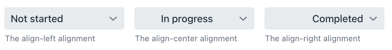
Choose among three alignment options: align-left (default), align-right, align-center.
XML code
<comboBox itemsEnum="com.company.onboarding.entity.OnboardingStatus"
          themeNames="align-left"
          helperText="The align-left alignment"/>
<comboBox itemsEnum="com.company.onboarding.entity.OnboardingStatus"
          themeNames="align-center"
          helperText="The align-center alignment"/>
<comboBox itemsEnum="com.company.onboarding.entity.OnboardingStatus"
          themeNames="align-right"
          helperText="The align-right alignment"/>
Helper Text Position
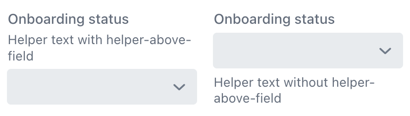
Setting helper-above-field will move the helper text from its default position below the field to above it.
XML code
<comboBox itemsEnum="com.company.onboarding.entity.OnboardingStatus"
          label="Onboarding status"
          helperText="Helper text with helper-above-field"
          themeNames="helper-above-field"/>
<comboBox itemsEnum="com.company.onboarding.entity.OnboardingStatus"
          label="Onboarding status"
          helperText="Helper text without helper-above-field"/>
Size
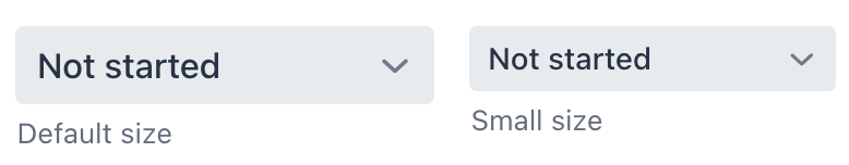
Two size options are available: the default size and small.
XML code
<comboBox itemsEnum="com.company.onboarding.entity.OnboardingStatus"
          helperText="Default size"/>
<comboBox itemsEnum="com.company.onboarding.entity.OnboardingStatus"
          themeNames="small"
          helperText="Small size"/>
Validation
To check values entered into the comboBox component, you can use a validator in a nested validators element.
The following predefined validators are available for comboBox:
XML Element |
|
|---|---|
elements |
custom - decimalMax - decimalMin - digits - doubleMax - doubleMin - email - max - min - negativeOrZero - negative - notBlank - notEmpty - notNull - positiveOrZero - positive - regexp - size |
Attributes
In Jmix there are many common attributes that serve the same purpose for all components.
The following are attributes specific to comboBox:
Name |
Description |
Default |
|---|---|---|
If the |
|
|
If the |
|
|
The |
||
Defines a space-delimited list of CSS class names to set on the overlay element. See Overlay. |
||
Sets the maximum number of items sent per request, should be greater than zero. See Items Fetch Callback. |
|
Handlers
In Jmix there are many common handlers that are configured in the same way for all components.
The following are handlers specific to comboBox:
|
To generate a handler stub in Jmix Studio, use the Handlers tab of the Jmix UI inspector panel or the Generate Handler action available in the top panel of the view class and through the Code → Generate menu (Alt+Insert / Cmd+N). |
Name |
Description |
|---|---|
|
|
|
|
This handler only fetches data when it’s needed. See Items Fetch Callback. |
|
Sets the |
See Also
See the Vaadin Docs for more information.
