integerField
integerField has many of the same features as textField, but it accepts only Integer input.
XML Element |
|
|---|---|
Java Class |
|
Attributes |
id - alignSelf - ariaLabel - ariaLabelledBy - autocapitalize - autocomplete - autocorrect - autofocus - autoselect - classNames - clearButtonVisible - colspan - css - dataContainer - enabled - errorMessage - focusShortcut - height - helperText - label - max - maxHeight - maxWidth - min - minHeight - minWidth - placeholder - property - readOnly - required - requiredMessage - step - stepButtonsVisible - tabIndex - themeNames - title - value - valueChangeMode - valueChangeTimeout - visible - width |
Handlers |
AttachEvent - BlurEvent - ClientValidatedEvent - ComponentValueChangeEvent - CompositionEndEvent - CompositionStartEvent - CompositionUpdateEvent - DetachEvent - FocusEvent - InputEvent - KeyDownEvent - KeyPressEvent - KeyUpEvent - statusChangeHandler - validator |
Elements |
Basics
The integerField component is designed to provide basic functionality for inputting and displaying integer values.
An example of integerField:
<integerField id="integerField"
              clearButtonVisible="true"
              value="27000"/>
integerField doesn’t handle formatting. Use TypedTextField when you need localized number formatting or support for different data types.
|
Data Binding
Data binding refers to linking a visual component to a data container. Changes in the visual component or corresponding data container can trigger updates to one another. See Using Data Components for more details.
The following example produces a data-aware integerField. The entity attribute must be of Integer type.
<data>
    <instance class="com.company.onboarding.entity.Step" id="stepDc"> (1)
        <fetchPlan extends="_base"/> (2)
        <loader id="stepDl"/>
    </instance>
</data>
<layout>
    <integerField dataContainer="stepDc"
                  property="duration"/> (3)
</layout>| 1 | InstanceContainer for the Step entity. |
| 2 | Inline fetch plan of the entity instance located in the container. |
| 3 | Binding the component to a data container and property. The dataContainer attribute contains a link to the stepDc data container, and the property attribute refers to the duration entity attribute. |
Step
The step attribute is used to control the increment or decrement value when the user interacts with the field using the up/down arrows, or the step buttons. Step determines how much the value changes with each interaction. It helps you define the level of precision for the integer field.
The step attribute is typically used in conjunction with min and max properties to define the valid range for the number field.
|
The stepButtonsVisible attribute controls whether the buttons for increasing/decreasing the value are displayed or hidden.
<integerField step="1"
              stepButtonsVisible="true"
              min="1"
              max="10"
              helperText="Max 10 items"/>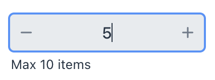
Validation
To check values entered into the integerField component, you can use a validator in a nested validators element.
The following predefined validators are available for integerField:
XML Element |
|
|---|---|
Predefined validators |
custom - digits - max - min - negativeOrZero - negative - notNull - positiveOrZero - positive |
Attributes
In Jmix there are many common attributes that serve the same purpose for all components.
The following are attributes specific to integerField:
Name |
Description |
Default |
|---|---|---|
Specifies the maximum value of the field. Entering a value which is greater than |
||
Specifies the minimum value of the field. Entering a value which is smaller than |
||
Sets the allowed number intervals of the field. This specifies how much the value will be increased/decreased when clicking on the step buttons. See Step. |
|
|
Sets the visibility of the buttons for increasing/decreasing the value accordingly to the default or specified step. See Step. |
|
See Also
See the Vaadin Docs for more information.
