dataGrid
A table of data that can be edited, sorted, filtered, and aggregated based on a column. It performs lazy loading while scrolling to ensure efficiency with large datasets.
XML Element |
|
|---|---|
Java Class |
|
Attributes |
id - aggregatable - aggregationPosition - alignSelf - allRowsVisible - classNames - colspan - columnReorderingAllowed - css - dataContainer - detailsVisibleOnClick - dropMode - editorBuffered - enabled - focusShortcut - height - maxHeight - maxWidth - metaClass - minHeight - minWidth - multiSort - multiSortOnShiftClickOnly - multiSortPriority - nestedNullBehavior - pageSize - rowDraggable - selectionMode - tabIndex - themeNames - visible - width |
Handlers |
AttachEvent - BlurEvent - CellFocusEvent - ColumnReorderEvent - ColumnResizeEvent - DetachEvent - FocusEvent - GridDragEndEvent - GridDragStartEvent - GridDropEvent - ItemClickEvent - ItemDoubleClickEvent - SortEvent - dataGenerator - dragFilter - dropFilter enterPressHandler - tooltipGenerator |
Elements |
actions - columns - column - contextMenu |
Basics
To create the component, use the dataGrid XML element and bind it to a data container. The component supports both collection and key-value containers. Then, specify which attributes from the container you want to display:
-
To display all attributes as specified in the fetch plan, add the columns element with
includeAll = true. To exclude unnecessary attributes, list them in theexcludeattribute separated by commas. -
To display only certain attributes, add the columns element nesting individual column elements for each attribute you want to include.
-
If the fetch plan contains a reference attribute, this attribute will be displayed according to its instance name. To display a specific attribute, add it explicitly to the fetch plan as well as in the
columnelement.
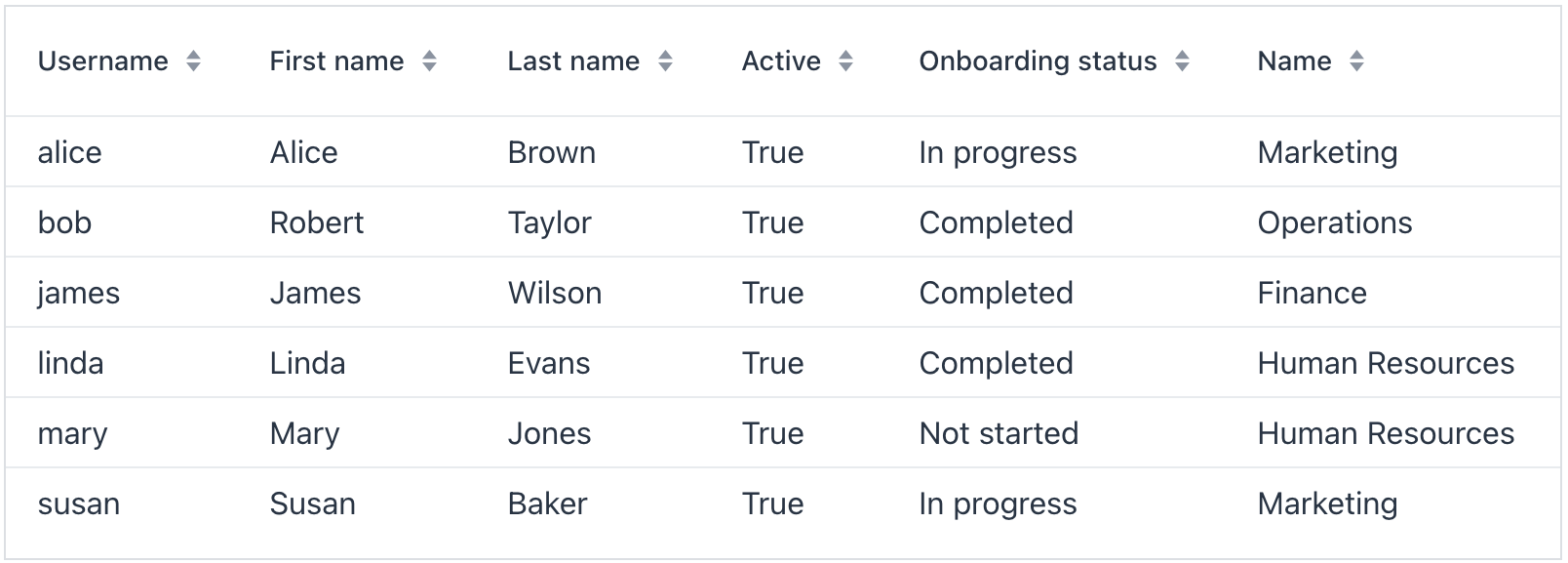
The following example demonstrates how a basic dataGrid is created:
<data readOnly="true">
    <collection id="usersDc"
                class="com.company.onboarding.entity.User">
        <fetchPlan extends="_base">
            <property name="department">
                <property name="name"/> (1)
            </property>
        </fetchPlan>
        <loader id="usersDl">
            <query>
                <![CDATA[select e from User e order by e.username]]>
            </query>
        </loader>
    </collection>
</data>
<layout>
    <dataGrid id="usersTable"
              width="100%"
              minHeight="20em"
              dataContainer="usersDc">
        <columns>
            <column property="username"/> (2)
            <column property="firstName"/>
            <column property="lastName"/>
            <column property="active"/>
            <column property="onboardingStatus"/>
            <column property="department.name"/> (3)
        </columns>
    </dataGrid>
</layout>| 1 | Reference attribute. |
| 2 | Column to display the attribute from the root entity. |
| 3 | Column to display the reference attribute accessed using dot notation. |
Data Binding
Data binding refers to linking a visual component to a data container. Data grid can display data loaded to either collection container or key-value container.
Collection Container
Typically, you bind a dataGrid to data declaratively in the XML descriptor using the dataContainer attribute. This attribute should refer to a collection container, that holds the data you want to display. Please see the relevant example in the previous section.
Key-Value Container
It is also possible to bind the DataGrid to a key-value container. This allows you to display the results of a query that returns scalar values and/or aggregates. For example:
<data readOnly="true">
    <keyValueCollection id="statusesDc">
        <loader id="statusesLoader">
            <query>
                <![CDATA[select o.department, o.onboardingStatus,
                count(o.onboardingStatus) from
                User o group by o.department, o.onboardingStatus]]>
            </query>
        </loader>
        <properties>
            <property name="department" datatype="string"/>
            <property name="onboardingStatus" datatype="int"/>
            <property name="count" datatype="int"/>
        </properties>
    </keyValueCollection>
</data>
<layout>
    <dataGrid width="100%" dataContainer="statusesDc">
        <columns>
            <column property="department"/>
            <column property="onboardingStatus"/>
            <column property="count"/>
        </columns>
    </dataGrid>
</layout>
Programmatic Binding
If you need to define a data container programmatically, use the metaClass attribute instead of dataContainer:
<dataGrid width="100%" id="dataGrid" metaClass="User">
    <columns>
        <column property="firstName"/>
        <column property="lastName"/>
        <column property="username"/>
        <column property="joiningDate"/>
        <column property="onboardingStatus"/>
    </columns>
</dataGrid>
After that, in the view controller, use the ContainerDataGridItems class to bind the data grid to a data container:
@ViewComponent
private DataGrid<User> dataGrid;

@ViewComponent
private CollectionContainer<User> usersDc;

@Subscribe
public void onInit(InitEvent event) {
    dataGrid.setItems(new ContainerDataGridItems<>(usersDc));
}
Inline Editing
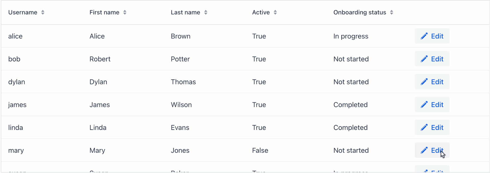
The component supports inline editing, allowing users to switch between reading and editing table data. Inline editing can be activated through buttons in the actions column or on double click.
| Inline edits require an explicit save action to commit the changes to the database. Provide users with a "Save" button or implement auto-save to commit changes when the user leaves the current cell. |
Actions Column
Use editorActionsColumn to provide Edit and Close buttons next to each row. These enable users to start and stop editing respectively.
The actions column is added relatively to other columns. When includeAll="true" is set, the editor column is placed at the far right.
|
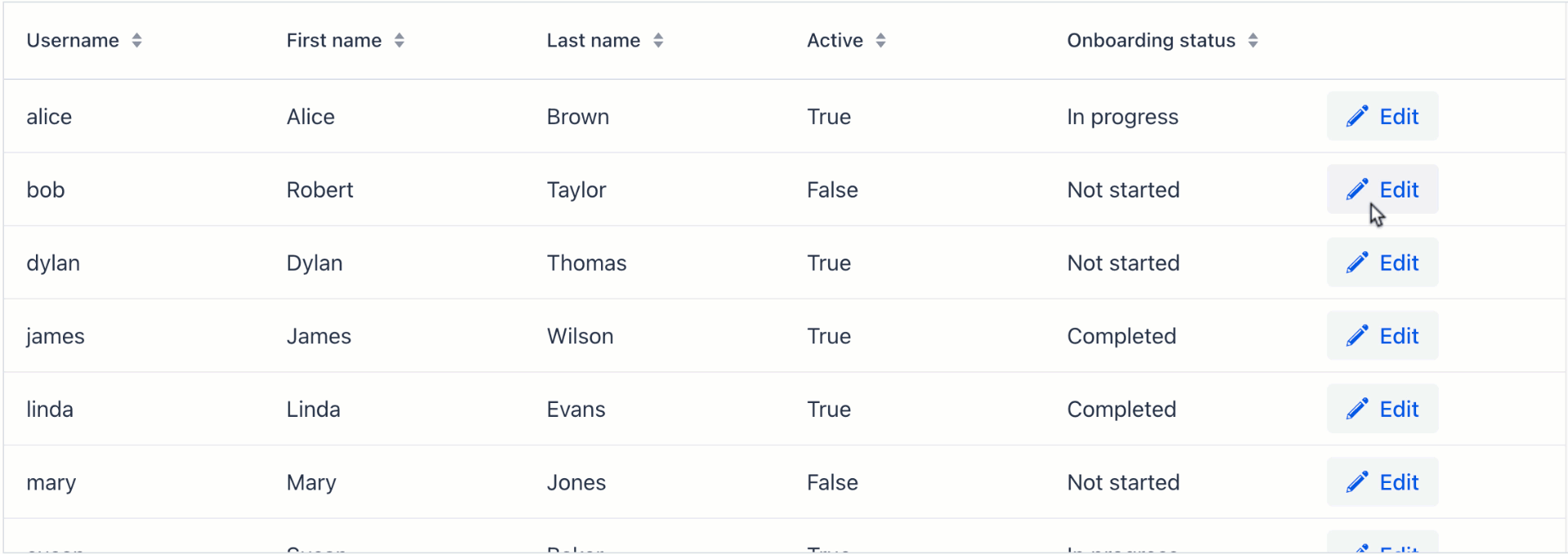
Show code
<dataGrid width="100%" dataContainer="usersDc" id="editableUsersTable">
    <columns>
        <column property="username"/>
        <column property="firstName" editable="true"/> (1)
        <column property="lastName" editable="true"/>
        <column property="active" editable="true"/>
        <column property="onboardingStatus"/>
        <editorActionsColumn>
            <editButton text="Edit" icon="PENCIL"/> (2)
            <closeButton text="Close" icon="CLOSE"/> (3)
        </editorActionsColumn>
    </columns>
</dataGrid>| 1 | Make appropriate columns editable. |
| 2 | Button to initiate editing. |
| 3 | Button to stop editing. |
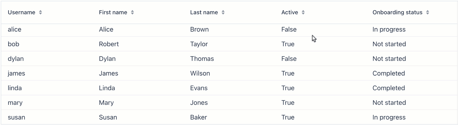
Buffered Mode
With buffered mode on, users will have to confirm or cancel their edits reducing the risk of accidental modifications. Clicking on a different row discards edits.
Show code
<dataGrid width="100%" dataContainer="usersDc" editorBuffered="true"> (1)
    <columns>
        <column property="username"/>
        <column property="firstName" editable="true"/> (2)
        <column property="lastName" editable="true"/>
        <column property="active" editable="true"/>
        <column property="onboardingStatus"/>
        <editorActionsColumn>
            <editButton text="Edit" icon="PENCIL"/> (3)
            <saveButton icon="CHECK" themeNames="success"/> (4)
            <cancelButton icon="CLOSE" themeNames="error"/> (5)
        </editorActionsColumn>
    </columns>
</dataGrid>| 1 | Enable buffered mode. |
| 2 | Make appropriate columns editable. |
| 3 | Button to initiate editing. |
| 4 | Button to confirm changes. |
| 5 | Button to cancel changes. |
Edit on Double Click
Sometimes it is more convenient to start inline editing by double-clicking the item.
Show code
<dataGrid width="100%" dataContainer="usersDc" id="dblClickTable">
    <columns>
        <column property="username"/>
        <column property="firstName" editable="true"/>
        <column property="lastName" editable="true"/>
        <column property="active" editable="true"/>
        <column property="onboardingStatus"/>
    </columns>
</dataGrid>
@ViewComponent
private DataGrid<User> dblClickTable;
@ViewComponent
private GridMenuItem<Object> emailItem;
@Subscribe
public void onInit(InitEvent event) {
DataGridEditor<User> tableEditor = dblClickTable.getEditor();
dblClickTable.addItemDoubleClickListener(e -> {
tableEditor.editItem(e.getItem());
Component editorComponent = e.getColumn().getEditorComponent();
if (editorComponent instanceof Focusable) {
((Focusable) editorComponent).focus();
}
});
}Auto-save Edits
Visual components, including dataGrid, keep temporary changes in a data container until a confirmation action is triggered to commit them to the database.
To automatically commit inline edits when the user leaves the current cell, create a handler for ItemPropertyChangeEvent and save the changes with dataManager:
@Subscribe(id = "usersDc", target = Target.DATA_CONTAINER)
public void onUsersDcItemPropertyChange(final InstanceContainer.ItemPropertyChangeEvent<User> event) {
    dataManager.save(event.getItem());
}
DataGridEditor
The io.jmix.flowui.component.grid.editor.DataGridEditor interface provides additional editor functionality: configure an editor, open the editor, save and cancel a row editing, and utility methods for defining column edit components.
To support framework mechanisms like data containers, value sources, etc., the column editor component must be added using DataGridEditor methods (DataGridEditor#setColumnEditorComponent()) instead of direct column API Column#setEditorComponent().
|
See the example:
@Autowired
private UiComponents uiComponents;

@ViewComponent
private DataGrid<User> editableUserTable;

@Subscribe
public void onInit(InitEvent event) {
    DataGridEditor<User> editor = editableUserTable.getEditor(); (1)

    editor.setColumnEditorComponent("timeZoneId", generationContext -> {
        //noinspection unchecked
        JmixComboBox<String> timeZoneField = uiComponents.create(JmixComboBox.class); (2)
        timeZoneField.setItems(List.of(TimeZone.getAvailableIDs()));
        timeZoneField.setValueSource(generationContext.getValueSourceProvider().getValueSource("timeZoneId"));
        timeZoneField.setWidthFull();
        timeZoneField.setClearButtonVisible(true);
        timeZoneField.setRequired(true);
        //noinspection unchecked,rawtypes
        timeZoneField.setStatusChangeHandler(((Consumer) generationContext.getStatusHandler())); (3)

        return timeZoneField; (4)
    });
}| 1 | Get the instance of DataGridEditor. |
| 2 | The JmixComboBox component instance is created using the UiComponents factory. |
| 3 | Set StatusChangeHandler. |
| 4 | The setColumnEditorComponent() method returns the visual component to be shown as the column editor component. |
SupportsStatusChangeHandler
By default, field components (for example, textField, comboBox) display error messages in a label above them. Such behaviour has disadvantages in case of limited area of edit cell. The io.jmix.flowui.component.SupportsStatusChangeHandler interface enables to define different way of displaying error messages. Components that implement this interface support error handling delegation.
By default, the inline editor uses StatusChangeHandler to set error message of a component as its title.
Header and Footer
The component can include header and footer sections to show supplementary information. Each section can contain one or more rows, which you can add using the following methods:
Method |
Description |
|---|---|
|
Adds a new row at the bottom of the header section. |
|
Adds a new row at the top of the header section. |
|
Adds a new row at the bottom of the footer section. |
|
Adds a new row at the top of the footer section. |
The following example demonstrates a dataGrid that includes merged cells in its header and a computed value in the footer:
Show code
<dataGrid id="dataGrid"
          width="100%"
          dataContainer="usersDc"
          themeNames="column-borders">
    <columns>
        <column property="firstName"/>
        <column property="lastName"/>
        <column property="active"/>
    </columns>
</dataGrid>
@ViewComponent
private DataGrid<User> dataGrid;
@ViewComponent
private CollectionContainer<User> usersDc;
@ViewComponent
private CollectionLoader<User> usersDl;
@Autowired
private DataManager dataManager;
@Autowired
private UiComponents uiComponents;
@Subscribe
protected void onInit(final InitEvent event) {
usersDl.load();
initHeader();
initFooter();
}
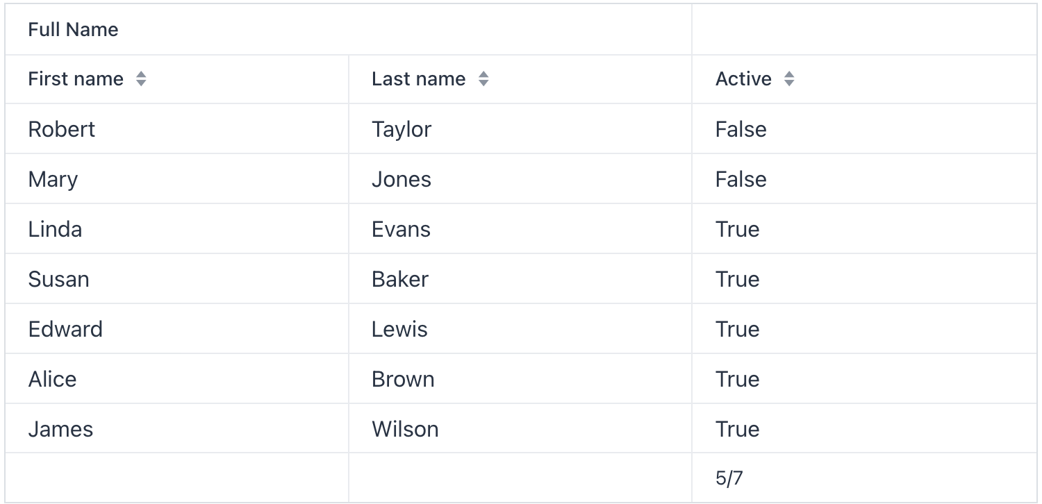
protected void initHeader() {
HeaderRow headerRow = dataGrid.prependHeaderRow();
HeaderRow.HeaderCell headerCell = headerRow.join(
dataGrid.getColumnByKey("firstName"),
dataGrid.getColumnByKey("lastName")); (1)
headerCell.setText("Full Name");
}
protected void initFooter() {
FooterRow footerRow = dataGrid.appendFooterRow();
FooterRow.FooterCell activeCell = footerRow.getCell(dataGrid.getColumnByKey("active"));
activeCell.setText(getActiveCount() + "/" + usersDc.getItems().size());
}
protected int getActiveCount() {
int activeCount = 0;
Collection<User> items = dataGrid.getGenericDataView().getItems().toList();
for (User user : items) {
if (user.getActive()) {
activeCount++;
}
}
return activeCount;
}| 1 | Cells within the header can be merged together. This helps to provide general information about related columns. |
| Both the header and footer can contain rich content and components. See live demo. |
Column Headers Filtering
| This is a preview feature. Its look and feel, as well as implementation details, may change significantly in future releases. |
Data in dataGrid can be filtered using property filters embedded into column headers.
You can define which columns should have a filter using the filterable XML attribute. Filterable columns have the "funnel" icon ( ) in their headers. If the user clicks this icon, a dialog with the property filter condition appears. If a condition is set, the icon in that column is highlighted.
To make sure the filter icon is always visible, set an appropriate width for the column using the width or autoWidth attribute. Don’t make the column resizable, otherwise users will be able to shrink the column width and lose the filter icon.
For example:
<dataGrid dataContainer="usersDc"
          width="100%">
    <columns>
        <column property="firstName" filterable="true"
                width="15em"/>
        <column property="lastName" filterable="true"
                autoWidth="true"/>
        <column property="username"/>
        <column property="active"/>
        <column property="joiningDate"/>
        <column property="onboardingStatus"/>
    </columns>
</dataGrid>
Property filters in column headers work in the same way as standalone property filters and genericFilter - they add conditions to the data loader. In the standard flow, the conditions are translated to the JPQL query and filter data on the database level.
Filterable columns can be used together with propertyFilter and genericFilter components. Conditions of all filters are combined by logical AND.
Currently, column filter conditions are not bound to the page URL. It means that if a user applies a filter and then navigates to a detail view and back, the filter will be cleared.
Actions
The dataGrid component implements the HasActions interface and can contain both standard list actions and custom actions. Actions are invoked by clicking designated buttons or from the context menu that appears on the right click.
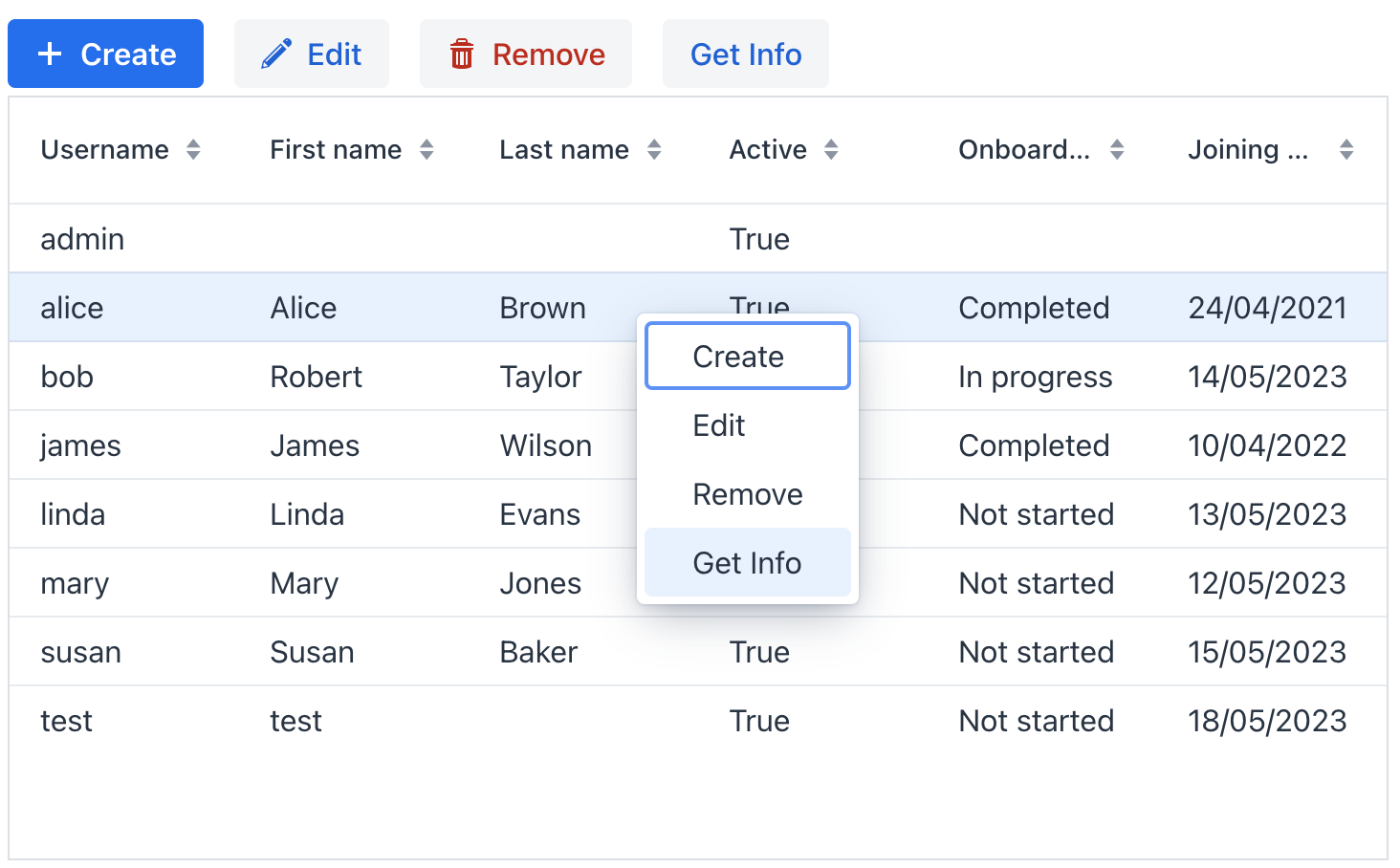
|
To add |
Show code
<hbox id="buttonsPanel" classNames="buttons-panel"> (1)
    <button id="createBtn" action="usersDataGrid.create"/>
    <button id="editBtn" action="usersDataGrid.edit"/>
    <button id="removeBtn" action="usersDataGrid.remove"/>
    <button id="infoBtn" action="usersDataGrid.getInfo"/>
</hbox>
<dataGrid width="100%" dataContainer="usersDc" id="usersDataGrid">
    <columns>
        <column property="username"/>
        <column property="firstName"/>
        <column property="lastName"/>
        <column property="active"/>
        <column property="onboardingStatus"/>
        <column property="joiningDate"/>
    </columns>
    <actions>
        <action id="create" type="list_create"/> (2)
        <action id="edit" type="list_edit"/>
        <action id="remove" type="list_remove"/>
        <action id="getInfo" text="Get Info"/> (3)
    </actions>
</dataGrid>| 1 | Define hbox to contain action buttons. |
| 2 | Define the list_create standard action. |
| 3 | Define the getInfo custom action. Value of its text attribute represents the action in the context menu and is used as the button caption. |
Context Menu
The context menu offers an alternative way to access actions through a right click. Each action is represented by its own menu item.
Use the contextMenu element to refine the list of items in the menu, organizing them with separators and a hierarchical structure.
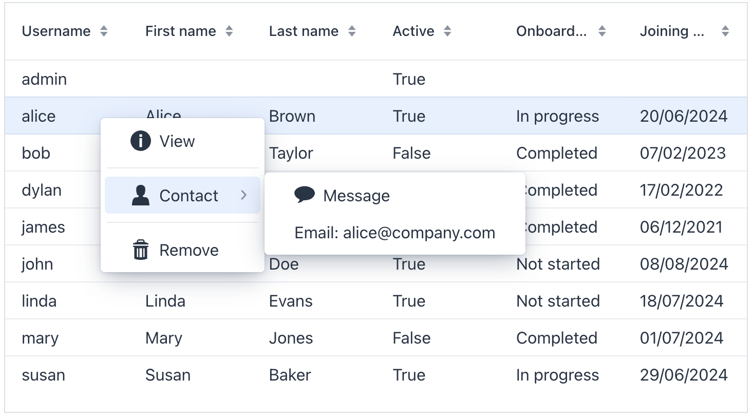
Show code
<dataGrid width="100%" dataContainer="usersDc" id="menuDataGrid">
    <columns>
        <column property="username"/>
        <column property="firstName"/>
        <column property="lastName"/>
        <column property="active"/>
        <column property="onboardingStatus"/>
        <column property="joiningDate"/>
    </columns>
    <actions showInContextMenuEnabled="false"> (1)
        <action id="create" type="list_create"/>
        <action id="edit" type="list_edit"/>
        <action id="remove" type="list_remove"/>
        <action id="getInfo" text="View"/>
        <action id="sendMessage" text="Message"/>
    </actions>
    <contextMenu id="contextMenu">
        <item action="menuDataGrid.getInfo" icon="INFO_CIRCLE"/> (2)
        <separator/>
        <item text="Contact" icon="USER"> (3)
            <item action="menuDataGrid.sendMessage" icon="COMMENT"/>
            <item id="emailItem"/> (4)
        </item>
        <separator/>
        <item action="menuDataGrid.remove" icon="TRASH"/>
    </contextMenu>
</dataGrid>| 1 | Hide all actions from the menu. Or hide a specific action using its visible attribute. |
| 2 | Add menu items explicitly for necessary actions. |
| 3 | Nest items within each other to create a hierarchy. |
| 4 | The item with content added dynamically via dynamicContentHandler. |
@ViewComponent
private GridMenuItem<Object> emailItem;

@Install(to = "contextMenu", subject = "dynamicContentHandler")
private boolean contextMenuDynamicContentHandler(final User user) {
    if (user == null) {
        return false;
    }
        emailItem.setText("Email: " + user.getEmail());
    return true;
}
Renderers
Renderers are used to customize the display of data in a data grid. For example, you could use a renderer to:
-
Format dates or numbers.
-
Display custom icons or images.
-
Create interactive elements, such as buttons or links.
-
Show different content based on the value of the cell.
Renderers can be defined in the following ways:
-
Declaratively in XML
There are a few pre-built renderers that can be assigned to a column in XML:
-
numberRenderer -
localDateRenderer -
localDateTimeRendererThey accept a
formatstring. For example:<column property="joiningDate"> <localDateRenderer format="MMM dd, yyyy"/> </column>To add a renderer in Jmix Studio, select the
columnelement in the view descriptor XML or in the Jmix UI structure panel and click on the Add→<Some>Renderer button in the Jmix UI inspector panel.
-
-
Using @Supply Annotation
Renderers can be supplied in a view controller using the
@Supplyannotation. Methods annotated with@Supplyreturn a value that will be passed as an input parameter to a method defined bysubject.A custom renderer can be assigned to a column using the
rendererhandler which is available on the Handlers tab of the Jmix UI inspector for anycolumnelement.
-
Using FragmentRenderer
You can render columns using a nested
fragmentRendererelement. Refer to the Fragment Renderer section for more information. -
Using addColumn() and addComponentColumn()
The
addColumn()andaddComponentColumn()methods allow you to add columns to the data grid.You can configure the added columns to use a renderer to show the data.
In the following example, we will add a column displaying the user’s picture:
@ViewComponent private DataGrid<User> usersDtGr; @Autowired private FileStorage fileStorage; @Subscribe public void onInit(InitEvent event) { Grid.Column<User> pictureColumn = usersDtGr.addComponentColumn(user -> { (1) FileRef fileRef = user.getPicture(); if (fileRef != null) { Image image = uiComponents.create(Image.class); (2) image.setWidth("30px"); image.setHeight("30px"); image.setClassName("user-picture"); StreamResource streamResource = new StreamResource( fileRef.getFileName(), () -> fileStorage.openStream(fileRef)); image.setSrc(streamResource); (3) return image; (4) } else { return new Span(); } }) .setHeader("Picture") .setAutoWidth(true) .setFlexGrow(0); usersDtGr.setColumnPosition(pictureColumn,0); }1 Adds a new column that shows the imagecomponent.2 The Imagecomponent instance is created using theUiComponentsfactory.3 imagegets its content from the givenStreamResourceby the reference stored in thepictureattribute of theUserentity.4 The addComponentColumn()method returns the visual component to be shown in the column cells.
Local Date Renderer
The LocalDateRenderer is responsible for presenting dates in the form of LocalDate values.
Within the data grid’s column element, there is a localDateRenderer sub-element that includes an optional nullRepresentation attribute and a mandatory format string attribute.
<column property="joiningDate">
    <localDateRenderer format="MMM dd, yyyy"/>
</column>The nullRepresentation attribute is used to specify the textual representation of null values.
Below is an example using LocalDateRenderer with the addColumn() method:
@ViewComponent
private DataGrid<User> usersDtGr;

@Subscribe
public void onInit(InitEvent event) {
    usersDtGr.addColumn(new LocalDateRenderer<>(
                    User::getJoiningDate,
                    () -> DateTimeFormatter.ofLocalizedDate(
                            FormatStyle.MEDIUM)))
            .setHeader("Joining date");
}
Local Date Time Renderer
The LocalDateTimeRenderer is responsible for presenting dates in the form of LocalDateTime values.
Within the data grid’s column element, there is a localDateTimeRenderer sub-element that includes an optional nullRepresentation attribute and a mandatory format string attribute.
<column property="passwordExpiration">
    <localDateTimeRenderer format="dd/MM/YYYY HH:mm:ss"/>
</column>
The nullRepresentation attribute is used to specify the textual representation of null values.
Number Renderer
The NumberRenderer allows you to display numbers in a specified format within the grid cells. It is particularly useful for rendering various types of numbers, including floating-point values.
Within the data grid’s column element, there is a numberRenderer sub-element that includes an optional nullRepresentation attribute and a mandatory format or numberFormat attribute.
<column property="factor">
    <numberRenderer numberFormat="#,#00.0000"/>
</column>
The nullRepresentation attribute is used to specify the textual representation of null values.
The numberFormat attribute follows the formatting rules and syntax of the java.text.DecimalFormat class.
|
|
Text Renderer
TextRenderer is a renderer for presenting simple plain-text string values.
In the example below, a custom text is displayed in the column:
<column key="status" header="Status"/>@Supply(to = "userStepsDataGrid.status", subject = "renderer")
private Renderer<UserStep> userStepsDataGridStatusRenderer() {
return new TextRenderer<>(userStep ->
isOverdue(userStep) ? "Overdue!" : "");
}Component Renderer
The example below shows how to define a column with custom renderer which displays a checkbox:
<column key="completed" width="4em" flexGrow="0"/>@Supply(to = "userStepsDataGrid.completed", subject = "renderer")
private Renderer<UserStep> userStepsDataGridCompletedRenderer() {
return new ComponentRenderer<>(userStep -> {
JmixCheckbox checkbox = uiComponents.create(JmixCheckbox.class);
checkbox.setValue(userStep.getCompletedDate() != null);
checkbox.addValueChangeListener(e -> {
// ...
});
return checkbox;
});
}Item Details
This component allows rows to expand, revealing additional information about each item. To implement this functionality, use the setItemDetailsRenderer() method. This method takes a ComponentRenderer as an argument, which specifies how the details are rendered.
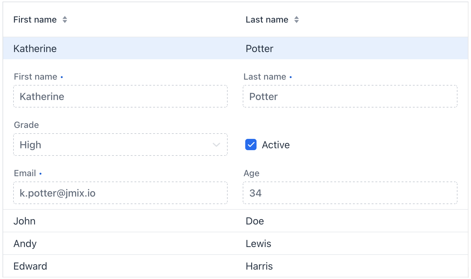
The detailsVisibleOnClick attribute allows you to control whether these details appear when the row is clicked. If you prefer the details to be triggered by an event other than clicking, set this attribute to false.
Sorting
Any column can be used for sorting the data displayed. Clicking on the column header activates a special control in the grid that shows which column is currently being sorted and the sorting direction (ascending or descending). Each subsequent click on the same header will toggle the sorting direction.
Sorting by Multiple Columns
It is also possible to sort by multiple columns simultaneously. When sorting by multiple columns, the first selected column determines the primary sorting criterion, the second column sets the secondary criterion, and so on. You can configure it using multiSort, multiSortOnShiftClickOnly, and multiSortPriority attributes.
For example:
<dataGrid width="100%"
          dataContainer="usersDc"
          multiSort="true"
          multiSortOnShiftClickOnly="true"
          multiSortPriority="APPEND">
Aggregating
The component supports aggregating values in its rows. When aggregation is enabled, it will display an additional row containing aggregated values. For example:
<dataGrid width="100%"
          dataContainer="stepsDc"
          aggregatable="true"
          aggregationPosition="TOP"> (1)
    <columns>
        <column property="name"/>
        <column property="duration">
            <aggregation type="AVG"
                         cellTitle="msg://aggregation.cellTitle"/> (2)
        </column>
        <column property="sortValue"/>
        <column property="factor">
            <aggregation type="AVG">
                <formatter>
                    <number format="#,##0.00"/> (3)
                </formatter>
            </aggregation>
        </column>
    </columns>
</dataGrid>| 1 | Set the aggregatable attribute to true. |
| 2 | Add the aggregation element for columns you want to aggregate. Add optional cellTitle attribute to display a hint when the user hovers aggregated value. |
| 3 | Specify formatter to display the aggregated value in the format other than the standard for this data type. |
The aggregation element can specify a class with custom aggregation logic through strategyClass attribute:
<dataGrid width="100%"
          dataContainer="usersDc"
          aggregatable="true"
          aggregationPosition="TOP">
    <columns>
        <column property="firstName"/>
        <column property="lastName"/>
        <column property="onboardingStatus">
            <aggregation
                    strategyClass="com.company.onboarding.view.component.datagrid.DataGridUserStatusAggregation"/>
        </column>
    </columns>
</dataGrid>
Such class must implement AggregationStrategy interface. For example:
public class DataGridUserStatusAggregation implements AggregationStrategy<OnboardingStatus, String> {

    @Autowired
    public Messages messages;

    @Override
    public String aggregate(Collection<OnboardingStatus> propertyValues) {
        OnboardingStatus mostFrequent = null;
        long max = 0;

        if (CollectionUtils.isNotEmpty(propertyValues)) {
            for (OnboardingStatus status : OnboardingStatus.values()) {
                long current = propertyValues.stream()
                        .filter(status :: equals)
                        .count();

                if (current > max) {
                    mostFrequent = status;
                    max = current;
                }
            }
        }

        if (mostFrequent != null) {
            String key = OnboardingStatus.class.getSimpleName() + "." + mostFrequent.name();
            return String.format("%s: %d/%d", messages.getMessage(OnboardingStatus.class, key), max, propertyValues.size());
        }

        return null;
    }

    @Override
    public Class<String> getResultClass() {
        return String.class;
    }
}
Attributes
In Jmix there are many common attributes that serve the same purpose for all components.
The following are attributes specific to dataGrid:
Name |
Description |
Default |
|---|---|---|
If Using this feature is discouraged for a large number of items as it may cause performance issues. |
|
|
If |
|
|
If the data in the component is aggregatable, determines whether the aggregation row is displayed above or below the other rows. Possible values: |
|
|
If |
|
|
If |
|
|
Determines rows where a drop can happen. Possible values: |
– |
|
If |
|
|
If |
|
|
If |
|
|
Determines whether the clicked column is added to the end or beginning of the sorted columns list. Possible values: |
|
|
Sets the behavior when parsing nested properties which may contain null values in the property chain. Possible values: |
|
|
Determines the page size or the number of items that will be fetched from the data provider at a time. |
|
|
If |
|
|
Sets the selection mode. Possible values: |
|
Handlers
In Jmix there are many common handlers that are configured in the same way for all components.
The following are handlers specific to dataGrid:
|
To generate a handler stub in Jmix Studio, use the Handlers tab of the Jmix UI inspector panel or the Generate Handler action available in the top panel of the view class and through the Code → Generate menu (Alt+Insert / Cmd+N). |
Name |
Description |
|---|---|
|
|
|
|
|
|
|
|
|
|
|
|
|
|
|
|
|
|
Adds a data generator for the data grid. If the generator was already added, does nothing. See the |
|
Allows to control which specific rows can be dragged, rather than making all rows draggable with rowDraggable. |
|
Allows to control which specific rows are valid drop targets. |
|
Handles the event when the user presses the Enter key. |
|
Generates tooltip for the column cell based on given conditions. See live demo. |
Elements
Elements of dataGrid provide a wide range of options to control the appearance, behavior, and functionality of columns both collectively and individually.
|
To add an element to a selected component click the Add button in the Jmix UI inspector panel. |
columns
The columns element can specify a set of attributes to display and behaviors for all columns.
XML Element |
|
|---|---|
Attributes |
exclude - includeAll - resizable - sortable |
Elements |
Name |
Description |
Default |
|---|---|---|
Excludes specific attributes from being shown. Several attributes must be separated with a comma. For example: |
– |
|
If |
– |
|
If |
|
|
If |
|
column
The column element defines an individual column. Attributes set for an individual column override those set for all columns.
XML Element |
|
|---|---|
Attributes |
autowidth - editable - filterable - flexGrow - footer - frozen - header - key - property - resizable - sortable - textAlign - visible - width |
Handlers |
AttachEvent - DataGridColumnVisibilityChangedEvent - DetachEvent - partNameGenerator - renderer - tooltipGenerator |
Elements |
Aggregation - FragmentRenderer - LocalDateRenderer - LocalDateTimeRenderer - NumberRenderer |
Name |
Description |
Default |
|---|---|---|
If |
|
|
If |
|
|
If |
|
|
Sets the flex grow ratio for this column. When set to |
|
|
Sets a footer text to the column. The attribute value can either be the text itself or a key in the message bundle. In case of a key, the value should begin with the |
– |
|
If |
|
|
Sets the column header text. The attribute value can either be the text itself or a key in the message bundle. In case of a key, the value should begin with the |
– |
|
Sets the user-defined identifier to map this column. The key can be used to fetch the column later with the The key has to be unique within the data grid, and it can’t be changed after set once. |
– |
|
Specifies the name of an entity attribute to be displayed in the column. This can be an attribute of the root entity |
– |
|
If |
|
|
If |
|
|
Specifies the alignment of the text with the following possible values: |
|
|
If |
|
|
Sets the width of the column as a CSS string. |
– |
Name |
Description |
|---|---|
Fired when the column visibility is changed through the gridColumnVisibility component. |
|
Generates parts of CSS class names for this column based on given conditions. This allows for customizing cell appearance based on the data displayed. See live demo. |
|
Renders column content using text or components. See text renderer and component renderer. |
|
Generates tooltip for the column cell based on given conditions. See live demo. |
contextMenu
The contextMenu element organizes items the right-click menu in a way that differs from their default arrangement. See the example.
XML Element |
|
|---|---|
Attributes |
id - classNames - css - enabled - visible |
Handlers |
AttachEvent - DetachEvent - GridContextMenuOpenedEvent - openedChangeEvent - dynamicContentHandler |
Elements |
item - separator |
Name |
Description |
|---|---|
Fired when the context menu opened state changes. May return the target item or the id of the target column allowing the menu to display items based on the clicked item. |
|
Fired when the context menu opened state changes. |
|
Handles dynamic updates to the menu when it opens, such as adding menu items or their content. See the example. |
See Also
See the Vaadin Docs for more information.
