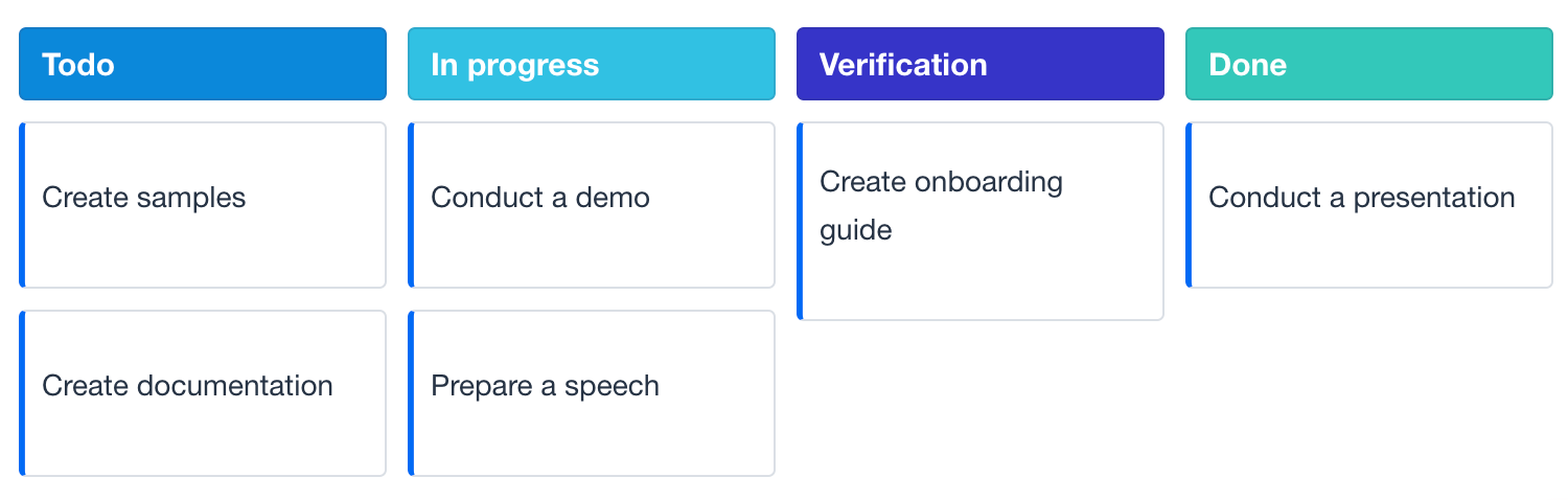
Kanban Component
The kanban UI component represents a Kanban board. The board displays workflow at different stages of a project using cards for tasks and columns for each stage.
Basics
To create the component, use the kanban XML element and bind it to data container. To do this, you can use Jmix Studio.
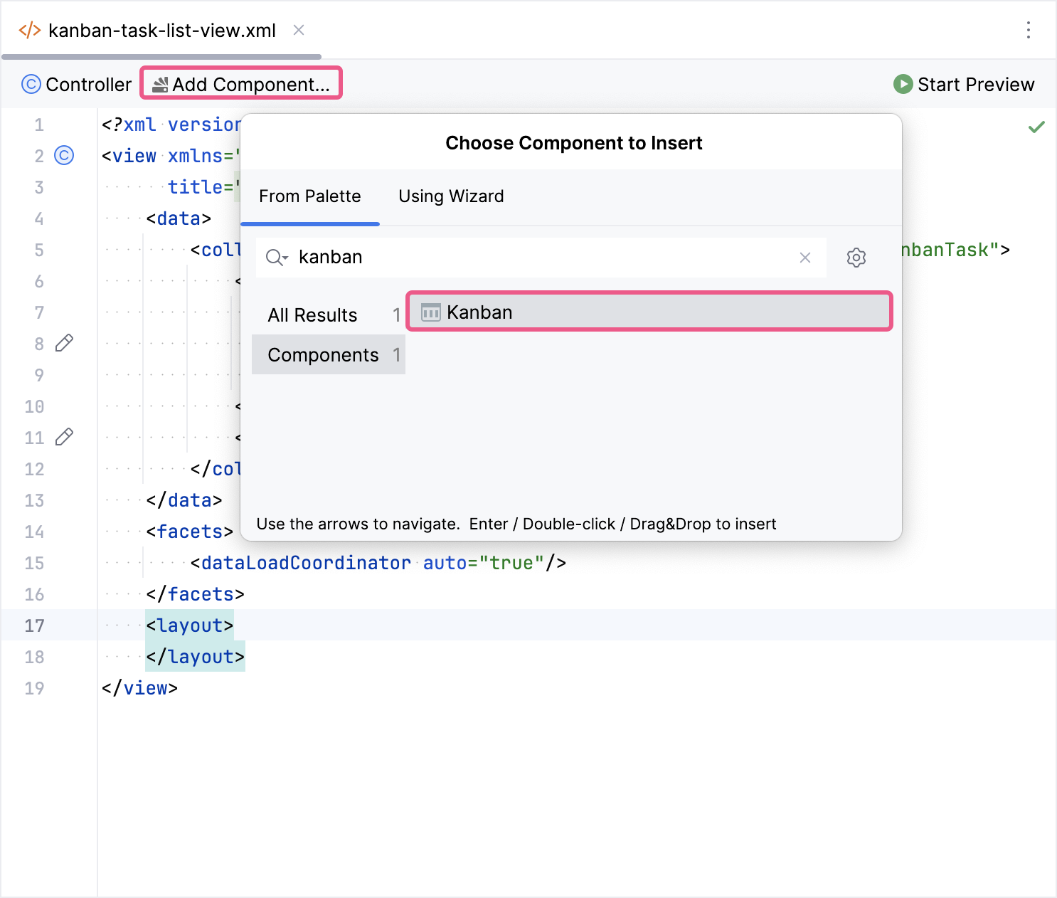
The new kanban element will be added in both the Jmix UI structure panel and in the XML. You can configure attributes like id, height, width, etc., in the same way as it is done for other UI components.
<kanban:kanban id="kanban"
               height="100%"
               width="100%"/>
If you don’t use the view designer, declare the kanban namespace in your view’s XML descriptor manually:
<view xmlns="http://jmix.io/schema/flowui/view"
      xmlns:kanban="http://jmix.io/schema/kanban/ui"
      title="msg://kanbanView.title">
Next, specify which data and columns you want to display:
-
To display columns, add the columns element with the
columnsEnumattribute. -
To configure the mapping of entity fields, use the propertiesMapping element.
The following example demonstrates how to create a basic kanban:
<data>
    <collection id="kanbanTasksDc"
                class="com.company.onboarding.entity.KanbanTask">
        <loader id="kanbanTasksDl" readOnly="true">
            <query>
                <![CDATA[select e from KanbanTask e]]>
            </query>
        </loader>
        <fetchPlan extends="_base"/>
    </collection>
</data>
<layout>
    <kanban:kanban id="kanban" dataContainer="kanbanTasksDc"
                   width="100%" height="100%">
        <kanban:columns>
            <kanban:column dataField="todo"
                           label="msg://kanban.column.todo.label"/>
            <kanban:column dataField="in-progress"
                           label="msg://kanban.column.in_progress.label"/>
            <kanban:column dataField="verification"
                           label="msg://kanban.column.verification.label"/>
            <kanban:column dataField="done"
                           label="msg://kanban.column.done.label"/>
        </kanban:columns>
    </kanban:kanban>
</layout>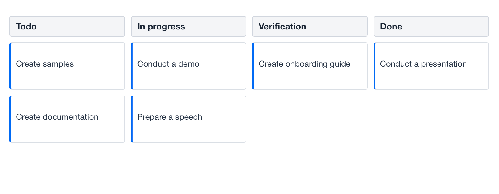
Data Binding
Data binding refers to linking a visual component to a data container. Kanban can display data loaded into either a collection container or a key-value container.
Collection Container
Typically, you bind a kanban to data declaratively in the XML descriptor using the dataContainer attribute. This attribute should refer to a collection container, that holds the data you want to display. Please see the relevant example in the previous section.
Key-Value Container
It is also possible to bind the kanban to a key-value container. For example:
<data>
    <keyValueCollection id="keyValueKanbanTasksDc">
        <properties idProperty="id">
            <property name="id" datatype="uuid"/>
            <property name="status" datatype="string"/>
            <property name="text" datatype="string"/>
        </properties>
        <loader>
            <query>
                <![CDATA[select t.id, t.status, t.text from KanbanTask t]]>
            </query>
        </loader>
    </keyValueCollection>
</data>
<layout>
    <kanban:kanban id="kanbanKeyValue"
                   dataContainer="keyValueKanbanTasksDc"
                   width="100%" height="100%">
        <kanban:columns>
            <kanban:column dataField="todo"
                           label="msg://kanban.column.todo.label"/>
            <kanban:column dataField="in-progress"
                           label="msg://kanban.column.in_progress.label"/>
            <kanban:column dataField="verification"
                           label="msg://kanban.column.verification.label"/>
            <kanban:column dataField="done"
                           label="msg://kanban.column.done.label"/>
        </kanban:columns>
    </kanban:kanban>
</layout>
Programmatic Binding
If you need to define a data container programmatically, you need to remove the dataContainer attribute:
<kanban:kanban id="programmaticallyKanban"
               width="100%" height="100%">
    <kanban:columns>
        <kanban:column dataField="todo"
                       label="msg://kanban.column.todo.label"/>
        <kanban:column dataField="in-progress"
                       label="msg://kanban.column.in_progress.label"/>
        <kanban:column dataField="verification"
                       label="msg://kanban.column.verification.label"/>
        <kanban:column dataField="done"
                       label="msg://kanban.column.done.label"/>
    </kanban:columns>
</kanban:kanban>
After that, in the view controller, use the ContainerKanbanItems class to bind the Kanban to a data container:
@ViewComponent
private Kanban<KanbanTask> programmaticallyKanban;

@ViewComponent
private CollectionContainer<KanbanTask> kanbanTasksDc;
@Autowired
private DataManager dataManager;

@Subscribe
public void onInit(InitEvent event) {
    programmaticallyKanban.setItems(new ContainerKanbanItems<>(kanbanTasksDc, UUID.class));
}
Properties Mapping
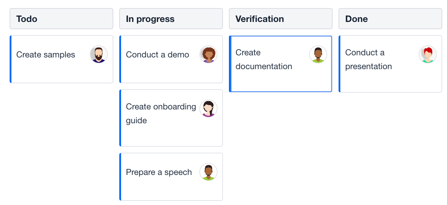
Properties mapping allows you to define how data from your entities is displayed in the Kanban board.
-
Jmix Entity: You have a Jmix entity (for example,
KanbanTask) that represents a task in your application. This entity has various attributes liketitle,status,dueDate, etc. -
Kanban Card: You want to display these task attributes visually on a Kanban card in your Jmix application.
-
Mapping: Jmix’s
Kanbancomponent provides a mechanism to link the entity attributes to the corresponding fields on the Kanban card.
The propertiesMapping element defines a mapping of entity properties to a set of task card fields. A task card displayed on the Kanban board has a predefined set of fields:
id |
The task’s unique ID. Required for display. |
|---|---|
status |
The task’s status. Must correspond to the dataField of a column or sub-column. Required for display. |
text |
The text of the task. Required for display. |
color |
A color used to visually highlight the task’s card. |
dueDate |
The task’s due date. |
priority |
The task’s priority. |
progress |
The task’s progress in percentages, a number from 0 to 100. |
swimlane |
The swimlane of the task. Must correspond to the dataField of a swimlane from the swimlanes definition, if one is defined. |
tags |
A comma-separated list of tags. |
userAvatar |
The avatar of the user assigned to the task. |
username |
The name of the user assigned to the task. |
Declarative Mapping
Typically, you map a kanban to entity properties in the XML descriptor using the propertiesMapping element.
Note how the attribute’s values are specified. The value can be an attribute of the root entity (text = "text") or an attribute of its child entity (username = "assignee.username") - use dot notation to traverse the object graph.
The following example shows a kanban that is mapped to some field of its task entity:
<kanban:kanban id="declarativePropertiesMappingKanban" dataContainer="kanbanTasksDc"
               width="100%" height="100%"
               taskUserAvatarVisible="true">
    <kanban:columns>
        <kanban:column dataField="todo"
                       label="msg://kanban.column.todo.label"/>
        <kanban:column dataField="in-progress"
                       label="msg://kanban.column.in_progress.label"/>
        <kanban:column dataField="verification"
                       label="msg://kanban.column.verification.label"/>
        <kanban:column dataField="done"
                       label="msg://kanban.column.done.label"/>
    </kanban:columns>
    <kanban:propertiesMapping id="id" status="status" text="text"
                              username="assignee.username"
                              userAvatar="assignee.picture"/>
</kanban:kanban>
Programmatic Mapping
You can define propertiesMapping programmatically. To do this, don’t specify it in the kanban XML markup. After that, in the view controller, set it using the setPropertiesMapping(JmixKanban.PropertiesMapping) method.
<kanban:kanban id="programmaticPropertiesMappingKanban" dataContainer="kanbanTasksDc"
               width="100%" height="100%"
               taskUserAvatarVisible="true">
    <kanban:columns>
        <kanban:column dataField="todo"
                       label="msg://kanban.column.todo.label"/>
        <kanban:column dataField="in-progress"
                       label="msg://kanban.column.in_progress.label"/>
        <kanban:column dataField="verification"
                       label="msg://kanban.column.verification.label"/>
        <kanban:column dataField="done"
                       label="msg://kanban.column.done.label"/>
    </kanban:columns>
</kanban:kanban>
@ViewComponent
private Kanban<KanbanTask> programmaticPropertiesMappingKanban;
@Subscribe
public void onInit(InitEvent event) {
JmixKanban.PropertiesMapping propertiesMapping = new JmixKanban.PropertiesMapping("id", "status", "text");
propertiesMapping.setUserAvatar("assignee.picture");
propertiesMapping.setUsername("assignee.username");
programmaticPropertiesMappingKanban.setPropertiesMapping(propertiesMapping);
}Save Delegate
There are three ways to change data using the kanban component:
-
Change the attribute mapped to status by dragging a kanban task card from one column to another.
-
Change the attribute mapped to swimlane by dragging a kanban task card from one swimlane to another.
-
Change the attribute mapped to priority by selection a different priority using the corresponding icon.
Visual components, including kanban, keep temporary changes in a data container until a confirmation action is triggered to commit them to the database.
To automatically commit changes when the user edits tasks, create a handler for saveDelegate and save the changes with DataManager:
<data>
    <collection id="kanbanTasksDc"
                class="com.company.onboarding.entity.KanbanTask">
        <loader id="kanbanTasksDl" readOnly="true">
            <query>
                <![CDATA[select e from KanbanTask e]]>
            </query>
        </loader>
        <fetchPlan extends="_base"/>
    </collection>
</data>
<layout>
    <kanban:kanban id="saveDelegateKanban" dataContainer="kanbanTasksDc"
                   width="100%" height="100%">
        <kanban:columns>
            <kanban:column dataField="todo"
                           label="msg://kanban.column.todo.label"/>
            <kanban:column dataField="in-progress"
                           label="msg://kanban.column.in_progress.label"/>
            <kanban:column dataField="verification"
                           label="msg://kanban.column.verification.label"/>
            <kanban:column dataField="done"
                           label="msg://kanban.column.done.label"/>
        </kanban:columns>
    </kanban:kanban>
</layout>
@Install(to = "saveDelegateKanban", subject = "saveDelegate")
private void kanbanSaveDelegate(final KanbanTask kanbanTask) {
dataManager.save(kanbanTask);
}|
To automatically save |
Actions
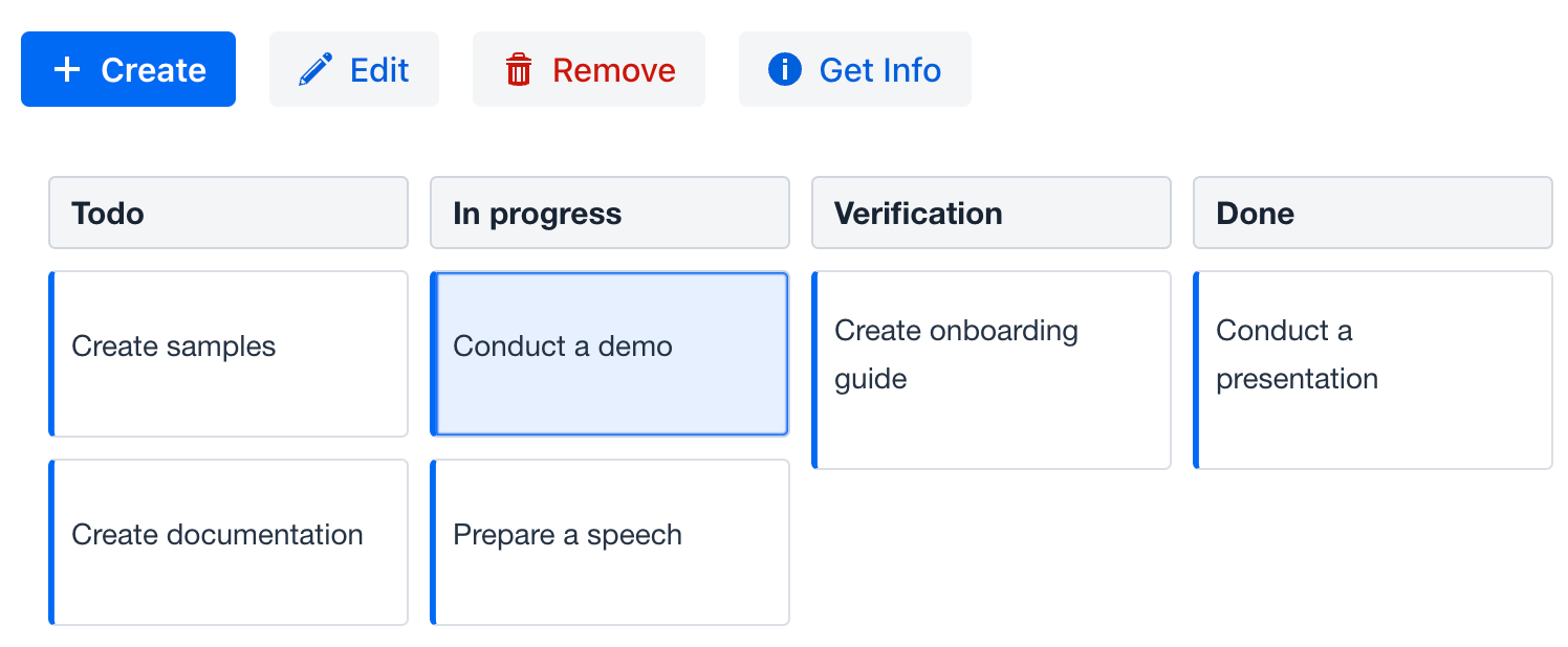
The kanban component implements the HasActions interface and can contain both standard list actions and custom actions. Actions are invoked by clicking a designated button.
The following example demonstrates adding actions to the component:
<hbox id="buttonsPanel" classNames="buttons-panel"> (1)
    <button id="createBtn" action="kanbanActions.create"/>
    <button id="editBtn" action="kanbanActions.edit"/>
    <button id="removeBtn" action="kanbanActions.remove"/>
    <button id="infoBtn" action="kanbanActions.getInfo"/>
</hbox>
<kanban:kanban id="kanbanActions" dataContainer="kanbanTasksDc"
               width="100%" height="100%">
    <kanban:columns>
        <kanban:column dataField="todo"
                       label="msg://kanban.column.todo.label"/>
        <kanban:column dataField="in-progress"
                       label="msg://kanban.column.in_progress.label"/>
        <kanban:column dataField="verification"
                       label="msg://kanban.column.verification.label"/>
        <kanban:column dataField="done"
                       label="msg://kanban.column.done.label"/>
    </kanban:columns>
    <kanban:actions>
        <kanban:action id="create" type="list_create"/> (2)
        <kanban:action id="edit" type="list_edit"/>
        <kanban:action id="remove" type="list_remove"/>
        <kanban:action id="getInfo" text="Get Info" icon="INFO_CIRCLE"/> (3)
    </kanban:actions>
</kanban:kanban>| 1 | Define an hbox container to show action buttons above the component. |
| 2 | Define the list_create standard action. This is a standard action for creating a new item. |
| 3 | Define the getInfo custom action. The value of its text attribute will be used as the button text. |
|
To add |
Hierarchical Columns
The kanban component supports hierarchical columns. Sub-columns have the same properties as top-level columns.
|
It is not possible to use sub-columns and swimlanes or columnsEnum together. |
The following example demonstrates a kanban with sub-columns:
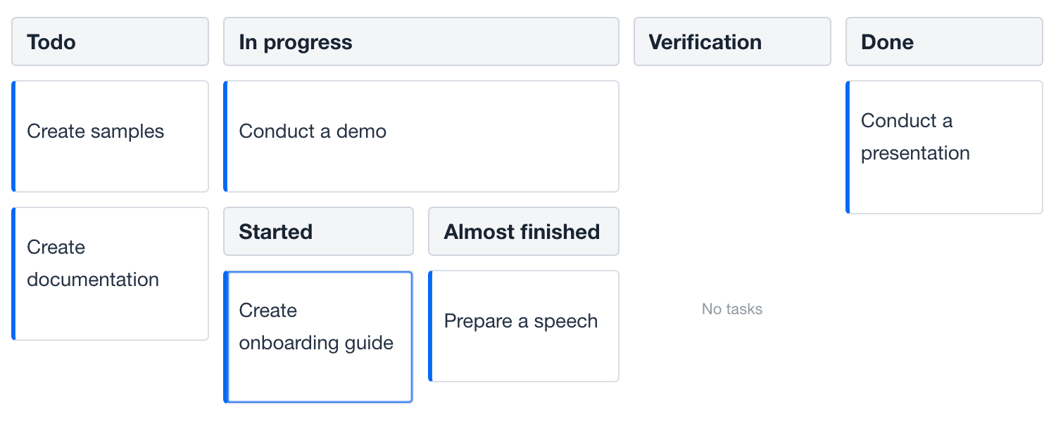
Show code
<kanban:kanban id="hierarchicalKanban" dataContainer="kanbanTasksDc"
               width="100%" height="100%">
    <kanban:columns>
        <kanban:column dataField="todo"
                       label="msg://kanban.column.todo.label"/>
        <kanban:column dataField="in-progress"
                       label="msg://kanban.column.in_progress.label">
            <kanban:columns>
                <kanban:column dataField="started"
                               label="msg://kanban.column.started.label"/>
                <kanban:column dataField="almost-finished"
                               label="msg://kanban.column.almost_finished.label"/>
            </kanban:columns>
        </kanban:column>
        <kanban:column dataField="verification"
                       label="msg://kanban.column.verification.label"/>
        <kanban:column dataField="done"
                       label="msg://kanban.column.done.label"/>
    </kanban:columns>
</kanban:kanban>
Hierarchy Mode
Displaying hierarchical columns is possible in two modes:
-
COLUMNS- sub-columns are represented as nested columns. -
TABS- sub-columns are represented as texted tabs. In this case, it makes sense to specify the selected column attribute.
For example:
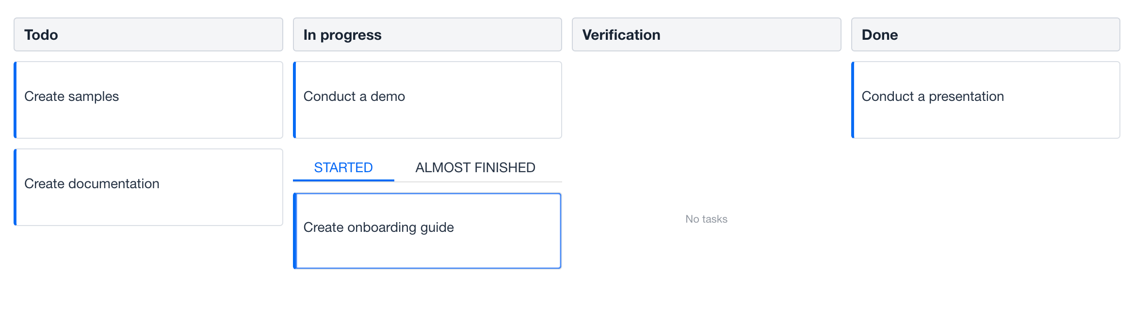
Show code
<kanban:kanban id="hierarchyModeKanban" dataContainer="kanbanTasksDc"
               width="100%" height="100%"
               hierarchyMode="TABS">
    <kanban:columns>
        <kanban:column dataField="todo"
                       label="msg://kanban.column.todo.label"/>
        <kanban:column dataField="in-progress"
                       label="msg://kanban.column.in_progress.label">
            <kanban:columns>
                <kanban:column dataField="started" selected="true"
                               label="msg://kanban.column.started.label"/>
                <kanban:column dataField="almost-finished"
                               label="msg://kanban.column.almost_finished.label"/>
            </kanban:columns>
        </kanban:column>
        <kanban:column dataField="verification"
                       label="msg://kanban.column.verification.label"/>
        <kanban:column dataField="done"
                       label="msg://kanban.column.done.label"/>
    </kanban:columns>
</kanban:kanban>
Task Position
Hierarchical columns can also be displayed on leaves. There are two options for task positions:
-
ALL- tasks can be shown in all levels of column hierarchy. -
LEAF- tasks can be shown only on leaf column.
For example:
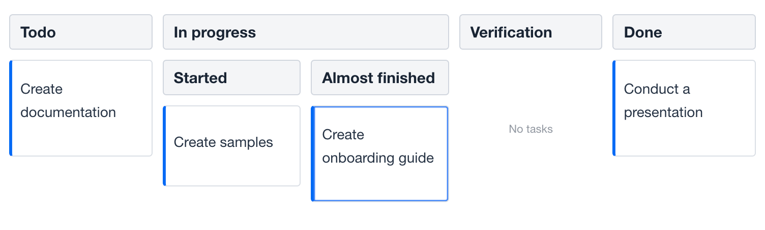
Show code
<kanban:kanban id="taskPositionKanban" dataContainer="kanbanTasksDc"
               width="100%" height="100%"
               taskPosition="LEAF">
    <kanban:columns>
        <kanban:column dataField="todo"
                       label="msg://kanban.column.todo.label"/>
        <kanban:column dataField="in-progress"
                       label="msg://kanban.column.in_progress.label">
            <kanban:columns>
                <kanban:column dataField="started" selected="true"
                               label="msg://kanban.column.started.label"/>
                <kanban:column dataField="almost-finished"
                               label="msg://kanban.column.almost_finished.label"/>
            </kanban:columns>
        </kanban:column>
        <kanban:column dataField="verification"
                       label="msg://kanban.column.verification.label"/>
        <kanban:column dataField="done"
                       label="msg://kanban.column.done.label"/>
    </kanban:columns>
</kanban:kanban>
Renderers
The kanban component supports customization of card display. Renderers can be used to customize the display of the column header, footer, and text of the Kanban task card.
Task Renderer
The task renderer is defined by a callback function that can be used for customizing task rendering. The Kanban calls it with two arguments: the task HTML element and the task data.
For example:
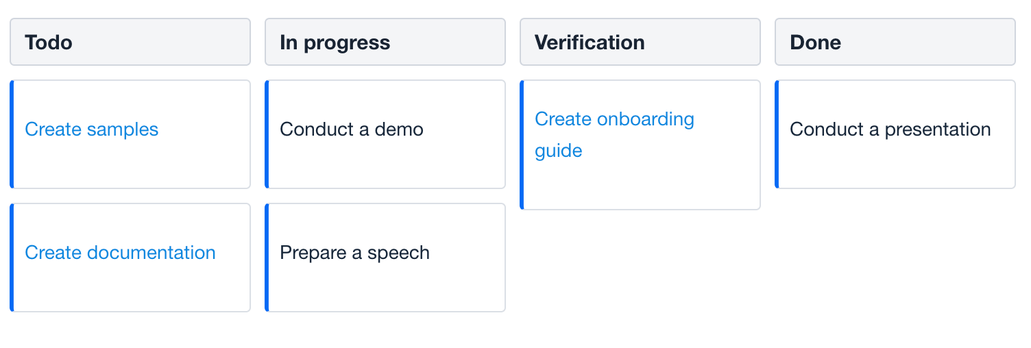
Show code
<kanban:kanban id="taskRendererKanban" dataContainer="kanbanTasksDc"
               width="100%" height="100%">
    <kanban:columns>
        <kanban:column dataField="todo"
                       label="msg://kanban.column.todo.label"/>
        <kanban:column dataField="in-progress"
                       label="msg://kanban.column.in_progress.label"/>
        <kanban:column dataField="verification"
                       label="msg://kanban.column.verification.label"/>
        <kanban:column dataField="done"
                       label="msg://kanban.column.done.label"/>
    </kanban:columns>

    <kanban:taskRendererFunction>
        <![CDATA[
            (task, data) => {
                task.style.color = data.text.includes("Create") ? '#0B88DF' : '#182739'
            }
        ]]>
    </kanban:taskRendererFunction>
</kanban:kanban>
Header Renderer
The header renderer is defined by a callback function that can be used for customizing column header rendering. The Kanban calls it with three arguments: column header HTML element, the column data and the column data field.
For example:
Show code
<kanban:kanban id="headerRendererKanban" dataContainer="kanbanTasksDc"
               width="100%" height="100%">
    <kanban:columns>
        <kanban:column dataField="todo"
                       label="msg://kanban.column.todo.label"/>
        <kanban:column dataField="in-progress"
                       label="msg://kanban.column.in_progress.label"/>
        <kanban:column dataField="verification"
                       label="msg://kanban.column.verification.label"/>
        <kanban:column dataField="done"
                       label="msg://kanban.column.done.label"/>
    </kanban:columns>
    <kanban:columnHeaderRendererFunction>
        <![CDATA[
            (header, data, dataField) => {
                let color = '';
                switch (data.label) {
                    case 'Todo': {
                        color = '#0B88DA';
                        break;
                    }
                    case 'In progress': {
                        color = '#30C1E3'
                        break;
                    }
                    case 'Verification': {
                        color = '#3634C8'
                        break;
                    }
                    case 'Done': {
                        color = '#34C8BA';
                        break;
                    }
                }

                header.style.background = color;
                header.style.color = '#FFF';
            }
        ]]>
    </kanban:columnHeaderRendererFunction>
</kanban:kanban>
Footer Renderer
The footer renderer is defined by a callback function which can be used for customizing column footer rendering. The Kanban calls it with three arguments: the column footer HTML element, the column data and the column data field.
For example:
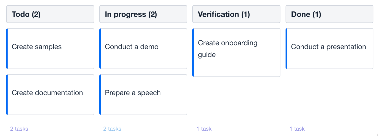
Show code
<kanban:kanban id="footerRendererKanban" dataContainer="kanbanTasksDc"
               width="100%" height="100%"
               columnSummaryEnabled="true"
               columnFooterVisible="true">
    <kanban:columns>
        <kanban:column dataField="todo"
                       label="msg://kanban.column.todo.label"/>
        <kanban:column dataField="in-progress"
                       label="msg://kanban.column.in_progress.label"/>
        <kanban:column dataField="verification"
                       label="msg://kanban.column.verification.label"/>
        <kanban:column dataField="done"
                       label="msg://kanban.column.done.label"/>
    </kanban:columns>
    <kanban:columnFooterRendererFunction>
        <![CDATA[
            (footer, data, dataField) => {
                footer.style.color = data.label === 'In progress' ? '#0B88DA' : '#3634C8';
            }
        ]]>
    </kanban:columnFooterRendererFunction>
</kanban:kanban>
Attributes
In Jmix there are many common attributes that serve the same propose for all components. The following are attributes specific to kanban:
|
You can view and edit attributes applicable to the component in Jmix Studio using the Jmix UI inspector panel. |
Name |
Description |
Default |
|---|---|---|
If |
|
|
If |
|
|
If |
|
|
If |
|
|
If |
|
|
If |
|
|
If |
|
|
If |
|
|
If |
|
|
If |
|
|
Sets the width of all columns in pixels. |
|
|
If |
|
|
If |
|
|
If |
|
|
Specifies the hierarchy mode of the nested columns with the following possible values: |
|
|
Sets the index of the column at which to start the swimlanes. See Swimlanes. |
|
|
Sets the index of the column at which to end the swimlanes. |
– |
|
If |
|
|
If |
|
|
Specifies the task position for columns with the following possible values: |
|
|
If |
|
|
If |
|
|
If |
|
|
If |
|
Handlers
In Jmix there are many common handlers that are configured in the same way for all components. The following are handlers specific to kanban:
|
To generate a handler stub in Jmix Studio, use the Handlers tab of the Jmix UI inspector panel or the Generate Handler action available in the top panel of the view class and through the Code → Generate menu (Alt+Insert / Cmd+N). |
Name |
Description |
|---|---|
|
|
|
|
|
|
|
|
|
|
|
|
|
|
|
|
|
|
|
|
|
|
Adds a save delegate function which will be used to save data that has been updated using Kanban. Called when a task card is dragged across the board and when the task priority changes using the corresponding icon. See Save Delegate. |
Elements
The elements within the kanban provide a wide range of options to control the appearance, behavior, and functionality of columns.
|
To add an element to a selected component, click the Add button in the Jmix UI inspector panel. |
Columns
The columns element can define a set of columns to display, either explicitly or using an enumeration.
XML Element |
|
|---|---|
Attributes |
|
Elements |
Name |
Description |
Default |
|---|---|---|
Specifies the enumeration FQN to be used as column values. The enumeration values will be used as the column’s dataField, and its localized value will be used as the column’s label. Nested columns are not available in this definition option. See live demo. |
– |
Column
The column element defines an individual column.
XML Element |
|
|---|---|
Java Class |
|
Attributes |
dataField - collapsed - collapsible - color - label - orientation - reorder - selected - visible - width |
Elements |
Name |
Description |
Default |
|---|---|---|
Sets the user-defined identifier to map this column. The The |
– |
|
If |
|
|
If |
|
|
Sets the column color property as a CSS string. The color is applied to the header title and can also be applied to cards located within the column. |
– |
|
Sets the column header text. The attribute value can either be the text itself or a key in the message bundle. In case of a key, the value should begin with the |
– |
|
Specifies the orientation of the task cards inside the column with the following possible values: |
|
|
If |
|
|
If |
– |
|
If |
|
|
Sets the width of the column in pixels. |
– |
Swimlanes
| This is a preview feature. Its look and feel, as well as implementation details, may change significantly in future releases. |
The swimlaes element can define a set of swimlanes to display, either explicitly or using an enumeration. Swimlanes are horizontal stripes that divide task cards into area of responsibility. Nested columns are not available when using swimlanes.
XML Element |
|
|---|---|
Attributes |
|
Elements |
Name |
Description |
Default |
|---|---|---|
Specifies the enumeration FQN to be used as swimlane values. The enumeration values will be used as the swimlane dataField, and its localized value will be used as the column’s label. |
– |
Swimlane
The swimlane element defines an individual swimlane.
XML Element |
|
|---|---|
Java Class |
|
Attributes |
Name |
Description |
Default |
|---|---|---|
Sets the user-defined identifier to map this swimlane. The The |
– |
|
Sets the swimlane color property as a CSS string. The color is applied to the swimlane horizontal stripes. |
– |
|
Sets the swimlane header text. The attribute value can either be the text itself or a key in the message bundle. In case of a key, the value should begin with the |
– |
PropertiesMapping
Kanban task cards can display specific fields of a Kanban task entity. The propertiesMapping element is used to set the mapping of entity properties to card fields. See the example.
XML Element |
|
|---|---|
Java Class |
|
Attributes |
id - status - test - color - dueDate - priority - progress - swimlane - tags - userAvatar - username - |
Name |
Description |
Default |
|---|---|---|
Specifies the name of an entity attribute to be mapped to the card |
|
|
Specifies the name of an entity attribute to be mapped to the card |
|
|
Specifies the name of an entity attribute to be mapped to the card |
|
|
Specifies the name of an entity attribute to be mapped to the card |
– |
|
Specifies the name of an entity attribute to be mapped to the card |
– |
|
Specifies the name of an entity attribute to be mapped to the card |
– |
|
Specifies the name of an entity attribute to be mapped to the card |
– |
|
Specifies the name of an entity attribute to be mapped to the card |
– |
|
Specifies the name of an entity attribute to be mapped to the card |
– |
|
Specifies the name of an entity attribute to be mapped to the card |
– |
|
Specifies the name of an entity attribute to be mapped to the card |
– |
See Also
See the Kanban Docs for more information.
