twinColumn
A component to intuitively select items from a list or collection by moving them between two columns.
-
XML element:
twinColumn -
Java class:
TwinColumn
Basics
The component puts two columns side by side. The left column contains items that the user can select from. The right column displays currently selected items. Users can select one or more items and click buttons to move them between columns, adding or removing them from the selection.
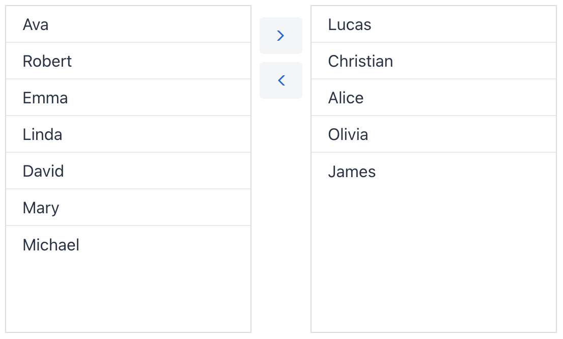
To create the component, use twinColumn XML element and set its itemsContainer attribute to a collection container. The items within this container will appear in the columns.
The following example demonstrates how a basic twin column is created:
<data>
    <collection id="usersDc" class="com.company.onboarding.entity.User">
        <loader id="usersDl" readOnly="true">
            <query>
                <![CDATA[select e from User e]]>
            </query>
        </loader>
        <fetchPlan extends="_base"/>
    </collection>
</data>
<facets>
    <dataLoadCoordinator auto="true"/> (1)
</facets>
<layout>
    <twinColumn itemsContainer="usersDc"/>
</layout>| 1 | Include the dataLoadCoordinator facet to load data automatically. |
Data Binding
Data binding refers to linking a visual component to a data container. Changes in the visual component or corresponding data container can trigger updates to one another. See Using Data Components for more details.
To create multiSelectComboBoxPicker connected to data, use the dataContainer and property attributes. The itemsContainer attribute is used to create a list of items.
Multi Select
The twinColumn component is always in multi-select mode, allowing users to select and move multiple items. You can also provide the ability to move all items at once by setting the selectAllButtonsVisible attribute:
<twinColumn itemsContainer="usersDc" selectAllButtonsVisible="true"/>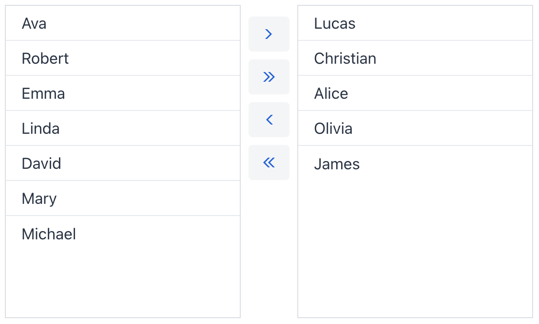
Column Labels
You can provide descriptive labels for each column with the itemsColumnLabel and selectedItemsColumnLabel attributes:
<twinColumn itemsContainer="usersDc" itemsColumnLabel="Users" selectedItemsColumnLabel="Moderators"/>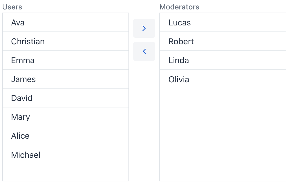
Items Order
By default, items do not maintain their original position in the list. Each time an item is moved to another column, it is added to the bottom of the list. You can choose to preserve the original order of items at all times by setting reorderable = "true".
<twinColumn itemsContainer="usersDc" reorderable="true"/>Theme Variants
The component’s appearance is customizable with the themeNames attribute, which allows you to select between four different options:
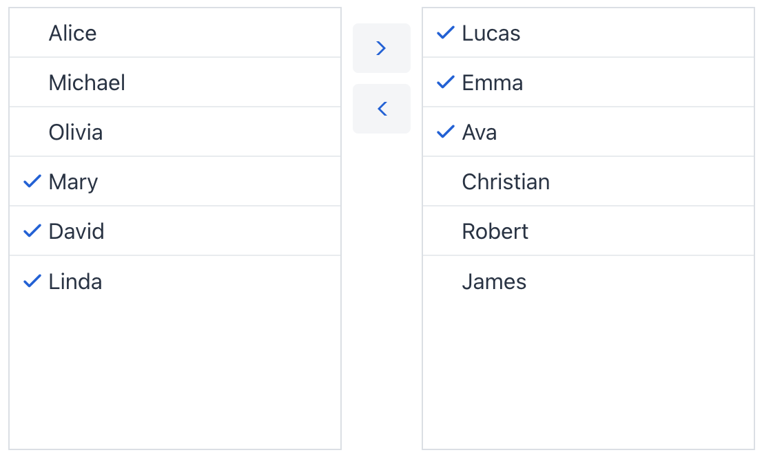
checkboxes
Use checkmarks to indicate which items are clicked, instead of changing the row background color.
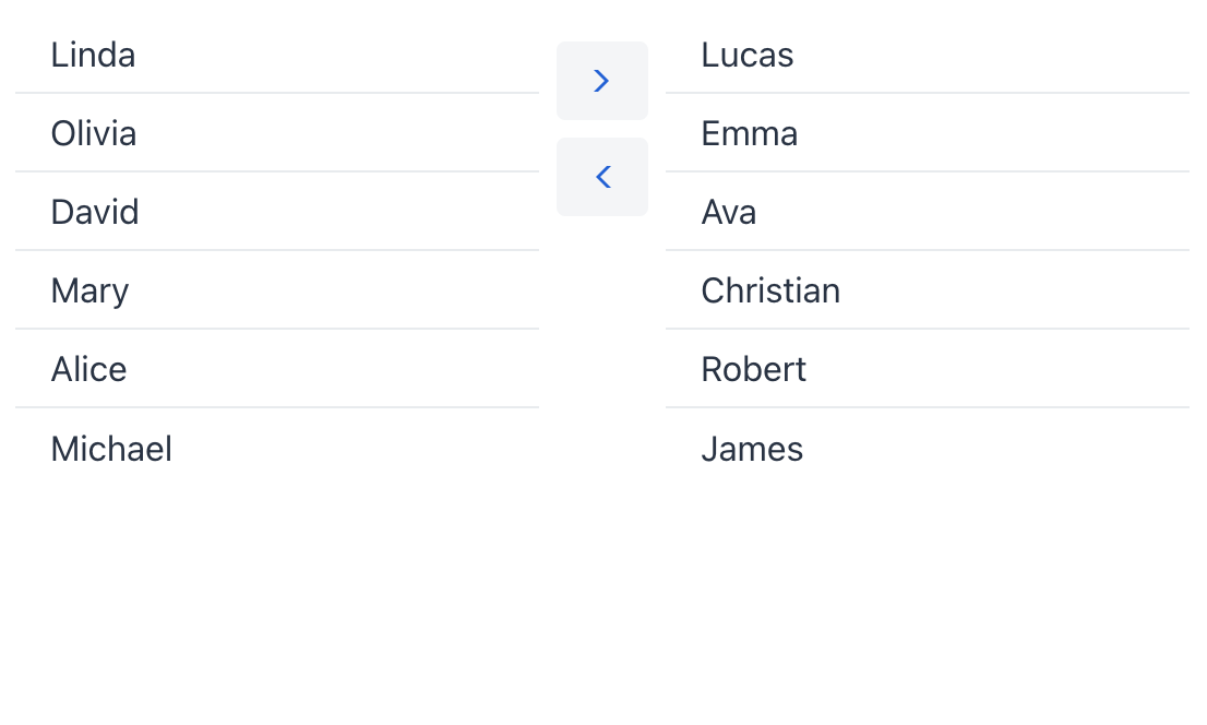
no-border
Removes component’s border.
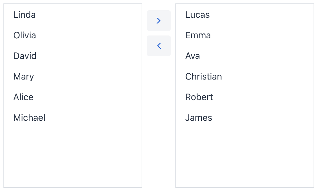
no-row-border
Removes row separators.
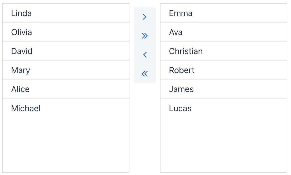
no-space-between-actions
Removes space between action buttons.
| Use a combination of themes separated by comma to change multiple visual aspects at once. |
Attributes
id - alignSelf - ariaLabel - ariaLabelledBy - classNames - colspan - css - dataContainer - enabled - height - helperText - itemsColumnLabel - itemsContainer - label - maxHeight - maxWidth - minHeight - minWidth - property - readOnly - reorderable - required - requiredMessage - selectAllButtonsVisible - selectedItemsColumnLabel - themeNames - visible - width
