radioButtonGroup
radioButtonGroup allows users to select a single value from a predefined list of items using radio buttons.
XML Element |
|
|---|---|
Java Class |
|
Attributes |
id - alignSelf - ariaLabel - ariaLabelledBy - classNames - colspan - css - dataContainer - datatype - enabled - errorMessage - height - helperText - itemsContainer - itemsEnum - label - maxHeight - maxWidth - minHeight - minWidth - property - readOnly - required - requiredMessage - themeNames - visible - width |
Handlers |
AttachEvent - ClientValidatedEvent - ComponentValueChangeEvent - DetachEvent - itemEnabledProvider - itemLabelGenerator - renderer - statusChangeHandler - validator |
Elements |
Basics
The simplest case of using radioButtonGroup is to select an enumeration value for an entity attribute.
<data>
<instance class="com.company.onboarding.entity.User" id="userDc">
<fetchPlan extends="_base"/>
<loader id="userDl"/>
</instance>
</data>
<layout>
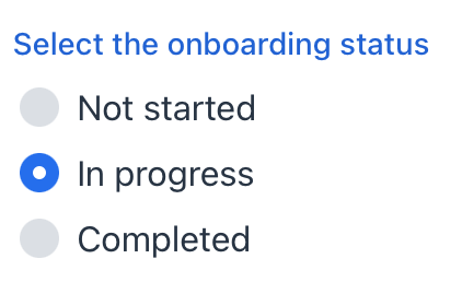
<radioButtonGroup id="statusRadioButtonGroup"
dataContainer="userDc"
property="onboardingStatus"
themeNames="vertical"
label="Select the onboarding status"/>
</layout>In the example above, the User entity has the onboardingStatus attribute of the OnboardingStatus type, which is an enumeration.
Data Binding
radioButtonGroup can fetch a list of items from a data container using the itemsContainer attribute. For example:
<data>
    <collection id="hobbiesDc" class="com.company.onboarding.entity.Hobby">
        <loader id="hobbiesDl" readOnly="true">
            <query>
                <![CDATA[select e from Hobby e]]>
            </query>
        </loader>
        <fetchPlan extends="_base"/>
    </collection>
</data>
<layout>
    <radioButtonGroup id="hobbiesRadioButtonGroup"
                      itemsContainer="hobbiesDc"
                      themeNames="vertical"/>
</layout>
In this case, radioButtonGroup will display instance names of the Hobby entity, located in the hobbiesDc data container, and its getValue() method will return the currently selected entity instance.
Building Items
To set the list of radioButtonGroup items, use the following methods:
Items List
<radioButtonGroup id="radioButtonGroupInt"
                  datatype="int"/>
The setItems() method allows you to specify component items programmatically.
@ViewComponent
private JmixRadioButtonGroup<Integer> radioButtonGroupInt;

@Subscribe
public void onInit(final InitEvent event) {
    radioButtonGroupInt.setItems(1, 2, 3, 4, 5);
}
Items Map
<radioButtonGroup id="ratingRadioButtonGroup"
                  datatype="int"/>
ComponentUtils.setItemsMap() allows you to specify a string label for each item value explicitly.
@ViewComponent
private JmixRadioButtonGroup<Integer> ratingRadioButtonGroup;

@Subscribe
public void onInit(final InitEvent event) {
    Map<Integer, String> map = new LinkedHashMap<>();
    map.put(2, "Poor");
    map.put(3, "Average");
    map.put(4, "Good");
    map.put(5, "Excellent");
    ComponentUtils.setItemsMap(ratingRadioButtonGroup, map);
}
Items Enum
You can use either a declarative or programmatic approach to set the values of an enum as radioButtonGroup items.
The following example demonstrates the declarative approach.
<radioButtonGroup id="radioButtonGroup"
                  itemsEnum="com.company.onboarding.entity.OnboardingStatus"/>
The example below uses the programmatic approach.
@ViewComponent
private JmixRadioButtonGroup<OnboardingStatus> enumRadioButtonGroup;

@Subscribe
public void onInit(final InitEvent event) {
    enumRadioButtonGroup.setItems(OnboardingStatus.class);
}
Item Enabled Provider
itemEnabledProvider allows you to dynamically control the enabled state of individual radio buttons based on specific conditions. Disabled items appear grayed out and cannot be selected by the user. All items are enabled by default.
@Install(to = "radioButtonGroup", subject = "itemEnabledProvider")
private boolean radioButtonGroupItemEnabledProvider(OnboardingStatus onboardingStatus) {
    if (onboardingStatus != null) {
        return onboardingStatus.getId() != 30;
    }
    return true;
}
Customizing Item Labels
itemLabelGenerator allows you to customize how items are displayed in the radioButtonGroup component. This gives you control over the text that users see, enabling you to present information in a more user-friendly or context-specific manner.
@Install(to = "statusRadioButtonGroup", subject = "itemLabelGenerator")
private String statusRadioButtonGroupItemLabelGenerator(
        final OnboardingStatus t) {
    return metadataTools.format(t).toUpperCase();
}
Rendering Items
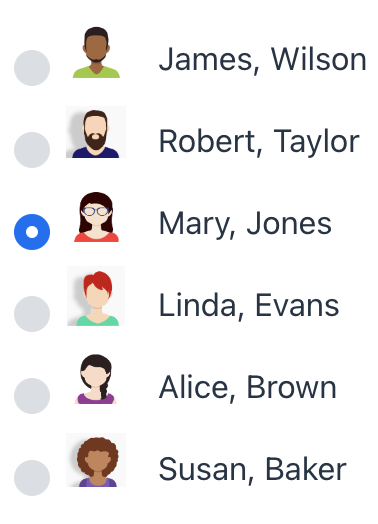
It is possible to customize the render of items. The renderer is applied to each item to create a component which represents the item.
You can use the setRenderer() method or the @Supply annotation for it.
@Autowired
private UiComponents uiComponents;

@Autowired
private FileStorage fileStorage;

@Supply(to = "rbgRenderer", subject = "renderer")
private ComponentRenderer<HorizontalLayout, User> rbgRendererRenderer() {
    return new ComponentRenderer<>(user -> {
        FileRef fileRef = user.getPicture();
        HorizontalLayout row = uiComponents.create(HorizontalLayout.class);
        row.setAlignItems(FlexComponent.Alignment.END);
        if (fileRef != null) {
            Image image = uiComponents.create(Image.class);
            image.setWidth("30px");
            image.setHeight("30px");
            image.setClassName("user-picture");
            StreamResource streamResource = new StreamResource(
                    fileRef.getFileName(),
                    () -> fileStorage.openStream(fileRef));
            image.setSrc(streamResource);
            row.add(image);
        }
        row.add(new Span(user.getFirstName() + ", " + user.getLastName()));
        return row;
    });
}
Alternatively, you can render items using a nested fragmentRenderer element. Refer to the Fragment Renderer section for more information.
Theme Variants
To customize the layout of items and where the helper text shows up, use the themeNames attribute.
Orientation
Items are arranged horizontally by default. To change the layout to vertical, you can use the vertical theme.
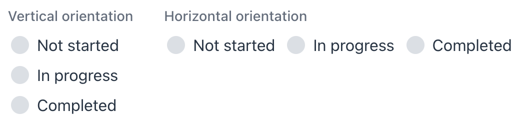
XML code
<radioButtonGroup themeNames="vertical"
                  itemsEnum="com.company.onboarding.entity.OnboardingStatus"
                  label="Vertical orientation"/>
<radioButtonGroup itemsEnum="com.company.onboarding.entity.OnboardingStatus"
                  label="Horizontal orientation"/>
Helper Text Position
Setting helper-above-field will move the helper text from its default position below the field to above it.
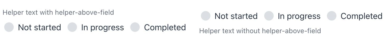
XML code
<radioButtonGroup themeNames="helper-above-field"
                  itemsEnum="com.company.onboarding.entity.OnboardingStatus"
                  helperText="Helper text with helper-above-field"/>
<radioButtonGroup itemsEnum="com.company.onboarding.entity.OnboardingStatus"
                  helperText="Helper text without helper-above-field"/>
Attributes
In Jmix there are many common attributes that serve the same purpose for all components.
The following are attributes specific to radioButtonGroup:
Name |
Description |
Default |
|---|---|---|
Defines the data container holding a list of items. The component displays the instance name of an entity. See Data Binding. |
||
Defines the enumeration class for creating a list of items. See Items Enum. |
Handlers
In Jmix there are many common handlers that are configured in the same way for all components.
The following are handlers specific to radioButtonGroup.
|
To generate a handler stub in Jmix Studio, use the Handlers tab of the Jmix UI inspector panel or the Generate Handler action available in the top panel of the view class and through the Code → Generate menu (Alt+Insert / Cmd+N). |
Name |
Description |
|---|---|
|
|
Allows you to customize the labels displayed for each radio button. See Customizing Item Labels. |
|
Sets the item renderer for this radio button group. See Rendering Items. |
See Also
See the Vaadin Docs for more information.
