UI Constraints
The UI Constraints add-on allows you to control the visibility and accessibility of UI components using declarative policies defined in resource roles.
For example, a button can be made inactive, a data grid can be hidden, and so on.
Any UI component or action can be managed by the UI Constraints, even if the component is not bound to data model and is not affected by entity operation and entity attribute policies. The only condition is that the component must have an ID.
This feature saves you from writing code that analyzes user’s roles or specific permissions and manages the component state in your application views. It also allows you to fine-tune the access control at runtime by editing roles in the Security → Resource roles views.
Installation
|
This add-on requires the Enterprise subscription. If you don’t have the subscription, see the Enterprise Trial section for how to get a trial version. |
For automatic installation through Jmix Marketplace, follow instructions in the Add-ons section.
For manual installation, follow the steps below.
-
Configure access to the premium repository.
-
Add the premium repository to your
build.gradle:repositories { // ... maven { url = 'https://global.repo.jmix.io/repository/premium' credentials { username = rootProject['premiumRepoUser'] password = rootProject['premiumRepoPass'] } } } -
Add premium repository credentials to
~/.gradle/gradle.properties:premiumRepoUser=123456123456 premiumRepoPass=abcdefabcdefGet the repository credentials from your license key: the first part of the key before dash is the repository user name, the part after dash is the password. For example, if your key is
123456123456-abcdefabcdef, then the user name is123456123456and the password isabcdefabcdef.
-
-
Add dependencies to your
build.gradle:implementation 'io.jmix.uiconstraints:jmix-uiconstraints-starter'
Usage
The UI Constraints add-on provides UI component policies that can be specified in resource roles either at development time using annotated Java interfaces or at runtime using the role management views.
The @UiComponentPolicy annotation that is used in Java interfaces is described below.
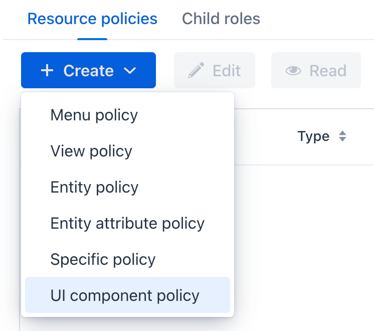
The runtime role editor can be accessed through the Security → Resource roles main menu item. When the UI Constraints add-on is included in the project, the dropdown list of policies will include the UI component policy item:
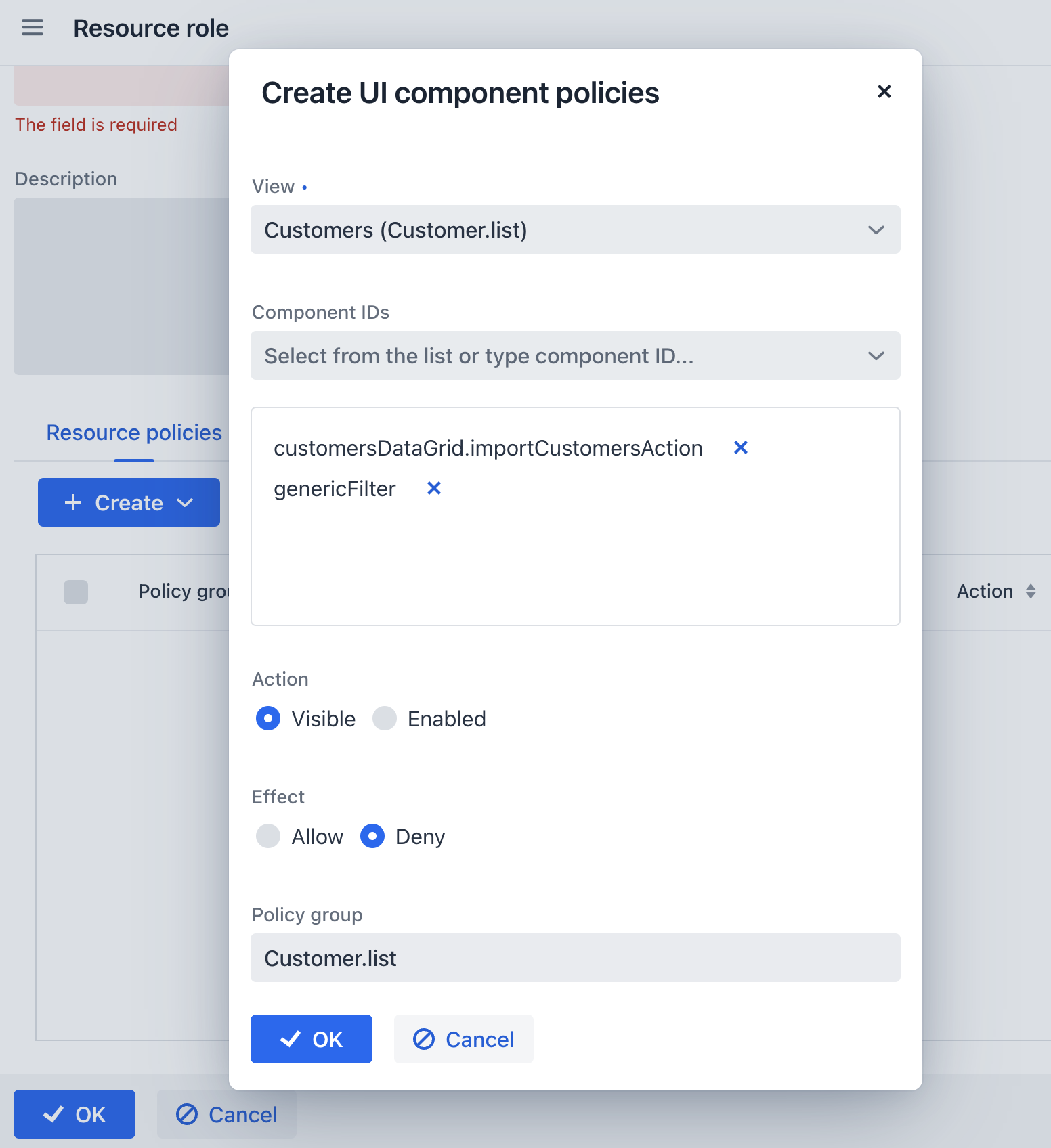
The UI component policy editor allows you to specify a target view, select existing components from a dropdown list and specify the policy action and effect:
Unlike entity and entity attribute policies, the UI component policy is "denying", that is it can only make a UI component or action less visible or accessible than it was before applying the policy. For example, if some entity attribute is visible due to an entity attribute policy, a UI component policy can make the corresponding UI component invisible if it specifies VISIBLE action with DENY effect. See more information about effects below.
UI component policies are applied at the end of the view opening process, after sending the ReadyEvent. By this moment, all view initialization is complete and other policies are applied.
UiComponentPolicy Annotation
The @UiComponentPolicy annotation allows you to define UI constraints in resource role interfaces at development time.
For example:
package com.company.demo.security;

import com.company.demo.view.customer.CustomerDetailView;
import com.company.demo.view.customer.CustomerListView;
import io.jmix.security.role.annotation.ResourceRole;
import io.jmix.uiconstraints.annotation.UiComponentPolicy;
import io.jmix.uiconstraints.annotation.UiComponentPolicyAction;
import io.jmix.uiconstraints.annotation.UiComponentPolicyEffect;

@ResourceRole(name = "EmployeeRole", code = EmployeeRole.CODE, scope = "UI")
public interface EmployeeRole {
    String CODE = "employee-role";

    @UiComponentPolicy(
            viewClass = CustomerListView.class,
            componentIds = {"customersDataGrid.importCustomersAction"},
            action = UiComponentPolicyAction.ENABLED,
            effect = UiComponentPolicyEffect.DENY
    )
    @UiComponentPolicy(
            viewClass = CustomerDetailView.class,
            componentIds = {"commentsPane"},
            action = UiComponentPolicyAction.VISIBLE,
            effect = UiComponentPolicyEffect.DENY
    )
    void customers();
}
Attributes of the @UiComponentPolicy annotation are described below.
viewClass and viewId
UI component policy is defined for components inside a view. The view can be specified either by the viewClass or by the viewId attribute.
componentIds
Each @UiComponentPolicy annotation can define policies for one or more UI components of a view. Their ID must be listed in the componentIds attribute. A policy can be applied to UI components of the following types:
-
A visual component (
textField,button,vbox,div, etc.) of a given view. For example:firstNameField,importButton. -
An action that belongs to a given view. For example:
save. -
An action that belongs to a UI component. For example:
userGrid.edit. -
A component or an action located inside a fragment. For example:
addressFragment.cityField.
action
UI component policy supports two types of actions:
-
VISIBLE- manages the visibility of the component. -
ENABLED- manages the accessibility of the component. If the component supports the read-only state, it will be set to read-only. Otherwise, it will be disabled.
effect
The effect attribute can have two values: ALLOW and DENY.
By default, if no UI component policies are applied, all UI components in the view have their initial visibility and accessibility state. Data-bound components are visible and accessible if a corresponding entity attribute policy exists.
If the DENY effect is specified in a UI component policy, it hides or disables a UI component or action. This is the usual use case for a UI component policy.
The ALLOW effect can be used if you need to override the effect of another UI component policy that has been applied to the same component by a different role. For example, if a user has already been assigned the A role and this role prevents access to a certain UI component, using the B role with the ALLOW effect will restore access to that component.
The ALLOW effect cannot show or enable a component that was hidden or disabled by its initial state or because by the absence of an enabling entity or entity attribute policy.
|
