select
select allows users to choose a single value from a list of items presented in an overlay.
XML Element |
|
|---|---|
Java Class |
|
Attributes |
id - alignSelf - ariaLabel - ariaLabelledBy - autofocus - classNames - colspan - css - dataContainer - datatype - emptySelectionAllowed - emptySelectionCaption - enabled - errorMessage - focusShortcut - height - helperText - itemsContainer - itemsEnum - label - maxHeight - maxWidth - minHeight - minWidth - overlayClass - placeholder - property - readOnly - required - requiredMessage - tabIndex - themeNames - visible - width |
Handlers |
AttachEvent - BlurEvent - ClientValidatedEvent - ComponentValueChangeEvent - DetachEvent - FocusEvent - InvalidChangeEvent - OpenedChangeEvent - itemEnabledProvider - itemLabelGenerator - renderer - statusChangeHandler - textRenderer - validator |
Elements |
Basics
select is similar to comboBox.
Use select when:
-
You don’t need user input and items filtering.
-
The list should be compact. It can be useful when the list of items is too long for radioButtonGroup.
The simplest case of using select is to select a value from an enumeration:
<select itemsEnum="com.company.onboarding.entity.DayOfWeek"
        label="Select the day of week"/>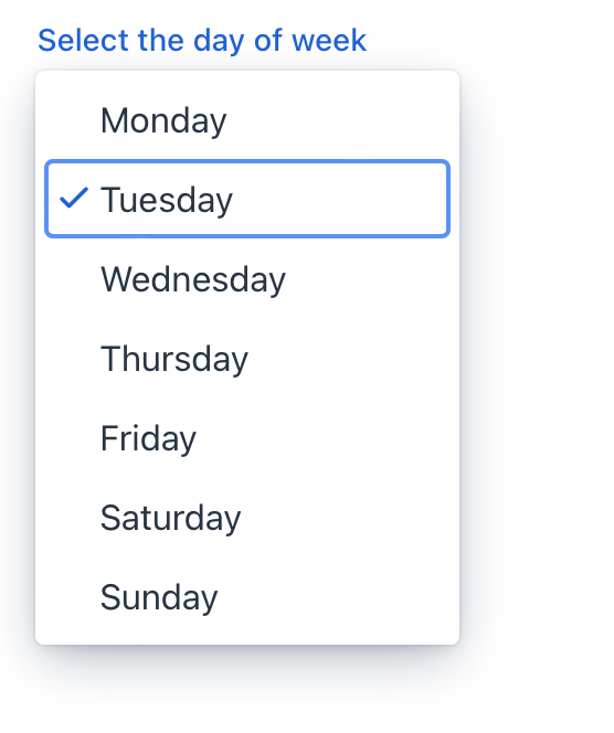
Data Binding
Data binding refers to linking a visual component to a data container. Changes in the visual component or corresponding data container can trigger updates to one another. See Using Data Components for more details.
By default, Jmix Studio generates select when creating an entity detail view with an enum attribute. For example, the User entity has the onboardingStatus attribute of the OnboardingStatus type, which is an enumeration.
<data>
    <instance id="userDc"
              class="com.company.onboarding.entity.User">
        <fetchPlan extends="_base"/>
        <loader id="userDl"/>
    </instance>
</data>
<layout>
    <formLayout id="form" dataContainer="userDc">
        <select id="onboardingStatusField"
                property="onboardingStatus"/>
    </formLayout>
</layout>
The following example demonstrates how to use the select component to select the department the user belongs to:
<data>
    <instance class="com.company.onboarding.entity.User"
              id="userDc"> (1)
        <fetchPlan extends="_base"> (2)
            <property name="department" fetchPlan="_base"/>
        </fetchPlan>
        <loader id="userDl"/>
    </instance>
    <collection class="com.company.onboarding.entity.Department"
                id="departmentsDc"> (3)
        <fetchPlan extends="_base"/>
        <loader id="departmentsDl">
            <query>
                <![CDATA[select e from Department e]]>
            </query>
        </loader>
    </collection>
</data>
<facets>
    <dataLoadCoordinator auto="true"/> (4)
</facets>
<layout>
    <select dataContainer="userDc"
            property="department"
            itemsContainer="departmentsDc"/> (5)
</layout>| 1 | Data container to hold the User instance which is currently being edited. |
| 2 | Fetch plan extended to retrieve a collection of Department instances that will be available for selection. |
| 3 | Data container to hold a collection of all existing Department instances. |
| 4 | Data load coordinator to automatically supply the component with instances to select from. |
| 5 | Binding the component to a data container and property. Specifying a collection of instances for selection using the itemsContainer attribute. |
Building Items
To set the list of select items, use the following methods:
Items List
<select id="selectItems" datatype="int"/>The setItems() method allows you to specify component items programmatically.
@ViewComponent
private JmixSelect<Integer> selectItems;

@Subscribe
public void onInit(final InitEvent event) {
    selectItems.setItems(1, 2, 3, 4, 5);
}
Items Map
<select id="selectMaps" datatype="int"/>ComponentUtils.setItemsMap() allows you to specify a string label for each item value explicitly.
@ViewComponent
private JmixSelect<Integer> selectMaps;

@Subscribe
public void onInit(final InitEvent event) {
    Map<Integer, String> map = new LinkedHashMap<>();
    map.put(2, "Poor");
    map.put(3, "Average");
    map.put(4, "Good");
    map.put(5, "Excellent");
    ComponentUtils.setItemsMap(selectMaps, map);
}
Items Enum
You can use either a declarative or programmatic approach to set the values of an enum as select items.
The following example demonstrates the declarative approach.
<select id="selectEnum"
        itemsEnum="com.company.onboarding.entity.DayOfWeek"/>
The example below uses the programmatic approach.
@ViewComponent
private JmixSelect<DayOfWeek> selectEnum;

@Subscribe
public void onInit(final InitEvent event) {
    selectEnum.setItems(DayOfWeek.class);
}
Disabled Items
Items can be disabled to indicate they are unavailable for selection, but they could be selected under different conditions.
itemEnabledProvider allows you to dynamically control the enabled state of individual items based on specific conditions. Disabled items appear grayed out and cannot be selected by the user. All items are enabled by default.
@Install(to = "select", subject = "itemEnabledProvider")
private boolean selectItemEnabledProvider(final Department department) {
    return department == null || department.getHrManager() != null;
}
Empty Selection Item
The select component offers the ability to display an empty selection item, which is helpful in scenarios where a default value or a "no selection" state is desired.
The emptySelectionAllowed attribute sets whether the user is allowed to select nothing. When set true a special empty item is shown to the user.
The empty selection item can be customized with the emptySelectionCaption attribute.
<select id="sizeSelect"
        emptySelectionAllowed="true"
        emptySelectionCaption="Unknown size"
        datatype="string"/>
The emptySelectionCaption attribute sets the empty selection caption when emptySelectionAllowed = true. The caption is shown for the empty selection item in the drop-down.
When the empty selection item is selected, the select shows the value provided by itemLabelGenerator for the null item, or the string set with the placeholder attribute or an empty string if not placeholder is set.
@Install(to = "sizeSelect", subject = "itemLabelGenerator")
private String sizeSelectItemLabelGenerator(final String t) {
    return t != null ? t : sizeSelect.getEmptySelectionCaption();
}
Customizing Item Labels
itemLabelGenerator allows you to customize how items are displayed in the dropdown list. This gives you control over the text that users see, enabling you to present information in a more user-friendly or context-specific manner.
@Install(to = "customItemsSelect", subject = "itemLabelGenerator")
private String customItemsSelectItemLabelGenerator(final Department t) {
    return t.getHrManager() != null
            ? t.getName() + "[Manager: " + t.getHrManager().getFirstName() +
            " " + t.getHrManager().getLastName() + "]"
            : t.getName();
}
itemLabelGenerator controls both the labels for each item in the dropdown list and the text displayed in the select component’s input field when an item is selected.
textRenderer controls the labels displayed in the dropdown list for each item.
@Install(to = "departmentSelect", subject = "textRenderer")
private String departmentSelectTextRenderer(final Department t) {
    return t.getName() + ", number #" + t.getNum();
}
textRenderer doesn’t affect the text displayed in the select component’s input field after an item is selected.
|
Use when you want to customize the labels shown in the dropdown list. This is helpful for improving clarity, adding additional information, or adapting the labels based on the selected object’s properties.
Rendering Items
It is possible to customize the render of items. The renderer is applied to each item to create a component which represents the item.
You can use the setRenderer() method or the @Supply annotation for it.
@Autowired
private UiComponents uiComponents;

@Supply(to = "selectWithRenderer", subject = "renderer")
private ComponentRenderer<Button, Department> selectWithRendererRenderer() {
    return new ComponentRenderer<>(department -> {
        Button button = uiComponents.create(Button.class);
        button.setText(department.getName());
        button.setIcon(VaadinIcon.DESKTOP.create());
        return button;
    });
}
Alternatively, you can render items using a nested fragmentRenderer element. Refer to the Fragment Renderer section for more information.
Overlay
Overlay is a semi-transparent or opaque layer that is used to create a dropdown list of items.
The overlayClass attribute allows you to add custom CSS classes to the overlay element.
<select itemsEnum="com.company.onboarding.entity.DayOfWeek"
        overlayClass="my-custom-overlay"/>
Define a custom style in your css file:
vaadin-select-overlay.my-custom-overlay::part(overlay){
    background-color: #ecfcf9;
    border-radius: 5px;
}
Theme Variants
Use the themeNames attribute to adjust text alignment, helper text placement, and component size.
Alignment
Choose among three alignment options: align-left (default), align-right, align-center.
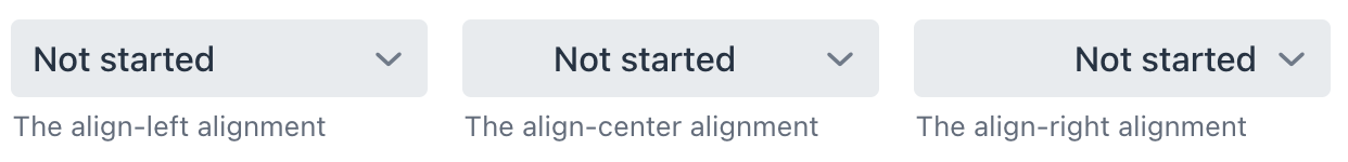
XML code
<select itemsEnum="com.company.onboarding.entity.OnboardingStatus"
        themeNames="align-left"
        helperText="The align-left alignment"/>
<select itemsEnum="com.company.onboarding.entity.OnboardingStatus"
        themeNames="align-center"
        helperText="The align-center alignment"/>
<select itemsEnum="com.company.onboarding.entity.OnboardingStatus"
        themeNames="align-right"
        helperText="The align-right alignment"/>
Helper Text Position
Setting helper-above-field will move the helper text from its default position below the field to above it.
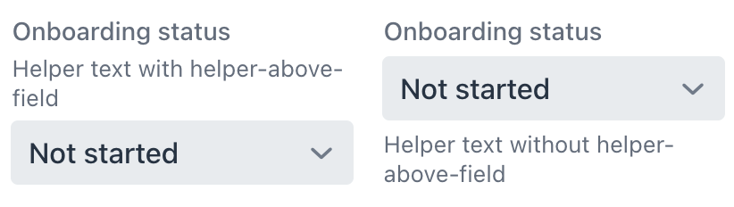
XML code
<select itemsEnum="com.company.onboarding.entity.OnboardingStatus"
        label="Onboarding status"
        helperText="Helper text with helper-above-field"
        themeNames="helper-above-field"/>
<select itemsEnum="com.company.onboarding.entity.OnboardingStatus"
        label="Onboarding status"
        helperText="Helper text without helper-above-field"/>
Size
Two size options are available: the default size and small.
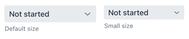
XML code
<select itemsEnum="com.company.onboarding.entity.OnboardingStatus"
        helperText="Default size"/>
<select itemsEnum="com.company.onboarding.entity.OnboardingStatus"
        themeNames="small"
        helperText="Small size"/>
Attributes
In Jmix there are many common attributes that serve the same purpose for all components.
The following are attributes specific to select:
Name |
Description |
Default |
|---|---|---|
Sets whether the user is allowed to select nothing. See Empty Selection Item. |
|
|
Sets the empty selection caption when |
Empty string "" |
|
Defines the data container holding a list of items. The component displays the instance name of an entity. See the second example in Data Binding. |
||
Defines the enumeration class for creating a list of items. See Items Enum. |
||
Defines a space-delimited list of CSS class names to set on the overlay element. See Overlay. |
Handlers
In Jmix there are many common handlers that are configured in the same way for all components.
The following are handlers specific to select.
|
To generate a handler stub in Jmix Studio, use the Handlers tab of the Jmix UI inspector panel or the Generate Handler action available in the top panel of the view class and through the Code → Generate menu (Alt+Insert / Cmd+N). |
Name |
Description |
|---|---|
|
|
|
|
|
|
Allows you to customize the labels displayed for each item. See Customizing Item Labels. |
|
Sets the item renderer for this select group. The renderer is applied to each item to create a component which represents the item option in the select’s drop down. See Rendering Items. |
|
It is a renderer for converting the item to a string. See Customizing Item Labels. |
See Also
See the Vaadin Docs for more information.
