dropdownButton
dropdownButton presents a main button, which, when clicked, reveals a dropdown menu containing a list of items.
XML Element |
|
|---|---|
Java Class |
|
Attributes |
id - alignSelf - classNames - colspan - css - dropdownIndicatorVisible - enabled - focusShortcut - height - icon - maxHeight - maxWidth - minHeight - minWidth - openOnHover - overlayClass - tabIndex - text - themeNames - title - visible - whiteSpace - width |
Handlers |
|
Elements |
Basics
The main button displays the primary text, or icon (or both) for the component. Users click this button to access the dropdown menu.
The dropdown menu contains a list of actions, each represented by a clickable item.
Each item in the dropdown menu can represent an action. When a user clicks on an action, the corresponding event handler is triggered.
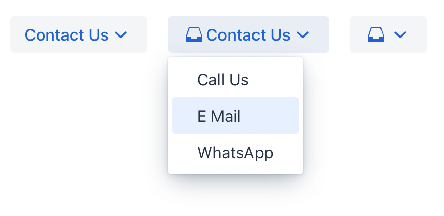
Here’s an example of defining a dropdownButton with a text, an icon and a tooltip (using the title attribute) retrieved from the message bundle:
<dropdownButton icon="MAILBOX" text="Contact Us" title="msg://contact">
    <items>
        <textItem id="callItem" text="Call Us"/>
        <textItem id="emailItem" text="E Mail"/>
        <textItem id="whatsAppItem" text="WhatsApp"/>
    </items>
</dropdownButton>
Elements
dropdownButton defined in the XML descriptor can contain nested elements:
actionItem
The actionItem element creates a link between a dropdown menu item and a specific action that should be executed when that item is clicked.
Use the ref attribute to point to the id of a defined action.
<actions>
    <action id="callAction" text="Call Us" icon="PHONE"/>
</actions>
<layout>
    <dropdownButton icon="MAILBOX" title="msg://contact" id="callBtn">
        <items>
            <actionItem id="callUsItem" ref="callAction"/>
        </items>
    </dropdownButton>
</layout>
When a user clicks on an actionItem in the dropdown, Jmix automatically triggers the action referenced by the ref attribute. Generate an ActionPerformedEvent handler method for this action. Add the logic to it:
@Subscribe("callAction")
public void onCallAction(final ActionPerformedEvent event) {
    notifications.show("Phone number: +6(876)5463");
}
componentItem
The componentItem element allows you to define custom inner content for dropdownButton.
<layout>
    <dropdownButton icon="MAILBOX" title="msg://contact" id="callBtn">
        <items>
            <componentItem id="emailIt">
                <hbox padding="false">
                    <icon icon="MAILBOX"/>
                    <span text="E Mail"/>
                </hbox>
            </componentItem>
        </items>
    </dropdownButton>
</layout>
You can generate a DropdownButtonItem.ClickEvent handler stub for componentItem using Jmix Studio.
@Subscribe("callBtn.emailIt")
public void onEmailItClick(final DropdownButtonItem.ClickEvent event) {
    notifications.show("Email: test@river.net");
}
textItem
The textItem element holds text.
<layout>
    <dropdownButton icon="MAILBOX" title="msg://contact" id="callBtn">
        <items>
            <textItem id="whatsAppIt" text="WhatsApp"/>
        </items>
    </dropdownButton>
</layout>
You can generate a DropdownButtonItem.ClickEvent handler stub for textItem using Jmix Studio.
@Subscribe("callBtn.whatsAppIt")
public void onCallBtnWhatsAppItClick(final DropdownButtonItem.ClickEvent event) {
    notifications.show("`WhatsApp: +6(876)5463");
}Theme Variants
The themeNames attribute allows you to assign a specific button style from the set of predefined variants.
-
Importance variants:
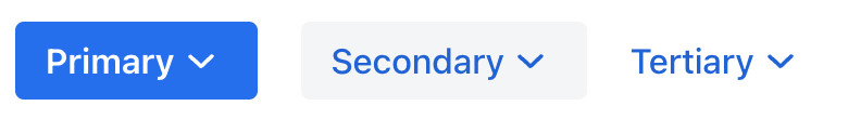
<dropdownButton text="Primary" themeNames="primary"/> <dropdownButton text="Secondary"/> <dropdownButton text="Tertiary" themeNames="tertiary-inline"/> -
Danger or error variants:
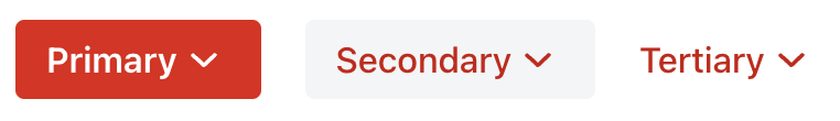
<dropdownButton text="Primary" themeNames="primary, error"/> <dropdownButton text="Secondary" themeNames="error"/> <dropdownButton text="Tertiary" themeNames="tertiary-inline, error"/> -
Success variants:
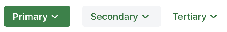
<dropdownButton text="Primary" themeNames="primary, success"/> <dropdownButton text="Secondary" themeNames="success"/> <dropdownButton text="Tertiary" themeNames="tertiary-inline, success"/> -
Contrast variants:

<dropdownButton text="Primary" themeNames="primary, contrast"/> <dropdownButton text="Secondary" themeNames="contrast"/> <dropdownButton text="Tertiary" themeNames="tertiary-inline, contrast"/> -
Size variants:

<dropdownButton text="Large" themeNames="large"/>
<dropdownButton text="Normal"/>
<dropdownButton text="Small" themeNames="small"/>
The variant theme names are defined in the DropdownButtonVariant class. See also Vaadin Docs for more information about button styles.
Attributes
In Jmix there are many common attributes that serve the same purpose for all components.
The following are attributes specific to dropdownButton:
Name |
Description |
Default |
|---|---|---|
Sets the visibility of the dropdown indicator. |
|
|
If the |
|
