checkbox
checkbox is a component with two states: selected or deselected.
XML Element |
|
|---|---|
Java Class |
|
Attributes |
id - alignSelf - ariaLabel - ariaLabelledBy - autofocus - classNames - clickShortcut - colspan - css - dataContainer - enabled - focusShortcut - height - indeterminate - label - maxHeight - maxWidth - minHeight - minWidth - property - readOnly - tabIndex - value - visible - width |
Handlers |
AttachEvent - BlurEvent - ClickEvent - ComponentValueChangeEvent - DetachEvent - FocusEvent |
Elements |
Data Binding
Data binding refers to linking a visual component to a data container. Changes in the visual component or corresponding data container can trigger updates to one another. See Using Data Components for more details.
The following example produces a data-aware checkbox. The entity attribute must be of Boolean type.
<data>
    <instance id="userDc"
              class="com.company.onboarding.entity.User"> (1)
        <fetchPlan extends="_base"/> (2)
        <loader/>
    </instance>
</data>
<layout>
    <checkbox id="checkbox"
              label="Active"
              dataContainer="userDc"
              property="active"/> (3)
</layout>| 1 | InstanceContainer for the User entity. |
| 2 | Inline fetch plan of the entity instance located in the container. |
| 3 | Binding the component to a data container and property. The dataContainer attribute contains a link to the userDc data container, and the property attribute refers to the active entity attribute. |
States
checkbox can exist in several states that define its visual appearance and functionality.
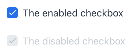
Enabled
-
Enabled: The checkbox is interactive and responsive to user input. Users can click on it to change its state.
-
Disabled: The checkbox is inactive and cannot be interacted with by the user. Visually, it is often grayed out to indicate its inactive state.
XML code
<checkbox label="The enabled checkbox"
          value="true"
          enabled="true"/>
<checkbox label="The disabled checkbox"
          enabled="false"
          value="true"/>
Read-only
The readOnly attribute controls whether the checkbox component can be interacted with by the user. If set to true, checkbox becomes read-only, meaning the user cannot change its state.
XML code
<checkbox label="The readOnly checkbox"
          value="true"
          readOnly="true"/>
<checkbox label="The editable checkbox"
          readOnly="false"
          value="true"/>
Indeterminate
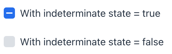
The indeterminate attribute controls whether checkbox is in an indeterminate state. This state represents a situation where checkbox is neither fully checked nor fully unchecked.
Visually, it changes the checkbox’s appearance to indicate an indeterminate state.
| As according to the HTML5 standard, this has only effect on the visual appearance, not on the checked value. |
XML code
<checkbox label="With indeterminate state = true"
          value="false"
          indeterminate="true"/>
<checkbox label="With indeterminate state = false"
          indeterminate="false"
          value="false"/>
Click Events
The com.vaadin.flow.component.ClickEvent is fired when the component is clicked. This handler must specify one of the following three subjects to detect the number of clicks related to the event.
-
click - fires the event whenever the component is clicked.
-
singleClick - fires the event after a timeout to ensure it is not a double click.
-
doubleClick - fires the event when the component is double-clicked.
For example:
com.vaadin.flow.component.ClickEvent is sent when the user clicks checkbox.
@Autowired
private Notifications notifications;

@Subscribe(id = "checkbox", subject = "clickListener")
public void onCheckboxClick(final ClickEvent<JmixCheckbox> event) {
    if (event.getSource().getValue()){
        notifications.show("Set");
    } else {
        notifications.show("Not set");
    }
}
Attributes
In Jmix there are many common attributes that serve the same purpose for all components.
The following are attributes specific to checkbox:
Name |
Description |
Default |
|---|---|---|
Sets the component explicitly disabled or enabled. See Enabled State. |
|
|
Set the indeterminate state of |
|
|
Specifies whether the |
|
Handlers
In Jmix there are many common handlers that are configured in the same way for all components.
The following are handlers specific to checkbox.
|
To generate a handler stub in Jmix Studio, use the Handlers tab of the Jmix UI inspector panel or the Generate Handler action available in the top panel of the view class and through the Code → Generate menu (Alt+Insert / Cmd+N). |
Name |
Description |
|---|---|
The |
See Also
See the Vaadin Docs for more information.
