multiSelectComboBox
multiSelectComboBox allows users to choose one or more items from a drop-down list. This component is similar to comboBox.
XML Element |
|
|---|---|
Java Class |
|
Attributes |
id - alignSelf - allowCustomValue - allowedCharPattern - ariaLabel - ariaLabelledBy autoExpand - autoOpen - autofocus - classNames - clearButtonVisible - colspan - css - dataContainer - enabled - errorMessage - focusShortcut - height - helperText - itemsContainer itemsEnum - label - maxHeight - maxWidth - metaClass - minHeight - minWidth - opened - overlayClass - pageSize - placeholder - property - readOnly - required - requiredMessage - selectedItemsOnTop - tabIndex - themeNames - title - visible - width |
Handlers |
AttachEvent - BlurEvent - ClientValidatedEvent - ComponentValueChangeEvent - CustomValueSetEvent - DetachEvent - FocusEvent - TypedValueChangeEvent - itemLabelGenerator - itemsFetchCallback - renderer - validator |
Elements |
Basics
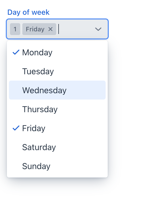
The drop-down list opens when the user clicks the field using a pointing device. Using the Up and Down keys or typing a character when the field is focused also opens the drop-down list.
<multiSelectComboBox itemsEnum="com.company.onboarding.entity.DayOfWeek"
                     label="Day of week"/>
Data Binding
Data binding refers to linking a visual component to a data container. Changes in the visual component or corresponding data container can trigger updates to one another. See Using Data Components for more details.
To create multiSelectComboBox connected to data, use the dataContainer and property attributes. The itemsContainer attribute is used to create a list of items. The following example produces a data-aware multiSelectComboBox.
<data>
    <instance class="com.company.onboarding.entity.User" id="userDc"> (1)
        <fetchPlan extends="_base"> (2)
            <property name="hobbies" fetchPlan="_base"/>
        </fetchPlan>
        <loader id="userDl"/>
    </instance>
    <collection class="com.company.onboarding.entity.Hobby" id="hobbiesDc"> (3)
        <fetchPlan extends="_base"/>
        <loader id="hobbiesDl">
            <query>
                <![CDATA[select e from Hobby e]]>
            </query>
        </loader>
    </collection>
</data>
<layout>
    <multiSelectComboBox dataContainer="userDc"
                         property="hobbies"
                         label="Hobbies"
                         itemsContainer="hobbiesDc"/> (4)
</layout>| 1 | InstanceContainer for the User entity. |
| 2 | Inline fetch plan of the entity instance located in the container. |
| 3 | CollectionContainer for the Hobby entity. |
| 4 | multiSelectComboBox gets hobbiesDc as an items container so that the list of hobbies drop-downs. |
The component’s value returns the list of selected items.
MultiSelectComboBox with MetaClass
You can use multiSelectComboBox without directly referencing data, meaning you don’t need to specify dataContainer or property attributes. In this case, use the metaClass attribute to specify the entity type for multiSelectComboBox. To specify a collection of instances for selection use the itemsContainer attribute.
For example, the component can work with the Hobby entity, which has the metadata class name Hobby.
<multiSelectComboBox metaClass="Hobby"
itemsContainer="hobbiesDc"/>Auto Expand
You can configure multiSelectComboBox to automatically expand its width to accommodate chips representing selected items. Expansion only works with undefined size in the desired direction (for example, setting max-width limits the component’s width). Possible values:
-
VERTICAL- field expands vertically and chips wrap.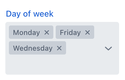
-
HORIZONTAL- field expands horizontally until max-width is reached, then collapses to overflow chip.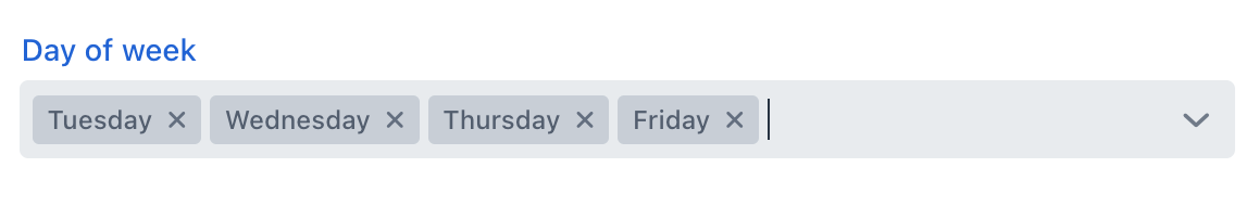
-
BOTH- field expands horizontally until max-width is reached, then expands vertically and chips wrap.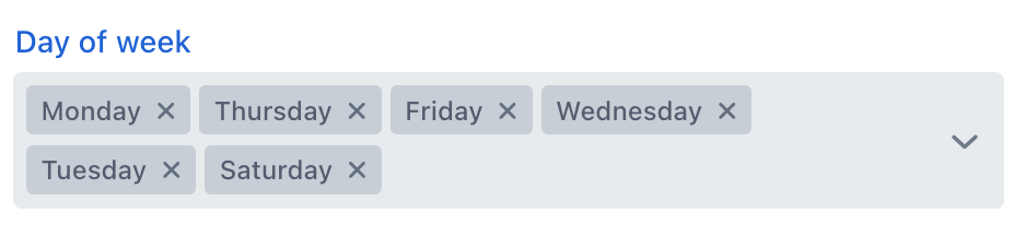
-
NONE- field does not expand and collapses to overflow chip.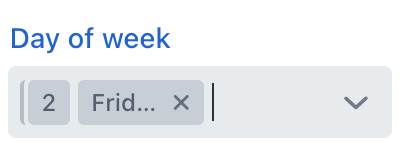
Selected Items on Top
The selectedItemsOnTop attribute controls how selected items are displayed in the overlay.
Here’s how it works:
-
If
selectedItemsOnTopis set totrue, selected items are displayed at the top of the overlay, while unselected items remain at the bottom. This arrangement can be visually appealing and intuitive, particularly if users frequently select a subset of items and need quick access to the most recently selected ones. -
If
selectedItemsOnTopis set tofalse(the default value), selected items are displayed in the order they were selected, without being moved to the top of the overlay. This arrangement maintains the order of selection and can be preferred in scenarios where order is crucial or if visual consistency with other UI elements is important.
Items Fetch Callback
multiSelectComboBox can load items in batches in response to user input.
For example, when the user enters foo, the component loads from the database at most 50 items having foo in the name and shows them the dropdown. When the user scrolls down the list, the component fetches the next batch of 50 items with the same query and adds them to the list.
Declarative Configuration
To implement this behavior, define the itemsQuery nested element.
The itemsQuery element should contain the JPQL query text in the nested query element and a few additional attributes specifying what and how to load data:
-
escapeValueForLike- enables searching for the values that contain special symbols:%,\, etc. The default value isfalse. -
searchStringFormat- a string that contains a variable placeholder, which is subsequently replaced with an actual value. -
class(optional) - specifies a full qualified name of the entity class which instances will be fetched. -
fetchPlan- an optional attribute that specifies the fetch plan to be used for loading the queried entity.
The itemsQuery element has the following nested elements:
-
query- an element that contains a JPQL query. -
fetchPlan- an optional descriptor of inline fetch plan.
Example of itemsQuery in multiSelectComboBox:
<multiSelectComboBox metaClass="Hobby"
                     label="Hobby"
                     pageSize="30"> (1)
    <itemsQuery class="com.company.onboarding.entity.Hobby"
                escapeValueForLike="true"
                searchStringFormat="(?i)%${inputString}%">
        <fetchPlan extends="_base"/>
        <query>
            <![CDATA[select e from Hobby e where e.name
            like :searchString escape '\' order by e.name]]>
        </query>
    </itemsQuery>
</multiSelectComboBox>| 1 | The pageSize attribute of the component defines the batch size when loading data from the database. It is 50 by default. |
Programmatic Configuration
Items fetching can also be defined programmatically using the itemsFetchCallback handler. For example:
@Autowired
protected DataManager dataManager;

protected Collection<Hobby> hobbies;

@Subscribe
public void onInit(final InitEvent event) {
    hobbies = dataManager.load(Hobby.class).all().list();
}

@Install(to = "hobbiesComboBox", subject = "itemsFetchCallback")
private Stream<Hobby> hobbiesComboBoxItemsFetchCallback(final Query<Hobby, String> query) {
    String enteredValue = query.getFilter()
            .orElse("");

    return hobbies.stream()
            .filter(hobby -> hobby.getName() != null &&
                    hobby.getName().toLowerCase().contains(enteredValue.toLowerCase()))
            .skip(query.getOffset())
            .limit(query.getLimit());
}
In this example, data is fetched using DataManager, but you can use this approach to load from a custom service as well.
Attributes
In Jmix there are many common attributes that serve the same purpose for all components.
The following are attributes specific to multiSelectComboBox:
Name |
Description |
Default |
|---|---|---|
Controls how the component behaves when there isn’t enough space to display all selected items as chips within the current field width. See Auto Expand. |
|
|
Defines an entity class for |
||
Sets whether the drop-down list should be opened or not. |
|
|
Enables or disables grouping of the selected items at the top of the overlay. See Selected Items on Top. |
|
Handlers
In Jmix there are many common handlers that are configured in the same way for all components.
The following are handlers specific to multiSelectComboBox.
|
To generate a handler stub in Jmix Studio, use the Handlers tab of the Jmix UI inspector panel or the Generate Handler action available in the top panel of the view class and through the Code → Generate menu (Alt+Insert / Cmd+N). |
Name |
Description |
|---|---|
|
|
This handler only fetches data when it’s needed. See Items Fetch Callback. |
|
Sets the |
See Also
See the Vaadin Docs for more information.
