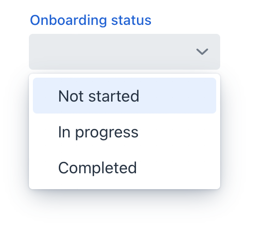
comboBox
comboBox allows users to select a single item from a drop-down list.
-
XML element:
comboBox -
Java class:
JmixComboBox
Basics
Use comboBox if:
-
Users need to select a single item.
-
The list should be compact. It can be useful when the list of items is too long for radioButtonGroup.
By default, Jmix Studio generates comboBox when creating an entity detail view with an enum attribute. For example, the User entity has the onboardingStatus attribute of the OnboardingStatus type, which is an enumeration.

In the comboBox element, the dataContainer attribute contains a link to the userDc data container, and the property attribute refers to the onboardingStatus entity attribute. In this case, the entity attribute is an enumeration, and the drop-down list displays localized names of all enumeration values.
<data>
    <instance class="com.company.onboarding.entity.User" id="userDc">
        <fetchPlan extends="_base"/>
        <loader id="userDl"/>
    </instance>
</data>
<layout>
    <comboBox id="comboBox"
              dataContainer="userDc"
              property="onboardingStatus"
              label="Onboarding status"/>
</layout>
Custom Items
You can specify the list of comboBox items using the setItems() method.
First, declare a component in the XML descriptor:
<data>
    <instance class="com.company.onboarding.entity.Step" id="stepDc">
        <fetchPlan extends="_base"/>
        <loader id="stepDl"/>
    </instance>
</data>
<layout>
    <comboBox id="durationComboBox"
              dataContainer="stepDc"
              property="duration"/>
</layout>
Then inject the component into the controller and specify a list of items in the onInit() method:
@ViewComponent
private JmixComboBox<Integer> durationComboBox;

@Subscribe
public void onInit(InitEvent event) {
    durationComboBox.setItems(new ArrayList<>(Arrays.asList(1,2,3,4,5)));
}
In the component’s drop-down list, the values 1, 2, 3, 4 and 5 will be displayed. The selected value will be put into the duration attribute of an entity located in the stepDc data container.
Validation
To check values entered into the comboBox component, you can use a validator in a nested validators element.
The following predefined validators are available for comboBox:
Attributes
id - allowCustomValue - autoOpen - autofocus - classNames - clearButtonVisible - colspan - dataContainer - enabled - errorMessage - height - helperText - invalid - itemsEnum - label - maxHeight - maxWidth - minHeight - minWidth - pageSize - pattern - placeholder - property - readOnly - required - requiredIndicatorVisible - requiredMessage - tabIndex - themeNames - title - visible - width
allowCustomValue
If the allowCustomValue attribute is true, the user can input string values that do not match to any existing item labels, which will fire CustomValueSetEvent.
Note that comboBox doesn’t do anything with the custom value string automatically. Use CustomValueSetEvent to determine how the custom value should be handled.
Default is false.
autoOpen
If the autoOpen attribute is true, the comboBox drop-down list is opened automatically when the field is focused using a mouse or touch, or when the user types in the field.
Set to false to disable this behaviour.
itemsEnum
Defines the enumeration class for creating a list of items. The drop-down list will show localized names of enum values; the component’s value will be an enum value.
<comboBox label="Onboarding status"
itemsEnum="com.company.onboarding.entity.OnboardingStatus"/>Handlers
AttachEvent - BlurEvent - ComponentValueChangeEvent - CustomValueSetEvent - DetachEvent - FocusEvent - itemLabelGenerator - statusChangeHandler - validator
|
To generate a handler stub in Jmix Studio, use the Handlers tab of the Jmix UI inspector panel or the Generate Handler action available in the top panel of the view class and through the Code → Generate menu (Alt+Insert / Cmd+N). |
CustomValueSetEvent
com.vaadin.flow.component.combobox.ComboBoxBase.CustomValueSetEvent is fired when the user enters a non-empty value that does not match any of the existing items. To enable input custom values, set the allowCustomValue attribute to true.
<comboBox id="colorComboBox"
          label="Select the color"
          allowCustomValue="true"/>
@ViewComponent
private JmixComboBox<String> colorComboBox;
@Subscribe
public void onInit(InitEvent event) {
colorComboBox.setItems(new ArrayList<>
(Arrays.asList("White", "Red", "Blue", "Grey")));
}
@Subscribe("colorComboBox")
public void onColorComboBoxCustomValueSet(CustomValueSetEvent<ComboBox<String>> event) {
colorComboBox.setValue(event.getDetail());
}See Also
See the Vaadin Docs for more information.
