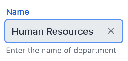
textField
An input field for editing text or values of arbitrary data types.
-
XML element:
textField -
Java class:
TypedTextField
Basics
The textField component is a typed component, which means it enables you to work with input of different data types. You can set its type by binding the component to an entity attribute of certain type or by setting type explicitly using the datatype attribute.
<textField id="nameField"
           label="Name"
           datatype="string"
           clearButtonVisible="true"
           themeNames="always-float-label"
           helperText="msg://textField.helper" placeholder="Test placeholder"/>
Additional methods to work with typed values include setTypedValue() and getTypedValue(). These methods are useful when you need to set or retrieve values of specific type, such as Integer or Long.
When processing changes to the component’s values, it is recommended to use TypedValueChangeEvent instead of ComponentValueChangeEvent. This approach ensures that the value is of the correct type and avoids the need for additional type conversions or checks.
Data Binding
To create textField connected to data, use dataContainer and property attributes.
<data>
    <instance class="com.company.onboarding.entity.Department"
              id="departmentDc">
        <fetchPlan extends="_base"/>
        <loader id="departmentDl"/>
    </instance>
</data>
<layout>
    <textField dataContainer="departmentDc"
               property="name"/>
</layout>
In the example above, the view describes the departmentDc data container for the Department entity, which has the name attribute. The textField component has a link to the container specified in the dataContainer attribute; the property attribute contains the name of the entity attribute that is displayed in textField.
Theme Variants
Use the themeNames attribute to adjust text alignment, helper text placement, and component size.
Alignment
Choose among three alignment options: align-left (default), align-right, align-center.

XML code
<textField themeNames="align-left"/>
<textField themeNames="align-center"/>
<textField themeNames="align-right"/>Attributes
id - alignSelf - allowedCharPattern - ariaLabel - ariaLabelledBy - autocapitalize - autocomplete - autocorrect - autofocus - autoselect - classNames - clearButtonVisible - colspan - css - dataContainer - datatype - enabled - errorMessage - focusShortcut - height - helperText - label - maxHeight - maxLength - maxWidth - minHeight - minLength - minWidth - pattern - placeholder - property - readOnly - required - requiredMessage - themeNames - title - value - valueChangeMode - valueChangeTimeout - visible - width
autoselect
Set to true to always have the field value automatically selected when the field gains focus, false otherwise.
value
Defines the value of textField.
If the value cannot be parsed to a required data type, the default conversion error message appears.
Handlers
AttachEvent - BlurEvent - ClientValidatedEvent - ComponentValueChangeEvent - CompositionEndEvent - CompositionStartEvent - CompositionUpdateEvent - DetachEvent - FocusEvent - InputEvent - KeyDownEvent - KeyPressEvent - KeyUpEvent - statusChangeHandler - TypedValueChangeEvent - validator
|
To generate a handler stub in Jmix Studio, use the Handlers tab of the Jmix UI inspector panel or the Generate Handler action available in the top panel of the view class and through the Code → Generate menu (Alt+Insert / Cmd+N). |
validator
Adds a validator instance to the component. The validator must throw ValidationException if the value is not valid.
@Install(to = "zipField", subject = "validator")
protected void zipFieldValidator(Integer value) {
    if (value != null && String.valueOf(value).length() != 6)
        throw new ValidationException("Zip must be of 6 digits length");
}See Also
See the Vaadin Docs for more information.


