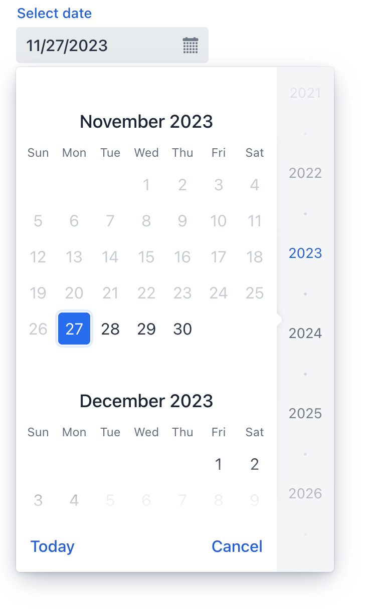
datePicker
datePicker lets users enter a date by typing or select it using a calendar overlay.
-
XML element:
datePicker -
Java class:
TypedDatePicker
Basics
Unlike a regular input field, datePicker has a calendar button and a calendar overlay. The calendar opens when the user clicks the button or the field itself, or starts entering a date.

The calendar is scrollable and allows selecting a year in the right pane. Click Today at the bottom to navigate back to the current date.
The following example defines a datePicker with a label:
<datePicker label="Select date"/>Data Types
datePicker is a typed component which supports common data types for storing a date:
-
date -
dateTime -
localDateTime -
offsetDateTime -
localDate
When you bind the component to an entity attribute, it will automatically assume the data type of that attribute. To set the type explicitly, use the datatype attribute.
Data Binding
Data binding refers to linking a visual component to a data container. Changes in the visual component or corresponding data container can trigger updates to one another. See Using Data Components for more details.
The following example produces a data-aware datePicker:
<datePicker dataContainer="userStepDc" property="dueDate"/>Date Format
The default date and time format in the application is defined by the localized format strings. To use a different format, add your own format strings to the message bundle.
To change the format for a particular component, use its dateFormat attribute.
Date Range
To restrict the input to a specific date range, specify the minimum and maximum dates using the max and min attributes:
<datePicker id="datePicker" min="2024-01-01" max="2024-12-31"/>Or specify an adaptable data range within the view controller:
@ViewComponent
private TypedDatePicker<Comparable> datePicker;

@Subscribe
public void onInit(InitEvent event) {
    datePicker.setMin(LocalDate.now());
    datePicker.setMax(LocalDate.now().plusDays(7));
}
Theme Variants
Use the themeNames attribute to adjust date alignment, helper text placement, and component size.
Alignment
Choose among three alignment options: align-left (default), align-right, align-center.

XML code
<datePicker themeNames="align-left"/>
<datePicker themeNames="align-center"/>
<datePicker themeNames="align-right"/>Validation
To check values entered into datePicker, add a validator element. This allows adding a custom validation criterion or select one of the following predefined validators:
This example demonstrates how to use the FutureValidator to ensure that the selected date is in the future:
<datePicker label="Select a future date"
            datatype="date">
    <validators>
        <future/>
    </validators>
</datePicker>
Attributes
id - alignSelf - allowedCharPattern - ariaLabel - ariaLabelledBy - autoOpen - classNames - clearButtonVisible - colspan - css - dataContainer - datatype - dateFormat - enabled - errorMessage - focusShortcut - height - helperText - label - max - maxHeight - maxWidth - min - minHeight - minWidth - name - opened - overlayClass - placeholder - property - readOnly - required - requiredMessage - tabIndex - themeNames - visible - weekNumbersVisible - width
Handlers
AttachEvent - BlurEvent - ClientValidatedEvent - ComponentValueChangeEvent - DetachEvent - FocusEvent - InvalidChangeEvent - OpenedChangeEvent - TypedValueChangeEvent - statusChangeHandler - validator
|
To generate a handler stub in Jmix Studio, use the Handlers tab of the Jmix UI inspector panel or the Generate Handler action available in the top panel of the view class and through the Code → Generate menu (Alt+Insert / Cmd+N). |
ClientValidatedEvent
ClientValidatedEvent is sent by the web component whenever it is validated on the client-side.
InvalidChangeEvent
com.vaadin.flow.component.datepicker.DatePicker.InvalidChangeEvent is sent when the value of the invalid attribute of the component changes.
OpenedChangeEvent
OpenedChangeEvent is sent every time the opened attribute of the component changes. That is, when the calendar is opened or closed.
validator
Adds a validator instance to the component. The validator must throw ValidationException if the value is not valid. For example:
@Install(to = "birthDatePicker", subject = "validator")
private void birthDatePickerValidator(Date date) {
        Date now = timeSource.currentTimestamp();
        if (date != null && DateUtils.addYears(now,-18).compareTo(date) < 0) {
            throw new ValidationException("The age must be over 18 years");
        }
}See Also
See Vaadin Docs for more information.


