richTextEditor
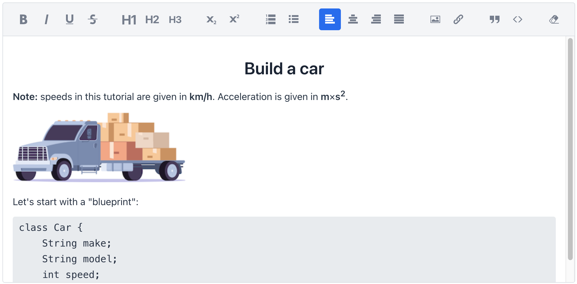
An area to input text with rich formatting. It supports a variety of formatting options such as bold, italics, underlining, text alignment along with adding links, images, code blocks and more, to make text visually appealing and well-structured.
-
XML element:
richTextEditor -
Java class:
JmixRichTextEditor
Basics
To add the component on a view, place it in the view descriptor:
<richTextEditor id="richTextEditor"/>Users can type and edit text using actions in the toolbar.

Unless set to a fixed size, the component will automatically adjust both its height and width to fit the content entered by the user.
Toolbar Actions
The component provides set of text formatting and editing capabilities that are available in the toolbar.

-
Formatting: apply bold, italic, underscore, or strikethrough to selected text.
-
Levels of heading.
-
Subscript and superscript.
-
Ordered or bulleted lists.
-
Alignment: align selected text to the left, center, right, or justified.
-
Attachment: insert images or embed links.
-
Blocks: add blockquote or code block.
-
Clean formatting: click to remove all formatting.
HTML Input
In addition to user input, text can also be programmatically entered into the component. This can be plain text or text formatted with standard HTML tags.
@ViewComponent
private RichTextEditor richTextEditor;
@Subscribe
public void onInit(final InitEvent event) {
    richTextEditor.setValue("<i>Jackdaws </i><u>love</u> " +
            "my <b>big</b> <sup>sphinx</sup> of " +
            "<span style=\"background-color:red;\">quartz</span>");
}
Data Binding
The component can display the content of an entity’s attribute, which may be plain text or text formatted with standard HTML tags.
To bind richTextEditor to an entity attribute:
-
Set the name of the data container to as the dataContainer attribute value.
-
Set the name of an attribute as the property attribute value.
Theme Variants
The component’s appearance is customizable with the themeNames attribute, which allows you to select between two different options:
compact

no-border

| Use both themes at once to get a compact editor with no borders. |
Attributes
id - alignSelf - ariaLabel - ariaLabelledBy - classNames - colspan - css - dataContainer - enabled - height - helperText - label - maxHeight - maxWidth - minHeight - minWidth - property - readOnly - themeNames - valueChangeMode - visible - width
Handlers
AttachEvent - DetachEvent - ComponentValueChangeEvent - CompositionStartEvent - CompositionUpdateEvent - CompositionEndEvent - KeyDownEvent - KeyPressEvent - InputEvent
|
To generate a handler stub in Jmix Studio, use the Handlers tab of the Jmix UI inspector panel or the Generate Handler action available in the top panel of the view class and through the Code → Generate menu (Alt+Insert / Cmd+N). |
