listMenu
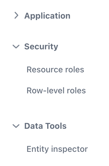
listMenu is a component for displaying a vertical menu with a collapsible drop-down sub-menus.
XML Element |
|
|---|---|
Java Class |
|
Attributes |
id - alignSelf - classNames - colspan - css - height - loadMenuConfig - maxHeight - maxWidth - minHeight - minWidth - themeNames - visible - width |
Handlers |
Basics
listMenu, together with drawerToggle and drawerLayout, is used in the MainView.
listMenu allows you to customize the main view, manage menu items, and apply custom styles.
It can also be used on any view as any other visual component.
To add the component on a view, place it in the view descriptor:
<listMenu id="listMenu"/>
You can also create and add the component to a view in a Java controller:
@ViewComponent
private VerticalLayout navigation;
@Autowired
private UiComponents uiComponents;
@Autowired
private ApplicationContext applicationContext;

@Subscribe
public void onInit(final InitEvent event) {
    JmixListMenu listMenu = uiComponents.create(JmixListMenu.class);

    MenuConfigListMenuItemProvider itemProvider =
            applicationContext.getBean(MenuConfigListMenuItemProvider.class);
    listMenu.setMenuItemProvider(itemProvider);
    navigation.add(listMenu);

    itemProvider.load();
}
Data Binding
The loadMenuConfig attribute controls whether the listMenu component loads its structure from the MenuConfig class. By default, this attribute is set to true, which means listMenu will load its menu items from the menu.xml file.
You can also create menu items programmatically using the JmixListMenu instance, for example:
@Route("")
@ViewController("MainView")
@ViewDescriptor("main-view.xml")
public class MainView extends StandardMainView {

    @ViewComponent
    private JmixListMenu menu;

    @Subscribe
    public void onInit(final InitEvent event) {
        ListMenu.MenuBarItem rootItem = new ListMenu.MenuBarItem("help")
                .withTitle("Help")
                .withPrefixComponent(VaadinIcon.QUESTION.create()); (1)
        ListMenu.MenuItem subItemNews = new ListMenu.MenuItem("news")
                .withTitle("News")
                .withClickHandler(  (2)
                        item -> {
                            notifications.create("News menu item clicked")
                                    .show();
                        }
                );
        rootItem.addChildItem(subItemNews);
        ListMenu.MenuSeparatorItem sep =
                new ListMenu.MenuSeparatorItem("separator"); (3)
        rootItem.addChildItem(sep);
        ListMenu.MenuItem subItemBlog = new ListMenu.MenuItem("blog")
                .withTitle("Blog");
        rootItem.addChildItem(subItemBlog);
        menu.addMenuItem(rootItem);
    }
}| 1 | Create a new menu item with an icon. |
| 2 | Create a new menu item with the clickHandler consumer. |
| 3 | Create a new separator item. |
Badges for Menu Item
You can find an example of setting menu item badges in the UI Events section.
Theme Variants
The themeNames attribute allows you to assign a specific listMenu style from the set of predefined variants.
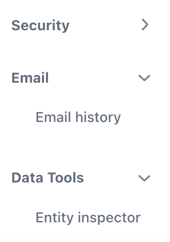
Toggle Reverse
With the themeNames="toggle-reverse" setting in the listMenu component, the expand/collapse toggle mark will be moved to the end of the parent menu item component. This means that the icon that indicates whether the child menu items are expanded or collapsed will be positioned on the right side of the parent menu item’s label.

Attributes
In Jmix there are many common attributes that serve the same purpose for all components.
The following are attributes specific to listMenu:
Name |
Description |
Default |
|---|---|---|
The |
|
