gridColumnVisibility
gridColumnVisibility is a component for managing the visibility of columns within a dataGrid component. It allows you to dynamically show or hide columns.
-
XML element:
gridColumnVisibility -
Java class:
JmixGridColumnVisibility
Basics
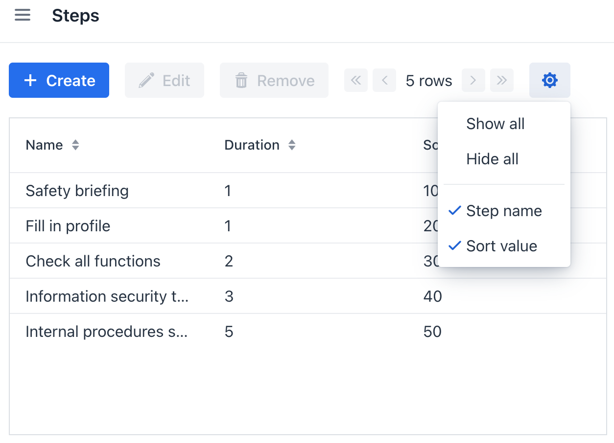
gridColumnVisibility consists of a button and a dropdown menu with the list of columns.

Below is an example of using gridColumnVisibility in a list view:
<hbox id="buttonsPanel" classNames="buttons-panel">
    <!-- ... -->
    <gridColumnVisibility dataGrid="stepsTable"
                          icon="COG"
                          themeNames="icon"
                          exclude="duration">
        <menuItem refColumn="name" text="msg://menuItem.text"/>
    </gridColumnVisibility>
</hbox>
<dataGrid id="stepsTable"
          width="100%"
          minHeight="20em"
          dataContainer="stepsDc">
    <columns>
        <column property="name"/>
        <column property="duration"/>
        <column property="sortValue"/>
    </columns>
</dataGrid>
Setting Up Dropdown Menu
menuItem
By default, the item text is copied from the column header. You can customize this using the menuItem element.
For example, in the previous example, the menuItem element is used to set a different localized message for the name column than the one specified in the dataGrid header.
include
The include attribute is used to specify which columns should be included in a dropdown menu of gridColumnVisibility.
exclude
The exclude attribute is used to specify which columns should be excluded from a dropdown menu of gridColumnVisibility.
For example, in the previous example, we excluded the duration column from the gridColumnVisibility dropdown menu.
Attributes
id - alignSelf - classNames - colspan - css - dataGrid - enabled - exclude - focusShortcut - height - hideAllEnabled - icon - include - maxHeight - maxWidth - minHeight - minWidth - showAllEnabled - tabIndex - text - themeNames - visible - whiteSpace - width
dataGrid
Sets a grid which columns will be managed by this component. The grid must be an instance of DataGrid or TreeDataGrid. The dataGrid attribute is required.
