Additional Options
Pop-up Window
The add-on provides an ability to display some information in a pop-up window on a map.
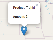
The GeoMap UI component has the openPopup(PopupWindow popupWindow) method that instantly opens the given pop-up window. Class PopupWindow contains two main parameters:
-
point— the geographical point where the pop-up will be opened. -
content— the HTML content of the pop-up window.
@Autowired
private GeoMap map;

@Subscribe
public void onAfterShow(AfterShowEvent event) {
    PopupWindow popupWindow = new PopupWindow(map.getCenter(), "Hello");
    map.openPopup(popupWindow);
}
You can set additional options for the pop-up window by passing an instance of the PopupWindowOptions class, which contains the following parameters:
-
closeButtonEnabled— whether the close button is enabled in a pop-up window. -
closeOnClick— whether a pop-up window should be closed when a user clicks on the map. -
maxWidth— the maximum width of the pop-up window in pixels. The default value is300. -
minWidth— the minimum width of the pop-up window in pixels. The default value is50.
A pop-up window can be attached to geometry. The pop-up window will be opened when a user clicks on the geometry on a map.
In case of canvas geometries, you can specify pop-up window in this way:
Order order = ordersTable.getSingleSelected();
CanvasLayer canvasLayer = map.getCanvas();
CanvasLayer.Point location = canvasLayer.addPoint(order.getLocation());
PopupWindowOptions popupWindowOptions = new PopupWindowOptions()
        .setCloseOnClick(true)
        .setMaxWidth(400);
location.setPopupContent(order.getProduct())
        .setPopupOptions(popupWindowOptions);
In case of VectorLayer, you can specify the popupContentProvider, which is a function that generates content for each geo-object’s pop-up window based on some geo-object parameters.
It can be performed declaratively using the @Install annotation in a screen controller, for example:
@Install(to = "map.orderLayer", subject = "popupContentProvider")
private String mapOrderLayerPopupContentProvider(Order order) {
    return String.format(
            "<b>Product: </b> %s " +
                    "<p>" +
                    "<b>Amount: </b> %s",
            order.getProduct(),
            order.getAmount());
}
Tooltip
In addition to pop-up windows, you can display small text in tooltips. Tooltips generally appear on hovering over geometries, but you can define them to be permanent, thereby using them as text labels picked to geometries:

In case of VectorLayer, you can specify the tooltipContentProvider, which is a function that generates content for each geo-object’s tooltip based on some geo-object parameters.
You can performe it declaratively using the @Install annotation in the screen controller, for example:
@Install(to = "map.orderLayer", subject = "tooltipContentProvider")
private String mapOrderLayerTooltipContentProvider(Order order) {
    return order.getProduct();
}
In case of сanvas geometries, you can specify tooltips this way:
Order order = ordersTable.getSingleSelected();
CanvasLayer canvasLayer = map.getCanvas();
CanvasLayer.Point point = canvasLayer.addPoint(order.getLocation());
TooltipOptions tooltipOptions = new TooltipOptions()
        .setPermanent(true)
        .setOpacity(0.7);
point.setTooltipContent(order.getProduct())
        .setTooltipOptions(tooltipOptions);
Also, you can set additional options for a tooltip box by passing an instance of the TooltipOptions class, which contains the following parameters:
-
direction— defines where a tooltip opens in relation to the geometry:right,left,top,bottom,center,auto. The default value isauto). Theautovalue dynamically switches betweenrightandleftaccording to the geometry position on the map. -
permanent— defines whether to open the tooltip permanently or only on mouseover. The default value isfalse. -
sticky— if set totrue, a tooltip will follow the mouse instead of being fixed at the feature center. The default value isfalse. -
interactive— if set totrue, a tooltip will accept mouse clicks. The default value isfalse. -
opacity— tooltip box opacity. The default value is0.9.
Point Icons
You can define a style for point icons. There are the following kinds of icons:
-
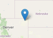
The default icon is a blue marker image, and it is used when the style is not specified for a point.
-
FontIconlooks like the default icon, but you can specify Font Awesome symbol inside it:@Autowired private GeometryStyles geometryStyles; @Install(to = "map.orderLayer", subject = "styleProvider") private GeometryStyle orderLayerStyleProvider(Order order) { return geometryStyles.point() .withFontIcon(JmixIcon.SHOPPING_BASKET) .setIconPathFillColor("#0051d3"); }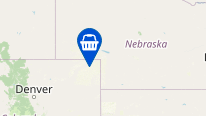
-
ImageIconallows you to use an image as an icon.@Autowired private GeometryStyles geometryStyles; @Autowired private GroupTable<Order> ordersTable; @Autowired private GeoMap map; @Install(to = "map.orderLayer", subject = "styleProvider") private GeometryStyle mapOrderLayerStyleProvider1(Order order) { return geometryStyles.point() .withImageIcon("classpath:/maps/ex1/jmix-logo.png") .setIconSize(33, 33); }
-
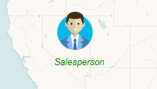
DivPointIconis a fully custom lightweight icon that uses the<div>element instead of an image.For example, you can create an icon that combines an image with a text label:
@Autowired
private GeometryStyles geometryStyles;

private String divElement = "<img src='https://cdn3.iconfinder.com/data/icons/business-avatar-1/512/3_avatar-128.png' width=60 height = 60/>\n" +
        "<font color = 'green' face = 'arial' size = 2> <i>Salesperson</i></font>";

@Install(to = "map.orderLayer", subject = "styleProvider")
private GeometryStyle mapOrderLayerStyleProvider(Order order) {
    return geometryStyles.point()
            .withDivIcon(divElement)
            .setStyles("my-div-style")
            .setPopupAnchor(30, 0);
}