ResponsiveGridLayout
ResponsiveGridLayout is a container where the components are laid out on a grid, based on Bootstrap’s 12 columns grid system (see Bootstrap documentation for details).
Component’s XML-name: responsiveGridLayout.
The main feature of this container is that it is fully responsive. The arrangement of the components located inside the ResponsiveGridLayout will automatically change depending on the size of the screen.
|
Note that |
Grid Breakpoints
The container grid consists of rows and columns. Rows are represented by the row element, within which you can declare only columns. Columns are represented by the col element, within which you can define components or other containers.
The entire horizontal space of ResponsiveGridLayout is divided into 12 parts of the same width. Each column can take one or more parts, and you can define it separately for different screen sizes (or breakpoints, in Bootstrap terminology). Breakpoints are defined by the xs, sm, md, lg, xl attributes and the value of the attribute sets the width of the column in 1/12 parts for this screen size.
Below is the correspondence between the breakpoints and the screen size:
-
xs- for extra-small screen, with width less than576px. The default value in Bootstrap. -
sm- for small screen, with width between576pxand768px. -
md- for medium screen, with width between768pxand992px. -
lg- for large screen, with width between992pxand1200px. -
xl- for extra-large screen, with width1200pxand up.
Breakpoints are applied hierarchically. For example, sm applies to small, medium, large, and extra-large devices, but not extra-small devices, represented by the first xs breakpoint.
|
Usage example:
<responsiveGridLayout>
    <row>
        <col sm="6" md="8"> (1)
            <label value="sm-6, md-8"/>
        </col>
        <col sm="6" md="4">
            <label value="sm-6, md-4"/>
        </col>
    </row>
    <row>
        <col sm="4" md="2">
            <label value="sm-4, md-2"/>
        </col>
        <col sm="4" md="8">
            <label value="sm-4, md-8"/>
        </col>
        <col sm="4" md="2">
            <label value="sm-4, md-2"/>
        </col>
    </row>
    <row>
        <col xs="6"> (2)
            <label value="xs-6"/>
        </col>
        <col xs="6">
            <label value="xs-6"/>
        </col>
    </row>
</responsiveGridLayout>| 1 | - This column will take up 6 parts on the small screen and 8 parts on the medium and all larger screens. |
| 2 | - This column will take up 6 parts on the extra-small and all larger screens. |
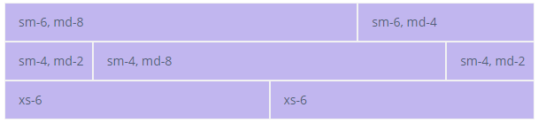
When the width of the screen is between 768px and 992px, the content of the ResponsiveGridLayout looks like this:
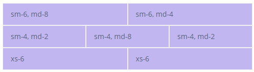
As the screen narrows and width became between 576px and 768px, the content will look like this:
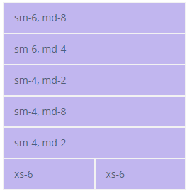
And then, when the width became less than 576px, like this:
|
For demonstration purposes, we use styles that paint over each cell: To learn more about styles, see the custom theme page. |
Col Element
Equal-width
You can define columns without explicit values like xs="6". If cols have no explicit values, then every column will be the same width at every breakpoint, from xs to xl. The column width, in this case, will be equal to the width of the component divided by the number of columns in the row.
For example:
<responsiveGridLayout>
    <row>
        <col>
            <label value="1 of 2"/>
        </col>
        <col>
            <label value="2 of 2"/>
        </col>
    </row>
    <row>
        <col>
            <label value="1 of 3"/>
        </col>
        <col>
            <label value="2 of 3"/>
        </col>
        <col>
            <label value="3 of 3"/>
        </col>
    </row>
</responsiveGridLayout>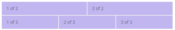
Setting One Column Width
If you specify the breakpoint value for only one column, the rest width of the container will be divided equally between the other columns.
For example:
<responsiveGridLayout>
    <row>
        <col>
            <label value="1 of 3"/>
        </col>
        <col xs="6">
            <label value="1 of 3 (wider)"/>
        </col>
        <col>
            <label value="1 of 3"/>
        </col>
    </row>
    <row>
        <col>
            <label value="1 of 3"/>
        </col>
        <col xs="5">
            <label value="1 of 3 (wider)"/>
        </col>
        <col>
            <label value="1 of 3"/>
        </col>
    </row>
</responsiveGridLayout>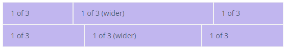
Auto and Default Width
Use {breakpoint}="AUTO" attributes to size columns based on the natural width of their content.
To create equal-width columns use {breakpoint}="DEFAULT". This is the default value for the case when no explicit column value is defined.
For example:
<responsiveGridLayout>
    <row justifyContentMd="CENTER">
        <col xs="DEFAULT" lg="2">
            <label value="1 of 3"/>
        </col>
        <col md="AUTO">
            <label value="Variable width content"/>
        </col>
        <col xs="DEFAULT" lg="2">
            <label value="1 of 3"/>
        </col>
    </row>
    <row>
        <col>
            <label value="1 of 3"/>
        </col>
        <col md="AUTO">
            <label value="Variable width content"/>
        </col>
        <col xs="DEFAULT" lg="2">
            <label value="1 of 3"/>
        </col>
    </row>
</responsiveGridLayout>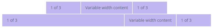
Row Element
Cols Attributes
The following attributes define the number of columns in the row at a specific breakpoint:
-
cols
-
colsLg
-
colsMd
-
colsSm
-
colsXl
For example:
<responsiveGridLayout stylename="demo">
    <row cols="3">
        <col>
            <label value="Column"/>
        </col>
        <col>
            <label value="Column"/>
        </col>
        <col>
            <label value="Column"/>
        </col>
        <col>
            <label value="Column"/>
        </col>
    </row>
</responsiveGridLayout>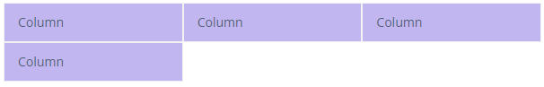
guttersEnable attribute
By default, guttersEnable="true". To disable gutters, use the guttersEnable attribute and set it to false. It removes the negative margins from the row and the horizontal padding from all immediate children columns.
For example:
<responsiveGridLayout>
    <row guttersEnabled="false">
        <col>
            <label value="Col 1"/>
        </col>
        <col>
            <label value="Col 2"/>
        </col>
        <col>
            <label value="Col 3"/>
        </col>
    </row>
    <row guttersEnabled="true">
        <col>
            <label value="Col 1"/>
        </col>
        <col>
            <label value="Col 2"/>
        </col>
        <col>
            <label value="Col 3"/>
        </col>
    </row>
</responsiveGridLayout>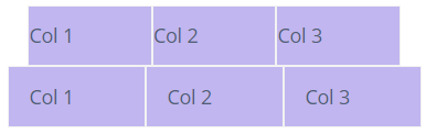
Alignment
Vertical Alignment of Row
You can align the entire row vertically using the following attributes at a specific breakpoint:
-
alignItems
-
alignItemsLg
-
alignItemsMd
-
alignItemsSm
-
alignItemsXl
For the listed above attributes, there are the following possible values:
-
BASELINE- everycolin arowis aligned as their baselines align. -
CENTER- everycolin arowis centered. -
END- everycolin arowis aligned to the bottom. -
START- everycolin arowis aligned to the top. -
STRETCH- everycolin arowis stretched to the full height of the row.
For example:
<responsiveGridLayout stylename="vertical-alignment">
    <row alignItems="START">
        <col>
            <label value="1 of 3"/>
        </col>
        <col>
            <label value="2 of 3"/>
        </col>
        <col>
            <label value="3 of 3"/>
        </col>
    </row>
    <row alignItems="CENTER">
        <col>
            <label value="1 of 3"/>
        </col>
        <col>
            <label value="2 of 3"/>
        </col>
        <col>
            <label value="3 of 3"/>
        </col>
    </row>
    <row alignItems="END" >
        <col>
            <label value="1 of 3"/>
        </col>
        <col>
            <label value="2 of 3"/>
        </col>
        <col>
            <label value="3 of 3"/>
        </col>
    </row>
</responsiveGridLayout>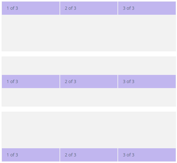
Vertical Alignment of Column
You can also align the col you need using the following attributes at a specific breakpoint:
-
alignSelf
-
alignSelfLg
-
alignSelfMd
-
alignSelfSm
-
alignSelfXl
For the listed above attributes, there are the following possible values:
-
AUTO -
BASELINE-colis aligned as its baseline is aligned. -
CENTER-colis centered. -
END-colis aligned to the bottom. -
START-colis aligned to the top. -
STRETCH-colis stretched to the full height of the row.
For example:
<responsiveGridLayout stylename="vertical-alignment">
    <row cols="3">
        <col alignSelf="AUTO">
            <label value="1 of 6"/>
        </col>
        <col alignSelf="BASELINE">
            <label value="2 of 6"/>
        </col>
        <col alignSelf="CENTER">
            <label value="3 of 6"/>
        </col>
        <col alignSelf="END">
            <label value="4 of 6"/>
        </col>
        <col alignSelf="START">
            <label value="5 of 6"/>
        </col>
        <col alignSelf="STRETCH">
            <label value="6 of 6"/>
        </col>
    </row>
</responsiveGridLayout>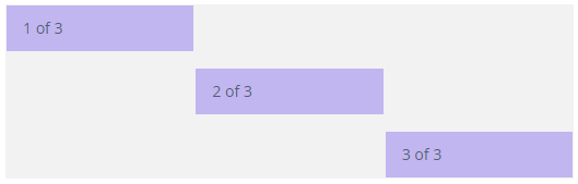
Horizontal Alignment
For horizontal alignment, you can use following attributes at a specific breakpoint:
-
justifyContent
-
justifyContentLg
-
justifyContentMd
-
justifyContentSm
-
justifyContentXl
For the listed above attributes, there are the following possible values:
-
AROUND- there are indents on the left, right, and between thecols. -
BETWEEN- there are indents between thecols. -
CENTER-colsinside theroware centered. -
END-colsinside therowaligned to the right. -
START-colsinside therowaligned to the left.
For example:
<responsiveGridLayout>
    <row justifyContent="START">
        <col xs="4">
            <label value="1 of 2"/>
        </col>
        <col xs="4">
            <label value="2 of 2"/>
        </col>
    </row>
    <row justifyContent="CENTER">
        <col xs="4">
            <label value="1 of 2"/>
        </col>
        <col xs="4">
            <label value="2 of 2"/>
        </col>
    </row>
    <row justifyContent="END">
        <col xs="4">
            <label value="1 of 2"/>
        </col>
        <col xs="4">
            <label value="2 of 2"/>
        </col>
    </row>
    <row justifyContent="AROUND">
        <col xs="4">
            <label value="1 of 2"/>
        </col>
        <col xs="4">
            <label value="2 of 2"/>
        </col>
    </row>
    <row justifyContent="BETWEEN">
        <col xs="4">
            <label value="1 of 2"/>
        </col>
        <col xs="4">
            <label value="2 of 2"/>
        </col>
    </row>
</responsiveGridLayout>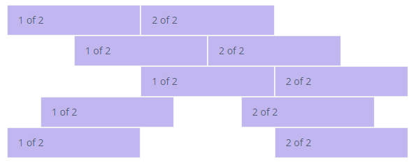
Reordering
The following attributes allow you to control the visual order of your content at a specific breakpoint:
-
order
-
orderLg
-
orderMd
-
orderSm
-
orderXl
As a value for the listed above attributes, you can define either a particular number or one of the predefined values: FIRST or LAST.
For example:
<responsiveGridLayout>
    <row cols="1">
        <col>
            <label value="First in DOM, no order applied"/>
        </col>
        <col order="12">
            <label value="Second in DOM, with a larger order"/>
        </col>
        <col order="1">
            <label value="Third in DOM, with an order of 1"/>
        </col>
    </row>
</responsiveGridLayout>

<responsiveGridLayout>
    <row cols="1">
        <col order="LAST">
            <label value="First in DOM, ordered last"/>
        </col>
        <col>
            <label value="Second in DOM, unordered"/>
        </col>
        <col order="FIRST">
            <label value="Third in DOM, ordered first"/>
        </col>
    </row>
</responsiveGridLayout>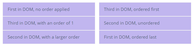
Offset
The following attributes allow you to move cols to the right at a specific breakpoint:
-
offset
-
offsetLg
-
offsetMd
-
offsetSm
-
offsetXl
The offset will be calculated by multiplying the attribute value to the container’s width divided by twelve.
For example:
<responsiveGridLayout >
    <row>
        <col md="4" xl="">
            <label value="md-4"/>
        </col>
        <col md="4" offsetMd="4">
            <label value="md-4, offset-md-4"/>
        </col>
    </row>
    <row>
        <col md="3" offsetMd="3">
            <label value="md-3, offset-md-3"/>
        </col>
        <col md="3" offsetMd="3">
            <label value="md-3, offset-md-3"/>
        </col>
    </row>
    <row>
        <col md="6" offsetMd="4">
            <label value="md-6, offset-md-4"/>
        </col>
    </row>
</responsiveGridLayout>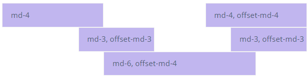
Default Bootstap Styles
You can also use default bootstrap styles via the stylename attribute. For example, with the pl value, you can set padding-left, with mt value, you can set margin-top, and so on. See all possible values on the bootstrap spacing page.
<responsiveGridLayout>
    <row stylename="mt-md-n2">
        <col md="AUTO" stylename="pl-0 pt-2">
            <hbox spacing="true">
                <label value="Col 1"/>
                <textField id="nameField"/>
            </hbox>
        </col>
        <col md="AUTO" stylename="pl-0 pt-2">
            <hbox spacing="true">
                <label value="Col 2"/>
                <textField id="keyField"/>
            </hbox>
        </col>
        <col md="AUTO" stylename="px-0 pt-2">
            <hbox spacing="true">
                <label value="Col 3"/>
                <checkBox id="checkBox"/>
            </hbox>
        </col>
        <col stylename="w-100 pl-0 pt-2">
            <label value="Col 4"/>
        </col>
    </row>
</responsiveGridLayout>
Attributes
containerType
ResponsiveGridLayout has two possible types:
-
FLUID- a full-width container that is spanning the entire width of the breakpoint. This is the default type. -
FIXED- once the screen width reaches a certain breakpoint, theResponsiveGridLayoutwidth is set to the following values:-
xl-1140px -
lg-960px -
md-720px -
sm-540px
-
For example:
<responsiveGridLayout containerType="FLUID">
    <row>
        <col sm="4">
            <label value="1 of 3"/>
        </col>
        <col sm="4">
            <label value="2 of 3"/>
        </col>
        <col sm="4">
            <label value="3 of 3"/>
        </col>
    </row>
</responsiveGridLayout>

<responsiveGridLayout containerType="FIXED">
    <row>
        <col sm="4">
            <label value="1 of 3"/>
        </col>
        <col sm="4">
            <label value="2 of 3"/>
        </col>
        <col sm="4">
            <label value="3 of 3"/>
        </col>
    </row>
</responsiveGridLayout>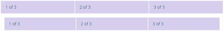
All XML Attributes
align - box.expandRatio - colspan - containerType - css - enable - height - htmlSanitizerEnabled - id - rowspan - stylename - visible
Row Attributes
alignItems - alignItemsLg - alignItemsMd - alignItemsSm - alignItemsXl - cols - colsLg - colsMd - colsSm - colsXl - guttersEnabled - height - id - justifyContent - justifyContentLg - justifyContentMd - justifyContentSm - justifyContentXl - stylename
