Calendar
Calendar component is designed to organize and display calendar events.
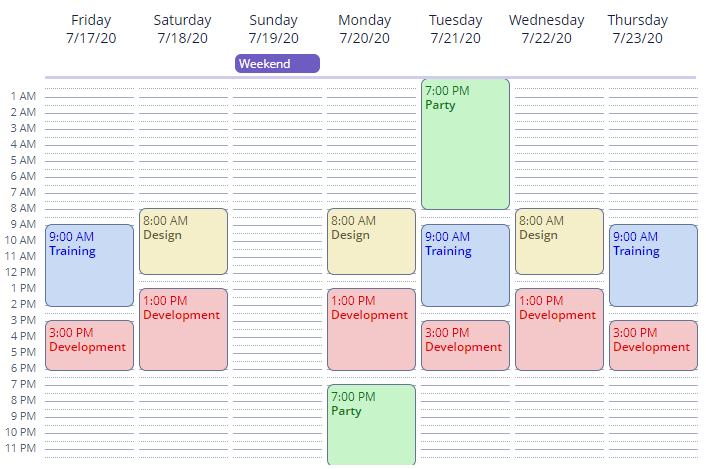
Component’s XML-name: calendar.
View Mode
Calendar has 3 view modes that are selected automatically based on the date range of calendar, defined by the startDate and endDate attributes:
-
Monthly view - displayed when the date range is over 7 days long.
<calendar id="monthlyView"
          captionProperty="caption"
          startDate="2021-05-01"
          endDate="2021-05-17"
          height="100%"
          width="100%"
          lastVisibleDayOfWeek="5"/>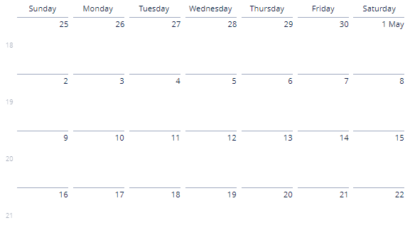
-
Weekly view - displayed when the date range is between 1 and 7 days long.
<calendar id="weeklyView"
          captionProperty="caption"
          startDate="2021-05-01"
          endDate="2021-05-07"
          height="100%"
          width="100%"/>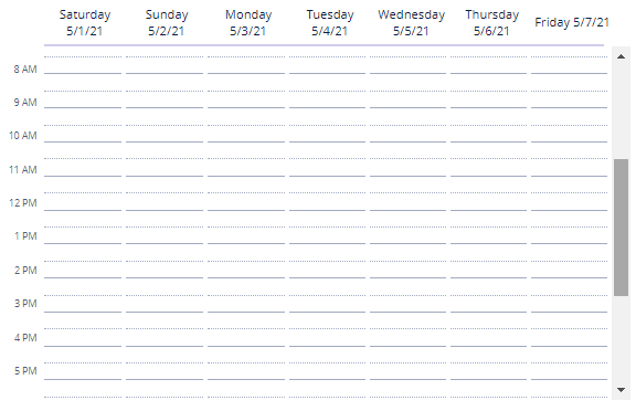
-
Single-day view - displayed when the date range is within one day.
<calendar id="singleDay"
          captionProperty="caption"
          startDate="2021-05-01"
          endDate="2021-05-01"
          height="100%"
          width="100%"/>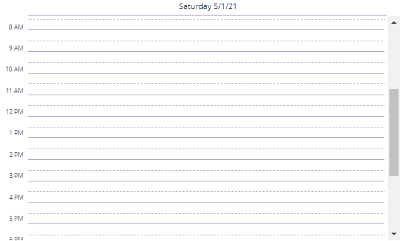
Customization
By default, calendar displays all 7 days of the week and 24 hours in each day. To change this behavior, there are the following attributes:
-
firstVisibleDayOfWeekandlastVisibleDayOfWeek- take values from1to7, where1is Sunday and7is Saturday.
-
firstVisibleHourOfDayandlastVisibleHourOfDay- take values from1to23, where1is 01:00 am and23is 23:00 pm.
For example, let’s customize calendar:
-
To display only the first half of the day when calendar is opened in single-day view.
-
To display only Tuesday and Wednesday in each week when calendar is opened in monthly view.
<calendar id="customized"
          captionProperty="caption"
          startDate="2021-05-01"
          endDate="2021-05-30"
          firstVisibleHourOfDay="6"
          lastVisibleHourOfDay="12"
          firstVisibleDayOfWeek="3"
          lastVisibleDayOfWeek="4"
          height="400px"
          width="500px"
          navigationButtonsVisible="true"/>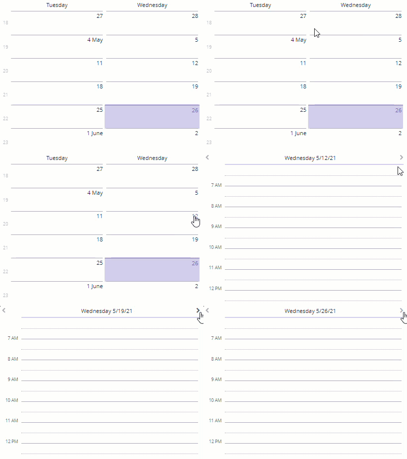
You can also use weeklyCaptionFormat to change the caption of weekdays. The rules of the SimpleDateFormat class define the format of the weeklyCaptionFormat value.
To change the time format, use the timeFormat attribute, with the following possible values:
-
24H -
12H- the default value.
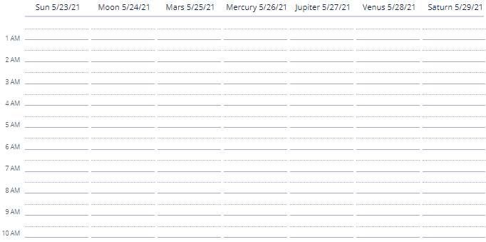
To change the names of days and months, use the setDayNames() and setMonthNames() methods, passing a map with the new values to them:
@Autowired
private Calendar<Date> customizedCalendar;

@Subscribe
public void onInit(InitEvent event) {
    Map<DayOfWeek, String> days = new HashMap<>(7);
    days.put(DayOfWeek.MONDAY,"Moon");
    days.put(DayOfWeek.TUESDAY,"Mars");
    days.put(DayOfWeek.WEDNESDAY,"Mercury");
    days.put(DayOfWeek.THURSDAY,"Jupiter");
    days.put(DayOfWeek.FRIDAY,"Venus");
    days.put(DayOfWeek.SATURDAY,"Saturn");
    days.put(DayOfWeek.SUNDAY,"Sun");
    customizedCalendar.setDayNames(days);
}
Calendar Events
Creating Events Programmatically
-
To display events, you can add the
SimpleCalendarEventobjects tocalendarusing theaddEvent()method of theCalendarEventProviderinterface:@Autowired private Calendar<Date> calendar; @Subscribe public void onInit(InitEvent event) { SimpleCalendarEvent<Date> simpleCalendarEvent = new SimpleCalendarEvent<>(); SimpleDateFormat simpleDateFormat = new SimpleDateFormat("yyyy-MM-dd HH:mm"); simpleCalendarEvent.setCaption("Development"); simpleCalendarEvent.setDescription("Platform development"); simpleCalendarEvent.setStart(simpleDateFormat.parse("2021-05-26 15:00", new ParsePosition(0))); simpleCalendarEvent.setEnd(simpleDateFormat.parse("2021-05-26 19:00", new ParsePosition(0))); simpleCalendarEvent.setAllDay(false); calendar.getEventProvider().addEvent(simpleCalendarEvent); } -
You can also add the list of the
SimpleCalendarEventobjects tocalendarusing thesetEventProvider()method, which accepts theListCalendarEventProviderobject as a parameter. -
To remove events, you can use
removeEvent()orremoveAllEvents()methods of theCalendarEventProviderinterface.
Data-aware Events
CalendarEventProvider interface has ContainerCalendarEventProvider implementation, which allows you to fill the calendar with events from your data model entities.
To be used for the ContainerCalendarEventProvider, an entity should have at least fields with one of the datatypes for the startDateProperty, endDateProperty attributes, and field with String type for captionProperty attribute:
@JmixEntity
@Table(name = "UIEX1_CUSTOM_CALENDAR_EVENT")
@Entity(name = "uiex1_CustomCalendarEvent")
public class CustomCalendarEvent {
    @JmixGeneratedValue
    @Column(name = "ID", nullable = false)
    @Id
    private UUID id;

    @Column(name = "EVENT_CAPTION")
    private String eventCaption;

    @Column(name = "EVENT_START_DATE")
    @Temporal(TemporalType.TIMESTAMP)
    private Date eventStartDate;

    @Column(name = "EVENT_END_DATE")
    @Temporal(TemporalType.TIMESTAMP)
    private Date eventEndDate;

}
Additionally, you can define fields with String type for descriptionProperty and stylenameProperty attributes and field with Boolean type for isAllDayProperty attribute.
Usage example:
<data readOnly="true">
    <collection id="customCalendarEventsDc"
                class="ui.ex1.entity.CustomCalendarEvent">
        <fetchPlan extends="_base"/>
        <loader id="customCalendarEventsDl">
            <query>
                <![CDATA[select e from uiex1_CustomCalendarEvent e]]>
            </query>
        </loader>
    </collection>
</data>
<layout>
    <calendar dataContainer="customCalendarEventsDc"
              width="800px"
              height="400px"
              firstVisibleHourOfDay="8"
              firstVisibleDayOfWeek="2"
              lastVisibleDayOfWeek="6"
              lastVisibleHourOfDay="20"
              captionProperty="eventCaption"
              startDateProperty="eventStartDate"
              endDateProperty="eventEndDate"
              weeklyCaptionFormat="yyyy-dd-MM"/>
</layout>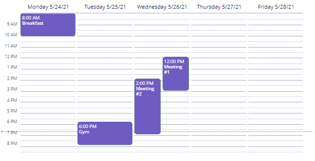
Events and Handlers
|
To generate a handler stub in Jmix Studio, select the component in the screen descriptor XML or in the Component Hierarchy panel and use the Handlers tab of the Component Inspector panel. Alternatively, you can use the Generate Handler button in the top panel of the screen controller. |
ContextHelpIconClickEvent
Programmatic usage: call the setContextHelpIconClickHandler() component method.
CalendarDateClickEvent
This event fires when the user clicks on a day number of the month.
Programmatic registration of the event handler: use the addDateClickListener() component method.
CalendarEventClickEvent
This event fires when the user clicks on the event.
Programmatic registration of the event handler: use the addEventClickListener() component method.
CalendarEventResizeEvent
This event fires when the user resizes the event.
Programmatic registration of the event handler: use the addEventResizeListener() component method.
CalendarEventMoveEvent
This event fires when the user moves the event.
Programmatic registration of the event handler: use the addEventMoveListener() component method.
CalendarWeekClickEvent
This event fires when the user clicks on a week number.
Programmatic registration of the event handler: use the addWeekClickListener() component method.
CalendarForwardClickEvent
This event fires when the user clicks on a forward navigation button.
Programmatic registration of the event handler: use the addForwardClickListener() component method.
CalendarBackwardClickEvent
This event fires when the user clicks on a backward navigation button.
Programmatic registration of the event handler: use the addBackwardClickListener() component method.
Styling
You can style calendar events with CSS. To configure a style, create a custom theme, and define the style name with needed parameters in the SCSS file. For example:
.v-calendar-event.event-red {
  background-color: #f4c8c8;
  color: #e00000;
}
Now you can set created style programmatically in the screen controller:
simpleCalendarEvent.setStyleName("event-red");or with the help of the stylenameProperty attribute, by specifying as a value the entity field that contains the name of the created style.
All XML Attributes
|
You can view and edit attributes applicable to the component using the Component Inspector panel of the Studio’s Screen Designer. |
align - box.expandRatio - caption - captionAsHtml - captionProperty - colspan - contextHelpText - contextHelpTextHtmlEnabled - css - dataContainer - datatype - description - descriptionAsHtml - descriptionProperty - enable - endDate - endDateProperty - firstVisibleDayOfWeek - firstVisibleHourOfDay - height - htmlSanitizerEnabled - icon - id - isAllDayProperty lastVisibleDayOfWeek - lastVisibleHourOfDay - navigationButtonsVisible - responsive - rowspan - startDate - startDateProperty - stylename - stylenameProperty - timeFormat - visible - weeklyCaptionFormat - width
