Drawer
Basics
The definition of the drawer in the screen descriptor should have the following structure: CssLayout contains both drawer and the rest of the screen layout (for example, workArea), with jmix-drawer-layout style assigned.
The drawer itself should include the following elements those represent:
-
The
Drawerheader isCssLayoutwithjmix-drawer-headerstyle assigned.-
A header icon with
app-iconstyle assigned. -
A header title with
app-titlestyle assigned.
-
-
The
Drawercontent, for example, SideMenu, withjmix-drawer-contentstyle assigned. -
The
Drawerfooter, withjmix-drawer-footerstyle assigned.-
A button is placed within a
drawerfooter and used to toggleDrawercollapsed state.
-
Toggle
The toggle() method expands or collapses the drawer depending on its current state. For example, if the drawer is already collapsed, it will be expanded after calling the toggle() method, and vice versa.
You can also check the drawer’s current state using the isCollapsed() method.
Expand on Hover
The expandOnHover attribute sets a mode when the drawer is expanded on hover. Note that the collapse state is not changed. The default value is false.
Usage Example
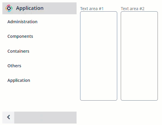
The most common way to use the drawer is on the app’s main screen.
For example:
<layout>
    <cssLayout stylename="jmix-drawer-layout">
        <drawer id="drawer" expandOnHover="true">
            <cssLayout stylename="jmix-drawer-header"
                       width="100%">
                <hbox spacing="true">
                    <image id="logoImage"
                           stylename="app-icon"
                           scaleMode="SCALE_DOWN">
                        <resource>
                            <theme path="branding/app-icon-menu.svg"/>
                        </resource>
                    </image>
                    <label id="appTitleLabel"
                           stylename="app-title"
                           value="Application"/>
                </hbox>
            </cssLayout>
            <sideMenu id="sideMenu"
                      width="100%"
                      stylename="jmix-drawer-content"/>
            <cssLayout stylename="jmix-drawer-footer"
                       width="100%">
                <hbox align="BOTTOM_RIGHT">
                    <button id="collapseDrawerButton"
                            icon="CHEVRON_LEFT"
                            stylename="jmix-drawer-collapse-button"
                            description="mainMsg://sideMenuCollapse"/>
                </hbox>
            </cssLayout>
        </drawer>
        <hbox spacing="true" margin="true">
            <textArea height="300px"
                      width="125px"
                      caption="Text area #1"/>
            <textArea height="300px"
                      width="125px"
                      caption="Text area #2"/>
        </hbox>
    </cssLayout>
</layout>
@Autowired
private Drawer drawer;
@Autowired
private Button collapseDrawerButton;
@Subscribe("collapseDrawerButton")
public void onCollapseDrawerButtonClick(Button.ClickEvent event) {
drawer.toggle(); (1)
if (drawer.isCollapsed()) { (2)
collapseDrawerButton.setIconFromSet(JmixIcon.CHEVRON_RIGHT);
} else {
collapseDrawerButton.setIconFromSet(JmixIcon.CHEVRON_LEFT);
}
}| 1 | Toggle the drawer on the button click. |
| 2 | Change the button icon depending on the drawer state. |
All XML Attributes
box.expandRatio - colspan - css - expandOnHover - id - rowspan - stylename
