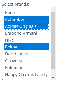
MultiSelectList
MultiSelectList displays a pre-defined list of options in a vertically scrollable list. MultiSelectList allows users to select or deselect one or more options by holding down the Shift or Control key while clicking on options.
Component’s XML-name: multiSelectList.
Basics
Use MultiSelectList if:
-
Users need to select one or many from the list of options.
-
The number of options is too large to use
CheckBoxGroup. -
The number of options is finite, and there’s no need to enter custom values.

To create MultiSelectList connected to data, use the optionsContainer attribute. For example:
<data>
    <collection id="brandsDc" class="ui.ex1.entity.Brand">
        <fetchPlan extends="_base"/>
        <loader id="brandsDl">
            <query>
                <![CDATA[select e from uiex1_Brand e]]>
            </query>
        </loader>
    </collection>
</data>
<layout>
    <multiSelectList id="multiSelectList"
                     caption="Select brands:"
                     optionsContainer="brandsDc"/>
</layout>
The component’s value returns a list of selected options.
You can also make some values selected programmatically by passing a java.util.List of values to the setValue() method:
@Autowired
private MultiSelectList<Hobby> hobbyList;

@Subscribe
public void onInit(InitEvent event) {
    hobbyList.setValue(Arrays.asList(Hobby.FAMILY, Hobby.COMPUTER));
}
Defining Options
You can specify a list of options either in the XML descriptor using the optionsContainer, optionsEnum attributes or programmatically in the controller using the setOptionsList(), setOptionsMap() and setOptionsEnum() methods.
Detailed information is available in the Defining Options section for SingleSelectList.
Events and Handlers
|
To generate a handler stub in Jmix Studio, select the component in the screen descriptor XML or in the Component Hierarchy panel and use the Handlers tab of the Component Inspector panel. Alternatively, you can use the Generate Handler button in the top panel of the screen controller. |
DoubleClickEvent
See DoubleClickEvent.
Validator
See Validator.
MultiSelectList XML Attributes
|
You can view and edit attributes applicable to the component using the Component Inspector panel of the Studio’s Screen Designer. |
align - caption - captionAsHtml - captionProperty - colspan - contextHelpText - contextHelpTextHtmlEnabled - css - dataContainer - description - descriptionAsHtml - editable - enable - box.expandRatio - height - htmlSanitizerEnabled - icon - id - optionsContainer - optionsEnum - property - required - requiredMessage - responsive - rowspan - stylename - tabIndex - visible - width
