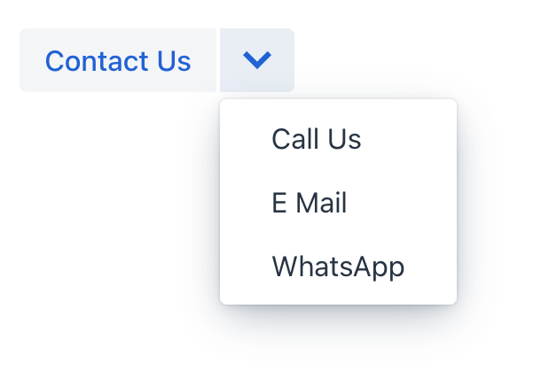
comboButton
comboButton is a button with a drop-down list of items. comboButton can be created to provide a set of variations on an action.
This component is very similar to dropdownButton.
The main difference is that an action can be added to the root button.
-
XML element:
comboButton -
Java class:
ComboButton
Basics
An example of comboButton:
<actions>
    <action id="contact" text="Contact Us"/>
</actions>
<layout>
    <comboButton id="saveButton" action="contact">
        <items>
            <textItem id="callItem" text="Call Us"/>
            <textItem id="emailItem" text="E Mail"/>
            <textItem id="whatsAppItem" text="WhatsApp"/>
        </items>
    </comboButton>
</layout>
Attributes
id - action - classNames - colspan - dropdownIcon - enabled - height - icon - maxHeight - maxWidth - minHeight - minWidth - openOnHover - tabIndex - text - themeNames - title - visible - whiteSpace - width
Handlers
|
To generate a handler stub in Jmix Studio, use the Handlers tab of the Jmix UI inspector panel or the Generate Handler action available in the top panel of the view class and through the Code → Generate menu (Alt+Insert / Cmd+N). |
