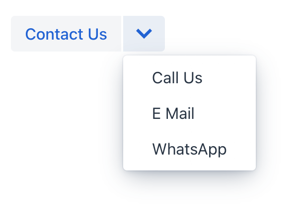
comboButton
comboButton is a button with a drop-down list of items. comboButton can be created to provide a set of variations on an action.
This component is very similar to dropdownButton.
The main difference is that an action can be added to the root button.
XML Element |
|
|---|---|
Java Class |
|
Attributes |
id - action - alignSelf - classNames - colspan - css - dropdownIcon - enabled - focusShortcut - height - icon - maxHeight - maxWidth - minHeight - minWidth - openOnHover - overlayClass - tabIndex - text - themeNames - title - visible - whiteSpace - width |
Handlers |
AttachEvent - BlurEvent - clickListener - doubleClickListener - singleClickListener - DetachEvent - FocusEvent |
Elements |
Basics
An example of comboButton:
<actions>
    <action id="contact" text="Contact Us"/>
</actions>
<layout>
    <comboButton id="saveButton" action="contact">
        <items>
            <textItem id="callItem" text="Call Us"/>
            <textItem id="emailItem" text="E Mail"/>
            <textItem id="whatsAppItem" text="WhatsApp"/>
        </items>
    </comboButton>
</layout>
Attributes
In Jmix there are many common attributes that serve the same purpose for all components.
The following are attributes specific to comboButton:
Name |
Description |
Default |
|---|---|---|
Allows to set the dropdown icon for |
|
