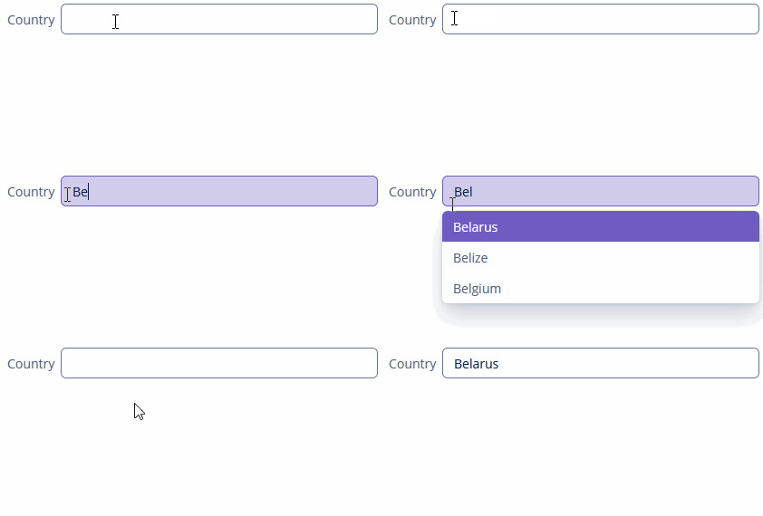
SuggestionField
SuggestionField allows searching for certain values according to a string entered by a user.
It can use any types of options: entities, strings, or enum values. SuggestionField does not have action buttons. The list of options is loaded in the background according to the logic defined by the application developer on the server-side.
Component’s XML-name: suggestionField.
Basics
Use SuggestionField if:
-
Users need to select a single option.
-
The number of options in the list of suggested values is too large to use ComboBox or EntityComboBox.
-
You want to provide high-performance search in the database without loading much data to the UI layer.
SuggestionField is an input text field with the additional functionality: a user enters a few characters, and if several matches have been found, all of them will be displayed in a drop-down list. SuggestionField refreshes the list of options on each entered symbol.

SearchExecutor
SearchExecutor is a functional interface that contains a single method: List<E> search(String searchString, Map<String, Object> searchParams).
Use the searchString parameter to filter candidates using the string entered by the user.
In the most common case, it is sufficient to set a SearchExecutor implementation to the component.
SearchExecutor can return any types of options, for example, entities, strings, or enum values.
-
Entities
First, declare a component in the XML descriptor:
<suggestionField id="entityField"
                 caption="msg://suggestionfield/entitySuggestion"/>
Then set
SearchExecutorto the component:@Autowired private DataManager dataManager; @Install(to = "entityField", subject = "searchExecutor") private List entityFieldSearchExecutor(String searchString, Map<String, Object> searchParams) { return dataManager.load(Country.class) .query("e.name like ?1 order by e.name", "(?i)%" + searchString + "%") .list(); }You can generate the
SearchExecutorimplementation stub using Studio.
-
Strings
@Install(to = "stringField", subject = "searchExecutor")
private List stringFieldSearchExecutor(String searchString, Map<String, Object> searchParams) {
    return Stream.of("John", "Andy", "Dora", "Martin", "Peter", "George")
            .filter(str -> StringUtils.containsIgnoreCase(str, searchString))
            .collect(Collectors.toList());
}
-
Enum
@Autowired
private Messages messages;

@Install(to = "enumField", subject = "searchExecutor")
private List enumFieldSearchExecutor(String searchString, Map<String, Object> searchParams) {
    return Stream.of(Hobby.values())
            .filter(status -> StringUtils.containsIgnoreCase(messages.getMessage(status), searchString))
            .collect(Collectors.toList());
}
|
The |
escapeForLike
You can use the escapeForLike() method to search for the values that contain special symbols:
@Install(to = "entitySuggestionField", subject = "searchExecutor")
private List entitySuggestionFieldSearchExecutor(String searchString, Map<String, Object> searchParams) {
    searchString = QueryUtils.escapeForLike(searchString);
    return dataManager.load(Customer.class)
            .query("e.firstName like ?1 escape '\\' order by e.firstName", "(?i)%" + searchString + "%")
            .list();
}
Suggestions Managing
asyncSearchDelayMs
The asyncSearchDelayMs attribute sets the delay between the last key press action and asynchronous search.
minSearchStringLength
The minSearchStringLength attribute sets the minimal string length, which is required to perform suggestions search.
If you set minSearchStringLength = 1 the suggestion popup is displayed almost immediately after the user starts typing, and too many suggestions appear at first. If you search through a large amount of data, make SuggestionField less sensitive, for example:
minSearchStringLength="4"popupWidth
The popupWidth attribute sets the width of the suggestion popup.
Possible options:
-
auto- the popup width will be equal to the maximum width of suggestions. -
parent- the popup width will be equal to the width of the main component. -
absolute (for example,
"170px") or relative (for example,"50%") value.
Using OptionsStyleProvider
OptionsStyleProvider allows managing additional style names for the suggested options displayed by SuggestionField:
@Install(to = "customerSuggestionField", subject = "optionStyleProvider")
private String customerSuggestionFieldOptionStyleProvider(Customer customer) {
    if (customer != null) {
        switch (customer.getLevel()) {
            case SILVER:
                return "silver-level";
            case GOLD:
                return "gold-level";
            case PLATINUM:
                return "platinum-level";
            case DIAMOND:
                return "diamond-level";
        }
    }
    return null;
}
Then you should define the item styles set in the application theme. Detailed information on creating a theme is available in Themes. Style names representing in the controller, together with prefixes identifying each item, form CSS selectors. For example:
.silver-level {
    background-color: #c0c0c0;
    color: black;
}

.gold-level {
    background-color: #fdd017;
    color: black;
}

.platinum-level {
    background-color: #e5e4e2;
    color: black;
}

.diamond-level {
    background-color: #b9f2ff;
    color: black;
}
Events and Handlers
|
To generate a handler stub in Jmix Studio, select the component in the screen descriptor XML or in the Component Hierarchy panel and use the Handlers tab of the Component Inspector panel. Alternatively, you can use the Generate Handler button in the top panel of the screen controller. |
Formatter
See Formatter.
Validator
Adds a validator instance to the component. The validator must throw ValidationException if the value is not valid.
If you are not satisfied with the predefined validators, adds your own validator instance:
@Install(to = "iconComboBox", subject = "validator")
protected void iconComboBoxValidator(FontAwesome icon) {
    if (icon != null)
        if (icon == FontAwesome.FILE_PDF_O)
            throw new ValidationException("The file type you selected " +
                    "is not currently supported");
}
SuggestionField XML Attributes
|
You can view and edit attributes applicable to the component using the Component Inspector panel of the Studio’s Screen Designer. |
align - asyncSearchDelayMs - caption - captionAsHtml - colspan - contextHelpText - contextHelpTextHtmlEnabled - css - dataContainer - description - descriptionAsHtml - editable - enable - box.expandRatio - height - htmlSanitizerEnabled - icon - id - inputPrompt - minSearchStringLength - popupWidth - property - required - requiredMessage - responsive - rowspan - stylename - suggestionsLimit - tabIndex - visible - width
