GroupTable
The GroupTable component is a table that supports the grouping of data by the values of one or multiple columns.
Component’s XML-name: groupTable.
Basics
GroupTable primarily replicates the functionality of the Table component.
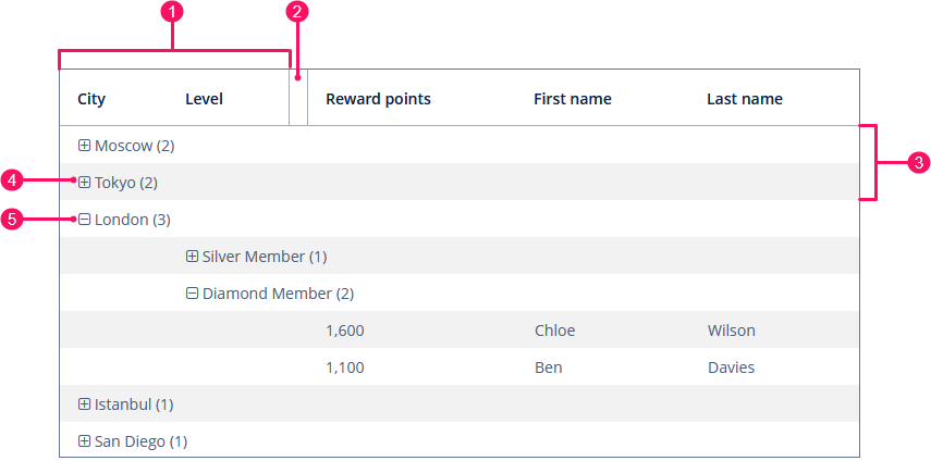
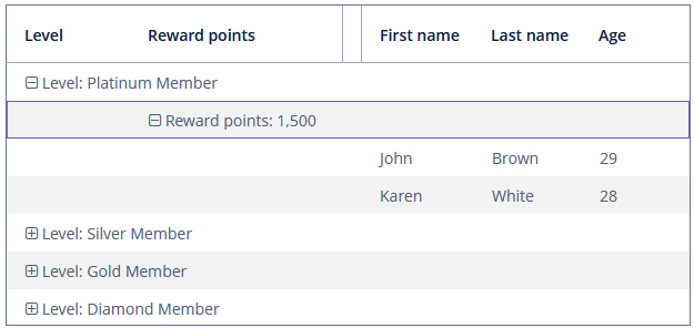
A typical group table is shown below:
-
Columns involved in data grouping
-
A special group separator
-
Grouped rows
-
Expand group button
-
Collapse group button
An example of GroupTable declaration in the XML screen descriptor is shown below:
<data>
    <collection id="customersDc" class="ui.ex1.entity.Customer">
        <fetchPlan extends="_base"/>
        <loader id="customersDl">
            <query>
                <![CDATA[select e from uiex1_Customer e]]>
            </query>
        </loader>
    </collection>
</data>
<layout>
    <groupTable id="groupTable" dataContainer="customersDc" width="100%" >
        <columns>
            <group>
                <column id="city"/>
                <column id="level"/>
            </group>
            <column id="rewardPoints"/>
            <column id="firstName"/>
            <column id="lastName"/>
        </columns>
    </groupTable>
</layout>
In the example, there is a collection container for the Customer entity. The table is bound to the container using the dataContainer attribute, while its columns element defines which entity attributes are shown in the table columns.
Grouping
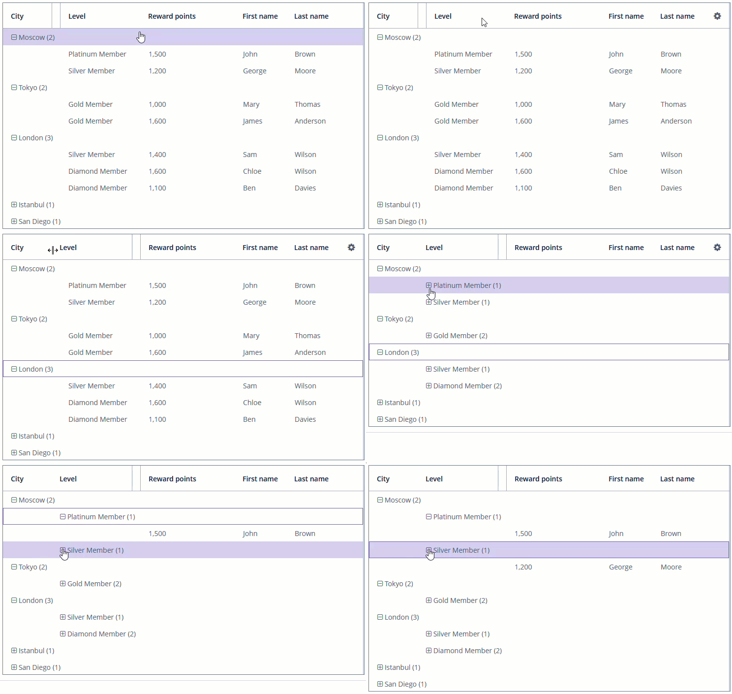
In order to group a table by a column, the required column should be dragged to the left and dropped in front of the ![]() element of the table header. Grouped values can be expanded and collapsed using
element of the table header. Grouped values can be expanded and collapsed using  /
/ buttons.
group is an optional element that can be present in a single instance inside columns. It contains a set of column elements, by which grouping will be performed initially when opening a screen.
In the example below, we will use the includeAll attribute of the columns element along with the group element. The table is grouped by the city column:
<groupTable id="customersGroupTable" dataContainer="customersDc" width="100%">
    <columns includeAll="true">
        <group>
            <column id="city"/>
        </group>
        <column id="firstName" groupAllowed="false"/>
    </columns>
</groupTable>
Each column element can contain the groupAllowed attribute with boolean value. This attribute controls whether a user can group by this column. The default value is true.
The fixedGrouping attribute controls whether a user can change the columns involved in data grouping. The default value is false.
Aggregating
GroupTable supports aggregation for table rows. For more information, see the Table section.
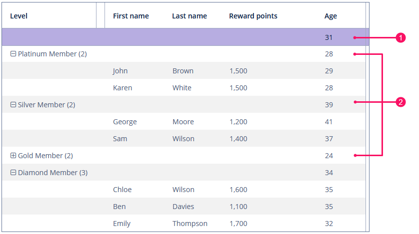
If the aggregatable attribute is true, the table shows aggregation results for each group (group aggregation) and results for all rows (total aggregation) in an additional row on the top.
-
Total aggregation
-
Group aggregation
If the showTotalAggregation attribute is false, the table does not show the total aggregation. The default value is true.
Multiselect
If the multiselect attribute is true, the click to the group row holding down the Ctrl key will expand the group (if collapsed) and set the selection to all rows of this group. But if the whole group is selected, Ctrl+click will not deselect all the group. You can still deselect certain rows using the common Ctrl key behavior.
Methods of GroupTable Interface
-
groupByColumns()- performs grouping by the given table columns.The example below will group the group table first by
leveland then bycity:groupTableP.groupByColumns("level", "city");
-
ungroupByColumns()- resets grouping by the given columns.The following example will ungroup the table by
level, while grouping bycityfrom the previous snippet will be kept.groupTableP.ungroupByColumns("level");
-
ungroup()- resets grouping at all.
-
setShowItemsCountForGroup()- show or hide items count forGroupTablegroups. The default value istrue.
-
The
getAggregationResults()method returns a map with aggregation results for the specified GroupInfo object, where map keys are table column identifiers and values are aggregation values.
-
The
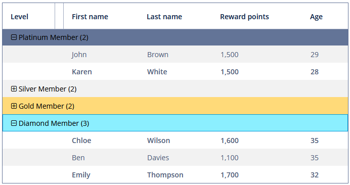
setStyleProvider()method allows setting table cell display style. ForGroupTable, it will acceptGroupTable.GroupStyleProvider, which extendsTable.StyleProvider.GroupStyleProviderhas a specific method for styling grouping rows with the GroupInfo parameter. This method will be invoked for every grouping row inGroupTable.Example of setting a style:
@Autowired
private GroupTable<Customer> styledTable;

@Subscribe
public void onInit(InitEvent event) {
    styledTable.setStyleProvider(new GroupTable.GroupStyleProvider<Customer>() {
        @Override
        public String getStyleName(Customer entity, @Nullable String property) {
            if (Boolean.TRUE.equals(entity.getEmail() != null)) {
                return "customer-has-email";
            }
            return null;
        }

        @Nullable
        @Override
        public String getStyleName(GroupInfo info) {
            Object value = info.getPropertyValue(info.getProperty());
            if (value instanceof Level) {
                Level level = (Level) value;
                switch (level) {
                    case SILVER:
                        return "level-silver";
                    case GOLD:
                        return "level-gold";
                    case PLATINUM:
                        return "level-platinum";
                    case DIAMOND:
                        return "level-diamond";
                }
            }
            return null;
        }
    });
}
Then you should define the cell and row styles in the application theme. Detailed information on creating a theme is available in Themes. Style names returned by the provider in the screen controller should be used as CSS selectors. For example:
.v-table {
  .customer-has-email {
    font-weight: bold;
  }

  .v-table-row,
    .v-table-row-odd {
      &.level-silver {
        background-color: #f2f2f2;
        color: black;

        .jmix-grouptable-group-cell-expander:before {
          color: black;
        }
      }
    }

  .v-table-row,
    .v-table-row-odd {
      &.level-gold {
        background-color: #ffda79;
        color: black;

        .jmix-grouptable-group-cell-expander:before {
          color: black;
        }
      }
    }

  .v-table-row,
    .v-table-row-odd {
      &.level-platinum {
        background-color: #637497;
        color: black;

        .jmix-grouptable-group-cell-expander:before {
          color: black;
        }
      }
    }

  .v-table-row,
    .v-table-row-odd {
      &.level-diamond {
        background-color: #8befff;
        color: black;

        .jmix-grouptable-group-cell-expander:before {
          color: black;
        }
      }
    }
}
Events and Handlers
|
To generate a handler stub in Jmix Studio, select the component in the screen descriptor XML or in the Component Hierarchy panel and use the Handlers tab of the Component Inspector panel. Alternatively, you can use the Generate Handler button in the top panel of the screen controller. |
AggregationDistributionProvider
AggregationDistributionProvider is similar to the same provider for the Table component with the only difference that when creating a provider, the GroupAggregationDistributionContext<V> object is used, which contains additional GroupInfo groupInfo - an object with information about the grouping row: properties of the grouped columns and their values.
ColumnCollapseEvent
See ColumnCollapseEvent.
ColumnReorderEvent
See ColumnReorderEvent.
EmptyStateLinkClickHandler
See EmptyStateClickEvent.
GroupCellValueFormatter
GroupCellValueFormatter enables you to provide custom text displayed within group rows.
In the example below, we replace the default text with the following format: <Grouped column name>: <Grouping value>.
@Install(to = "groupTableFormatter", subject = "groupCellValueFormatter")
private String groupTableFormatterGroupCellValueFormatter(
        GroupTable.GroupCellContext<Customer> context) {
    String key = Customer.class.getSimpleName() +
            "." + context.getGroupInfo().getProperty();
    return messages.getMessage(Customer.class,key) + ": " +
            context.getFormattedValue();
}
To register the aggregation distribution provider programmatically, use the setGroupCellValueFormatter() component method.
IconProvider
See IconProvider.
LookupSelectHandler
See LookupSelectHandler.
SelectionEvent
See SelectionEvent.
All XML Attributes
|
You can view and edit attributes applicable to the component using the Component Inspector panel of the Studio’s Screen Designer. |
Table XML Attributes
aggregatable - aggregationStyle - align - caption - captionAsHtml - colspan - columnControlVisible - columnHeaderVisible - contextHelpText - contextHelpTextHtmlEnabled - contextMenuEnabled - css - dataContainer - description - descriptionAsHtml - editable - emptyStateLinkMessage - emptyStateMessage - enable - box.expandRatio - fixedGrouping - height - htmlSanitizerEnabled - icon - id - metaClass - multiLineCells - multiselect - reorderingAllowed - responsive - rowspan - showSelection - showTotalAggregation - sortable - stylename - tabIndex - textSelectionEnabled - visible - width
Column XML Attributes
align - caption - captionAsHtml - captionProperty - collapsed - dateFormat - description - editable - expandRatio - groupAllowed - id - link - linkScreenId - linkScreenOpenMode - maxTextLength - optionsContainer - required - requiredMessage - resolution - sort - sortable - visible - width
