EntityComboBox
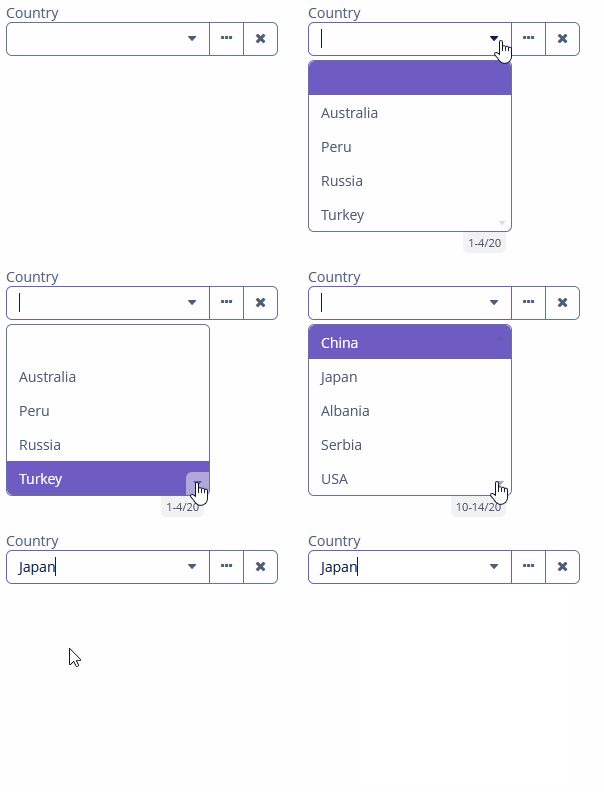
EntityComboBox allows users to select a single entity instance from a drop-down list and perform actions when the user clicks buttons on the right.
In fact, EntityComboBox is a hybrid of ComboBox and EntityPicker.
Component’s XML-name: entityComboBox.
Basics
Use EntityComboBox if:
-
The field value is a reference to an entity instance.
-
Users need to select a single option.
-
The list should be compact. It can be handy when the list of options is too long for RadioButtonGroup or SingleSelectList.
-
Users need filtering functionality.
-
Users need to perform some actions on the related entity instance.
EntityComboBox is a text field with a scrollable list of entity instances. It can have both custom and predefined actions:

To create EntityComboBox connected to data, use the dataContainer and property attributes. The optionsContainer attribute is used to create a list of options:
<data>
    <instance id="addressDc" class="ui.ex1.entity.Address"> (1)
        <fetchPlan extends="_base"> (2)
            <property name="country" fetchPlan="_instance_name"/>
        </fetchPlan>
    </instance>
    <collection id="countriesDc" class="ui.ex1.entity.Country"> (3)
        <fetchPlan extends="_base"/>
        <loader id="countriesDl">
            <query>
                <![CDATA[select e from uiex1_Country e]]>
            </query>
        </loader>
    </collection>
</data>
<facets>
    <dataLoadCoordinator auto="true"/>
</facets>
<layout>
    <vbox spacing="true">
        <entityComboBox id="countryField"
                        caption="msg://ui.ex1.entity/Address.country"
                        dataContainer="addressDc"
                        property="country"
                        optionsContainer="countriesDc"> (4)
            <actions>
                <action id="lookup" type="entity_lookup"/>
                <action id="clear" type="entity_clear"/>
            </actions>
        </entityComboBox>
    </vbox>
</layout>| 1 | InstanceContainer for the Address entity. |
| 2 | Inline fetch plan of the entity instance located in the container. |
| 3 | CollectionContainer for the Country entity. |
| 4 | countryField gets countriesDc as an options container so that the list of countries is displayed. |
In the example above, the screen defines the addressDc data container for the Address entity having the country attribute. In the entityComboBox element, the dataContainer attribute contains a link to the addressDc data container, and the property attribute refers to the country entity attribute. The entity attribute should be a reference to an entity. In the following example, it is Country.
Actions
There are no default actions for EntityComboBox. You need to explicitly add all necessary actions, for example:
<entityComboBox dataContainer="addressDc"
                property="country"
                optionsContainer="countriesDc">
    <actions>
        <action id="lookup" type="entity_lookup"/>
        <action id="clear" type="entity_clear"/>
    </actions>
</entityComboBox>
Detailed information on defining custom and predefined actions is available in the Actions section for EntityPicker.
Validation
To check values entered into the EntityComboBox component, you can use a validator in a nested validators element.
The following predefined validators are available for EntityComboBox:
In the example below, we will show a NotNullValidator usage for countryValidField:
<entityComboBox id="countryValidField"
                caption="Select a country"
                optionsContainer="countriesDc">
    <validators>
        <notNull/>
    </validators>
</entityComboBox>
Handling User Input
The user can enter a value that is not in the initial drop-down list and then select the item later without entering it again. To handle it, you should use EnterPressHandler.
@Autowired
private CollectionContainer<Country> countriesDc;

@Autowired
private EntityComboBox<Country> countryEntityComboBox;

@Autowired
private DataContext dataContext;

@Install(to = "countryEntityComboBox", subject = "enterPressHandler")
private void countryEntityComboBoxEnterPressHandler(HasEnterPressHandler.EnterPressEvent
                                                                enterPressEvent) {
    Country country = dataContext.create(Country.class); (1)
    country.setName(enterPressEvent.getText()); (2)
    countriesDc.getMutableItems().add(country); (3)
    countryEntityComboBox.setValue(country);
}| 1 | Create a new instance and merge it into the context. |
| 2 | Set the name of the newly created country entity. |
| 3 | Add merged entity. |
EnterPressHandler is invoked when the user enters a value and presses Enter. In this case, a new value is added to the list of options and becomes available for later use.
Events and Handlers
|
To generate a handler stub in Jmix Studio, select the component in the screen descriptor XML or in the Component Hierarchy panel and use the Handlers tab of the Component Inspector panel. Alternatively, you can use the Generate Handler button in the top panel of the screen controller. |
EnterPressHandler
See the example of programmatic registration in the Handling User Input section for ComboBox.
EnterPressHandler can be provided declaratively using the @Install annotation in the screen controller. See this example in the Handling User Input section for EntityComboBox.
FieldIconProvider
See FieldIconProvider.
Formatter
See Formatter.
OptionIconProvider
See OptionIconProvider.
OptionImageProvider
See OptionImageProvider.
OptionStyleProvider
See OptionStyleProvider.
OptionsCaptionFilter
See OptionsCaptionFilter.
Validator
Adds a validator instance to the component. The validator must throw ValidationException if the value is not valid.
If you are not satisfied with the predefined validators, adds your own validator instance:
@Install(to = "iconComboBox", subject = "validator")
protected void iconComboBoxValidator(FontAwesome icon) {
    if (icon != null)
        if (icon == FontAwesome.FILE_PDF_O)
            throw new ValidationException("The file type you selected " +
                    "is not currently supported");
}
ValueChangeEvent
See ValueChangeEvent.
EntityComboBox XML Attributes
|
You can view and edit attributes applicable to the component using the Component Inspector panel of the Studio’s Screen Designer. |
align - buffered - caption - captionAsHtml - captionProperty - colspan - contextHelpText - contextHelpTextHtmlEnabled - css - dataContainer - description - descriptionAsHtml - editable - enable - box.expandRatio - filterMode - height - htmlSanitizerEnabled - icon - id - inputPrompt - metaClass - nullName - nullOptionVisible - optionsContainer - pageLength - property - required - requiredMessage - responsive - rowspan - stylename - tabIndex - visible - width
EntityComboBox XML Elements
actions - formatter - validators.
