ButtonsPanel
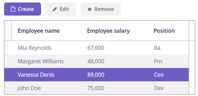
ButtonsPanel is a container that streamlines the use and placement of the components, usually buttons, for data management in a table.

Component’s XML-name: buttonsPanel.
Basics
ButtonsPanel can be located either inside a table or in any other place on a screen.
Usage example of ButtonsPanel container inside a table:
<groupTable id="employeesTable"
            width="100%"
            dataContainer="employeesDc">
    <actions>
        <action id="create" type="create"/>
        <action id="edit" type="edit"/>
        <action id="remove" type="remove"/>
    </actions>
    <columns>
        <column id="name"/>
        <column id="salary"/>
        <column id="position"/>
    </columns>
    <buttonsPanel id="buttonsPanel"
                  alwaysVisible="true">
        <button id="createBtn" action="employeesTable.create"/>
        <button id="editBtn" action="employeesTable.edit"/>
        <button id="removeBtn" action="employeesTable.remove"/>
    </buttonsPanel>
</groupTable>
If the ButtonsPanel is located in a table, it is combined with the table’s rowsCount component, using vertical space more effectively.
Attributes
Customization
By default, buttons in the buttonsPanel are placed horizontally with line-wrapping. If there is not enough space in a line, the buttons that do not fit will be displayed in the next line.
You can change the default behavior to display buttonsPanel in one row:
-
Create a theme extension or a custom theme.
-
Define the SCSS variable
$jmix-buttonspanel-flow.
All XML Attributes
align - alwaysVisible - box.expandRatio - caption - captionAsHtml - colspan - contextHelpText - contextHelpTextHtmlEnabled - css - description - descriptionAsHtml - enable - expand - height - htmlSanitizerEnabled - icon - id - margin - responsive - rowspan - spacing - stylename - visible - width
