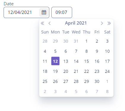
DateField
DateField is a mix of two components: DatePicker and TimeField. It allows you to display and enter the date and time.

Component’s XML-name: dateField.
Basics
To create a DateField associated with data, you should use the dataContainer and property attributes:
@JmixEntity
@Table(name = "UIEX1_PERSON")
@Entity(name = "uiex1_Person")
public class Person {

    /* other attributes */

    @Column(name = "BIRTHDAY")
    @Temporal(TemporalType.DATE)
    private Date birthday;
<data>
<instance id="personDc"
class="ui.ex1.entity.Person">
<fetchPlan extends="_base"/>
<loader/>
</instance>
</data>
<layout>
<dateField dataContainer="personDc"
property="birthday"
caption="Birthday"/>
</layout>In the example above, the screen has the personDc data container for the Person entity, which has the birthday property. The reference to the data container is specified in the dataContainer attribute. The name of the entity attribute, which value should be displayed in the field, is set in the property attribute.
Date and Time Format
Data-aware DateField
If the field is associated with an entity attribute, it will automatically take the appropriate form:
-
If the attribute has the
java.sql.Datetype, or the@Temporal(TemporalType.DATE)annotation is specified, then the time field will not be displayed. -
Otherwise, the time field with hours and minutes will be displayed.
You can define the date and time format by the date and time datatypes and specify it in the localized messages pack in the dateFormat and timeFormat keys.
Standalone DateField
If the field is not connected to an entity attribute, you can set the data type using the datatype attribute, which accepts the following values:
-
date -
dateTime -
localDate -
localDateTime -
offsetDateTime
dateFormat Attribute
You can change the date and time format using the dateFormat attribute. An attribute value can be either a format string or a key in the localized message pack.
<dateField caption="Month only DateField"
           dateFormat="MM/yy"/>
The format is defined by the rules of the SimpleDateFormat class. If there are no H or h characters in the format, the time field will not be displayed.
|
|
Attributes
autofill
The autofill attribute set to true enables automatically filling the current month and year after entering a day. If the attribute is disabled, the DateField resets value when the date is not fully entered.
In case the autofill attribute is enabled, and rangeStart or rangeEnd are set, the values of these attributes are considered when filling the date.
<dateField autofill="true"/>resolution
The resolution attribute allows you to define the date and time accuracy. An attribute value should match the DateField.Resolution enumeration:
-
SEC -
MIN- default value, to within a minute. -
HOUR -
DAY -
MONTH -
YEAR
If resolution="DAY" or resolution="MIN", and dateFormat is not specified, the format will be taken from one set in the message pack with the dateFormat or dateTimeFormat keys.
<dateField resolution="MONTH"/>Timestamp Conversions
DateField can perform timestamp value conversions between a server and user time zones if the user’s time zone is set by the setTimeZone() method.
The time zone is assigned automatically from the current user session when the component is bound to an entity attribute of the timestamp type. If the component is not bound to such an attribute, you can call setTimeZone() in the screen controller.
Today’s date in the calendar is determined against the current timestamp in a user’s web browser, which depends on the OS time zone settings. The user’s time zone doesn’t affect this behavior.
Validation
To check values entered into the DateField component, you can use a validator in a nested validators element.
The following predefined validators are available for DateField:
In the example below, we will show a FutureValidator usage:
<dateField caption="Select a future date"
           dateFormat="MM/yy">
    <validators>
        <future/>
    </validators>
</dateField>
Events and Handlers
|
To generate a handler stub in Jmix Studio, select the component in the screen descriptor XML or in the Jmix UI hierarchy panel and use the Handlers tab of the Jmix UI inspector panel. Alternatively, you can use the Generate Handler button in the top panel of the screen controller. |
Validator
Adds a validator instance to the component. The validator must throw ValidationException if the value is not valid.
If you are not satisfied with the predefined validators, add your own validator instance:
@Install(to = "birthdayField", subject = "validator")
protected void birthdayFieldValidator(Date date) {
    Date now = timeSource.currentTimestamp();
    if (DateUtils.addYears(now,-18).compareTo(date) < 0)
        throw new ValidationException("The age must be over 18 years old");
}
ValueChangeEvent
See ValueChangeEvent.
DateField XML Attributes
|
You can view and edit attributes applicable to the component using the Jmix UI inspector panel of the Studio’s Screen Designer. |
align - autofill - box.expandRatio - buffered - caption - captionAsHtml - colspan - contextHelpText - contextHelpTextHtmlEnabled - css - dataContainer - datatype - dateFormat - description - descriptionAsHtml - editable - enable - height - htmlSanitizerEnabled - icon - id - property - rangeEnd - rangeStart - required - requiredMessage - resolution - responsive - rowspan - stylename - tabIndex - timeMode - visible - width
