ValuePicker
The ValuePicker component displays a value of any type. It consists of the text field and the set of buttons defined by actions.
ValuePicker is a base class for ValuesPicker, EntityPicker, EntityComboBox.
Component’s XML-name: valuePicker.
Basics
ValuePicker can have a caption and both custom and predefined actions:
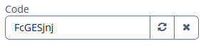
An example of defining ValuePicker with a caption retrieved from localized messages and two actions:
<valuePicker id="valuePicker"
             caption="msg://code">
    <actions>
        <action id="generate"
                icon="REFRESH"
                description="msg://description"/>
        <action id="clear" type="value_clear"/>
    </actions>
</valuePicker>
To create ValuePicker connected to data, use the dataContainer and property attributes:
<data>
    <instance id="userDc"
              class="ui.ex1.entity.User">
        <fetchPlan extends="_base"/>
        <loader/>
    </instance>
</data>
<layout spacing="true">
    <vbox spacing="true" id="vBox">
        <valuePicker id="loginValuePicker"
                     caption="msg://ui.ex1.entity/User.login"
                     dataContainer="userDc"
                     property="login">
            <actions>
                <action id="generate" icon="REFRESH"/>
            </actions>
        </valuePicker>
In the example above, the screen defines the userDc data container for the User entity with the login attribute. In the ValuePicker, the dataContainer attribute contains a link to the userDc data container, and the property attribute includes the name of the login entity attribute.
By default, a user cannot input the value manually. If you set the fieldEditable attribute to true, you enable manual input. Keep in mind the entered value is not set to the data model. To handle user input, use the FieldValueChangeEvent listener.
Look at the example below. We have the User entity with the age attribute. Let’s define the ageValuePicker in the XML-descriptor with fieldEditable="true":
<valuePicker id="ageValuePicker"
             caption="msg://ui.ex1.entity/User.age"
             dataContainer="userDc"
             property="age"
             fieldEditable="true">
    <actions>
        <action id="clear" type="value_clear"/>
    </actions>
</valuePicker>
Now the user can input the value manually. To handle this value, interpreted as String, subscribe to FieldValueChangeEvent in the controller:
@Autowired
private ValuePicker<Integer> ageValuePicker;

@Subscribe("ageValuePicker")
public void onAgeValuePickerFieldValueChange(ValuePicker.FieldValueChangeEvent<Integer> event) {
    String text = event.getText(); (1)
    notifications.create()
            .withCaption("Entered value: " + text)
            .show();
    if (!Strings.isNullOrEmpty(text)) {
        ageValuePicker.setValue(Integer.parseInt(text)); (2)
    }
}| 1 | Get the user input value as String. |
| 2 | Set the parsed value to the ageValuePicker. |
Actions
You can define custom and predefined actions for ValuePicker displayed as buttons on the right.
You can do it either in the XML descriptor using the actions nested element or programmatically in the controller using the addAction() method.
|
To add |
Predefined Action
The framework provides only one predefined action - value_clear:
<action id="clear" type="value_clear"/>Use the type and id attributes for declaring predefined action in XML.
Use addAction() to set it programmatically:
@Autowired
protected ValuePicker<String> loginValuePicker;
@Autowired
protected Actions actions;

@Subscribe
protected void onInit(InitEvent event) {
    loginValuePicker.addAction(actions.create(ValueClearAction.ID));
}
Custom Actions
To define a custom action in XML, use the actions nested element. Specify the id and icon attributes for the action:
<valuePicker id="loginValuePicker"
             caption="msg://ui.ex1.entity/User.login"
             dataContainer="userDc"
             property="login">
    <actions>
        <action id="generate" icon="REFRESH"/>
    </actions>
</valuePicker>
Then implement a custom logic in the screen controller by subscribing to Action.ActionPerformedEvent:
@Subscribe("loginValuePicker.generate") (1)
protected void onLoginValuePickerGenerate(Action.ActionPerformedEvent event) {
    loginValuePicker.setValue(RandomStringUtils.randomAlphabetic(5, 10));
}| 1 | The @Subscribe annotation contains the ValuePicker id and the id of the action separated by a dot. |
Validation
To check values entered into the ValuePicker component, you can use a validator in a nested validators element.
The following predefined validators are available for ValuePicker:
In the example below, we will show a NotNullValidator usage for countryValidField:
<entityComboBox id="countryValidField"
                caption="Select a country"
                optionsContainer="countriesDc">
    <validators>
        <notNull/>
    </validators>
</entityComboBox>
Events and Handlers
|
To generate a handler stub in Jmix Studio, select the component in the screen descriptor XML or in the Jmix UI hierarchy panel and use the Handlers tab of the Jmix UI inspector panel. Alternatively, you can use the Generate Handler button in the top panel of the screen controller. |
FieldIconProvider
See FieldIconProvider.
Formatter
See Formatter.
Validator
Adds a validator instance to the component. The validator must throw ValidationException if the value is not valid.
If you are not satisfied with the predefined validators, add your own validator instance:
@Install(to = "iconComboBox", subject = "validator")
protected void iconComboBoxValidator(FontAwesome icon) {
    if (icon != null)
        if (icon == FontAwesome.FILE_PDF_O)
            throw new ValidationException("The file type you selected " +
                    "is not currently supported");
}
ValueChangeEvent
See ValueChangeEvent.
ValuePicker XML Attributes
|
You can view and edit attributes applicable to the component using the Jmix UI inspector panel of the Studio’s Screen Designer. |
align - caption - captionAsHtml - css - description - descriptionAsHtml - enable - box.expandRatio - fieldEditable - htmlSanitizerEnabled - icon - id - inputPrompt - stylename - tabIndex - visible - width
