SourceCodeEditor
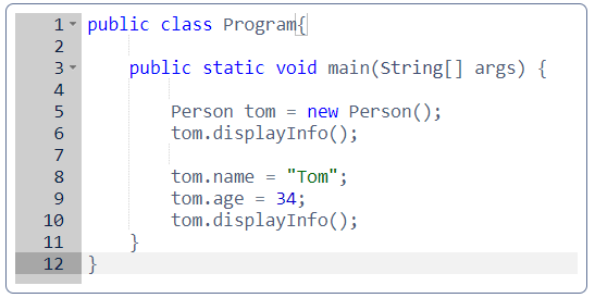
SourceCodeEditor allows displaying and entering source code. This component is a multi-line text area that provides code highlighting, line numbers, and ability to implement code completion.

Component’s XML-name: sourceCodeEditor.
Attributes
SourceCodeEditor mostly replicates the functionality of TextField component and has the following specific attributes:
-
handleTabKey- defines whether the Tab button on the keyboard is handled to indent lines. The default value isfalse- Tab is used to focus to the next tab stop.
-
highlightActiveLine- defines whether to highlight the line the caret is on. The default value istrue.
-
mode- allows you to choose one of the supported languages for the syntax highlighting:-
Java -
CSS -
Groovy -
HTML -
JavaScript -
Properties -
SCSS -
SQL -
XML -
Text- the default value, nothing will be highlighted.
-
-
printMargin- defines whether the printing edge line should be displayed. The default value istrue.
-
printMarginColumn- defines how wide is the print column. The default value is80characters.
-
showGutter- defines whether to show the left gutter with line numbers.
-
suggestOnDot- defines whether the suggester handler will be called after the user presses the dot.
Validation
To check values entered into the SourceCodeEditor component, you can use a validator in a nested validators element.
The following predefined validators are available for SourceCodeEditor:
In the example below, we will show a RegexpValidator usage for validatedSourceCodeEditor:
<sourceCodeEditor id="validatedSourceCodeEditor"
                  handleTabKey="true">
    <validators>
        <regexp regexp="[a-z]*"/>
    </validators>
</sourceCodeEditor>
Events and Handlers
|
To generate a handler stub in Jmix Studio, select the component in the screen descriptor XML or in the Jmix UI hierarchy panel and use the Handlers tab of the Jmix UI inspector panel. Alternatively, you can use the Generate Handler button in the top panel of the screen controller. |
Mode
Mode delegate method allows you to choose one of the supported languages for the syntax highlight:
@Install(to = "sourceCodeEditor", subject = "mode")
private String sourceCodeEditorMode() {
    return SourceCodeEditor.Mode.Java.getId();
}
Programmatic usage: call the setMode() component method.
Suggester
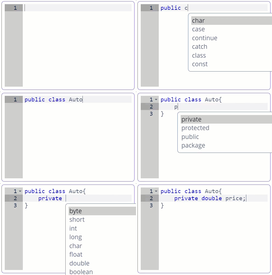
SourceCodeEditor supports code autocompletion provided by the Suggester handler.
Below is an example of implementing autocompletion of Java keywords.
-
Define the component in the screen XML descriptor:
<sourceCodeEditor id="sourceCodeEditor" mode="Java" handleTabKey="true"/> -
Define the suggester handler and return the list of values for autocompletion:
private static String[] KEYWORDS = {
        "byte",
        "short",
        //...

@Install(to = "sourceCodeEditor", subject = "suggester")
private List<Suggestion> sourceCodeEditorSuggester(AutoCompleteSupport source, String text, int cursorPosition) {
    return Stream.of(KEYWORDS)
            .map(keyword -> new Suggestion(source, keyword, keyword, null, -1, -1))
            .collect(Collectors.toList());
}
As a result, we have a simple Java code editor with autocompletion:

To invoke suggestions press Ctrl+Space. Depending on the value of the suggestOnDot attribute, suggestions may appear automatically after pressing the dot.
Programmatic usage: call the setSuggester() component method.
Validator
See Validator.
ValueChangeEvent
See ValueChangeEvent.
Appearance
The appearance of SourceCodeEditor can be customized using SCSS variables with $jmix-sourcecodeeditor-* prefix.
SourceCodeEditor XML Attributes
|
You can view and edit attributes applicable to the component using the Jmix UI inspector panel of the Studio’s Screen Designer. |
align - box.expandRatio - caption - captionAsHtml - colspan - contextHelpText - contextHelpTextHtmlEnabled - css - dataContainer - description - descriptionAsHtml - editable - enable - handleTabKey - height - highlightActiveLine - htmlSanitizerEnabled - icon - id - mode - printMargin - printMarginColumn - property - required - requiredMessage - responsive - rowspan - showGutter - stylename - suggestOnDot - tabIndex - visible - width
