TagPicker
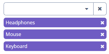
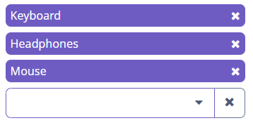
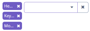
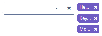
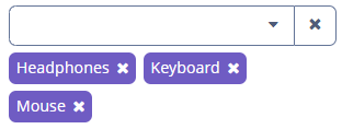
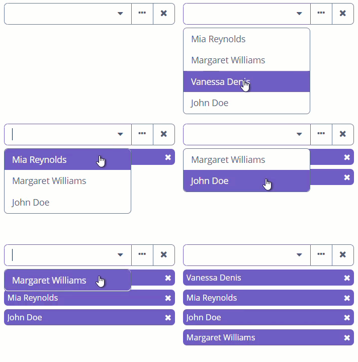
TagPicker allows you to display the selected values as tags. This component combines ComboBox and ValuesPicker, so it has a dropdown list and the ability to work with actions. You can also use TagField for work with tags.
Component’s XML-name: tagPicker.
Data-aware TagPicker
To create a TagPicker associated with data, you should use the dataContainer, property and optionsContainer attributes. In the example below, we select from all the employees of the company those employees who will be listed for a particular department:
@JmixEntity
@Table(name = "UIEX1_DEPARTMENT")
@Entity(name = "uiex1_Department")
public class Department {
    @InstanceName
    @Column(name = "NAME")
    private String name;

    @JoinColumn(name = "PARENT_DEPT_ID")
    @ManyToOne(fetch = FetchType.LAZY)
    private Department parentDept;

    @JoinColumn(name = "MANAGER_ID")
    @ManyToOne(fetch = FetchType.LAZY)
    private Employee manager;

    @OneToMany(mappedBy = "department")
    private List<Employee> employees;
}
@JmixEntity
@Table(name = "UIEX1_EMPLOYEE")
@Entity(name = "uiex1_Employee")
public class Employee {
@InstanceName
@Column(name = "NAME")
private String name;
@OneToMany(mappedBy = "employee")
private List<EquipmentLine> equipment;
@JoinColumn(name = "DEPARTMENT_ID")
@ManyToOne(fetch = FetchType.LAZY)
private Department department;
}<data>
<instance id="departmentDc"
class="ui.ex1.entity.Department">
<fetchPlan extends="_base">
<property name="employees" fetchPlan="_base"/>
</fetchPlan>
<loader/>
</instance>
<collection id="employeesDc"
class="ui.ex1.entity.Employee">
<fetchPlan extends="_base"/>
<loader id="employeesDl">
<query>
<![CDATA[select e from uiex1_Employee e]]>
</query>
</loader>
</collection>
</data>
<layout>
<tagPicker id="employeesTagPicker"
property="employees"
dataContainer="departmentDc"
optionsContainer="employeesDc">
<actions>
<action id="lookup" type="tag_lookup"/>
<action id="clear" type="value_clear"/>
</actions>
</tagPicker>
</layout>In the example above, the screen has the departmentDc data container for the Department entity, which has the employee property. The reference to the data container is specified in the dataContainer attribute. The employeesDc collection of Employee entities is set for optionsContainer attribute to display those values in the drop-down list.
You can also use metaClass attribute instead of dataContainer and property attributes. It enables to use field with entity type without data container:
<data>
    <collection id="employeesDc"
                class="ui.ex1.entity.Employee">
        <fetchPlan extends="_base"/>
        <loader id="employeesDl">
            <query>
                <![CDATA[select e from uiex1_Employee e]]>
            </query>
        </loader>
    </collection>
</data>
<layout>
    <tagPicker id="employeesPicker"
               metaClass="uiex1_Employee"
               optionsContainer="employeesDc">
        <actions>
            <action id="lookup" type="tag_lookup"/>
            <action id="clear" type="value_clear"/>
        </actions>
    </tagPicker>
</layout>
Setting Options Programmatically
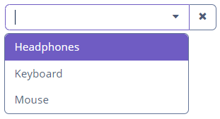
If the component is not connected to an entity attribute, you can set possible values for the drop-down list programmatically in the screen:
<layout>
    <tagPicker id="dataTypeTagPicker"
               inlineTags="true"/>
</layout>
@Autowired
private TagPicker<String> dataTypeTagPicker;
@Subscribe
public void onInit(InitEvent event) {
dataTypeTagPicker.setOptionsList(Arrays.asList(
"Headphones", "Keyboard", "Mouse")
);
}
Attributes
Actions
As TagPicker is the subclass of ValuesPicker, it can use all actions applicable for it.
Note, if there is no defined action, by default will be loaded ValueClearAction.
Events and Handlers
|
To generate a handler stub in Jmix Studio, select the component in the screen descriptor XML or in the Jmix UI hierarchy panel and use the Handlers tab of the Jmix UI inspector panel. Alternatively, you can use the Generate Handler button in the top panel of the screen controller. |
TagPicker has the following handlers and events described in TagField:
TagCaptionProvider
See TagCaptionProvider.
TagClickListener
See TagClickListener.
TagComparator
See TagComparator.
TagStyleProvider
See TagStyleProvider.
Validator
See Validator.
TagPicker XML Attributes
|
You can view and edit attributes applicable to the component using the Jmix UI inspector panel of the Studio’s Screen Designer. |
align - box.expandRatio - caption - captionAsHtml - colspan - contextHelpText - contextHelpTextHtmlEnabled - css - dataContainer - description - descriptionAsHtml - editable - enable - filterMode - height - hideSelectedOptions - htmlSanitizerEnabled - icon - id - inlineTags - inputPrompt - metaClass - optionsContainer - property - required - requiredMessage - responsive - rowspan - stylename - tabIndex - tagPosition - visible - width

