timePicker
timePicker lets users enter or select a time.
-
XML element:
timePicker -
Java class:
TypedTimePicker
Basics
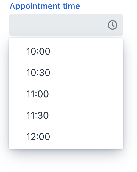
Time can be entered directly using a keyboard or selected from an overlay with a list of time values. The overlay appears on clicking the field or the clock button.

The following example defines a timePicker of localTime type with a label:
<timePicker id="timePicker" datatype="localTime" label="Appointment time"/>Data Types
timePicker is a typed component which supports common data types for storing a time value:
-
localTime -
offsetTime -
time
To change the type, use the datatype attribute.
Step
The default interval between the items displayed in the overlay is set to one hour. A custom step value can be set using the step attribute. This can also be done in the view controller:
@ViewComponent
private TypedTimePicker<Comparable> timePicker;

@Subscribe
public void onInit(InitEvent event) {
    timePicker.setStep(Duration.ofMinutes(30));
}
The step must divide an hour or day evenly. For example, "15 minutes", "30 minutes" and "2 hours" are valid steps, whereas "42 minutes" isn’t.
| The overlay doesn’t appear for steps less than 15 minutes, to avoid showing an impractical number of choices. |
Time Range
To restrict the input to a specific time range, specify a minimum and maximum value using the max and min attributes. This can also be done in the view controller:
@ViewComponent
private TypedTimePicker<Comparable> timePicker;

@Subscribe
public void onInit(InitEvent event) {
    timePicker.setMin(LocalTime.of(8,0));
    timePicker.setMax(LocalTime.of(17,0));
}
Apply a validator to set a more specific time range.
Attributes
id - alignSelf - allowedCharPattern - autoOpen - classNames - clearButtonVisible - colspan - dataContainer - datatype - enabled - errorMessage - height - helperText - invalid - label - max - maxHeight - maxWidth - min - minHeight - minWidth - placeholder - property - readOnly - required - requiredIndicatorVisible - requiredMessage - step - tabIndex - visible - width
Handlers
AttachEvent - BlurEvent - ClientValidatedEvent - ComponentValueChangeEvent - DetachEvent - FocusEvent - InvalidChangeEvent - TypedValueChangeEvent - statusChangeHandler - validator
|
To generate a handler stub in Jmix Studio, use the Handlers tab of the Jmix UI inspector panel or the Generate Handler action available in the top panel of the view class and through the Code → Generate menu (Alt+Insert / Cmd+N). |
ClientValidatedEvent
ClientValidatedEvent is sent by the web component whenever it is validated on the client-side.
InvalidChangeEvent
com.vaadin.flow.component.datepicker.DatePicker.InvalidChangeEvent is sent when the value of the invalid attribute of the component changes.
validator
Adds a validator instance to the component. The validator must throw ValidationException if the value is not valid.
@Install(to = "timePicker", subject = "validator")
private void timePickerValidator(LocalTime value) {
    if (value != null && LocalTime.of(13,0).isBefore(value) && LocalTime.of(14,0).isAfter(value)) {
        throw new ValidationException("No appointments between 13:00 to 14:00.");
    }
}See Also
See Vaadin Docs for more information.
