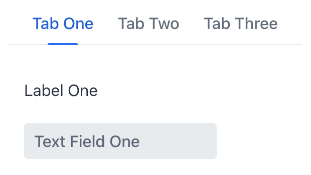
tabSheet
tabSheet is a container which allows switching between tabs. Several tabs help group content on the page.
-
XML element:
tabSheet -
Java class:
JmixTabSheet
Basics
The contents of a tab is described by the tab component. Each tab can contain only one child component. Multiple components must be wrapped with a layout component, such as vbox.
<tabSheet id="tabSheet">
    <tab id="tab1" label="Tab One">
        <vbox>
            <label text="Label One"/>
            <textField placeholder="Text Field One"/>
        </vbox>
    </tab>
    <tab id="tab2" label="Tab Two">
        <label text="Label Two"/>
    </tab>
    <tab id="tab3" label="Tab Three">
        <label text="Label Three"/>
    </tab>
</tabSheet>
|
To add |
tabSheet can have any practical number of tabs. If there are more tabs than the tab bar can fit, navigation buttons will appear.
Handlers
|
To generate a handler stub in Jmix Studio, use the Handlers tab of the Jmix UI inspector panel or the Generate Handler action available in the top panel of the view class and through the Code → Generate menu (Alt+Insert / Cmd+N). |
See Also
See Vaadin Docs for more information.
