GroupBoxLayout
GroupBoxLayout is a container that displays a frame around its components with an optional caption. Additionally, it can collapse the content.
Component’s XML-name: groupBox.
Basics
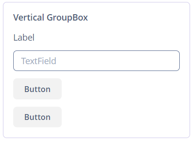
Usage example:
<groupBox caption="Vertical GroupBox"
          spacing="true"
          width="AUTO">
    <label value="Label"/>
    <textField inputPrompt="TextField"/>
    <button caption="Button"/>
    <button caption="Button"/>
</groupBox>
By default, the groupBox container is 100% wide, similar to vbox.
Attributes
-
caption- defines the group header.
-
orientation- defines components placement direction − horizontal or vertical. The default value isvertical. Horizontal orientation is shown below: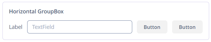
-
collapsable- if the value is set to true, the user can hide the component’s content using a button in the top-left corner.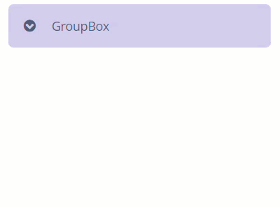
-
collapsed- collapses component’s content initially if set totrue, works withcollapsable="true"attribute.
-
showAsPanel- if set totrue, the component will look like Vaadin Panel. The default value isfalse.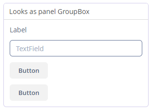
-
outerMargin- sets the outer margins outside the border ofgroupBox. If set totrue, the outer margins will be added on all sides of the component. To set the outer margins for all sides individually, settrueorfalsefor each side ofgroupBox:<groupBox outerMargin="true, false, true, false"/>
All XML Attributes
align - box.expandRatio - caption - captionAsHtml - collapsable - collapsed - colspan - contextHelpText - contextHelpTextHtmlEnabled - css - description - descriptionAsHtml - enable - expand - height - htmlSanitizerEnabled - icon - id - orientation - outerMargin requiredIndicatorVisible - responsive - rowspan - showAsPanel - spacing - visible - width
