Creating a Custom Theme
A built-in theme can be modified in the project. In the modified theme, you can:
-
Change branding images.
-
Add icons to use them in visual components. See the Icons section below.
-
Create new styles for visual components and use them in the stylename attribute. This requires some expertise in CSS.
-
Modify existing styles of the visual components.
-
Modify common parameters, such as background color, margins, spacing, etc.
Creating a Theme Using Studio
Themes are defined in SCSS files. To create a custom theme in the project, you should create a specific file structure in the src/main/themes/<theme-name> directory.
A convenient way to do this is to use Jmix Studio: right-click on the User Interface node in the Jmix project window and select New → Custom Theme. Enter a unique theme name and choose the theme you want to extend in the Base theme dropdown.
As a result, the following directory structure will be created (for example, for Helium theme extension):
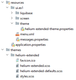
A <theme-name>-theme.properties file must be located in the resources.
styles.scss is an entry point to compile the theme:
@import "helium-extended-defaults";
@import "addons";
@import "helium-extended";

.helium-extended {
  @include addons; (1)
  @include helium-extended;
}| 1 | addons is a special file that is automatically generated based on the added theme add-ons. |
Compiled themes are placed in the build/themes directory and will be included in the JAR/WAR artifact of the project.
The theme name and the corresponding <theme-name>-theme.properties file path are defined in the application.properties file:
jmix.ui.theme.name = helium-extended
jmix.ui.theme-config = ui/ex1/theme/helium-extended-theme.properties|
You can recompile the theme without restarting the application:
Then you should force the browser to reload the page. For example, in Google Chrome you can do it by pressing |
Customizing the Helium Theme
The simplest way to customize the default Helium theme is to use the interactive editor available online. Here you can create your color preset and then use it in your project. To do this, follow the steps below:
-
Extend the Helium theme in your project using Jmix Studio: right-click on the User Interface node in the Jmix project window and select New → Custom Theme. Enter the new theme name, for example,
helium-extended, and select the helium theme in the Base theme dropdown. -
Open the online Theme editor. Here you can play around with the available styling variables and see the result right away.
-
Once the theme meets your requirements, tap the Download button.
-
Copy variable declarations and place them to the
helium-extended.scssfile, for example:@import "../helium/helium"; @mixin helium-extended { @include helium; /* Basic */ --primary-color: #0097D8; --primary-color_rgb: 0, 151, 216; /* Common */ --primary-color-shade-1: #0084BD; --primary-color-shade-2: #0076A8; --primary-dim-color: #2EC0FF; /* TextField */ --textfield-background-color: #E8FFFC; } -
Restart the application. Now the user will see the application with the Helium-extended theme on the first login.
Helium Theme Presets
Preset is a list of CSS variables used for colors. Using presets, you can integrate colors (for example, corporate colors) into your application.
You can create a custom preset or use predefined presets.
The Helium theme and its extensions have two predefined color presets: dark and white.
All available color presets are defined in the application.properties file:
jmix.ui.theme.modes = light, darkThe default color preset is light.
The Helium theme and its extensions have three predefined theme size presets: small, medium, and large.
All available theme size presets are defined in the application.properties file:
jmix.ui.theme.sizes = small, medium, largeThe default theme size preset is medium.
Let’s create a new color preset - cobalt.
-
Extend the Helium theme in your project using Jmix Studio: right-click on the User Interface node in the Jmix project window and select New → Custom Theme. Enter the new theme name, for example,
helium-ext, and select the helium theme in the Base theme dropdown. -
Define variable declarations and place them to the
helium-ext.scssfile, for example:@import "../helium/helium"; @mixin helium-ext { @include helium; &.cobalt { @include helium-cobalt; } } @mixin helium-cobalt { /* Basic */ --primary-color: #0055A6; --primary-color_rgb: 0, 85, 166; /* Common */ --primary-color-shade-1: #004C95; --primary-color-shade-2: #004484; --primary-dim-color: #C6D1EC; /* Button */ --button-primary-focused-border-color: #C6D1EC; } -
Define a new color preset in the
application.propertiesfile and make it default:jmix.ui.theme.modes = light, dark, cobalt jmix.ui.theme.default-mode-to-use = cobalt -
Restart the application. Now the user will see the application with the Helium-ext theme with the cobalt color preset on the first login.
Changing Branding
You can configure some branding properties, such as icons, login and main application window captions, and the website icon (favicon.ico).
To use custom images, replace default ones in the src/main/themes/<theme-name>/branding directory.
To set window captions and the login window welcome text, change them in the messages.properties file. Update messages to reflect the purpose of the application. The example is below:
ui.ex1/menu.application=Main Menu

ui.ex1.screen.main/application.caption = Sample UI Application
ui.ex1.screen.main/application.logoLabel = Sample UI Application
ui.ex1.screen.login/welcomeLabel = Welcome to Sample UI Application
Adding Fonts
You can add custom fonts to your theme. To add a font family, import it in the first line of the styles.scss file, for example:
@import url(http://fonts.googleapis.com/css?family=Roboto);To replace the standard font in the project, set the custom one in the <theme-name>-defaults.scss file:
$v-font-family: 'Roboto';Creating New Styles
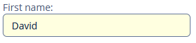
Consider the example of setting the yellow background color to the text field displaying the customer’s name.
Define the TextField component in the XML descriptor:
<textField id="nameTextField"
           dataContainer="customerDc"
           property="firstName"
           caption="First name:"
           stylename="name-field"/>
In the stylename attribute, specify the name of the style.
In the <theme-name>.scss file, add the new style definition to the <theme-name> mixin:
@import "../helium/helium";

@mixin helium-extended {
  @include helium;

  .name-field {
      background-color: lightyellow;
  }
}
After restarting the project, the field will be displayed as follows:
Modifying Existing Styles
To modify style parameters of existing components, add the corresponding CSS code to the <theme-name> mixin of the <theme-name>.scss file. Use developer tools of your web browser to find out CSS classes assigned to the elements of visual components. For example, to display the application menu items in bold, the contents of the <theme-name>.scss file should be as follows:
@import "../helium/helium";

@mixin helium-extended {
  @include helium;

  .jmix-sidemenu-item-caption {
      font-weight: bold;
  }
}
Modifying Common Parameters
Themes contain some SCSS variables that control application background color, component size, margins, and other parameters.
Below is the example of a Halo theme extension since it is based on the Valo theme from Vaadin and provides the widest range of customization options.
The <theme-name>-defaults.scss file is intended for overriding theme variables. Most of the Halo variables correspond to those described in the Valo documentation. Below are the most common variables:
$v-background-color: #fafafa;        /* component background color */
$v-app-background-color: #e7ebf2;    /* application background color */
$v-panel-background-color: #fff;     /* panel background color */
$v-focus-color: #3b5998;             /* focused element color */
$v-error-indicator-color: #ed473b;   /* empty required fields color */

$v-line-height: 1.35;                /* line height */
$v-font-size: 14px;                  /* font size */
$v-font-weight: 400;                 /* font weight */
$v-unit-size: 30px;                  /* base theme size, defines the height for buttons, fields and other elements */

$v-font-size--h1: 24px;              /* h1-style Label size */
$v-font-size--h2: 20px;              /* h2-style Label size */
$v-font-size--h3: 16px;              /* h3-style Label size */

/* margins for containers */
$v-layout-margin-top: 10px;
$v-layout-margin-left: 10px;
$v-layout-margin-right: 10px;
$v-layout-margin-bottom: 10px;

/* spacing between components in a container (if enabled) */
$v-layout-spacing-vertical: 10px;
$v-layout-spacing-horizontal: 10px;

/* whether filter search button should have "friendly" style*/
$jmix-filter-friendly-search-button: true;

/* whether button that has primary action or marked as primary itself should be highlighted*/
$jmix-highlight-primary-action: false;

/* basic table and datagrid settings */
$v-table-row-height: 30px;
$v-table-header-font-size: 13px;
$v-table-cell-padding-horizontal: 7px;
$v-grid-row-height
$v-grid-row-selected-background-color
$v-grid-cell-padding-horizontal

/* input field focus style */
$v-focus-style: inset 0px 0px 5px 1px rgba($v-focus-color, 0.5);
/* required fields focus style */
$v-error-focus-style: inset 0px 0px 5px 1px rgba($v-error-indicator-color, 0.5);

/* animation for elements is enabled by default */
$v-animations-enabled: true;
/* popup window animation is disabled by default */
$v-window-animations-enabled: false;

/* inverse header is controlled by cuba.web.useInverseHeader property */
$v-support-inverse-menu: true;

/* show "required" indicators for components */
$v-show-required-indicators: false !default;
The sample <theme-name>-defaults.scss for a theme with a dark background and slightly minimized margins is provided below:
@import "../halo/halo-defaults";

$v-background-color: #444D50;

$v-font-size--h1: 22px;
$v-font-size--h2: 18px;
$v-font-size--h3: 16px;

$v-layout-margin-top: 8px;
$v-layout-margin-left: 8px;
$v-layout-margin-right: 8px;
$v-layout-margin-bottom: 8px;

$v-layout-spacing-vertical: 8px;
$v-layout-spacing-horizontal: 8px;

$v-table-row-height: 25px;
$v-table-header-font-size: 13px;
$v-table-cell-padding-horizontal: 5px;

$v-support-inverse-menu: false;

$jmix-highlight-primary-action: true;
Modifying Server-Side Theme Parameters
You can override the variables in the <theme-name>-theme.properties file, which specifies some server-side parameters. For example, to change the Add Condition dialog size of the Filter component, the <theme-name>-theme.properties file should contain the following:
@include=io/jmix/ui/theme/halo-theme.properties

jmix.ui.filter.addConditionScreen.dialog.height = 500
jmix.ui.filter.addConditionScreen.dialog.width = 500
Creating a Theme Manually
Let’s create a Hover Dark theme, a dark variation of the built-in Hover theme.
-
Create the following file structure in your project:
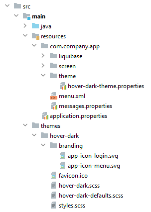
-
The
hover-dark.scssfile:@import "../hover/hover"; @mixin hover-dark { @include hover; } -
The
hover-dark-defaults.scssfile:@import "../hover/hover-defaults";Override the default style variables in the
hover-dark-defaults.scssfile; that is, replace the variables in it by the following ones:@import "../hover/hover-defaults"; $v-app-background-color: #262626; $v-background-color: lighten($v-app-background-color, 12%); $v-border: 1px solid (v-tint 0.8); $font-color: valo-font-color($v-background-color, 0.85); $v-button-font-color: $font-color; $v-font-color: $font-color; $v-link-font-color: lighten($v-focus-color, 15%); $v-link-text-decoration: none; $v-textfield-background-color: $v-background-color; $jmix-hover-color: #75a4c1; $jmix-maintabsheet-tabcontainer-background-color: $v-app-background-color; $jmix-menubar-background-color: lighten($v-app-background-color, 4%); $jmix-tabsheet-tab-caption-selected-color: $v-font-color; $jmix-window-modal-header-background: $v-background-color; $jmix-menubar-menuitem-border-radius: 0; -
The
styles.scssfile:@import "hover-dark-defaults"; @import "addons"; @import "hover-dark"; .hover-dark { @include addons; @include hover-dark; } -
Create the
hover-dark-theme.propertiesfile in thesrc/main/resources/<project package>/themefolder:@include=io/jmix/ui/theme/hover-theme.properties -
To compile an extended theme, define the following dependencies in
build.gradle:dependencies { // ... themes 'io.jmix.ui:jmix-ui-themes' implementation 'io.jmix.ui:jmix-ui-themes' } -
Define the theme name and the corresponding
<theme-name>-theme.propertiesfile path in theapplication.propertiesfile:jmix.ui.theme.name = hover-dark jmix.ui.theme-config = ui/ex1/theme/hover-dark-theme.properties -
Restart the application or recompile the theme. Now the user will see the application with the Hover-dark theme on the first login: