TagField
TagField allows you to display the selected values as tags. This component is based on SuggestionField and has similar functionality, but one significant difference is that TagField allows you to select multiple values instead of a single value. You can also use TagPicker for work with tags.
Component’s XML-name: tagField.
Basics
Use TagField if:
-
You need to display selected values as tags.
-
You need to select multiple options.
-
The number of options in the list of suggested values is too large to use CheckBoxGroup.
-
You want to provide high-performance search in the database without loading much data to the UI layer.
To enable TagField suggestions, you should use the search executor.
Attributes
TagField has all specific attributes of the SuggestionField:
and one special attribute:
-
clearAllVisible- responsible for displaying the button that deletes all previously selected values. By default,clearAllVisible = "false".
Creating New Items
TagField has ENTER keypress handler and a predefined class NewTagProvider for converting entered text to tag. In the example below, we convert entered text to entity:
@JmixEntity
@Table(name = "UIEX1_DEPARTMENT")
@Entity(name = "uiex1_Department")
public class Department {
    @InstanceName
    @Column(name = "NAME")
    private String name;

    @JoinColumn(name = "PARENT_DEPT_ID")
    @ManyToOne(fetch = FetchType.LAZY)
    private Department parentDept;

    @JoinColumn(name = "MANAGER_ID")
    @ManyToOne(fetch = FetchType.LAZY)
    private Employee manager;

    @OneToMany(mappedBy = "department")
    private List<Employee> employee;
}
@JmixEntity
@Table(name = "UIEX1_EMPLOYEE")
@Entity(name = "uiex1_Employee")
public class Employee {
@InstanceName
@Column(name = "NAME")
private String name;
@OneToMany(mappedBy = "employee")
private List<EquipmentLine> equipment;
@JoinColumn(name = "DEPARTMENT_ID")
@ManyToOne(fetch = FetchType.LAZY)
private Department department;
}<data>
<instance id="departmentDc"
class="ui.ex1.entity.Department">
<fetchPlan extends="_base">
<property name="employee" fetchPlan="_base"/>
</fetchPlan>
<loader/>
</instance>
</data>
<layout>
<tagField id="employeesTagField"
dataContainer="departmentDc"
property="employee"
caption="Department employees" />
</layout>@Autowired
private TagField<Employee> employeesTagField;
@Autowired
private Metadata metadata;
@Subscribe
public void onInit(InitEvent event) {
employeesTagField.setEnterPressHandler(new TagField.NewTagProvider<Employee>() {
@Override
public Employee create(String name) {
Employee employee = metadata.create(Employee.class);
employee.setName(name);
return employee;
}
});
}Validation
To check values entered into the TagField component, you can use a validator in a nested validators element.
The following predefined validators are available for TagField:
In the example below, we will show a SizeValidator usage for validatedCheckBoxGroup:
<checkBoxGroup id="validatedCheckBoxGroup"
               optionsContainer="customersDc"
               caption="The number of customers is limited from 2 to 5">
    <validators>
        <size min="2" max="5"/>
    </validators>
</checkBoxGroup>
Events and Handlers
|
To generate a handler stub in Jmix Studio, select the component in the screen descriptor XML or in the Component Hierarchy panel and use the Handlers tab of the Component Inspector panel. Alternatively, you can use the Generate Handler button in the top panel of the screen controller. |
Formatter
See Formatter.
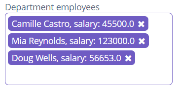
TagCaptionProvider
To change the displayed caption of tags, TagField has TagCaptionProvider.
@Install(to = "employeesTagField", subject = "tagCaptionProvider")
private String employeesTagFieldTagCaptionProvider(Employee employee) {
    return employee.getName() + ", salary: " + employee.getSalary();
}
TagClickListener
This listener allows you to handle clicks on tags. For example, you can programmatically set the edit screen to open for the tag that the user clicked on:
@Autowired
private ScreenBuilders screenBuilders;

@Subscribe("employeesTagField")
public void onEmployeesTagFieldTagClick(TagField.TagClickEvent<Employee> event) {
    screenBuilders.editor(Employee.class, this)
            .editEntity(event.getItem())
            .show();
}
TagComparator
TagComparator allows you to sort tags. For example, you can sort employees by their salaries, in descending order:
@Autowired
private TagField<Employee> employeesTagField;
@Subscribe
public void onInit(InitEvent event) {
employeesTagField.setTagComparator((o1, o2) -> {
Double salary1 = o1.getSalary();
Double salary2 = o2.getSalary();
if (salary1 == null) {
return 1;
} else if (salary2 == null) {
return -1;
}
return salary2.compareTo(salary1);
});
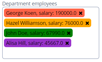
}TagStyleProvider
TagStyleProvider allows managing additional style for the tags:
@Install(to = "employeesTagField", subject = "tagStyleProvider")
private String employeesTagFieldTagStyleProvider(Employee employee) {
    if (employee != null) {
        switch (employee.getPosition()) {
            case DEV:
                return "developer";
            case BA:
                return "business-analyst";
            case PM:
                return "project-manager";
            case CEO:
                return "chief-executive-officer";
        }
    }
    return null;
}
Then you should define the item styles set in the application theme. Detailed information on creating a theme is available in Themes. Style names representing in the controller, together with prefixes identifying each item, form CSS selectors. For example:
.jmix-taglabel.developer {
  background-color: green;
  color: black;
}

.jmix-taglabel.business-analyst {
  background-color: orange;
  color: black;
}

.jmix-taglabel.project-manager {
  background-color: darkorchid;
  color: black;
}

.jmix-taglabel.chief-executive-officer {
  background-color: tomato;
  color: black;
}
Validator
Adds a validator instance to the component. The validator must throw ValidationException if the value is not valid.
If you are not satisfied with the predefined validators, adds your own validator instance:
@Install(to = "validCheckBoxGroup", subject = "validator")
protected void validCheckBoxGroupValidator(Collection<EducationalStage> value) {
    if (value.contains(EducationalStage.NO) & value.size() > 1)
        throw new ValidationException("You cannot select the No Education " +
                "value together with other values");
}
ValueChangeEvent
See ValueChangeEvent.
TagField XML Attributes
|
You can view and edit attributes applicable to the component using the Component Inspector panel of the Studio’s Screen Designer. |
align - asyncSearchDelayMs - box.expandRatio - caption - captionAsHtml - clearAllVisible - colspan - contextHelpText - contextHelpTextHtmlEnabled - css - dataContainer - description - descriptionAsHtml - editable - enable - height - htmlSanitizerEnabled - icon - id - inputPrompt - minSearchStringLength - popupWidth - property - required - requiredMessage - responsive - rowspan - stylename - suggestionsLimit - tabIndex - visible - width
TagField XML Elements
formatter - query - validators
