Examples
Creating Chart with Data from Entity
In this example, we will create a chart similar to 3D Stacked Column Chart from AmCharts demos. The type of the chart will be SerialChart. This chart will retrieve data from a database, so the dataContainer attribute has to be defined.
Creating Entity
Let’s create an entity with the CountryGrowth name and the following attributes:
-
countryof theStringtype -
year2014of theDoubletype -
year2015of theDoubletype
The source code of the CountryGrowth entity will look like this:
@JmixEntity
public class CountryGrowth {
    @JmixProperty(mandatory = true)
    @JmixId
    @JmixGeneratedValue
    protected UUID id;

    @JmixProperty(mandatory = true)
    @InstanceName
    protected String country;

    @JmixProperty(mandatory = true)
    protected Double year2014;

    @JmixProperty(mandatory = true)
    protected Double year2015;

    public CountryGrowth() {
        this.id = UUID.randomUUID();
    }

    public UUID getId() {
        return id;
    }

    public void setId(UUID id) {
        this.id = id;
    }

    public void setCountry(String country) {
        this.country = country;
    }

    public String getCountry() {
        return country;
    }

    public void setYear2014(Double year2014) {
        this.year2014 = year2014;
    }

    public Double getYear2014() {
        return year2014;
    }

    public void setYear2015(Double year2015) {
        this.year2015 = year2015;
    }

    public Double getYear2015() {
        return year2015;
    }
}
This class describes a non-persistent entity. An instance of this class contains the number of the country GDP growth rate for 2014 and 2015 years.
Screen XML Descriptor
Create a new blank screen and replace the code in the XML descriptor with the following:
<window xmlns="http://jmix.io/schema/ui/window"
xmlns:chart="http://jmix.io/schema/ui/charts"> (1)
<data>
<collection id="countryGrowthDc"
class="charts.ex1.entity.CountryGrowth"/> (2)
</data>
<layout>
<chart:serialChart id="column3d"
angle="30"
categoryField="country"
dataContainer="countryGrowthDc"
depth3D="60"
height="100%"
plotAreaFillAlphas="0.1"
startDuration="1"
theme="LIGHT"
width="100%"> (3)
<chart:categoryAxis gridPosition="START"/> (4)
<chart:valueAxes>(5)
<chart:axis position="LEFT"
stackType="BOX_3D"
title="GDP growth rate"
unit="%"/>
</chart:valueAxes>
<chart:graphs>(6)
<chart:graph balloonText="GDP grow in [[category]] (2014): <strong>
[[value]]</strong>"
fillAlphas="0.9"
lineAlpha="0.2"
title="2014"
type="COLUMN"
valueField="year2014" id="graph2014"/>
<chart:graph balloonText="GDP grow in [[category]] (2015): <strong>
[[value]]</strong>"
fillAlphas="09."
lineAlpha="0.2"
title="2015"
type="COLUMN"
valueField="year2015" id="graph2015"/>
</chart:graphs>
<chart:export/>(7)
</chart:serialChart>
</layout>
</window>| 1 | The root window element contains the chart namespace to enable using charts in the screen. |
| 2 | The chart retrieves data from the countryGrowthDc data container defined in the CollectionContainer. Names and values are displayed using the country, year2014 and year2015 attributes of the CountryGrowth entity. |
| 3 | The chart:serialChart component contains the following attributes:
|
| 4 | chart:categoryAxis – an element of the chart:serialChart component that describes the category axis.
|
| 5 | chart:valueAxes – an element of the chart:serialChart component that defines vertical value axes. In our case, only one vertical axis is used. The axis is described by the chart:axis element.
|
| 6 | chart:graphs – an element of the chart:serialChart component that contains a collection of chart:graph elements. The graph is described by the chart:graph element.
|
| 7 | chart:export – an optional element that enables chart export. |
Screen Controller
Open the Column3dChart screen controller and replace its content with the following code:
@UiController("sample_Column3dChart")
@UiDescriptor("column3d-chart.xml")
public class Column3dChart extends Screen {
@Autowired
private CollectionContainer<CountryGrowth> countryGrowthDc;
@Subscribe
private void onInit(InitEvent event) {
List<CountryGrowth> items = new ArrayList<>();
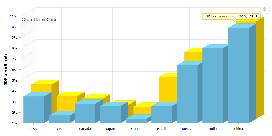
items.add(countryGrowth("USA", 3.5, 4.2));
items.add(countryGrowth("UK", 1.7, 3.1));
items.add(countryGrowth("Canada", 2.8, 2.9));
items.add(countryGrowth("Japan", 2.6, 2.3));
items.add(countryGrowth("France", 1.4, 2.1));
items.add(countryGrowth("Brazil", 2.6, 4.9));
items.add(countryGrowth("Russia", 6.4, 7.2));
items.add(countryGrowth("India", 8.0, 7.1));
items.add(countryGrowth("China", 9.9, 10.1));
countryGrowthDc.setItems(items);
}
private CountryGrowth countryGrowth(String country, double year2014, double year2015) {
CountryGrowth cg = new CountryGrowth();
cg.setCountry(country);
cg.setYear2014(year2014);
cg.setYear2015(year2015);
return cg;
}
}The onInit method populates the countryGrowthDc data container with the data.
Creating Chart with Data from DataProvider
This chart retrieves data through the DataProvider created in the controller, so the dataContainer attribute is not defined.
Screen XML Descriptor
Create a new blank screen and replace the code in the XML descriptor with the following:
<window xmlns="http://jmix.io/schema/ui/window"
        xmlns:chart="http://jmix.io/schema/ui/charts"> (1)
    <layout>
        <chart:serialChart id="chart"
                           categoryField="year"
                           height="100%"
                           marginLeft="0"
                           marginTop="10"
                           plotAreaBorderAlpha="0"
                           width="100%">(2)
            <chart:chartCursor cursorAlpha="0"/>(3)
            <chart:legend equalWidths="false"
                          periodValueText="total: [[value.sum]]"
                          position="TOP"
                          valueAlign="LEFT"
                          valueWidth="100"/>(4)
            <chart:valueAxes>(5)
                <chart:axis gridAlpha="0.07"
                            position="LEFT"
                            stackType="REGULAR"
                            title="Traffic incidents"/>
            </chart:valueAxes>
            <chart:graphs>(6)
                <chart:graph fillAlphas="0.6"
                             hidden="true"
                             lineAlpha="0.4"
                             title="Cars"
                             valueField="cars"/>
                <chart:graph fillAlphas="0.6"
                             lineAlpha="0.4"
                             title="Motorcycles"
                             valueField="motorcycles"/>
                <chart:graph fillAlphas="0.6"
                             lineAlpha="0.4"
                             title="Bicycles"
                             valueField="bicycles"/>
            </chart:graphs>
            <chart:categoryAxis axisColor="#DADADA"
                                gridAlpha="0.07"
                                startOnAxis="true">(7)
            </chart:categoryAxis>
            <chart:export/>(8)
        </chart:serialChart>
    </layout>
</window>| 1 | The root window element contains the chart namespace to enable using charts in the screen. |
| 2 | The chart:serialChart component. |
| 3 | chart:chartCursor – an element of the chart:serialChart component that adds a cursor to the chart. The cursor follows the mouse pointer and shows a tooltip with the value of the corresponding point on a chart.
|
| 4 | chart:legend – an element of the chart:serialChart component that defines the chart legend.
|
| 5 | chart:valueAxes – an element of the chart:serialChart component that defines vertical value axes. In our case, only one vertical axis is used. The axis is described by the chart:axis element.
|
| 6 | chart:graphs – an element of the chart:serialChart component that contains a collection of chart:graph elements. The graph is described by the chart:graph element.
|
| 7 | chart:categoryAxis – an element of the chart:serialChart component that describes the category axis.
|
| 8 | chart:export – an optional element that enables chart export. |
Screen Controller
Open the StackedareaChart screen controller and replace its content with the following code:
@UiController("sample_StackedareaChart")
@UiDescriptor("stackedarea-chart.xml")
public class StackedareaChart extends Screen {
@Autowired
private SerialChart chart;
@Subscribe
private void onInit(InitEvent event) {
ListDataProvider dataProvider = new ListDataProvider();
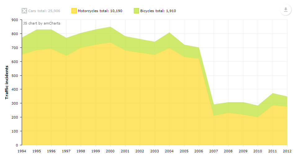
dataProvider.addItem(transportCount(1994, 1587, 650, 121));
dataProvider.addItem(transportCount(1995, 1567, 683, 146));
dataProvider.addItem(transportCount(1996, 1617, 691, 138));
dataProvider.addItem(transportCount(1997, 1630, 642, 127));
dataProvider.addItem(transportCount(1998, 1660, 699, 105));
dataProvider.addItem(transportCount(1999, 1683, 721, 109));
dataProvider.addItem(transportCount(2000, 1691, 737, 112));
dataProvider.addItem(transportCount(2001, 1298, 680, 101));
dataProvider.addItem(transportCount(2002, 1275, 664, 97));
dataProvider.addItem(transportCount(2003, 1246, 648, 93));
dataProvider.addItem(transportCount(2004, 1318, 697, 111));
dataProvider.addItem(transportCount(2005, 1213, 633, 87));
dataProvider.addItem(transportCount(2006, 1199, 621, 79));
dataProvider.addItem(transportCount(2007, 1110, 210, 81));
dataProvider.addItem(transportCount(2008, 1165, 232, 75));
dataProvider.addItem(transportCount(2009, 1145, 219, 88));
dataProvider.addItem(transportCount(2010, 1163, 201, 82));
dataProvider.addItem(transportCount(2011, 1180, 285, 87));
dataProvider.addItem(transportCount(2012, 1159, 277, 71));
chart.setDataProvider(dataProvider);
}
private DataItem transportCount(int year, int cars, int motorcycles, int bicycles) {
MapDataItem item = new MapDataItem();
item.add("year", year);
item.add("cars", cars);
item.add("motorcycles", motorcycles);
item.add("bicycles", bicycles);
return item;
}
}The onInit method submits data to the chart as a rolling value. This type of charts shows the ratio of separate parts to their total value.
Creating Chart with Incremental Data Update
This chart will retrieve data from a data container, and this data will be updated automatically. The chart is not refreshed completely when new data is added to the data container: data points are added on the fly every 2 seconds. This approach will be useful, for example, for creating dynamically updated dashboards.
In this example, we will show the dynamic of new orders amounts based on the Order entity.
-
Let’s create the
Orderentity with the following attributes:-
dateof theDatetype -
amountof theBigDecimaltype -
descriptionof theStringtype
-
-
Then create a new screen and call it
orders-history. -
Replace the code in the XML descriptor with the following:
<window xmlns="http://jmix.io/schema/ui/window"
        xmlns:chart="http://jmix.io/schema/ui/charts">(1)
    <data>
        <collection id="ordersDc" class="charts.ex1.entity.Order"/>(2)
    </data>
    <facets>
        <timer id="updateChartTimer" delay="2000" repeating="true" autostart="true"/>(3)
    </facets>
    <layout>
        <chart:serialChart id="orderHistoryChart"
                           categoryField="date"
                           dataContainer="ordersDc"
                           width="100%">(4)
            <chart:graphs>
                <chart:graph valueField="amount"/>(5)
            </chart:graphs>
        </chart:serialChart>
    </layout>
</window>
1 The root windowelement contains thechartnamespace to enable using charts in the screen.2 We will not load the data from the container in this example. Instead, the sample data will be generated on the fly, so you don’t need to create a loader. 3 We will update the chart on the fly using a timer– a facet that will send HTTP requests to the server side. Set the following properties:-
The timer
id. -
The data should be updated every 2 seconds, so set
delayto2000milliseconds. -
Select repeating and autostart checkboxes.
4 The serialChartcomponent has a data container bound to it. Set thedateproperty for the category axis.5 Set the amountproperty for the value axis. -
-
Switch to the
OrdersHistorycontroller. Its code looks like this:@UiController("sample_OrdersHistory") @UiDescriptor("orders-history.xml") public class OrdersHistory extends Screen { @Autowired private Metadata metadata; (1) @Autowired private TimeSource timeSource; @Autowired private CollectionContainer<Order> ordersDc; private final Random random = new Random(42); @Subscribe private void onInit(InitEvent event) { (2) Order initialValue = metadata.create(Order.class); initialValue.setAmount(new BigDecimal(random.nextInt(1000) + 100)); initialValue.setDate(timeSource.currentTimestamp()); ordersDc.getMutableItems().add(initialValue); (3) } @Subscribe("updateChartTimer") private void onTimerTick(Timer.TimerActionEvent event) { (4) Order orderHistory = metadata.create(Order.class); orderHistory.setAmount(new BigDecimal(random.nextInt(1000) + 100)); orderHistory.setDate(timeSource.currentTimestamp()); ordersDc.getMutableItems().add(orderHistory); System.out.println("get"); } }1 Inject necessary dependencies: metadata,timeSource, and the data container for theOrderentity.2 Initializes the chart in the onInit()method. We will generate a newOrderinstance with a random amount value.3 The new instance is added to the collection data container using the getMutableItems().add()method.4 Subscribes to TimerActionEvent. Using the same logic for creating a random Order instance, we will generate a new Order instance each time the timer event is fired. -
At this stage, the chart is already functional, but the data container size will increase rapidly, so we need to limit the number of items to be displayed. Let’s add some code to the controller:
-
Create a Queue of orders.
private Queue<Order> itemsQueue = new LinkedList<>(); -
Add the following code to the end of the
onTimerTickmethod:itemsQueue.add(orderHistory); (1) if (itemsQueue.size() > 10) { (2) ordersDc.getMutableItems().remove(0); System.out.println("in"); }1 Each time the timer event is fired, the generated item is added to the top of the itemsQueue. 2 When the queue size exceeds 10 items, the oldest item is excluded.
-
Result
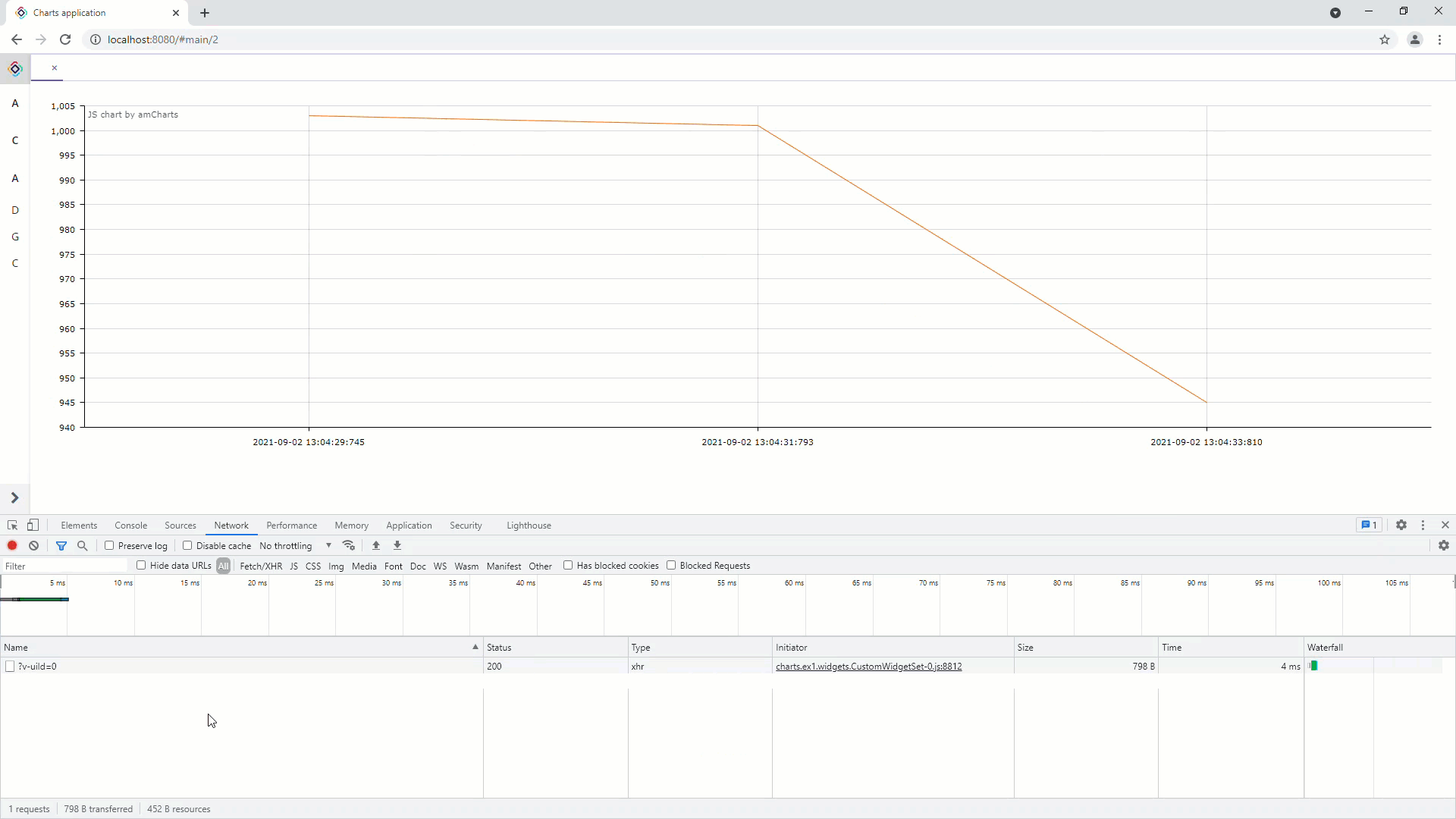
All the data is sent to the browser incrementally. If you open the Chrome developer console on the Network tab, you will see that every 2 seconds, our web page sends an HTTP request to the backend, and in response to that, the backend sends a small JSON message. The JSON contains one add and one remove operation for the amount value. Thus, we do not re-send all the data.
Using Events
Let’s consider the use of events. We will add handling of a graph item click to the screen created in the example above. Add the following code to the screen controller:
@Autowired
private SerialChart column3d; (1)
@Autowired
private Notifications notifications; (2)
@Subscribe
private void onInit(InitEvent event) {
column3d.addGraphItemClickListener(graphItemClickEvent -> (3)
notifications.create()
.withCaption(itemClickEventInfo(graphItemClickEvent))
.withContentMode(ContentMode.HTML)
.show());
// ...
}
private String itemClickEventInfo(Chart.GraphItemClickEvent event) { (4)
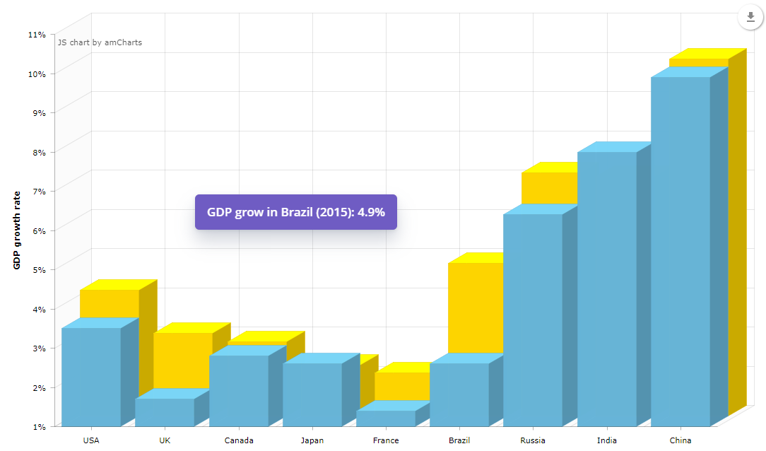
CountryGrowth countryGrowth = (CountryGrowth) event.getEntityNN(); (5)
return String.format("GDP grow in %s (%s): %.1f%%",
countryGrowth.getCountry(),
event.getGraphId().substring(5),
"graph2014".equals(event.getGraphId()) ? countryGrowth.getYear2014() : countryGrowth.getYear2015());
}| 1 | Injects the chart. |
| 2 | Injects Notifications in order to show messages. |
| 3 | Adds a listener at the bottom of the onInit method. |
| 4 | A method for getting the information about the element of the chart. |
| 5 | The SerialChart component is bound to the data container, so the getEntityNN() method gets the item clicked. |
To see the results, open the screen and click one of the columns.
Configuration using JSON
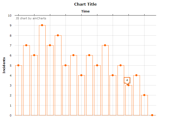
In order to configure a chart, in addition to assigning XML attributes, you can use a custom JSON described in the AmCharts documentation.
For example, we have a serialChart:
<window xmlns="http://jmix.io/schema/ui/window"
        xmlns:chart="http://jmix.io/schema/ui/charts">
    <layout>
        <chart:serialChart id="serialChart">
            <chart:valueAxes>
                <chart:axis axisAlpha="0" position="LEFT" title="Incidents"/>
            </chart:valueAxes>
            <chart:graphs>
                <chart:graph id="g1" bullet="ROUND" type="COLUMN" valueField="value"/>
            </chart:graphs>
            <chart:categoryAxis position="TOP" title="Time" labelsEnabled="false"/>
        </chart:serialChart>
    </layout>
</window>
This chart has some data:
@UiController("sample_SerialChartJsonTitle")
@UiDescriptor("serial-chart-json-title.xml")
public class SerialChartJsonTitle extends Screen {
    @Autowired
    private SerialChart serialChart;

    @Subscribe
    private void onInit(InitEvent event) {
        ListDataProvider serialChartDataProvider = new ListDataProvider();
        int[] serialChartData = {5, 7, 6, 9, 7, 8, 5, 6, 4, 6, 5, 7, 4, 5, 3, 4, 2, 0};

        for (int i = 0; i < serialChartData.length; i++) {
            serialChartDataProvider.addItem(graphData(serialChartData[i]));
        }

        serialChart.setDataProvider(serialChartDataProvider);
    }

    private DataItem graphData(int value) {
        MapDataItem item = new MapDataItem();
        item.add("value", value);
        return item;
    }
}
And now we can change the chart’s configuration. As an example, let’s add a title. Add the following code in the end of the onInit method:
serialChart.setNativeJson("{\n" +
        " \"titles\": [\n" +
        " {\n" +
        " \"size\": 15,\n" +
        " \"text\": \"Chart Title\"\n" +
        " }\n" +
        " ]\n" +
        "}");
You can also set JSON configuration in the XML descriptor:
 <chart:serialChart id="serialChart">
     <chart:nativeJson>
         <![CDATA[
{
    "titles": [
        {
            "size": 15,
            "text": "Chart Title"
        }
    ]
}
]]>
     </chart:nativeJson>
     <chart:valueAxes>
         <chart:axis axisAlpha="0" position="LEFT" title="Incidents"/>
     </chart:valueAxes>
     <chart:graphs>
         <chart:graph id="g1" bullet="ROUND" type="COLUMN" valueField="value"/>
     </chart:graphs>
     <chart:categoryAxis position="TOP" title="Time" labelsEnabled="false"/>
 </chart:serialChart>