2. Display Markers on Map
Add Attribute to Entity and UI
Let’s add the location attribute to the User entity:
Double-click on the User entity in Jmix tool window and choose its last attribute (to append the new attribute at the end):
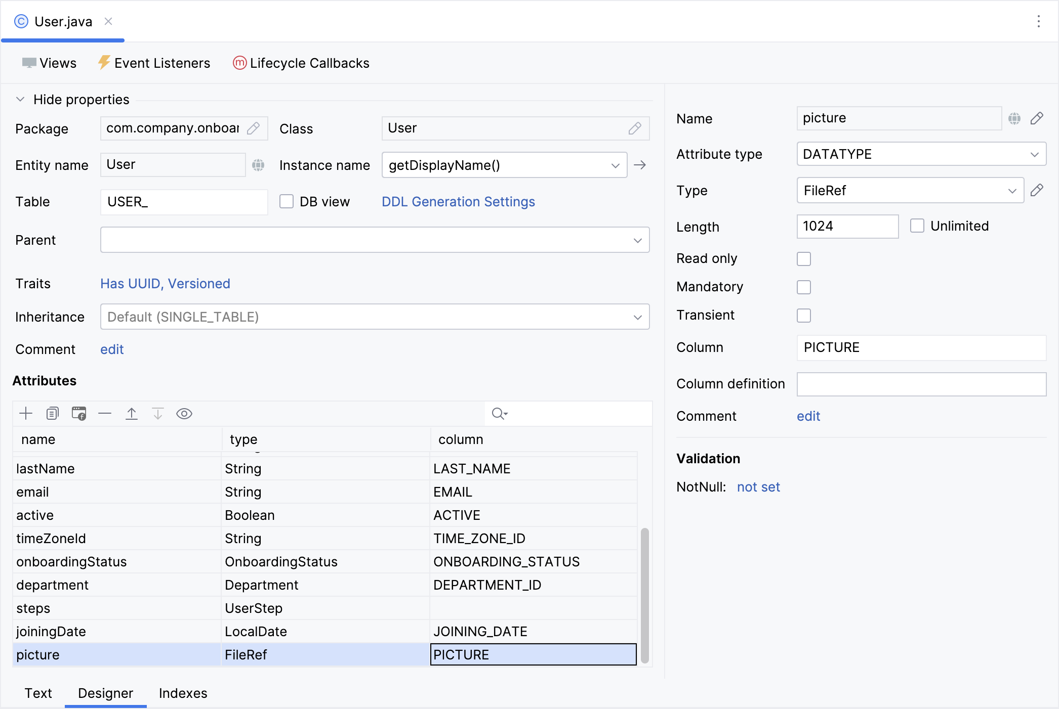
Click Add ( ) in the Attributes toolbar. In the New Attribute dialog, input
 location in the Name field, choose ASSOCIATION in the Attribute type dropdown, and Location in the Type dropdown. Select One to One cardinality and mark the Owning Side checkbox.
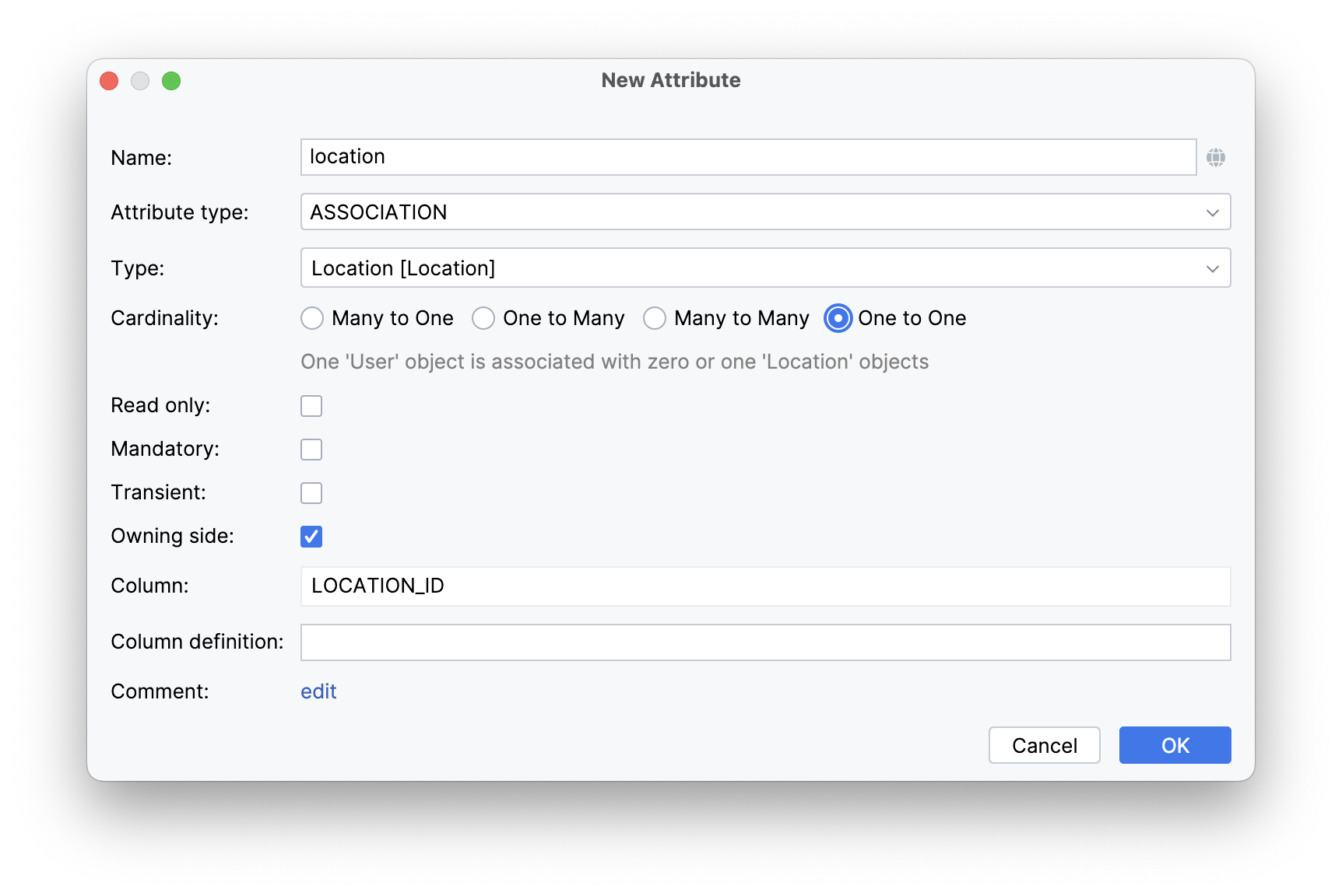
To establish a one-to-one reference, Studio recommends generating an inverse attribute in the Location entity.
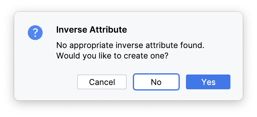
Click Yes, and then OK in the next dialog.
Choose the location attribute and click the Add to Views ( ) button in the Attributes toolbar:
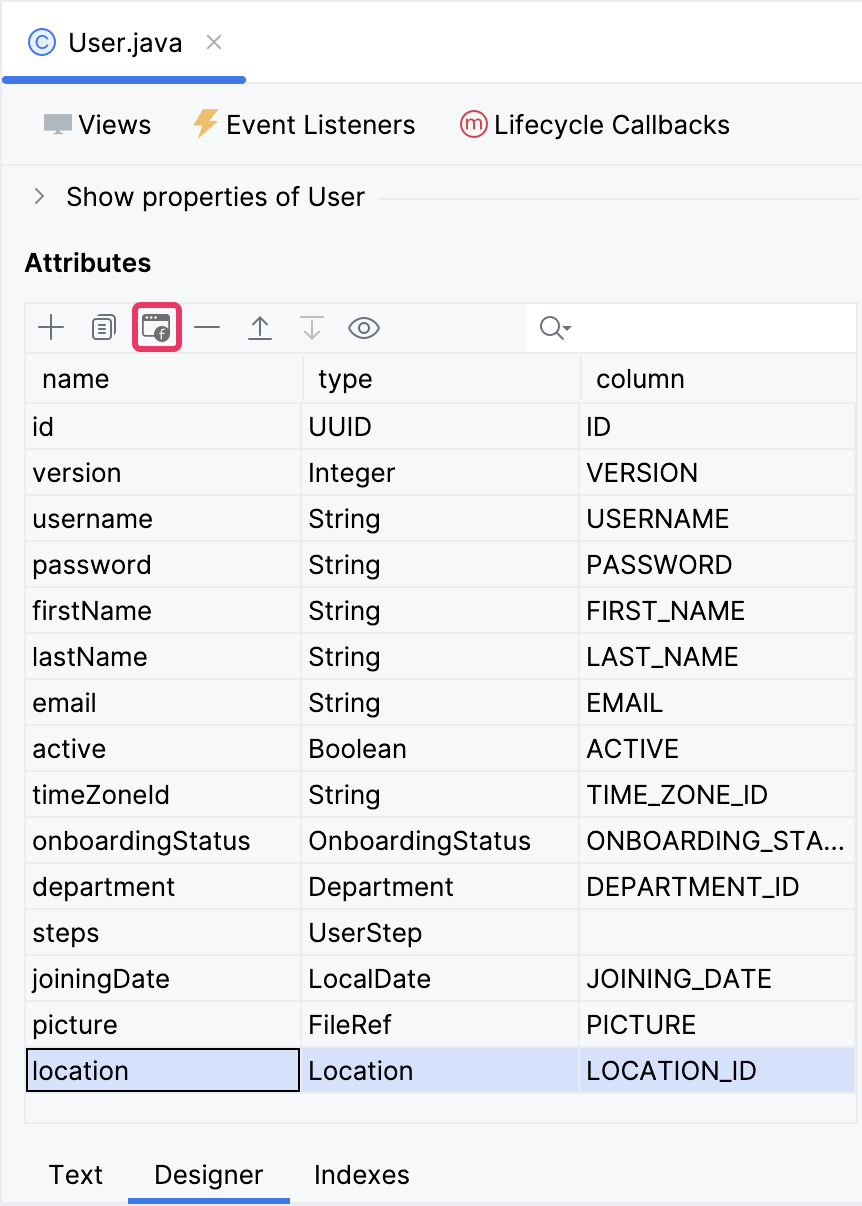
The displayed dialog window will present all views that exhibit the User entity. Select the User.detail view:
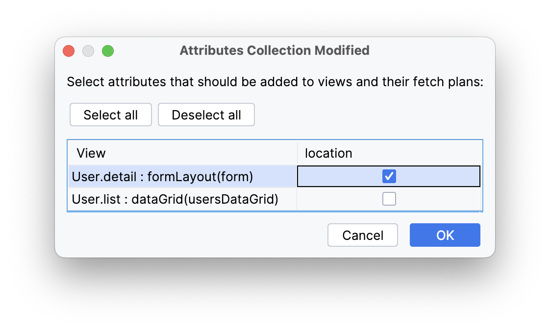
Subsequently, Studio will append the location property to fetchPlan and place the entityPicker component within formLayout of the User.detail view.
Click the Debug button ( ) in the main toolbar.
Prior to application execution, Studio will draft a Liquibase changelog:
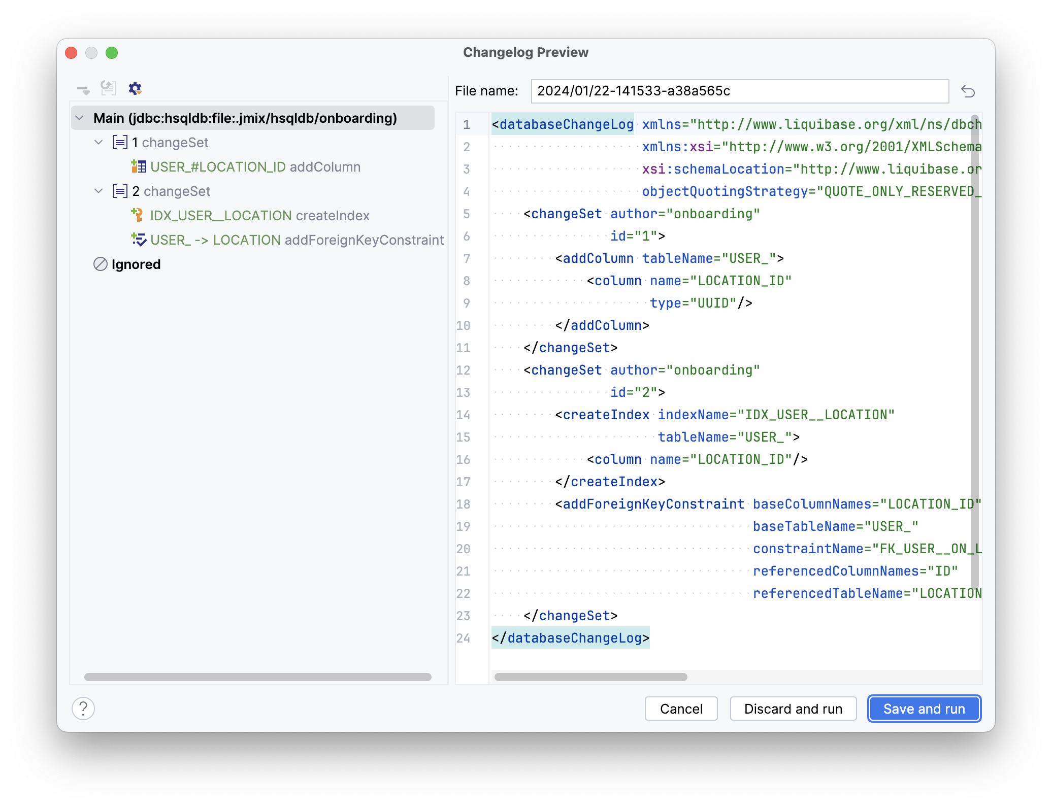
Click Save and run.
Studio will execute the changelog, proceed with building and running the application.
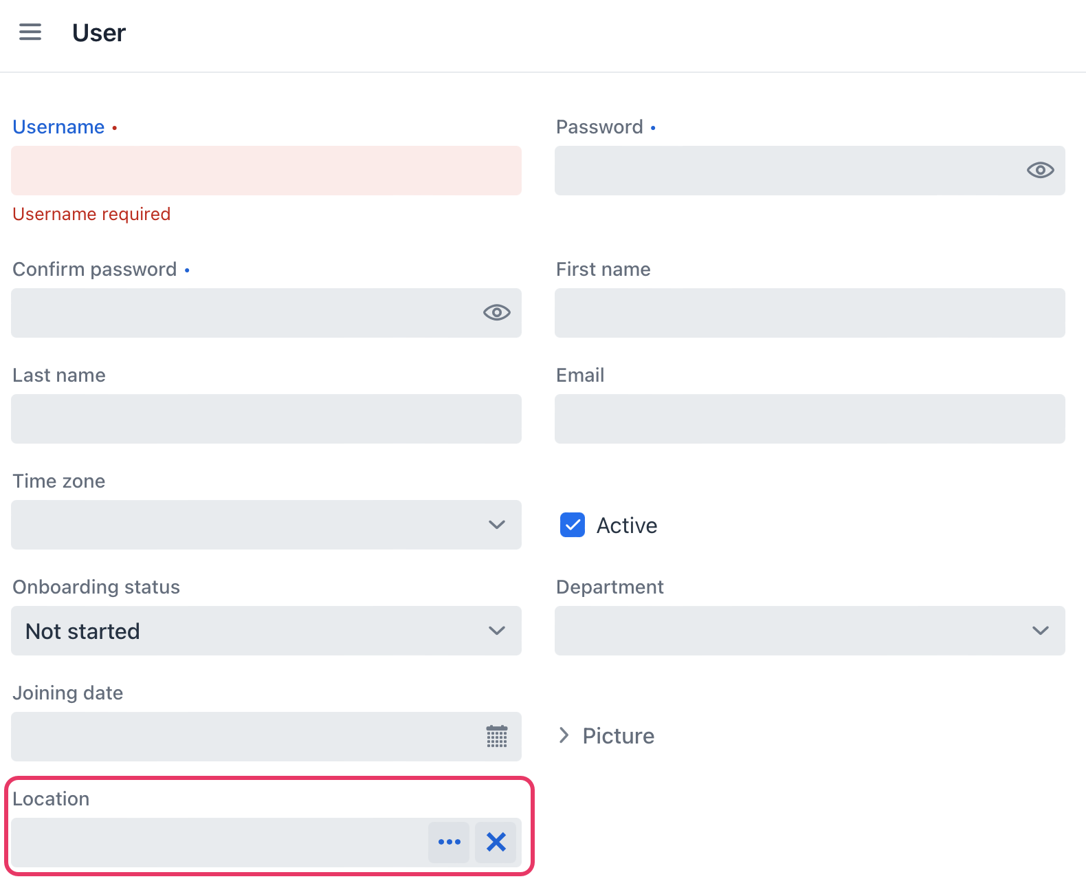
Access http://localhost:8080 using your web browser and log into the application using the credentials admin/admin.
Choose the Users item in the Application menu.
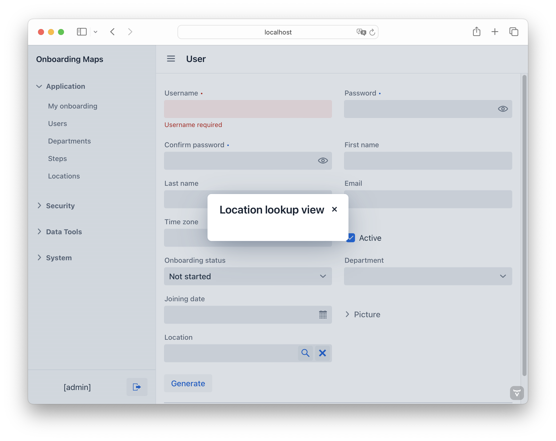
Click Create. The UI control for selecting a location will be displayed at the bottom of the form:
Create Blank View
If your application is currently running, terminate it by clicking the Stop button ( ) in the main toolbar.
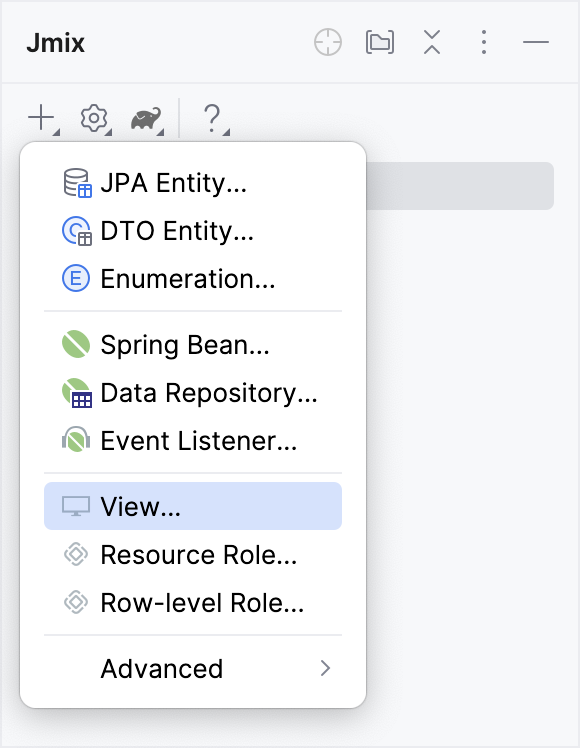
In the Jmix tool window, select New () → View:
In the Create Jmix View window, choose the Blank view template:
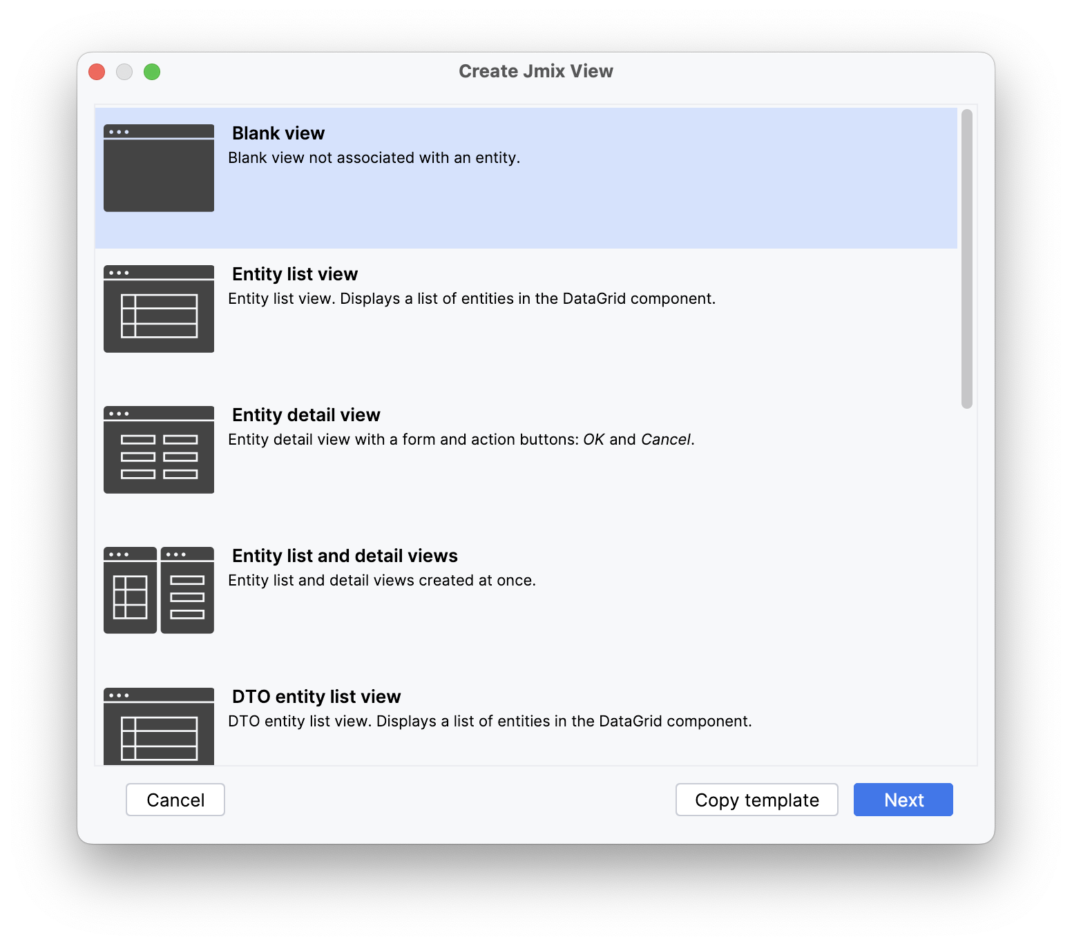
Click Next.
On the subsequent step of the wizard, input the following:
-
Descriptor name:
location-lookup-view -
Controller name:
LocationLookupView -
Package name:
com.company.onboarding.view.locationlookup
Clear Parent menu item, as it is unnecessary for this view.
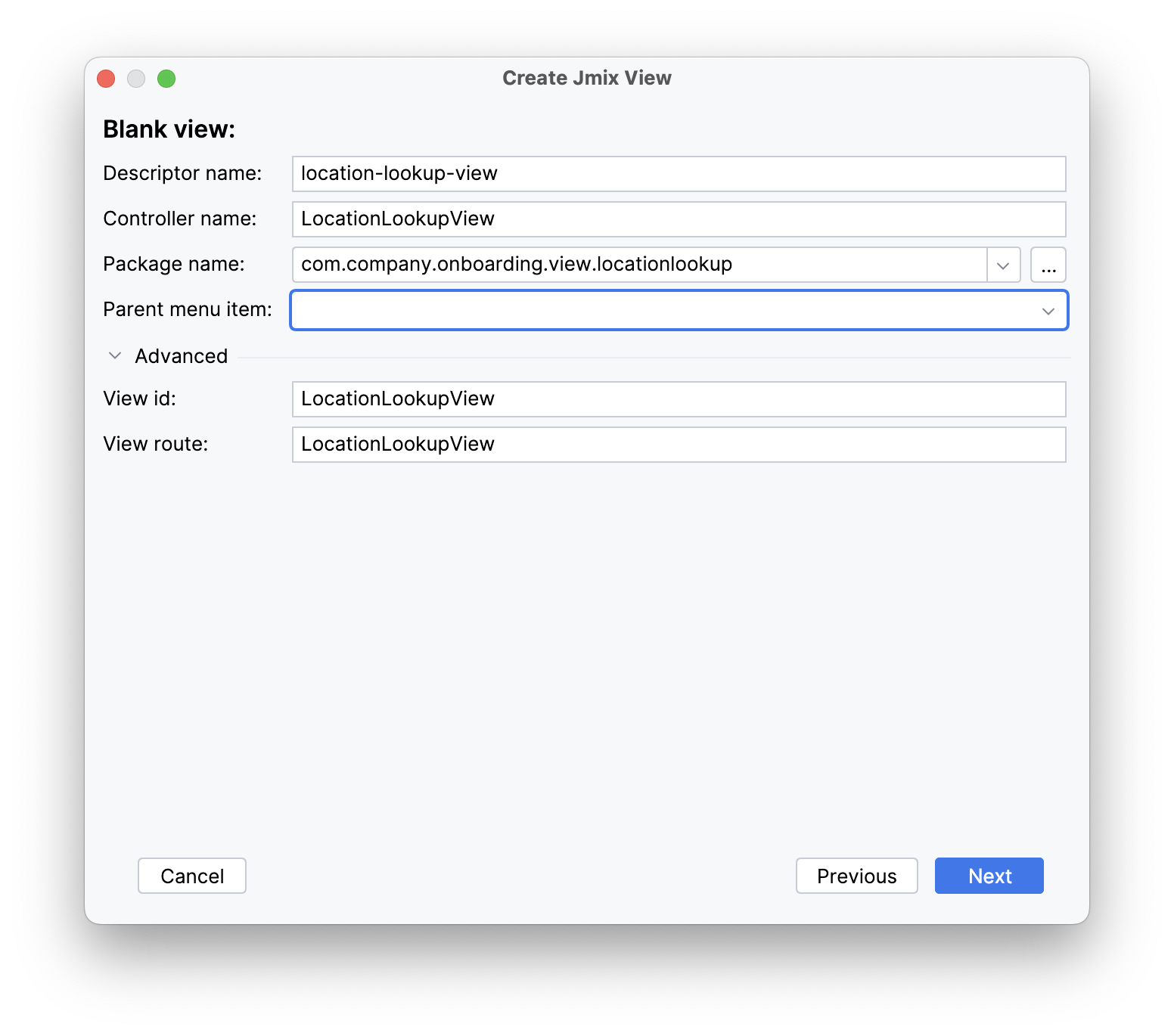
Click Next and then Create.
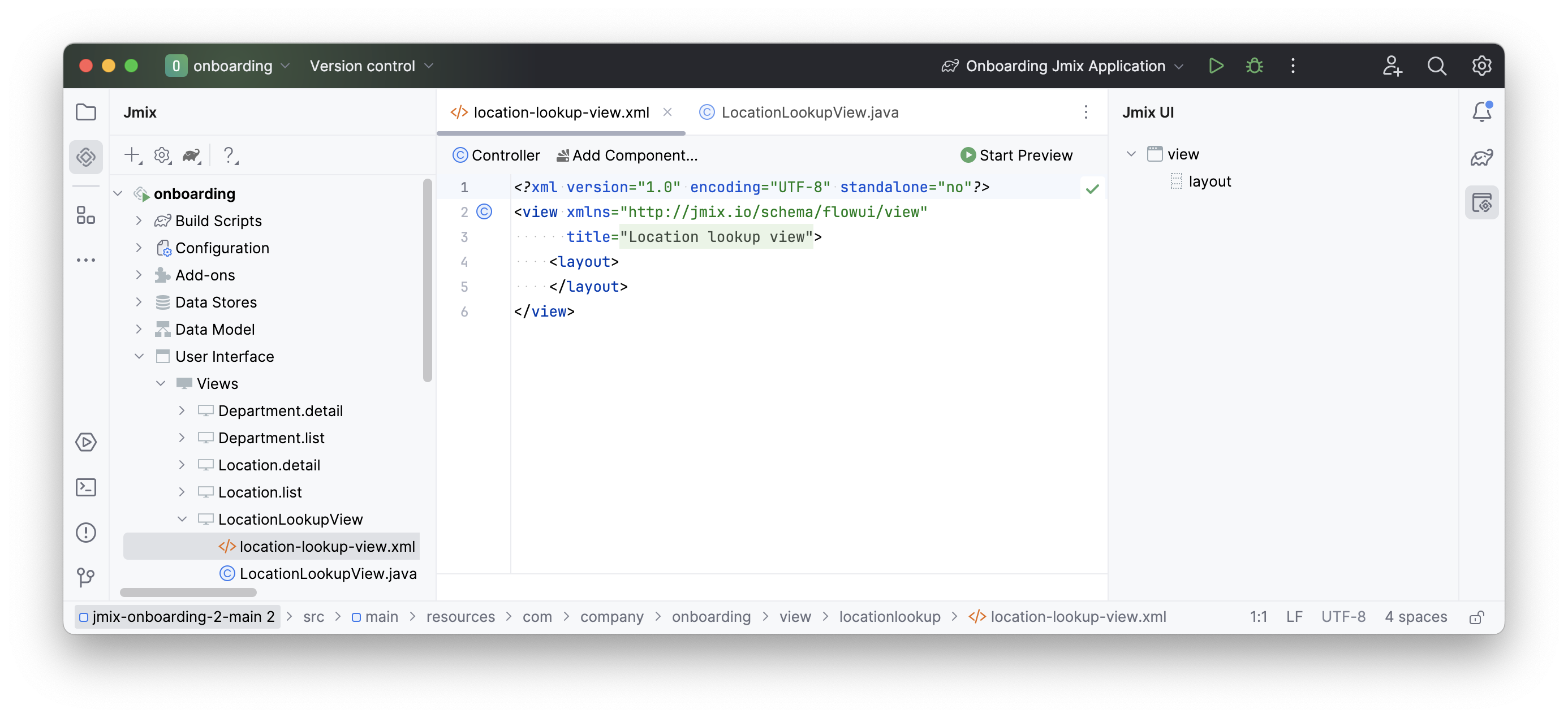
Studio will generate an empty view and display it in the designer:
Set Up View Opening
Our new view is intended to open from the user’s detail view. To achieve this, the Location field will be utilized.
We will need to replace the Studio-generated entityPicker component with the valuePicker component. Open user-detail-view.xml and locate the entityPicker component within the formLayout:
<layout>
    <formLayout id="form" dataContainer="userDc">
        ...
        <entityPicker id="locationField" property="location">
            <actions>
                <action id="entityLookup" type="entity_lookup"/>
                <action id="entityClear" type="entity_clear"/>
            </actions>
        </entityPicker>
        ...
    </formLayout>
</layout>
Modify the XML element of the component to valuePicker and eliminate the nested actions element.
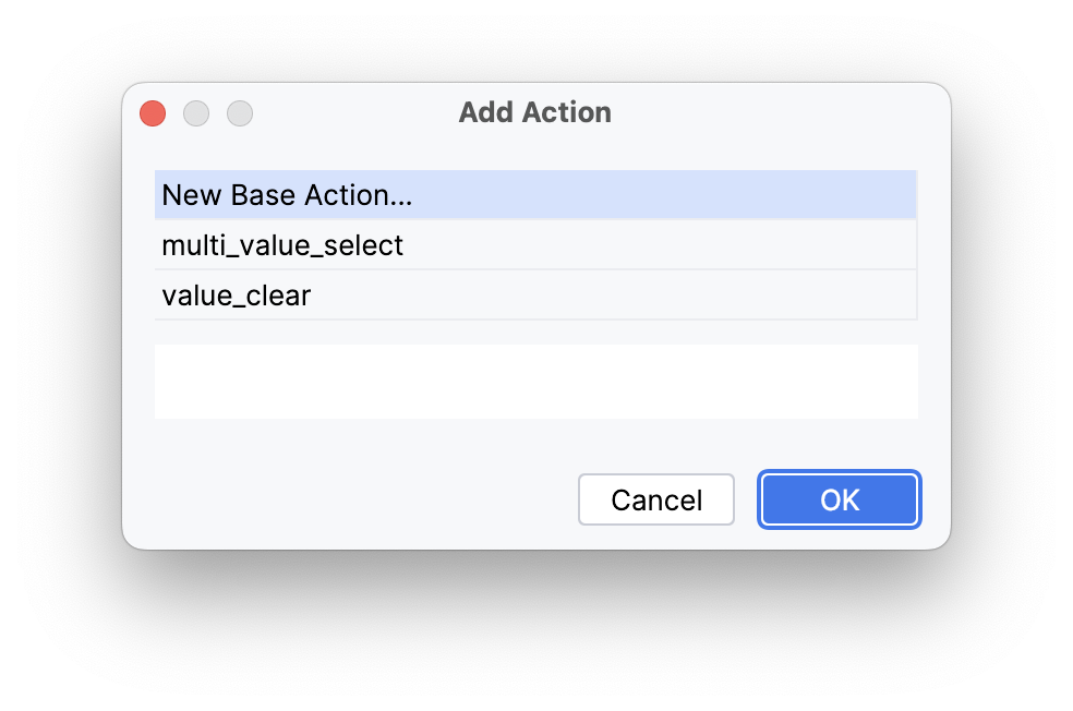
Choose valuePicker within the Jmix UI hierarchy panel or in the view XML descriptor, then click the Add button in the inspector panel. Opt for Actions → Action from the drop-down list.
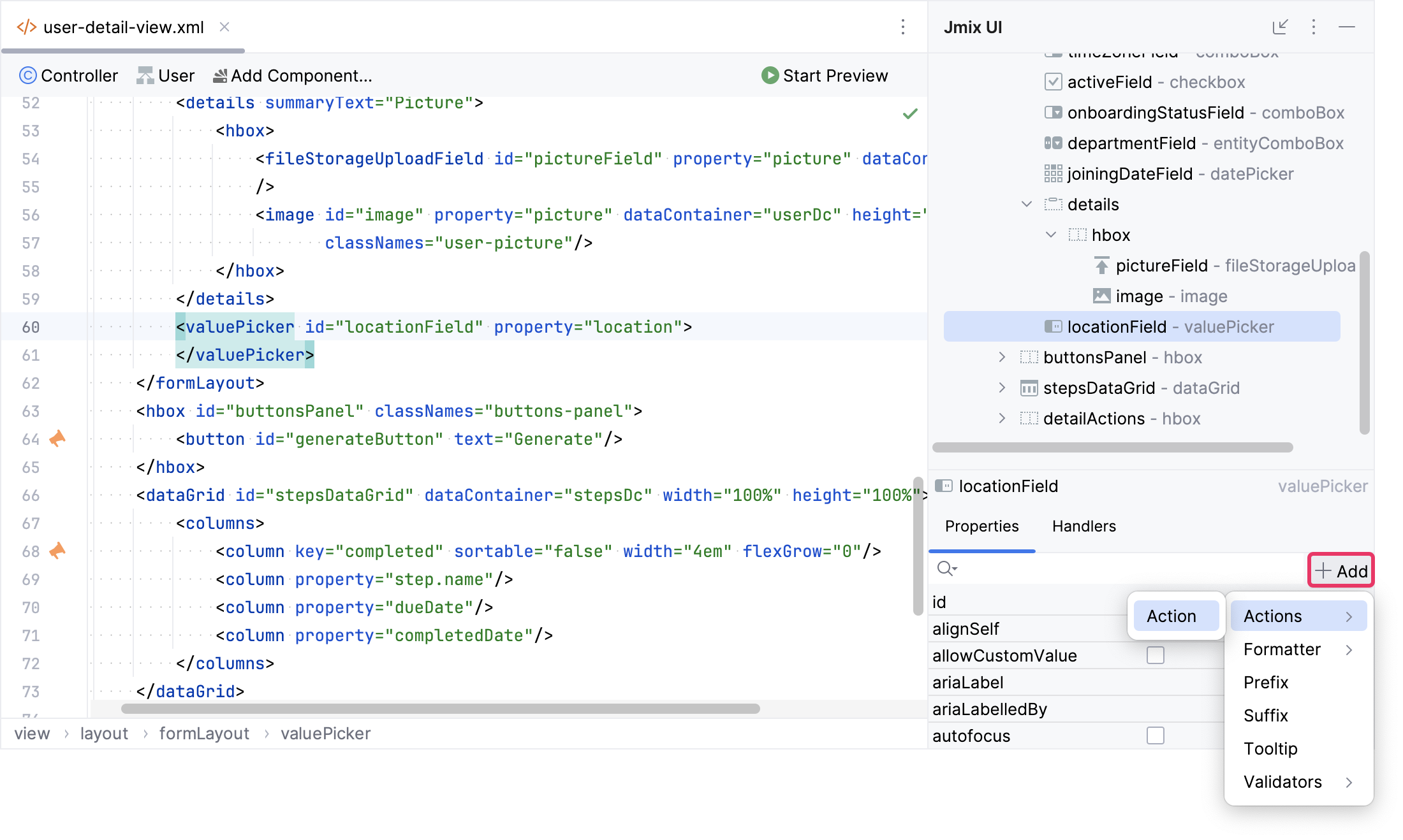
First, select a New Base Action and click OK.
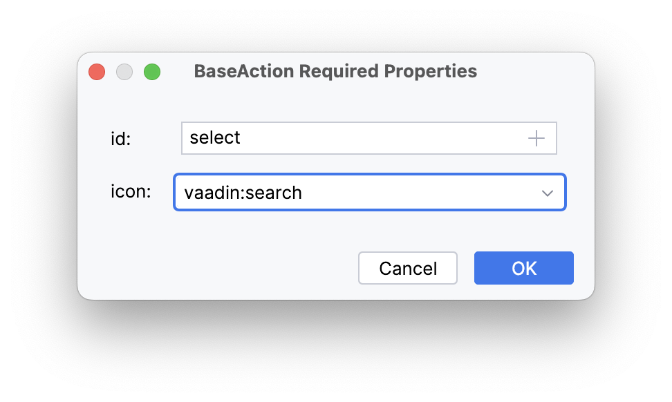
Set the id of the action to select and icon to vaadin:search.
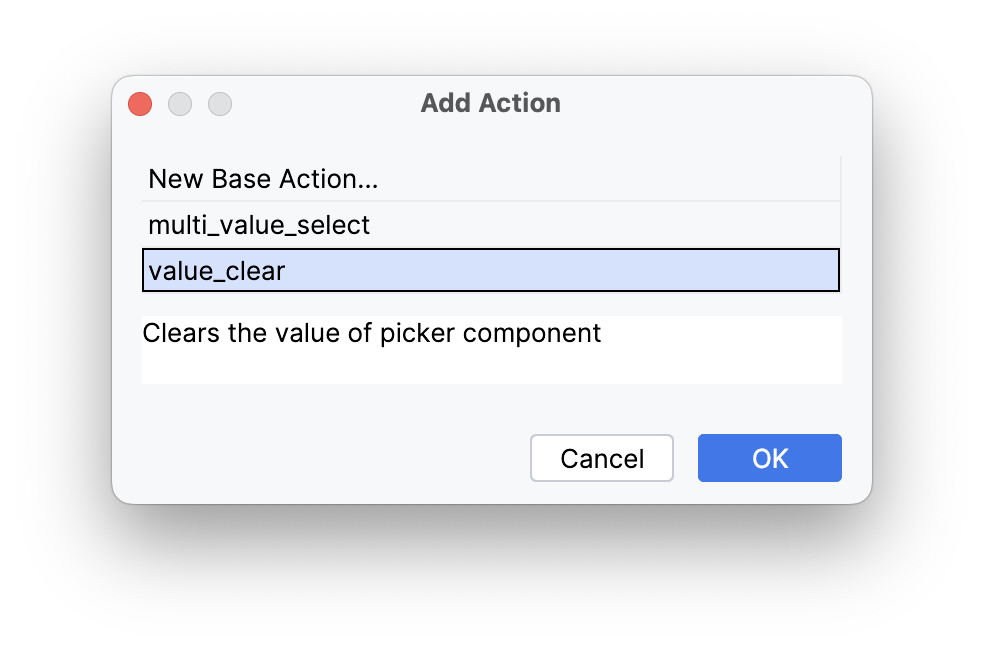
Next, add a predefined value_clear action for locationField:
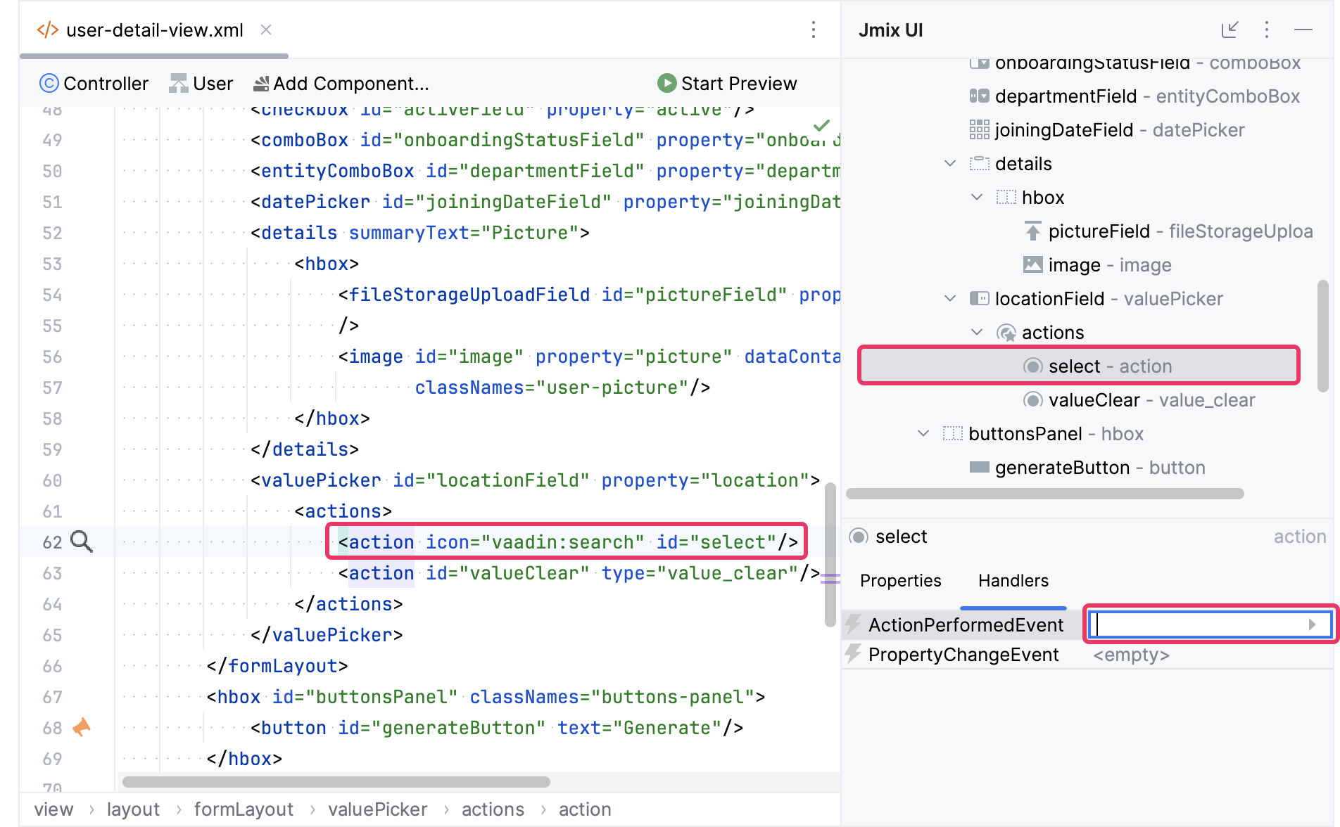
Choose the select action in the Jmix UI hierarchy panel or in the view XML descriptor. Then, navigate to the Handlers tab in the Jmix Inspector panel to generate an ActionPerformedEvent handler method:
Add the logic of opening LocationLookupView to ActionPerformedEvent handler method:
@Autowired
private DialogWindows dialogWindows; (1)

@Subscribe("locationField.select")
public void onLocationFieldSelect(final ActionPerformedEvent event) {
    dialogWindows.view(this, LocationLookupView.class).open();
}| 1 | The DialogWindows bean provides a fluent interface for opening views in dialog windows. |
Launch the application. Select the Users item from the Application menu. Click Create. The User.detail view will appear. Locate the Location field and click on the ( ) Search button. This action will prompt the
 LocationLookupView to open in a dialog.
Now you’ll have the opportunity to review the alterations occurring in our view.
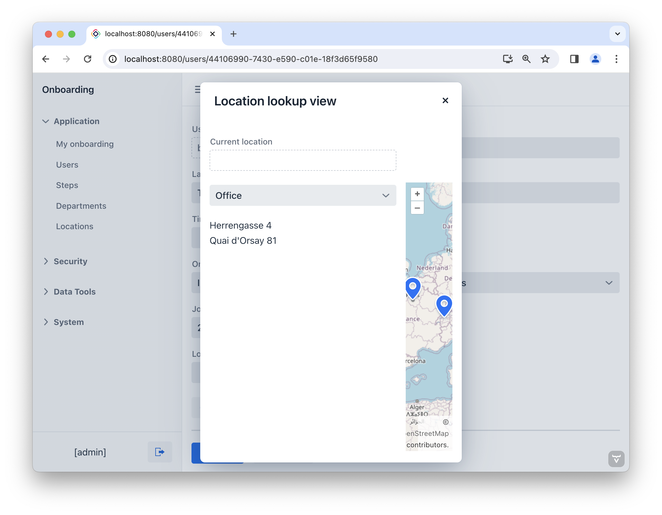
Add Components on LocationLookupView
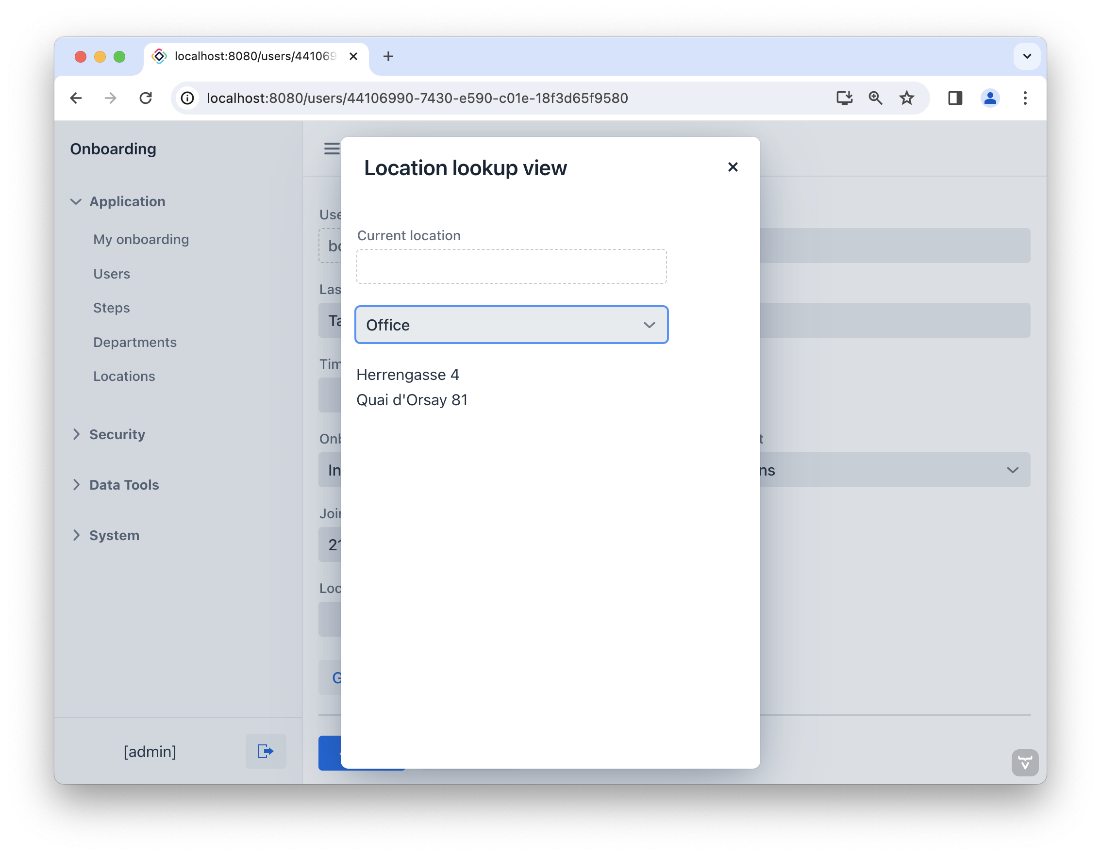
First, include a field where the current location selected on the map will be shown. Navigate to the actions panel, click Add Component, locate entityPicker, and double-click it. Configure the component’s properties as follows:
<entityPicker id="currentLocationField"
              metaClass="Location"
              readOnly="true"
              width="20em"
              label="msg://currentLocationField.label"/>
Next, we’ll add two hbox containers:
-
The first will encompass a list of locations and a map.
-
The second will contain the Select and Cancel buttons.
<hbox padding="false"
      height="100%"
      width="100%"/>
<hbox id="controlLayout"/>
Click Add Component in the actions panel and then drag and drop Layouts → VBox (vertical box) to the first hbox element within the Jmix UI hierarchy panel. Configure the properties of the vbox as follows:
<vbox padding="false" width="25em"/>Subsequently, incorporate a field for selecting the type of location. Click Add Component in the actions panel, locate select, and then drag and drop it into the vbox. Configure the component’s properties as follows:
<select id="locationTypeField"
        emptySelectionAllowed="true"
        width="20em"
        itemsEnum="com.company.onboarding.entity.LocationType"/>
To showcase the list of locations, we’ll utilize the listBox component. Firstly, introduce a data container which will supply a collection of Location entities for the virtual list. To achieve this, click Add Component in the actions panel, navigate to the Data components section, and proceed to double-click the Collection item. Within the Collection Properties Editor window, select Location in the Entity field and then click OK:
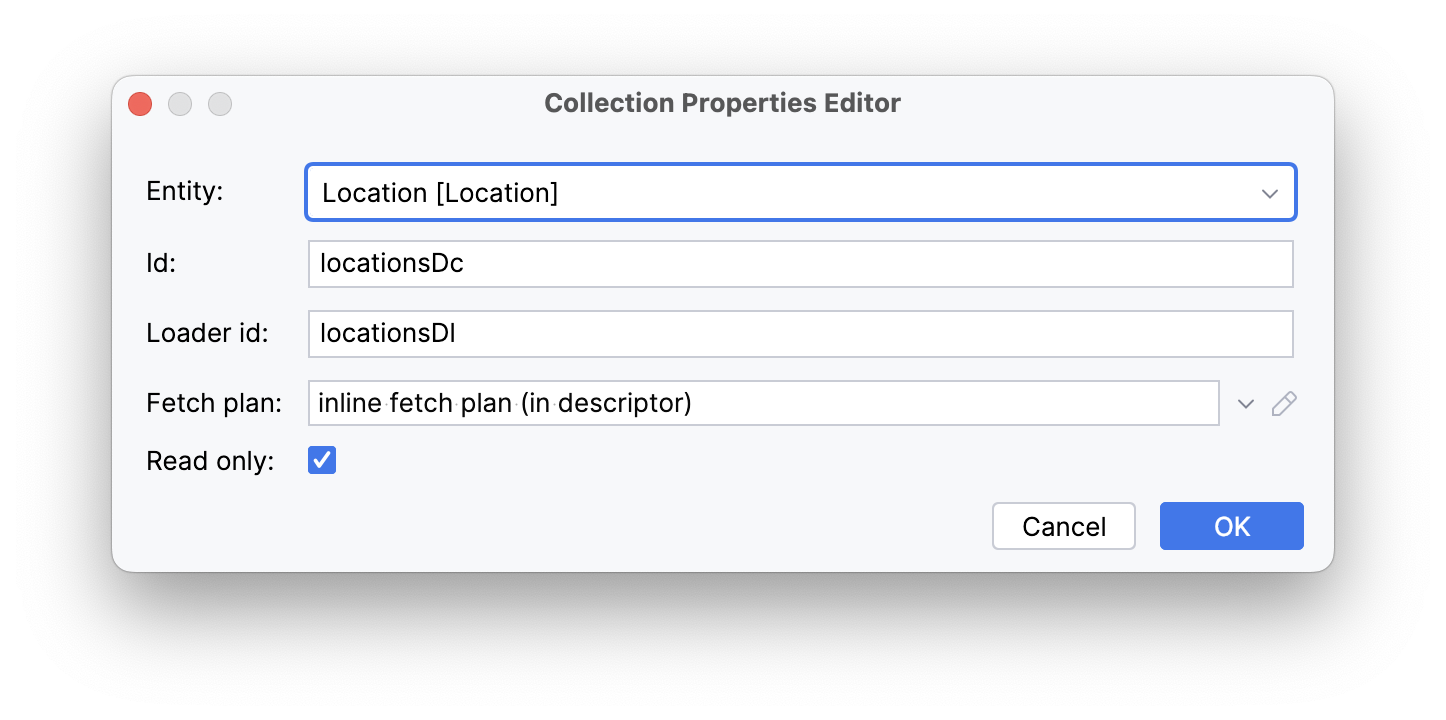
Studio will generate the collection container:
<data>
    <collection id="locationsDc" class="com.company.onboarding.entity.Location">
        <fetchPlan   extends="_base"/>
        <loader id="locationsDl" readOnly="true">
            <query>
                <![CDATA[select e from Location e]]>
            </query>
        </loader>
    </collection>
</data>
Load Data
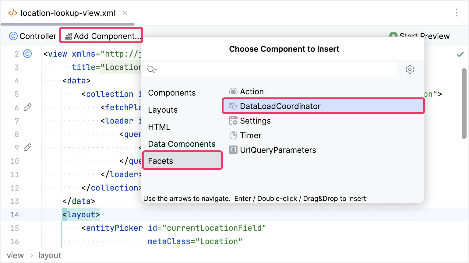
To trigger the created loader, include the dataLoadCoordinator facet.
The default query retrieves all Location instances, but you’ll need to filter only the locations selected in the locationTypeField component. As a result, we declare query conditions associated with an input field via DataLoadCoordinator.
We will utilize the component_ prefix in a query condition to reference the locationTypeField component.
Let’s configure query conditions declaratively in the <condition> XML element:
<view xmlns="http://jmix.io/schema/flowui/view"
      title="msg://locationLookupView.title"
      xmlns:c="http://jmix.io/schema/flowui/jpql-condition"> (1)
    <data>
        <collection id="locationsDc" class="com.company.onboarding.entity.Location">
            <fetchPlan extends="_base"/>
            <loader id="locationsDl" readOnly="true">
                <query>
                    <![CDATA[select e from Location e]]>
                    <condition> (2)
                        <c:jpql> (3)
                            <c:where>e.type = :component_locationTypeField</c:where> (4)
                        </c:jpql>
                    </condition>
                </query>
            </loader>
        </collection>
</data>| 1 | Adds the JPQL conditions namespace. |
| 2 | Defines the condition element within the query. |
| 3 | Defines a JPQL condition with an optional join element and a mandatory where element. |
| 4 | Includes a WHERE clause by type attribute with the :component_locationTypeField parameter. |
Add ListBox
Click Add Component in the actions panel, locate listBox, and then drag and drop it into the vbox. Configure the component’s properties as follows:
<listBox id="listBox"
         itemsContainer="locationsDc"
         minHeight="20em"
         width="20em"/>
At this point, the view XML should appear as shown below:
<?xml version="1.0" encoding="UTF-8" standalone="no"?>
<view xmlns="http://jmix.io/schema/flowui/view"
      title="msg://locationLookupView.title"
      xmlns:c="http://jmix.io/schema/flowui/jpql-condition">
    <data>
        <collection id="locationsDc" class="com.company.onboarding.entity.Location">
            <fetchPlan extends="_base"/>
            <loader id="locationsDl" readOnly="true">
                <query>
                    <![CDATA[select e from Location e]]>
                    <condition>
                        <c:jpql>
                            <c:where>e.type = :component_locationTypeField</c:where>
                        </c:jpql>
                    </condition>
                </query>
            </loader>
        </collection>
    </data>
    <layout>
        <entityPicker id="currentLocationField"
                      metaClass="Location"
                      readOnly="true"
                      width="20em"
                      label="msg://currentLocationField.label"/>
        <hbox padding="false"
              height="100%"
              width="100%">
            <vbox padding="false"
                  width="25em">
                <select id="locationTypeField"
                        emptySelectionAllowed="true"
                        width="20em"
                        itemsEnum="com.company.onboarding.entity.LocationType">
                </select>
                <listBox id="listBox"
                         itemsContainer="locationsDc"
                         minHeight="20em"
                         width="20em"/>
            </vbox>
        </hbox>
        <hbox id="controlLayout"/>
    </layout>
</view>
Let’s run the application to observe the new feature in action.
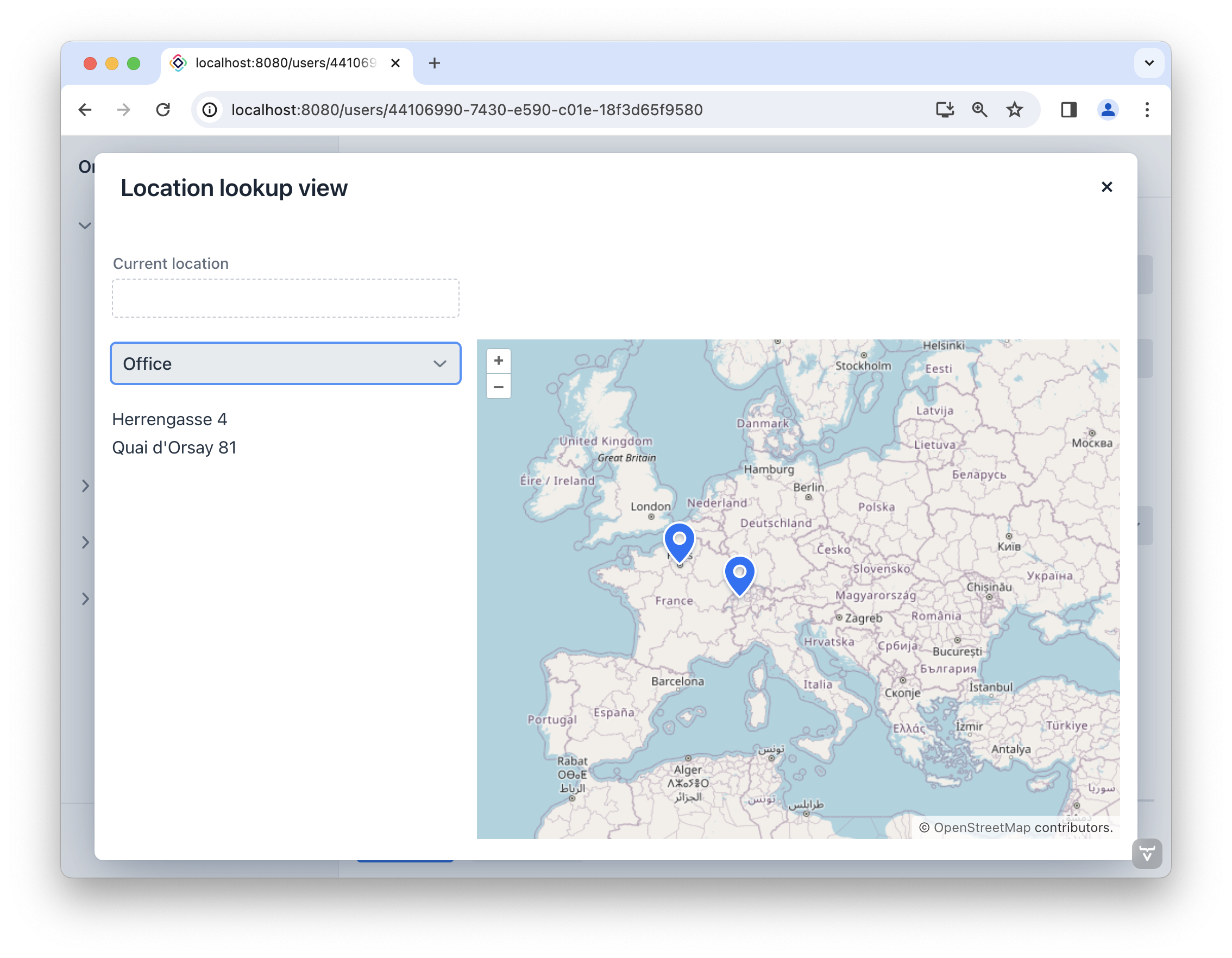
Add Map
Position the cursor after the vbox element. Click Add Component in the actions panel, find the GeoMap item, and then double-click it.
The new map element will be generated beneath the vbox element in the Jmix UI hierarchy panel and in XML. Configure the id, height and width attributes as shown below.
<maps:geoMap id="map"
             height="100%"
             width="100%"/>
Next, include a tile layer with OsmSource, set a map view, and add a vector layer with DataVectorSource. The completed map should appear as shown below:
<maps:geoMap id="map"
             height="100%"
             width="100%">
    <maps:mapView centerX="0" centerY="51">
        <maps:extent minX="-15" minY="30" maxX="40" maxY="60"/>
    </maps:mapView>
    <maps:layers>
        <maps:tile>
            <maps:osmSource/>
        </maps:tile>
        <maps:vector id="dataVectorLayer">
            <maps:dataVectorSource id="buildingSource"
                                   dataContainer="locationsDc"
                                   property="building"/>
        </maps:vector>
    </maps:layers>
</maps:geoMap>
Let’s launch the application to see the new feature in action.
As we can see, the map does not fit on the view. Therefore, we’ll need to modify the view size. Add the @DialogMode annotation to the LocationLookupView controller:
@Route(value = "LocationLookupView", layout = MainView.class)
@ViewController("LocationLookupView")
@ViewDescriptor("location-lookup-view.xml")
@DialogMode(width = "60em", height = "45em")
public class LocationLookupView extends StandardView {
}
Press Ctrl/Cmd+S and switch to the running application. Click on the () Search button located next to the Location field. The LocationLookupView view will open as a dialog with the width and height we determined earlier.
The following step will demonstrate how to utilize distinct markers for offices and coworking spaces.
Add Buttons
Let’s add the Select button to save the current location for the user, and the Cancel button to terminate without saving.
Open the location-lookup-view.xml XML descriptor and find the controlLayout hbox. Click Add Component in the actions panel, then drag and drop two buttons into controlLayout.
The created buttons should be associated with actions. Define the actions element, including nested action elements, as illustrated below.
<actions>
    <action id="select"
            text="msg://selectAction.text"
            icon="CHECK"
            actionVariant="PRIMARY"
            enabled="false"/> (1)
    <action id="cancel"
            type="view_close"/> (2)
</actions>| 1 | select custom action properties are defined in-place. |
| 2 | The standard view close action. |
Generate the action performed event using the Jmix UI inspector panel → Handlers tab.
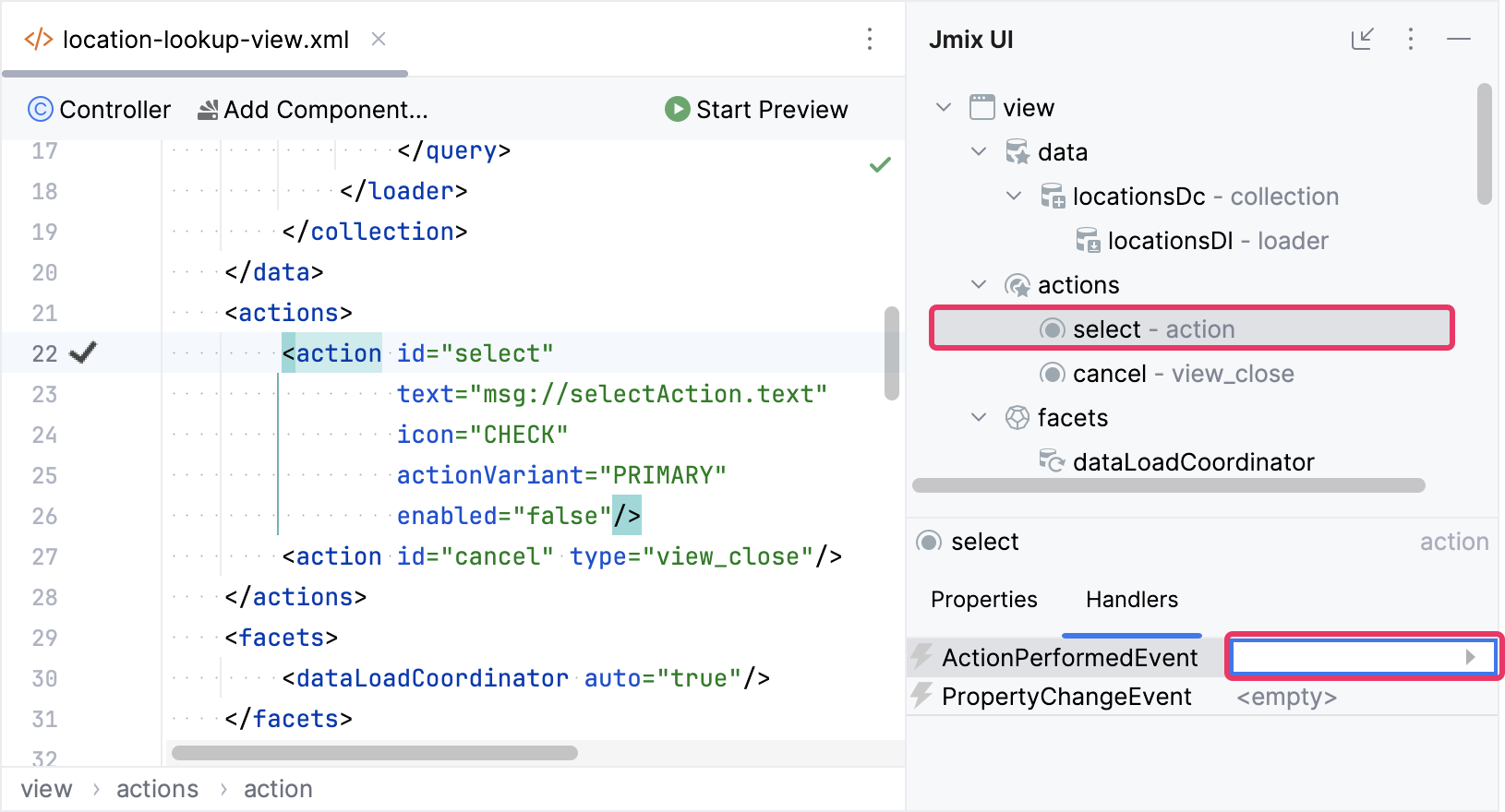
Implement the select action handler:
@Subscribe("select")
public void onSelect(final ActionPerformedEvent event) {
    close(StandardOutcome.SELECT); (1)
}| 1 | The close() method closes the view. It accepts a StandardOutcome.SELECT object that can be processed by the calling code. We will handle it later. |
Assign the button ids and link each button with the respective action as shown below:
<hbox id="controlLayout">
    <button id="selectBtn" action="select"/>
    <button id="cancelBtn" action="cancel"/>
</hbox>
Use Custom Markers
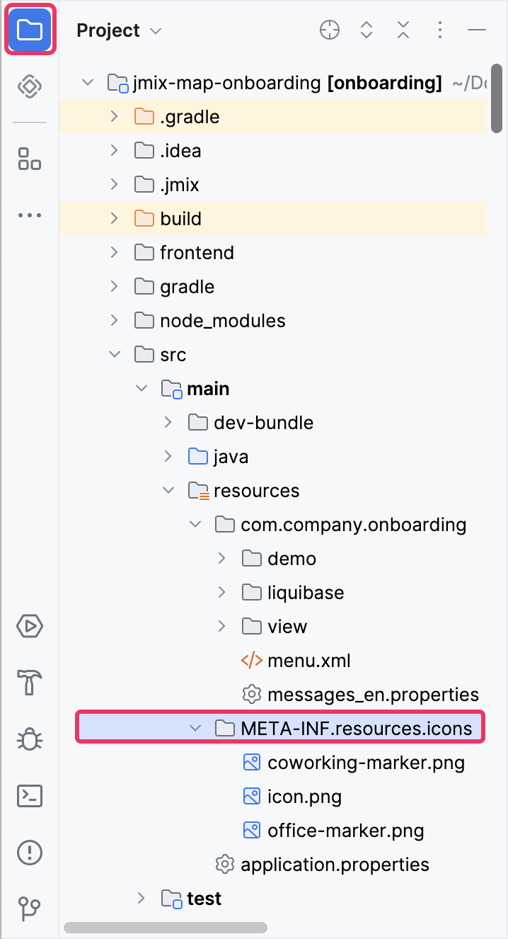
Switch to the Project tool window and locate various markers for offices and coworking spaces within the /src/main/resources/META-INF/resources/icons/ directory in the classpath:
Open the LocationLookupView controller and inject buildingSource.
@ViewComponent("map.dataVectorLayer.buildingSource")
private DataVectorSource<Location> buildingSource;|
You can inject view components and Spring beans using the Inject button in the actions panel: 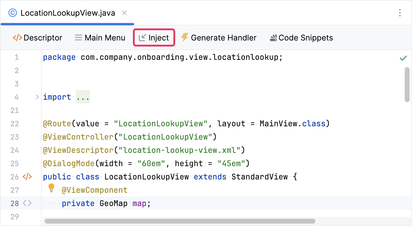
|
Next, introduce a method to customize the display of markers:
private void initBuildingSource(){
    buildingSource.setStyleProvider(location -> new Style() (1)
            .withImage(new IconStyle()
                    .withScale(0.5)
                    .withAnchorOrigin(IconOrigin.BOTTOM_LEFT)
                    .withAnchor(new Anchor(0.49, 0.12))
                    .withSrc(location.getType() == LocationType.OFFICE
                            ? "icons/office-marker.png"
                            : "icons/coworking-marker.png"))
            .withText(new TextStyle()
                    .withBackgroundFill(new Fill("rgba(255, 255, 255, 0.6)"))
                    .withPadding(new Padding(5, 5, 5, 5))
                    .withOffsetY(15)
                    .withFont("bold 15px sans-serif")
                    .withText(location.getCity())));
}| 1 | Establishes a new style that combines an image with a text label for our markers. The image varies based on the location type. |
Click Generate Handler button in the top actions panel and select Controller handlers → InitEvent:
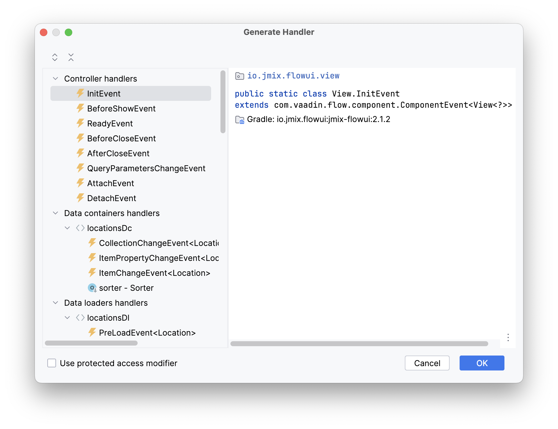
Click OK. Studio will generate a handler method stub. Invoke initBuildingSource() from the InitEvent handler:
@Subscribe
public void onInit(final InitEvent event) {
    initBuildingSource();
}
Launch the application and open LocationLookupView. Evaluate the appearance of markers for different location types.
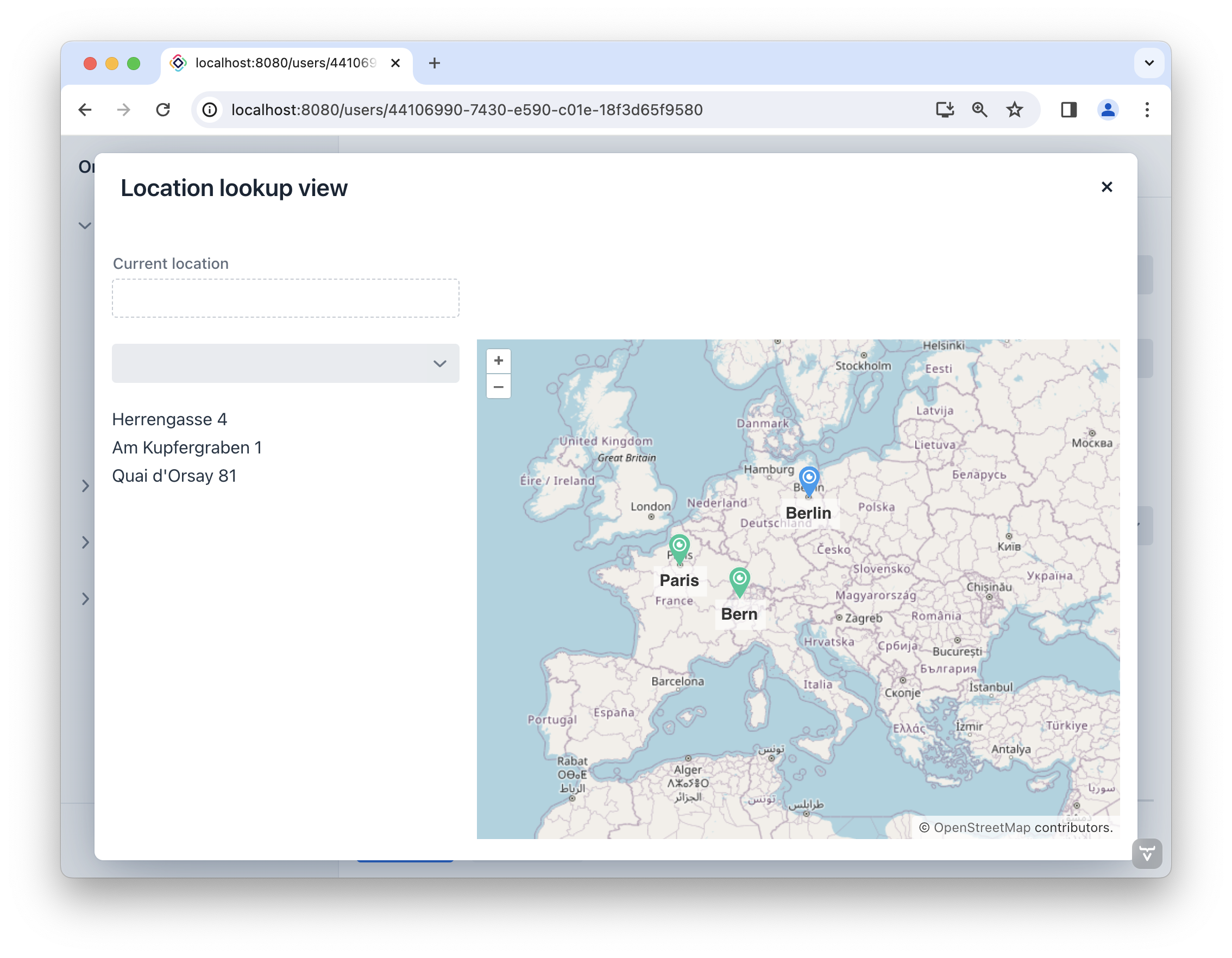
Handle Marker Events
Once a user chooses a marker on the map, the selected location is assigned to the Current location field. Additionally, the map’s zoom level is adjusted, centering the map on the selected location, with the chosen marker placed in the center of the map view.
Open the LocationLookupView controller and add the setMapCenter() method:
private void setMapCenter(Geometry center) {
    map.fit(new FitOptions(center)
            .withDuration(2000)
            .withEasing(Easing.LINEAR)
            .withMaxZoom(20d));
}
Next, navigate to the initBuildingSource() method and incorporate the following code at the end of the method body:
private void initBuildingSource(){
//...
buildingSource.addGeoObjectClickListener(clickEvent -> {
Location location = clickEvent.getItem();
setMapCenter(location.getBuilding());
});
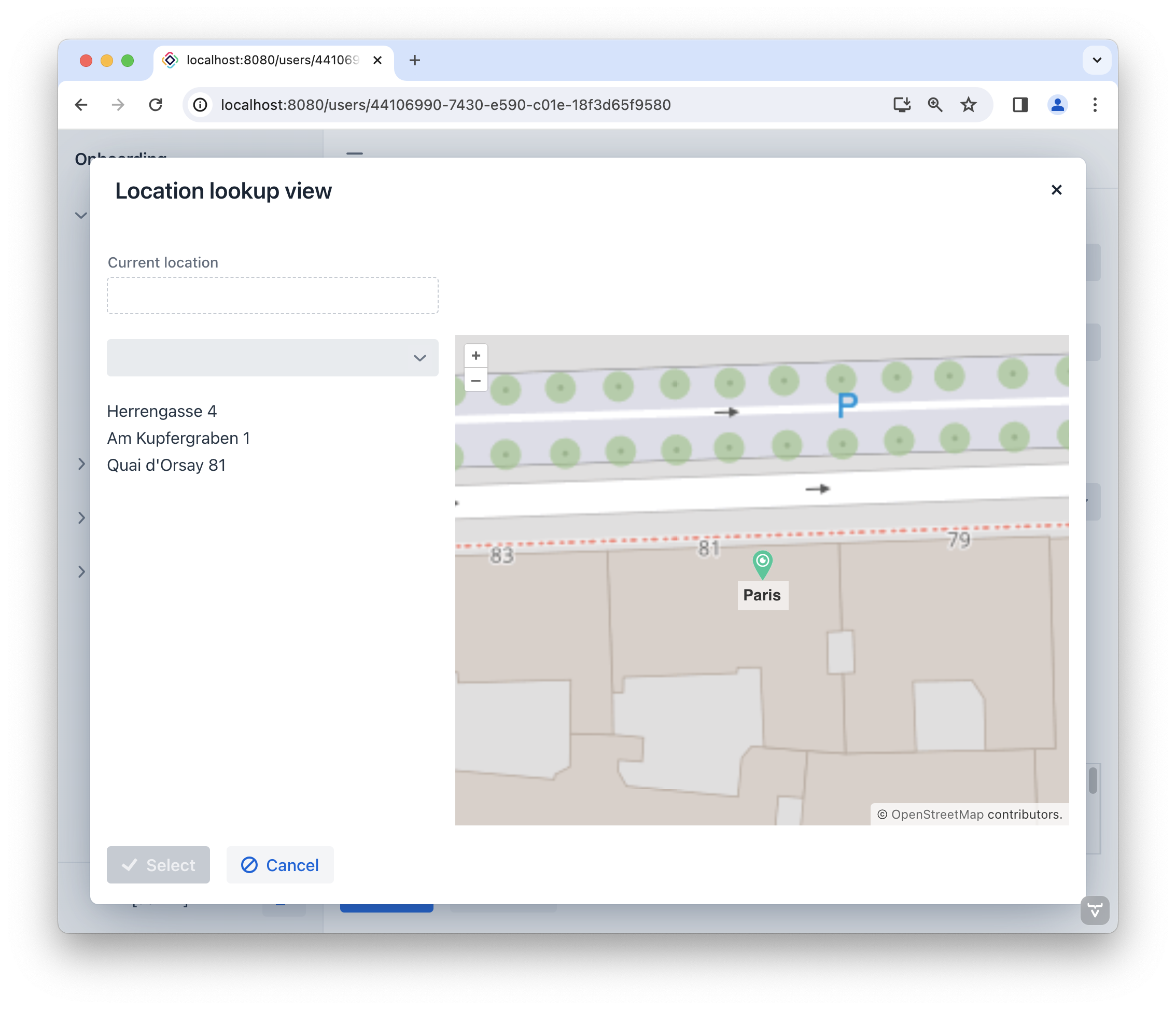
}Let’s run the application to observe the new feature in action. Now, when you click on the marker, the map will zoom in and center itself based on the location’s coordinates.
Now we need to display the selected location in the Current location field and make the Select button available.
Return to the LocationLookupView controller. Inject currentLocationField and the select action. Define the selected variable:
@ViewComponent
private EntityPicker<Location> currentLocationField;

@ViewComponent
private BaseAction select;

private Location selected;
Then add the onLocationChanged() method:
private void onLocationChanged(Location newLocation) {
    if (newLocation != null)
        if (!Objects.equals(newLocation, selected)) {
            selected = newLocation;
            select.setEnabled(true); (1)

            setMapCenter(newLocation.getBuilding());

            currentLocationField.setValue(newLocation); (2)
        }
}| 1 | Makes the Select action available. |
| 2 | Sets the selected location in the Current location field. |
Invoke onLocationChanged() from the initBuildingSource() method:
private void initBuildingSource(){
    //...
    buildingSource.addGeoObjectClickListener(clickEvent -> {
        //...
        onLocationChanged(location);
    });
}