multiSelectComboBox
Basics
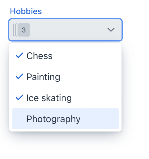
The drop-down list opens when the user clicks the field using a pointing device. Using the Up and Down keys or typing a character when the field is focused also opens the drop-down list.
To create multiSelectComboBox connected to data, use the dataContainer and property attributes. The itemsContainer attribute is used to create a list of items:
<data>
    <instance class="com.company.onboarding.entity.User" id="userDc"> (1)
        <fetchPlan extends="_base"> (2)
            <property name="hobbies" fetchPlan="_base"/>
        </fetchPlan>
        <loader id="userDl"/>
    </instance>
    <collection class="com.company.onboarding.entity.Hobby" id="hobbiesDc"> (3)
        <fetchPlan extends="_base"/>
        <loader id="hobbiesDl">
            <query>
                <![CDATA[select e from Hobby e]]>
            </query>
        </loader>
    </collection>
</data>
<layout>
    <multiSelectComboBox dataContainer="userDc"
                         property="hobbies"
                         label="Hobbies"
                         itemsContainer="hobbiesDc"/> (4)
</layout>| 1 | InstanceContainer for the User entity. |
| 2 | Inline fetch plan of the entity instance located in the container. |
| 3 | CollectionContainer for the Hobby entity. |
| 4 | multiSelectComboBox gets hobbiesDc as an items container so that the list of hobbies drop-downs. |
The component’s value returns a list of selected items.
Attributes
id - alignSelf - allowCustomValue - allowedCharPattern - autoOpen - autofocus - classNames - clearButtonVisible - colspan - dataContainer - enabled - errorMessage - height - helperText - invalid - itemsContainer - itemsEnum - label - maxHeight - maxWidth - metaClass minHeight - minWidth - opened - placeholder - property - readOnly - required - requiredIndicatorVisible - tabIndex - themeNames - title - visible - width
Handlers
AttachEvent - BlurEvent - ClientValidatedEvent - ComponentValueChangeEvent - CustomValueSetEvent - DetachEvent - FocusEvent - TypedValueChangeEvent - itemLabelGenerator - validator
|
To generate a handler stub in Jmix Studio, use the Handlers tab of the Jmix UI inspector panel or the Generate Handler action available in the top panel of the view class and through the Code → Generate menu (Alt+Insert / Cmd+N). |
See Also
See the Vaadin Docs for more information.
