Chart Component
The Chart component is available in the Add Component palette of the Studio View Designer as soon as you install the add-on in your project. Creating a chart boils down to configuring the properties of this component either in XML using nested elements and attributes or through its Java API.
In the example below, a chart is created and first configured declaratively using XML:
<charts:chart id="chart">
<charts:dataSet>
<charts:source dataContainer="vehiclesDc"
categoryField="year"
valueFields="cars motorcycles bicycles"/>
</charts:dataSet>
<charts:series>
<charts:bar name="Cars"/>
<charts:bar name="Motorcycles" stack="stack"/>
<charts:bar name="Bicycles" stack="stack"/>
</charts:series>
<charts:xAxes>
<charts:xAxis/>
</charts:xAxes>
<charts:yAxes>
<charts:yAxis>
<charts:axisLabel formatter="{value}"/>
</charts:yAxis>
</charts:yAxes>
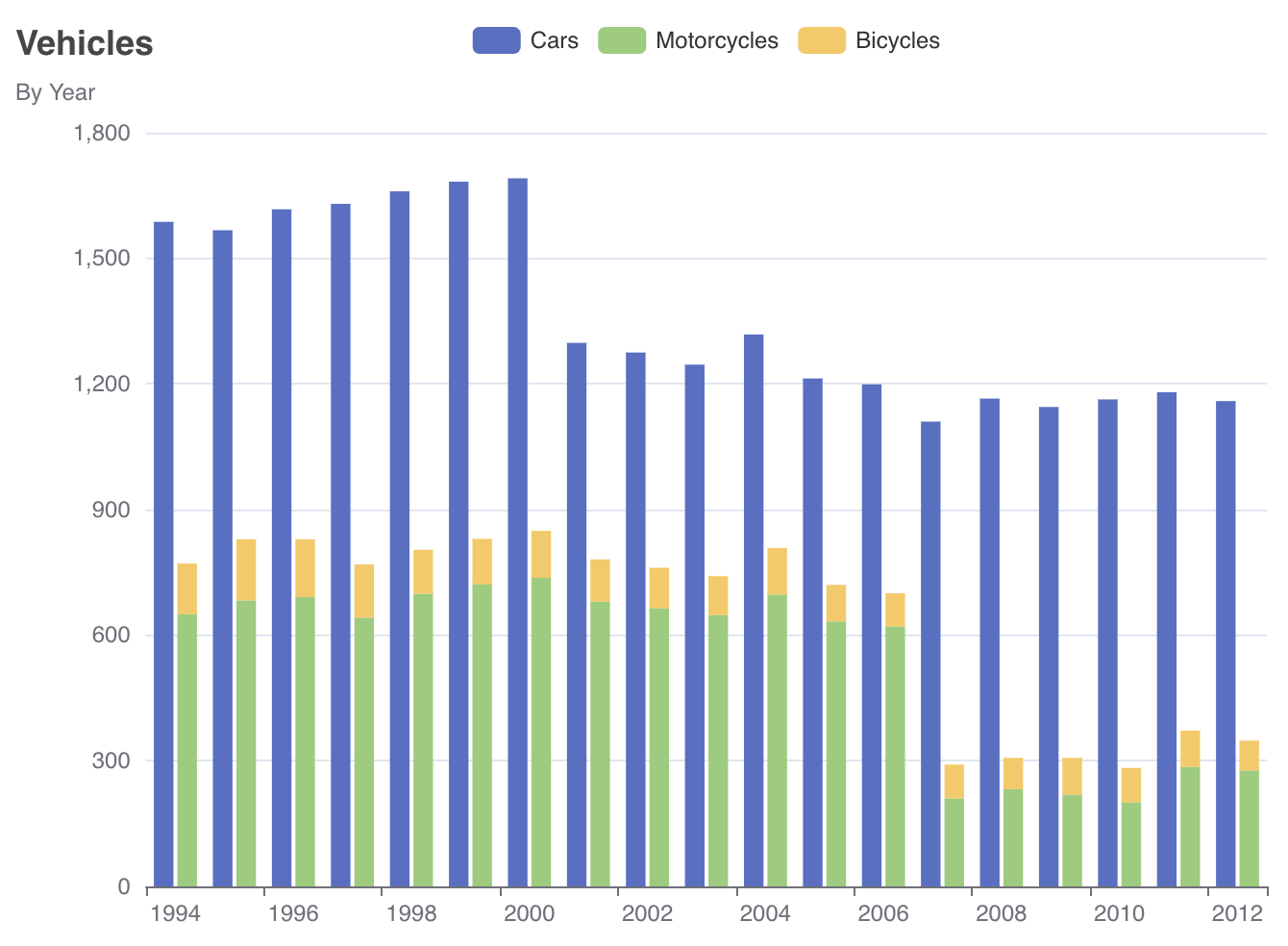
</charts:chart>After that, additional properties are set programmatically in Java:
@ViewComponent
private Chart chart;

@Subscribe
public void onInit(final InitEvent event) {
    chart.setLegend(new Legend().withTop("0"));
    chart.setTitle(new Title().withText("Vehicles").withSubtext("By Year"));
}
The resulting chart looks as follows:
If you don’t use the view designer, declare the charts namespace in your view’s XML descriptor manually:
<view xmlns="http://jmix.io/schema/flowui/view"
xmlns:charts="http://jmix.io/schema/charts/ui"/>|
When configuring a chart, you can refer to the official Apache ECharts documentation to find the properties you need, and then use corresponding Jmix Chart properties. Most of the time, you will find exact matches between JavaScript and Jmix APIs. |
DataSet
The dataSet property defines the data source for the chart’s series and enables data reuse across multiple series within one charts tag.
In the following example, a data set is configured in XML and connects a chart to the vehiclesDc data container:
<charts:dataSet>
    <charts:source dataContainer="vehiclesDc"
                   categoryField="year"
                   valueFields="cars motorcycles bicycles"/>
</charts:dataSet>
The chart will use the year attribute of the entity to get a category name and cars, motorcycles and bicycles attributes to get values.
The same data set can be configured in Java as follows:
chart.setDataSet(
        new DataSet().withSource(
                new DataSet.Source<EntityDataItem>()
                        .withDataProvider(new ContainerChartItems<>(vehiclesDc))
                        .withCategoryField("year")
                        .withValueFields("cars", "motorcycles", "bicycles")
        )
);
The chart element can include only one dataSet configuration.
|
Series
The series element defines the type of chart to display (e.g., line, bar, scatter). Each chart type can be configured differently within the series element.
The basic chart types supported by Jmix include:
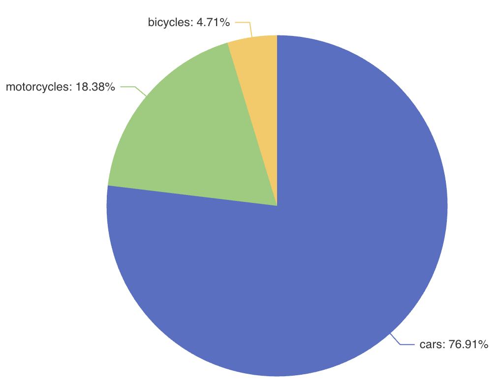
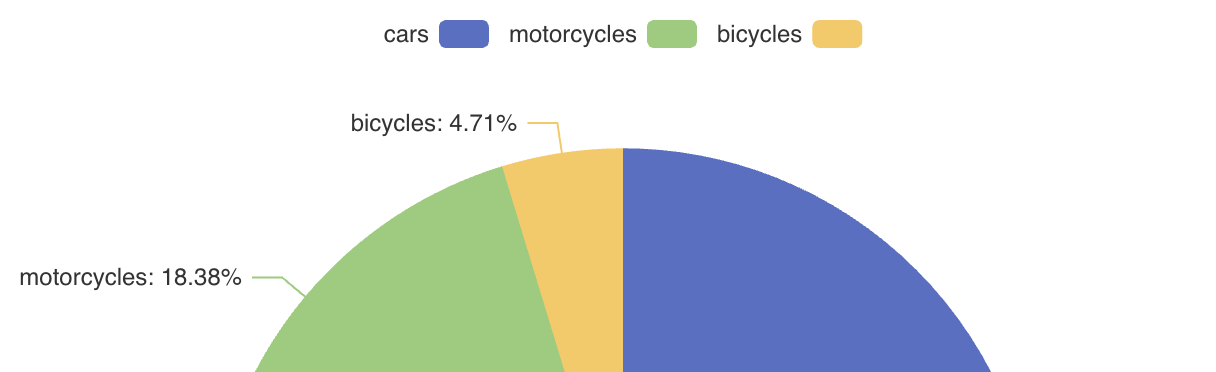
In the following example, the series element defines a pie chart:
<charts:chart>
    <charts:dataSet>
        <charts:source dataContainer="vehiclesIn2012Dc"
                       categoryField="name"
                       valueFields="value"/>
    </charts:dataSet>
    <charts:series>
        <charts:pie>
            <charts:label formatter="{b}: {d}%"/>
        </charts:pie>
    </charts:series>
</charts:chart>
The label element configures text labels of pie segments. Its formatter attribute defines a pattern which can include the data item name and value. See more about label and formatter in the ECharts documentation.
The resulting pie chart looks as follows:
The chart element can include multiple series configurations, in which case the data will be shared across all chart types.
|
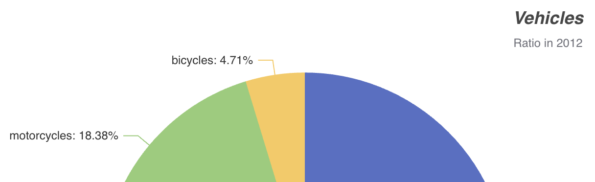
Title
The title property displays the chart’s main title and subtitle, customizable in text content, positioning, alignment, and style.
For example:
<charts:chart>
    <charts:title text="Vehicles" subtext="Ratio in 2012"
                  top="0" right="0" textAlign="CENTER">
        <charts:textStyle fontStyle="ITALIC"/>
    </charts:title>
This configuration specifies both the main title and a subtitle for the chart, positioned in the top right corner with centered text alignment and italic text style:
Legend
The legend property shows the symbol, color, and name of different series. Legends can be clicked to toggle the display of the chart series. The legend is automatically generated based on the provided data.
<charts:chart>
    <charts:legend align="RIGHT"/>
This example displays a legend with symbols on the right:
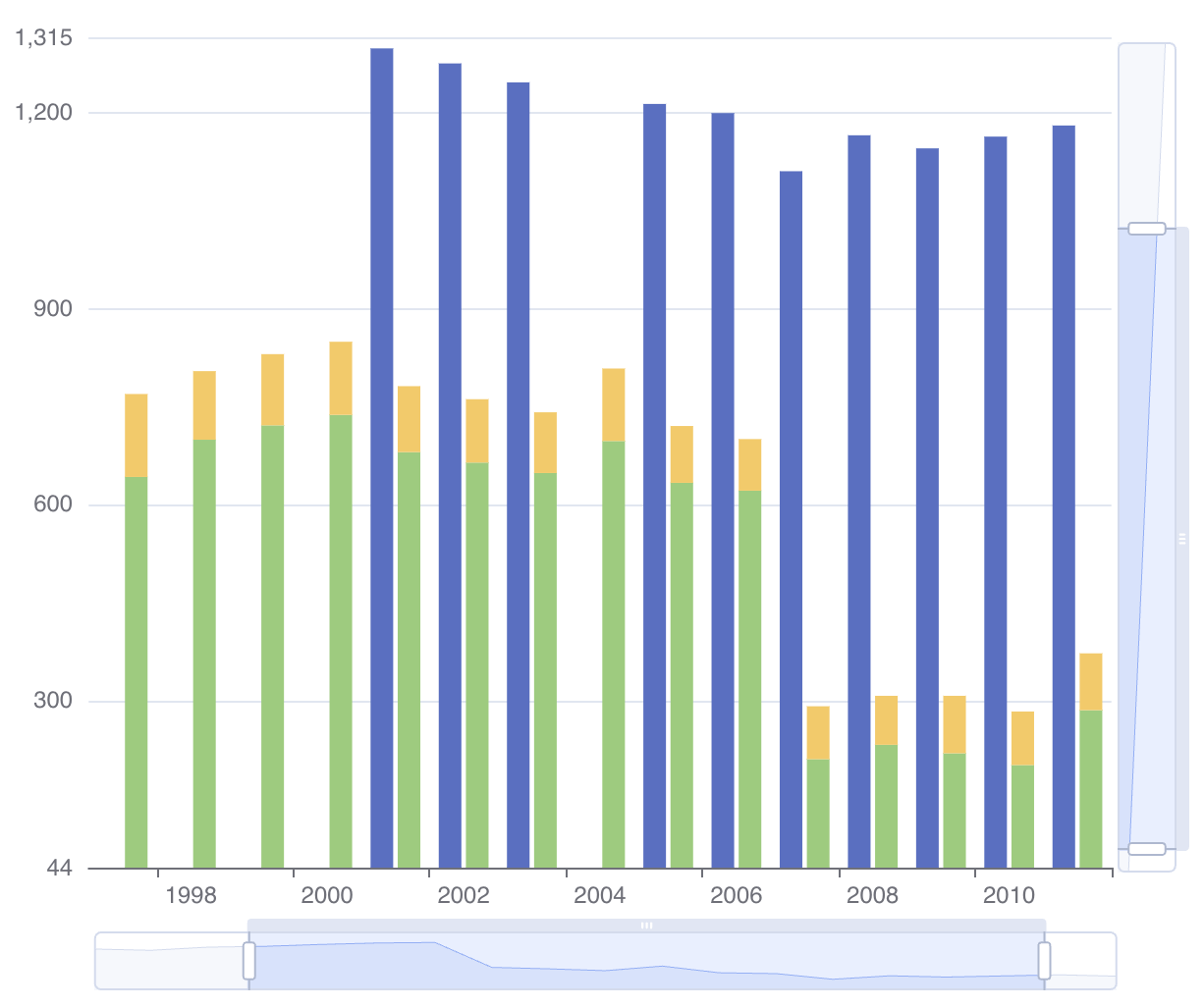
DataZoom
The dataZoom property provides two primary features:
-
Inside data zoom enables users to zoom or roam within coordinate systems through mouse dragging, mouse wheel movements, or finger touch gestures on touch screens.
-
Slider type data zoom offers features like data thumbnails for a quick overview, zooming in/out, selection brushing, drag to move, and click to locate within the chart’s data range.
For example:
<charts:chart>
    <charts:dataZoom>
        <charts:insideDataZoom/>
        <charts:sliderDataZoom orientation="HORIZONTAL"/>
        <charts:sliderDataZoom orientation="VERTICAL" right="5%"/>
    </charts:dataZoom>
Notice the horizontal and vertical sliders displayed on the chart:
NativeJson
The nativeJson property allows you to configure the chart using a direct JSON string as an alternative when the component’s Java API or XML attributes do not meet specific customization requirements. This feature provides access to the full range of ECharts' configuration options.
For example:
<charts:chart>
    <charts:nativeJson>
        <![CDATA[{
            "title": {
                "text": "Vehicles",
                "subtext": "Ratio in 2012",
                "top": "0",
                "right": "0",
                "textAlign": "CENTER",
                "textStyle": {
                  "fontStyle": "italic"
                }
            }
        }]]>
    </charts:nativeJson>
Here the nativeJson element configures the chart title in the same way as in the XML configuration above.
nativeJson configuration is merged with existing properties and overrides corresponding properties defined in XML.
|
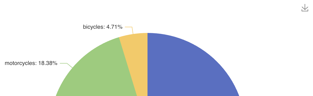
ToolBox
The toolbox property provides a group of utility tools, which includes export, data view, dynamic type switching, data area zooming, and reset configurations.
For example, the following configuration adds ability to export the chart as a PNG image:
<charts:chart>
    <charts:toolbox>
        <charts:features>
            <charts:saveAsImage title="Export to PNG" type="PNG"/>
        </charts:features>
    </charts:toolbox>
Notice the download icon in the top right corner of the chart: