Bar Chart
In this section, you will:
-
Integrate a chart with multiple series
-
Add
title,tooltip,legendelements -
Bind data through a data container
Multiple Series Chart Setup
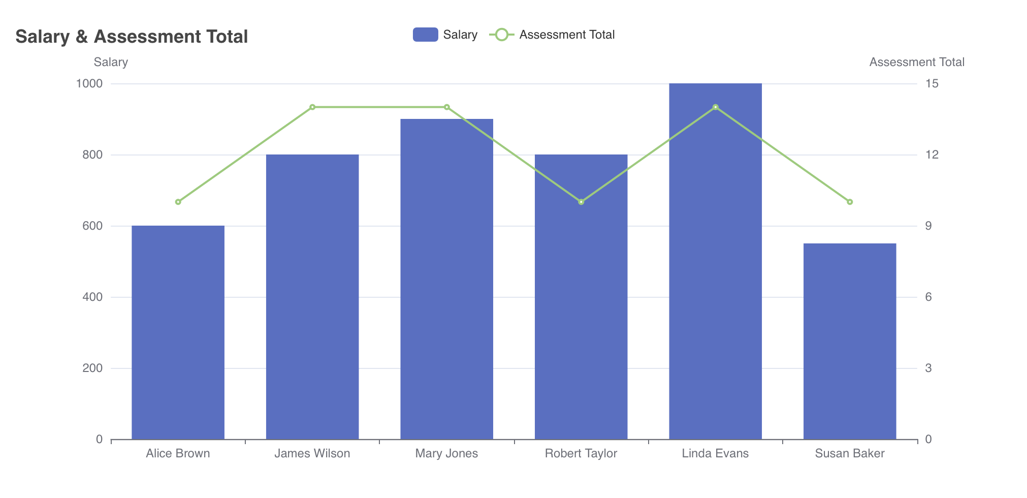
You will integrate a chart component that combines a bar series to represent employees' salaries and a line series to display their total assessment scores.
Setting Chart Series
Double-click on user-list-view.xml in the Jmix tool window. First, click on the formLayout element where your chart will be located.
To add a chart element, choose Add Component in the actions panel, select the Chart item.
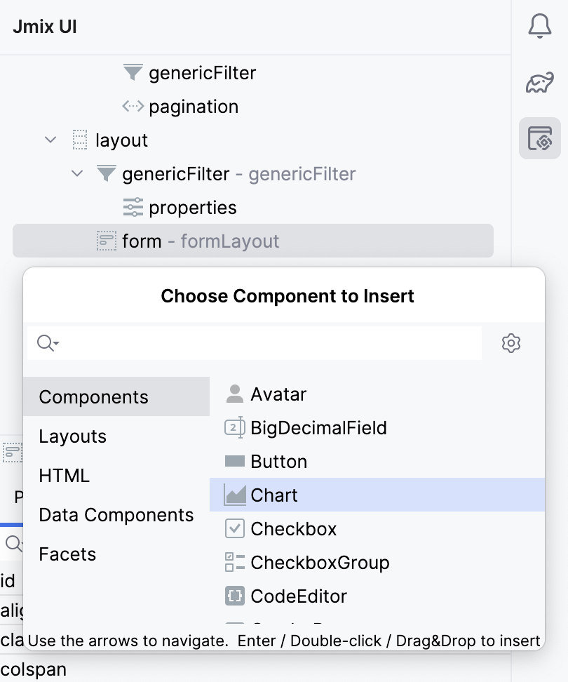
This will automatically add the charts namespace to your root tag, if you haven’t added it in this file yet.
<view xmlns="http://jmix.io/schema/flowui/view"
    xmlns:charts="http://jmix.io/schema/charts/ui" />
As well as the <charts:chart/> element in the formLayout. Configure the id, height and width attributes as follows.
<charts:chart id="bar" width="40em" height="100%" minHeight="30em" alignSelf="STRETCH">To pick your charts type you need the series attribute.
Select the chart element in the Jmix UI hierarchy panel or in the view XML descriptor, then click on the Add button in the inspector panel. Choose Series → Bar from the drop-down list.
To include the line series to your chart, choose the series element and pick Add → Line. Add a name property for both chart types: Salary and AssesmentTotal respectively.
<charts:series>
    <charts:bar name="Salary"/>
    <charts:line name="Assessment Total"/>
</charts:series>
Adding Axes
The Bar, scatter, line charts need yAxes and xAxes elements to display the chart’s values.
To add an X axis, click on the charts element and choose Add → XAxes → XAxis. Your chart X axis will display the names of the employees.
<charts:xAxes>
    <charts:xAxis/>
</charts:xAxes>
Since the chart has two different data types with varying scales, you need to configure two Y axes separately.
To configure the first Y-axis for displaying employees' salaries, click on the chart element and pick Add → XAxes → XAxis.
Add the name="Salary" attribute in the XAxis element and configure its position and alignment.
The values in the database are stored as multiples of 100,000. To display these values in a format scaled down to hundreds, add the axisLabel element under YAxis and set the formatterFunction attribute as follows.
<charts:yAxis name="Salary" position="LEFT" alignTicks="true">
    <charts:axisLabel
            formatterFunction="function(value){return value / 100;}"/>
</charts:yAxis>
The formatterFunction attribute defines a JavaScript function which is called to adjust the format of the tick values on the axis.
In the example above, the function divides the incoming value by 1000 to adjust the scale from hundreds of thousands to hundreds.
To add the second Y axis, choose the YAxes element and pick Add → XAxis, configure the axis' name, position and ticks alignment as follows.
<charts:yAxis name="Assessment Total" position="RIGHT" alignTicks="true"/>Next, map each Y axis with its respective series by adding yAxisIndex attributes in the bar and line series respectively as shown below.
<charts:series>
    <charts:bar name="Salary" yAxisIndex="0"/>
    <charts:line name="Assessment Total" yAxisIndex="1"/>
</charts:series>
Adding Chart Properties
Now, you will add optional properties to your chart such as title, tooltip, and legend to provide more context.
Title
By default, the title text appears at the top of the chart. To add a title, select the chart element, then choose Add → Title from the inspector panel. Configure the text attribute to describe what the chart represents, i.e. Salary & Assessment Total.
<charts:title text="Salary & Assessment Total"/>Tooltip
The tooltip attribute provides detailed information when users hover over different parts of the chart. To add a tooltip attribute, select the chart element, then choose Add → Tooltip. Set the trigger attribute to "AXIS" to show tooltips for all items in the same category.
<charts:tooltip trigger="AXIS">
    <charts:axisPointer type="SHADOW"/>
</charts:tooltip>Data Binding Using Data Container
First, you need to load all users except the Admin.
Create a new collectionContainer under the data element with the employeesDc name and the corresponding JPQL query as follows.
<collection id="employeesDc"
            class="com.company.onboarding.entity.User">
    <fetchPlan extends="_base">
        <property name="department" fetchPlan="_base"/>
    </fetchPlan>
    <loader id="employeesDl" readOnly="true">
        <query>
            <![CDATA[select e from User e where e.username <> 'admin']]>
        </query>
    </loader>
</collection>
To include the loaded data to the chart, select the chart element and add a dataSet attribute manually.
<charts:dataSet/>Inside the dataSet element, choose the employeesDc container as your source and configure the categoryField as your X axis, and valueFields as your Y axes as follows.
<charts:dataSet>
    <charts:source dataContainer="employeesDc"
                   categoryField="username" valueFields="salary assessmentTotal"/>
</charts:dataSet>
By the end of this tutorial, your bar chart XML configuration will be as follows.
<charts:chart id="bar" width="40em" height="100%" minHeight="30em" alignSelf="STRETCH">
<charts:title text="Salary & Assessment Total"/>
<charts:tooltip trigger="AXIS">
<charts:axisPointer type="SHADOW"/>
</charts:tooltip>
<charts:legend/>
<charts:dataSet>
<charts:source dataContainer="employeesDc"
categoryField="username" valueFields="salary assessmentTotal"/>
</charts:dataSet>
<charts:xAxes>
<charts:xAxis/>
</charts:xAxes>
<charts:yAxes>
<charts:yAxis name="Salary" position="LEFT" alignTicks="true">
<charts:axisLabel
formatterFunction="function(value){return value / 100;}"/>
</charts:yAxis>
<charts:yAxis name="Assessment Total" position="RIGHT" alignTicks="true"/>
</charts:yAxes>
<!-- Add yAxisIndex for each series to bind yAxis to their corresponding data -->
<charts:series>
<charts:bar name="Salary" yAxisIndex="0"/>
<charts:line name="Assessment Total" yAxisIndex="1"/>
</charts:series>
</charts:chart>This chart provides a visualization of the employees’ salaries and total assessment score.